Note to self: The l-o-n-g tale of paper lacings

Dear Everyone ~

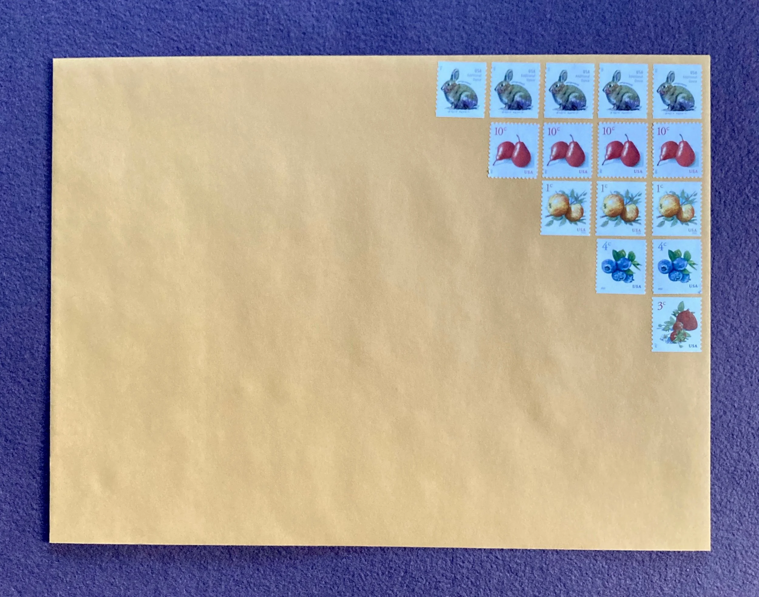
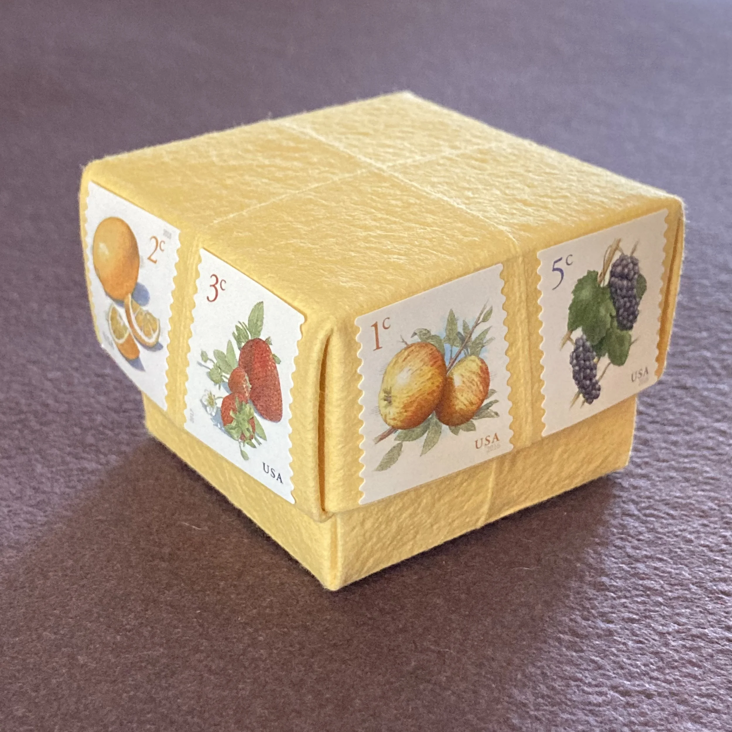
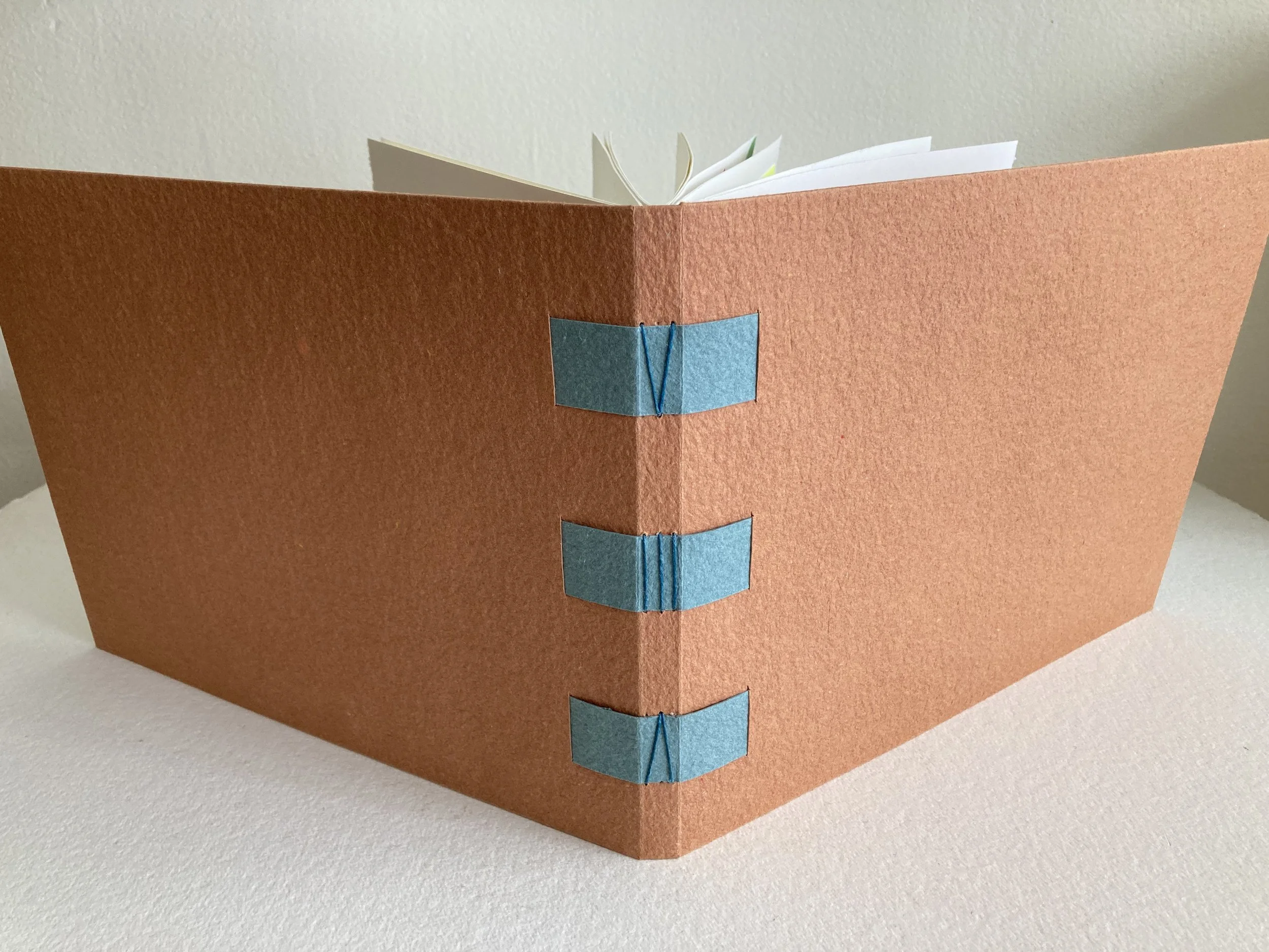
Bookful of Illustrated Notes to Self will debut in a little under two weeks, on Saturday, February 26. Kit assembly has been hilarious, because it required two “seatings,” like a fine restaurant. The covers of the book structure that students will make are 12 x 28 inches, and I ran out of acreage on my huge table. For shipping purposes, I am folding the Stonehenge and the Saint-Armand cover sheet in half, then wrapping them in white tissue (tied with French embroidery thread, pourquoi pas?) and sandwiching them between two pieces of cardboard before wrapping them, yet again, in sturdy kraft paper….Even if you are not joining us for my sixth Bookful collaboration with artist, author, and dear friend Cat Bennett, I thought you might enjoy the voluminousness of the spread, so to speak.

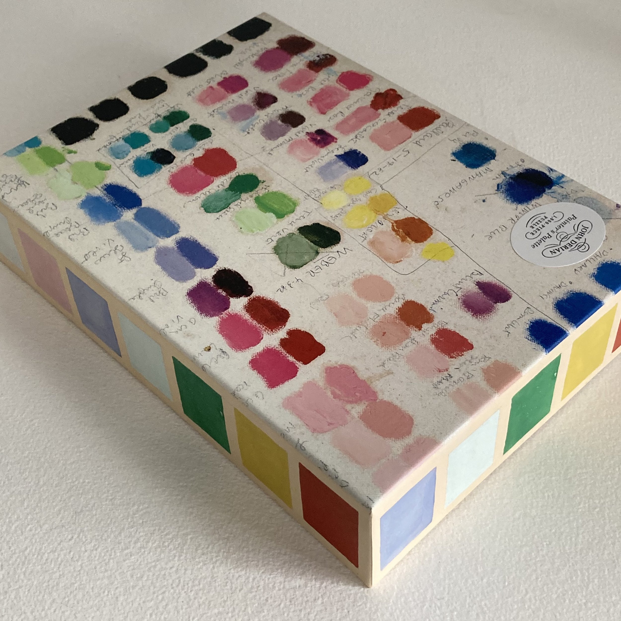
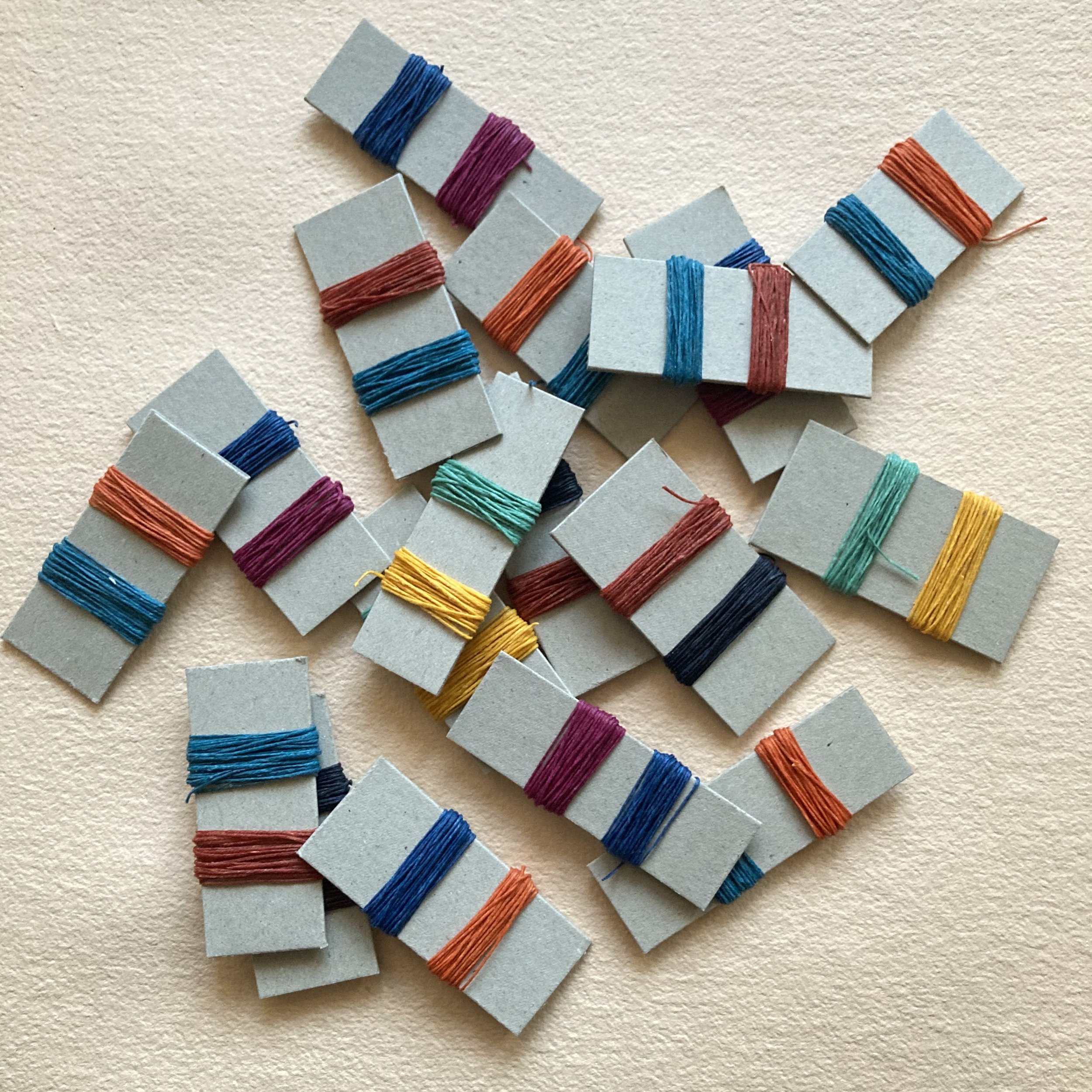
Note to self: For each Bookful workshop, fashion a palette guide for keeping track of all the paper colour-thread-ribbon combinations. I do this so I can have a visual archive keepsake of the materials we’ve used in each workshop. For this one, I’ve selected five cover/lacing palettes: Terra cotta with prune, Mineral green with terra cotta, Prune with charcoal, Orange with mineral green & Charcoal with orange.

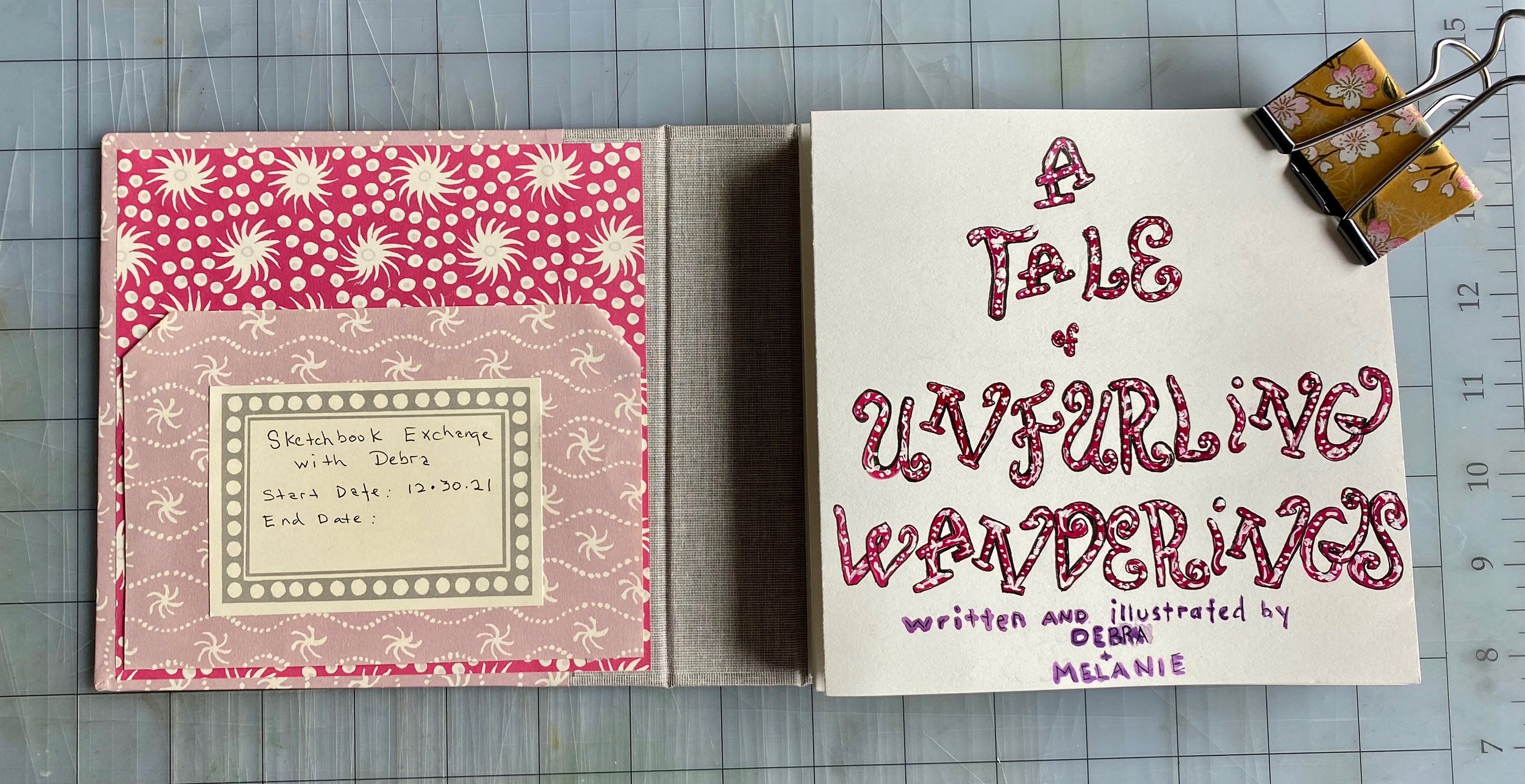
I’m particularly excited about this four-Saturday workshop via Zoom, partly because of the book structure and partly because I love the notion of “Notes to self.” Cat and I anticipate that everyone’s books will be so personal, as we illustrate our thoughts, musings, and mantras.

Five overseas parcels—one to Austria and four to Canada—are well en route to their destinations, thanks to the USPS. The parcel I sent to Gabriele in Austria (Bookful four-timer and enthusiastic participant in several other private & group zoom workshops, regardless of the time of day!) weighed over five pounds! Piggybacking onto her Notes to Self kit were Gabriele’s kit for a private workshop (Mighty-fine-nine-signtaure-spine) and an additional kit from the Desk Beautification workshop that she attended last October. She has shared with me what she plans to do with the two additional kits, and when she sends photos, I’ll be able to share them with you.

I’m delighted to announce that Rachel—who was one of three youngest students in my Introduction to Bookbinding workshop last March—will be joining us. Her experience inspired her to become one of our youngest Bookful students to date.

As always: Cat & I both look forward to sharing our love of drawing, painting, and bookbinding with Everyone in this four-part (12 hours-ful) workshop!

Bookful of Illustrated Notes to Self

Wrapping & packing, Bari

Czech out these enclosure sets!

Dear Everyone ~

The Velke Losiny paper mill in the Czech Republic has been making handmade paper since the 16th century. I discovered them a little over 30-ish years ago when I first began bookbinding, and I’ve been smitten ever since with every aspect of their quality. When I first opened the shop, I stocked their DL envelopes (the lovely European equivalent of a #10, measuring 4⅜ x 8¾, with a perfectly pleasing proportion of 1:2). The envelope had a deckle edge on all three sides of its flap. Swoonarama. And the accompanying thick flat card had a dreamy deckle on all four sides. But I am not enveloped with bittersweet nostalgia, because…

Velke Losiny’s petite enclosure set—a flat card and elegant envelope—is doubly swoonworthy. The card has a distinctive texture and measures 2 x 3½ with deckle edges on all four sides. The companion envelope is made from a single handmade sheet and thus sports a deckle edge on all four sides, including the throat (which is lovely enough to be a décolletage). It measures 2⅝ x 3⅞ and is also textured. The set is basically beguiling, taking all manner of writing implements smoothly & splendidly.

For this post, we have a guest encloser, photographer and hand-letterer Audrey Kuhn, the eldest niece of my postal muse. Audrey and Alyson not only share a love of paper, but also have the same initials (ARK). They have the same favorite letter (A) and similar sensibilities regarding wordplay. They have taken to texting each other their Wordle results every morning, with asides. Alyson acknowledges that Audrey’s “default striped lettering” (which she developed while working as a sign artist at Trader Joe’s) awes her. Audrey has graciously added assorted awesome annotations & addresses on these Velke Losiny “cuties.”

As you see, these enclosure cards and envelopes are multi-charmed. You can use an individual card for tying on a gift or a bag, or propping on a pillow. The envelopes are like a sweater set with their matching enclosure card, but they are also ideal for presenting one (or two) tiny Cambridge Imprint origami hearts (folded from a 3 x 3 piece, one-quarter of a 6 x 6 sheet).

We have made petite packets, tied with French embroidery thread: a set of five cards & matching envelopes, or a set of five cards, or a set of five envelopes.

Velke Losiny enclosure sets

Ensconced, Bari

PasteSF’s cards put the Ah! in collage

Dear Everyone ~

Denise Fiedler is a collage artist in San Francisco. Alyson Kuhn (a.k.a. My Postal Muse) recently visited Denise at her new studio, and promptly raved to me about her “Fiedler trip.” Denise and I have now bonded over our mutual love of collage and scraps. I am thrilled to debut her whimsical images on notecards.

I’ve selected a dozen delightful designs: a friendly menagerie (including a pooch sporting a French maritime-striped tee) and some luscious fruits & flora. The A2 notecards are available singly, with a true white envelope. In happy fact, you could make one lucky correspondent deliriously scrap-happy by sending a different collage card every month. Alyson has spontaneously named this the Fiedler of the Month Club, and it’s a delicious deal.

Denise’s appreciation of scraps and their creative possibilities inspired me to customize a parcel of Extremely Exquisite Scraps for her, for an upcoming project.

And I’m already hoping to entice her to offer this beribonned box (below) as a card. It’s one of three collages Alyson commissioned for the backs of her business cards, to illustrate Writing, Wrapping & Rhetoric, her professional predilections.

* * * * *
PasteSF Collage Cards

Scrap happy, Bari

Note to self: Bookful Nº 6 begins soon!

Dear Everyone ~

Bookful of Illustrated Notes to Self is my sixth Bookful collaboration
with artist, author & dear friend Cat Bennett. Our four-Saturday workshop via Zoom will debut Saturday, February 26, which is semi-soonish!

The inspiration for this Bookful series came from Cat’s observation that she says (usually silently, but not always) “Note to self”, when she sees something she wants to remember, both for how it looks, and also for how it makes her feel. For example: Look for the good in all things! or Find beauty everywhere! We all have these simple insights that are well worth recording, by illustrating them in a beautiful bound book (rather than snapping a series of phone photos).

Alyson Kuhn, a.k.a. my postal muse, has added her 2¢ worth to this discussion. She says, “An illustrated note to self is imbued with a sensory overlay, because your image is created by hand (yours!), and the touch memory deepens the visual memory of whatever you put on the page.”

The book structure you will make is a triple-signature booklet with woven paper lacings. The landscape format (11½ wide x 8½ tall) provides a luxurious expanse (8½ x 22) for your “notes to self” in the form of paintings, collages, and musings.

Cat will lead us in exercises to create bold images with brief captions, aspirations & inspirations. You’ll use drawing, painting, and painted paper collage to make your images. And, as you’ll see, your images don’t need to be literal or figurative. You’ll want to have colored pencils, crayons, black marker pens, watercolor paint, scissors and a glue stick. And your notes to self! It’s not unlikely that new notes will occur to you as you work.

The palette options are a celebration of my fresh shipment from the masterful papermakers at Saint-Armand Papeterie. I’ve paired colours to create five earthy combinations: Terra cotta with prune lacings, Mineral green with terra cotta lacings, Prune with charcoal lacings, Orange with mineral green lacings & Charcoal with orange lacings. Each kit includes two different colours of waxed-linen thead, so that you can enjoy the humming and hawing of choosing which to use. And if you’d like to order an extra kit or two, please feel free to call or e me.

As always, Cat & I like to emphasize, especially if you are a Bookful newcomer, that absolutely no drawing or bookbinding experience is necessary. The pace and camaraderie are positively soothing yet energizing. Plus you will have the videos to watch and rewatch. We look forward to rezooming our creative pursuits with you soon!

Bookful of Illustrated Notes to Self

Chattily, Bari

Arty Heart Bunting Origami Kit

Dear Everyone ~

The newest kit in our shop from Cambridge Imprint is literally, figuratively & decoratively heartwarming. It’s officially called the Heart Bunting Origami Kit. The keepsake box, like its companions (a cloud of butterflies, a galaxy of stars, a delirium of bobbles/baubles), presents 36 assorted sheets of patterned papers (6 x 6) in a valentinian palette, ranging from Victorian mauve to ruby red, with perfect pink and springy magenta in the mix. You can fold 36 voluptuous hearts, or you can trim some of the sheets into quarters (3 x 3) and make 4 dainty hearts from each full-size sheet. The papers, as always, are accompanied by a charming booklet of helpful instructions. You do not need a bone folder to whip up a batch of hearts, but if you use one, your creases will be a whisper crisper.

Robb Morgan, our non-resident star of Cambridge Imprint folding, has arranged the hearts he folded into some charmola configurations, which would be LOVEly on a tray or a table, or, dare we say, on a pillow. Robb’s photos always give me ideas.

When the Cambridge shipment arrived, one of the first things I wanted to try was making an envelope to hold some origami hearts. First, I made a little booklet envelope measuring 2¾ x 4½, which can snugly enclose a trio (a mélange à trois!) of petite hearts. Then I made a backless envelope measuring 4¼ x 4¾. It can comfortably hold at least one large heart nestled with a couple of petite hearts. Both envelopes are made from a single 6 x 6 sheet, so you can envelop your origami hearts to your heart's content!

And, for excessorizing, I have stocked up on Cambridge Imprint small labels in a valentinian palette. Each label measures 1¾ x 1¼, and delightfully dresses up an envelope (especially with a fruit stamp) or a wrapped gift. Beautify a bottle, box, or bag! If you want to bunt or garlandize your hearts, you will need a needle and thread (or an awl and some slinky ribbon).

Announcing Fresh Fruits & Bunnies Stamp Sampler

Dear Everyone ~

Back in the summer of 2020, I debuted the Summer Stamp Sampler, a manila stock page whose 12 rows served up strips of four fab fruit stamps. Low denominations but delightful designs: 1¢ apples, 2¢ lemons, 3¢ strawberries, and 5¢ grapes. Artist John Burgoyne’s original illustrations made charming stamps, under the tasteful eye of U.S. Postal Service art director Derry Noyes.

But why was there no 4¢ stamp? We may never know, but the wait is over. Earlier this month, a luscious shipment of fresh 4¢ blueberries arrived. Artist John Burgoyne’s blueberries combine pen, ink & watercolour, and they have put a spring in our fruit sampler! And speaking of springing—or hopping—our refreshed fruit sampler also includes two rows (16 stamps in all) of the 20¢ brush rabbit by San Francisco Bay Area artist and designer Dugald Stermer. (Sadly, the artist passed away before his stamp was issued in 2021.) Alyson, my postal muse, and I consider the bunny the perfect companion to the fruits.

We've been chatting about combinations, denominations, mailing rates, etc., and here are the fruits of our philatelic musings.

Think of the fruit stamps as the postage with the mostage, as it takes many of them to make 58¢ (for a letter-size envelope, up to 6 x 9) or $1.16 (for an envelope larger than 6 x 9, even by a hair/hare). The fruits look quite delish on an envelope of almost any shade when you alternate two contrasting colourways, which you can arrange in a row or a checkerboard. Some of our favourite combos are blueberries & strawberries, and grapes & lemons. Singly, these stamps are handy (and extraordinarily inexpensive) for a multitude of embellishing missions, including gift wrapping, envelope sealing, and note affixing.

Another delightful arrangement is to create a frame by arraying the stamps along all four sides of the envelope. Here you see a Grand Carta Pura Envelope, which holds a folded notecard. Measuring 6¼ x 9, it is considered a large envelope, so requires a minimum of $1.16. If you include any enclosures, say a pair of Glimpses & Whimsies of Bari Zaki Studio postcards, then you’ll need to add 20¢ (1 bunny or several fruits) for that second ounce.

Frankly, we are big fans of overfranking, which is a real word meaning to put more postage on an envelope or parcel than it requires. (Alas, you cannot get credit for doing this, to apply against a future inadvertent instance of underfranking!) The large kraft envelope seen here measures 9 x 12, requiring $1.16 worth of postage for one ounce… but it’s delightfully likely that whatever you’re putting inside will tip the scales at more than an ounce, and it’s 1-bunny-worth (20¢) for each additional ounce.

The Fruits & Bunnies Sampler is available in two formats: either a manila stock page enveloped in a British glassine sleeve, secured with a pair of tiny Japanese-paper-covered butterfly clips, or in an origami box (2⅛ x 2⅛ x 1½) that I’ve fashioned from luscious Saint-Armand paper, with ten teeny Japanese-paper-covered butterfly clips clustered inside the orchard of stamps. If you are so inclined, you can decorate the sides of your box, as shown here!

In anticipation of Valentine’s Day, we will include a slim glassine sleeve with a row of five 10¢ pairs of pears and one 46¢ kaleidoscopic flower (loves me…loves me not).

Fruits & Bunnies Stamp Sampler

Tutti frutti, Bari

Janet & Bari’s Year of Creative Synergy

Dear Everyone ~

Janet Bouldin is an artist whose name some of you will recognize. Last month, I debuted her most recent series of watercolour postcards, Daily Domesticity and Trio of Bouquets, which you can read about here. She also illustrated the Glimpses & Whimsies of Bari Zaki Studio postcard set, which you can read about here, and the sheaflet for the More Art of the Hand-folded Envelope kit, which debuted on Valentines Day 2021. You can read about that here. Today, I want to share with you Janet’s & my sketchbook exchange over the last 12 months: our year of creative synergy.

First a bit of background: In the summer of 2019, we sent each other a postcard (sometimes two) every day. It was invigorating to build a steady stream of sending & receiving mail on a daily basis! It kept both of our creative flows flowing, and our friendship blossoming. Janet has become one of my most prolific & prized correspondents.

We have always shared with each other what’s going on in our sketchbooks. (It’s become a ritual that we now refer to simply as show & tell.) In November of 2020, I decided to “formalize” our habit, and I began drawing in a sketchbook just as I normally do, taping a few inspirations to the inside front cover, then skipping the first page and starting to draw on the second…. I then presented it to Janet to fill the next page or two, along with a fresh sketchbook for her to begin to draw in. Then each time we met, we’d swap. Most times, we’d have each filled at least two or three pages. I hadn’t counted the number of pages in each book, nor given much thought to when we’d get to the last page. It was more about the process, the exchange, and the creative connection. We used a pair of vintage books I had unbound & rebound with warm white Hahnemühle pages: Best Plays by Chekhov and A Midsummer Nights Dream. There was something so utterly satisfying about seeing the books begin to pooch with the puckering of Janet’s watercolours and the layers of my painted paper collages.

Janet’s art practice has really taken flight since her retirement from teaching English. And she definitely hasn’t lost her knack for clear self-expression. Here are a handful of her thoughts about her drawing practice and our sketchbook exchange.

“ I have discovered that it’s easier than I expected to draw or make art every day. And that the more I draw every day, the deeper is my relaxation whilst I’m doing it, as well as more lingering effects (new ideas, more comfort), and the more I want to do it. ”

“ Thinking about the gentle nudge of the journals, remembering instead that I decided it was more of a welcome. If I didn’t know exactly which direction to turn in on a given day, the journal beckoned in a non-judgmental way and often became a stepping stone as well as a place to start or a place to end up. ”

“ As we were nearing the end of our first sketchbooks, and before we’d even decided on what the second round would contain, I realized that I can’t imagine being without this exchange. I would be bereft, I know. It’s become a wonderful, creative, supportive subtext to our deeply appreciated friendship. It’s a little magical, almost. May we fill shelves with them! ”

“ Seeing your work is inspiring, and it also inspires me to know that you’ll be seeing—without judgment, with appreciation—mine. The surprise and delight for me are never ending. ”

We’ve decided to have a theme for one of our next pair of sketchbooks: teacups. The other we will surrender to serendipity. I started the Serizawa (March) soft-cover Coptic stitch book, and Janet started the buttonhole-stitch book covered in Cambridge Imprint Starry Papers. Here is how they are shaping up. And we are mulling & musing about scanning some of our pages and making them into a set of postcards for the shop.

Extra, extra: Melanie’s exciting sketchbook exchange

Dear Everyone ~

At the beginning of December, Melanie O’Steen sent me a delightful email describing an idea she’d been percolating on for a couple of months. Our friendship has blossomed from her very first foray into bookbinding, when she took my Buttonhole-stitch workshop through Sonheim Creative. (Anyone taking this workshop could e me or call with any questions, and Melanie did.) Her intense curiosity & creativity regarding paper set us up to become great pals. Two years later, she is a Bookful five-timer who has also taken several private bookbinding workshops with me. Now, Melanie has invited me to help her with the technicalities of the two sketchbook exchanges she has conceived.

I have been over the moon delighted to help Melanie get her project underway, and naturally I’ve asked if I may share her creative process. She has provided lovely shots documenting her bookmaking process, and below are her inspiring descriptions of bookish details. Bear in mind that neither one of Melanie’s “paper penpals” lives near her. Melanie has made, as you can see, four sketchbooks, two that she will exchange with Debra in California, and two that she will exchange with Dorothy in North Carolina. So, Melanie and Debra will each start a sketchbook, and then “exchange” them, building off of the other’s previous panels. Ditto, Melanie and Dorothy.

“ Earlier this year, I came across an artist’s blog where she described her sketchbook exchange with a friend. I had never heard of such a project. Their exchange centered on responding artistically to each other’s page. Sometimes, it was responding to just a single stroke of color. I found this inviting and intriguing. (Unfortunately, I can’t recall the artist’s name or the name of her blog, but I am all the more grateful.) My friends, Dorothy and Debra, have played very important roles in my creative journey. Proposing this exchange is my way of honoring them and their creativity. Making books (Thank you, Bari!) has become one of the most life-giving things for me. ”

“ I truly love accordion books! There’s something about the unfolding of the pages, just like the unfolding of our stories and our art journeys. After learning several delightful accordion methods this past year in the Bookful workshops, I never considered another style of book for the exchange project. I can barely wait to see the accordions all stretched out, with my friends’ art intermingled with mine. ”

“ I knew I wanted the sketchbooks to be square, with bookcloth spines, and small enough for us not to feel intimidated by the blank page. I first encountered the Cambridge Imprint Special Starry Papers during the Bountiful Bookful workshop. They are so whimsical and cheerful, and I love how they can be mixed and matched. For the covers, I coordinated papers for Debra and me, and I chose a different coordinated pattern for Dorothy and me. One last-minute decision I made during construction was to line my friends’ sketchbooks with my coordinating paper and my sketchbooks with their coordinating paper. This aesthetic connection—in one accord, which is perfect for an accordion book— is so representative of my friendships with Debra and Dorothy. ”

“ For this exchange, I knew that if I applied too many constraints, such as a theme, it would feel like pressure. So, we don’t know what each other’s theme is, and we may not even know what our own themes are, until we begin drawing on that very first page. I do love surprises! It will be a conversation in a way, and I plan to include a note to each friend when I mail them their sketchbooks, suggesting some guidelines for the exchange, including: work at your own pace, date your work, feel no pressure to perform, don’t treat the art as precious, and enjoy! ”

“ Our original idea—and we discussed this a lot!— was to mail the sketchbooks back and forth to each other throughout the year. But when we realized how costly that would be, we went back to the drawing table :). Although we lose the aspect of working directly in each other’s sketchbooks, the following method simplified the logistics. We each make a first entry in our sketchbook, take a photo of it, and send it in a text to the appropriate friend. The recipient then responds artistically on a separate piece of paper and sends her response via text photo back to that friend. And thus the creative process continues. At the end of the project we will mail all our artistic responses to the rightful owner who will then glue (or otherwise affix) them into her sketchbook. ”

I love how Melanie, Dorothy & Debra have adapted a sketchbook exchange to work long distance. I particularly love this confluence of technology and tactility! And probably texture and tea! Not incidentally, I’m delighted that Melanie’s Cambridge Imprint fandom runs deep, from her large-label “bookplates” (under glassine!) to her bookbinding scraps.

Special Starry Papers
Sketchbooks
Multi-marvy Labels

Excitement will ensue, Bari

P.S.
Pencil Shaving cards from Britain have finally landed at the shop after a mysterious whirlwind tour around the Continent. The online shop is hereby fully stocked.

2021: It’s a wrap!

Dear Everyone ~

It’s high time to put a bow, or a wreath of bows, on 2021. I’d like to thank everyone, for the last time this year, for appreciating what Bari Zaki Studio represents and for expressing what it means to you. Herewith, some of my favourite mail of the year. But first, a deep bow to Robb Morgan, our non-resident star of Cambridge Imprint folding. (He folded this bevy of bowties from Special Starry Papers trimmed to U.S. currency size.)

This from Tammy D. might just win Email of the Year:

“My dear Bari ~ I can’t even believe how quickly I parted with my money upon reading your latest luscious email. I am enamored of these papers and washi. You have such a gift with words and phrases. Unlike, say, J Peterman, your descriptives are achievable! Perhaps not as handily or deftly as your own creations, but I know I can create something beautiful with the items I purchase from you.”

Of the mail I received this year from my Postal Muse, this envelope is my favourite. Alyson cut the address frame from the Mass Audubon diminutive desk calendar, the stamps were recent acquisitions from her dealer in Carmel, and, yes, my eyes almost bugged out at the ensemble.

Marcia Shortt is a friend of Alyson’s, and her envelope came as a total surprise, which was a gift unto itself. I love how she arranged the dual labels, giving my name its very own label. And above the label is an additional BZS which she applied with alphabet stickers in very pale celadon. The assorted papery bits within are cards and tags she’s made from vintage ephemera & postage stamps.

Brian Russo, artist and fellow booklover, spent a few weeks this past summer road-tripping around America, which is exactly what he wrote as his return address! He sent me a handful of ephemera from his travels, which I soon plan to use in my sketchbook.

I loved Carla Jacobs’ way of recycling the Saint-Armand multi-media pad wrap as a postcard, by slicing off the sides of the wrapper. She embellished their logo with colour pencil and notes, “Nothing of quality is tossed in the trash.” Cheers to that!

Every year I receive a lovely letterpress holiday card from my bookbinding fabric suppliers at Campbell Logan Bindery. The interior greeting is always a book themed quote. This year’s greeting is “Books are hindrances to persisting stupidity.”

Continuing that theme, this envelope from Susan M. warmed my mailbox and my heart! I love the multitude of embellishments, from hand-lettering to bookshelf washi tape, from the “By Snail, Par L’escargot” to the “Thank You” Forever postage stamp. The interior card is from an edition of 13, printed by Susan.

Receiving one of Becky Sherrod’s calligraphed envelopes is an exquisite epistolary treat. Both the envelope and notecard are works of calligraphic art. The interior card with its floral B is hand-drawn and watercoloured … I am beyond beatific!

Cat Bennett sent this big red bloom, one of her iconic shapes, made from a collage of painted paper. The row of stripes reminds me of a painting exercise she shared with us in Bountiful Bookful of Personal Patterns, a reminder to stay calm and paint stripes.

Emery Kennett borders on having a border fetish. She loves drawing them on envelopes, on notecards & in her sketchbook. She has sent me several envelopes over the months, always with a different border and colour combination. This border, she writes, “was inspired by an old game of Tiddlywinks”. The envelope is Rivoli Rose.

From the simple to the elaborate, missives brighten the day not only of the recipient but also of the sender. May we brighten each other’s days in 2022.

Scene above is the grand finale to my 2021 “catching up with correspondence”.

Wishing everyone a peaceful New Year & a beautifully creative 2022! ~ Bari

Post-Boxing Day post

Dear Everyone ~

Yesterday was Boxing Day, the British (and British Commonwealth) big shopping day after Christmas, presumably named to honour all the boxes shoppers would go home with. I’ve never been in the UK on Boxing Day, but love the idea of a holiday named for boxes.

My personal affinity for boxes bloomed after I saw the movie “Paper Moon” when I was ten. Addie Loggins’ character (Tatum O’Neal) always had her cigar box close at hand, containing her most worldly possessions, including chewing gum, cigarettes, and a small amount of cash. Having a box to carry around spoke to me. Soon thereafter, I started collecting cigar boxes, then stationery boxes, then I began organizing my stationery in cigar boxes.

Here are a few of my favourite boxes at home, relaxing.

The Betty’s biscuit tin is from my visit to York in 2019. When I saw the box on the counter at Betty’s café, it wasn’t the biscuits I was drooling for, it was the tin. The illustrations are charmola, and the tin is the perfect size to hold my various watercolour tubes. (I shared the biscuits before we left, so the tin would be empty for the trip back to Chicago.)

My friend Margo in Portola Valley sent me for Christmas this 1,000-piece puzzle from John Derian. This image of paint swatches on canvas happens to be one of my absolute favourites from his series of vintage illustrations. I couldn’t be more thrilled to have this box! I’ve already fashioned the wrapping paper the gift came in into the envelope for my thank-you note to Margo. I puzzled over whether it would be a liner or the actual envelope, but because the paper was so sturdy, I decided it could be a weather-worthy envelope.

Another sort of boxing day is when I receive a shipment from Carta Pura. They package all their pads of paper in these utilitarian extra-thick kraft boxes. I like to use them for organizing miscellany & then I hand-letter the “front” so that I know what’s inside.

Also this Christmas I received a gift from Jo Malone London, from my friends Debbie & Callan here in Chicago. The diffusers with their lovely bottle of scent (lime-basil-mandarin!) came in a deluxe mini-shoebox-size box, truly swoonworthy. (Hmmm, Jo Malone has the same number of letters as…Bari Zaki.) The branding is a paragon of understatedness.

From the humble to the luxurious, any box deserves a second life. My only word to the wise: label your box somehow, so you know what’s inside!

Vox box, Bari