Dear Everyone ~

I’m a bit giddy to announce Glimpses & Whimsies of Bari Zaki Studio, a set of ten large postcards. These were many moons in the making & collaborating with two dear friends, artist Janet Bouldin and my postal muse, Alyson Kuhn.
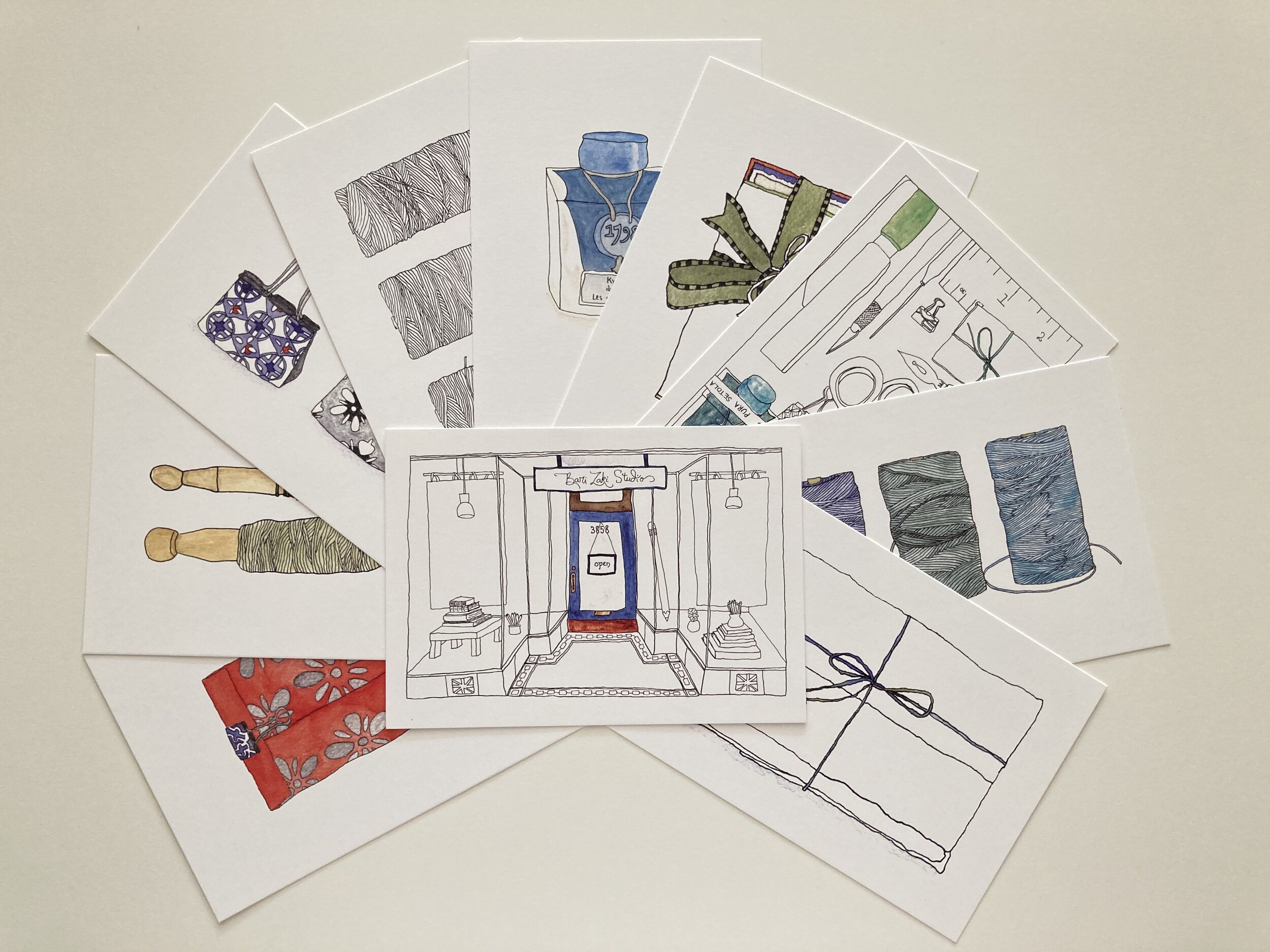
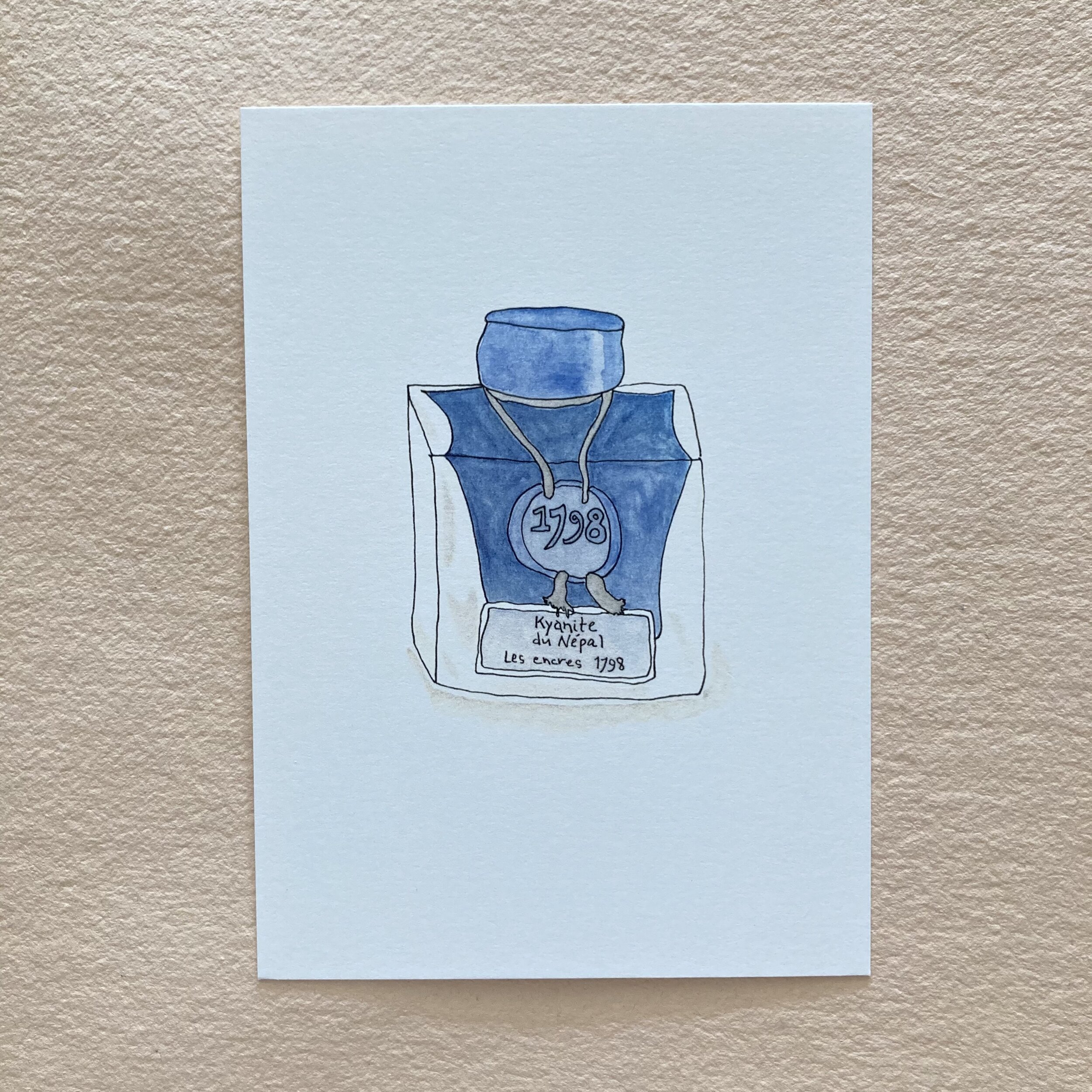
The postcards are my third collaboration with Janet. First, I commissioned a quartet of watercolour illustrations, which we titled Tableaux postcards, depicting quiet domestic pleasures. Then, Janet started experimenting with scraps from Serizawa calendar page scraps left over from my bookbinding projects. These became a series of beguiling teapot collage cards. Seeing her personal artwork presented as Bari Zaki Studio products was such a thrill for both of us, and this inspired me to ask Janet if she’d be interested in drawing a few objets in the shop. She replied:
“ For me, the shop is magical. Each time I visit, something different catches my eye to delight and inspire. I would love the chance to share some of my favourite Bari Zaki Studio vignettes. ”

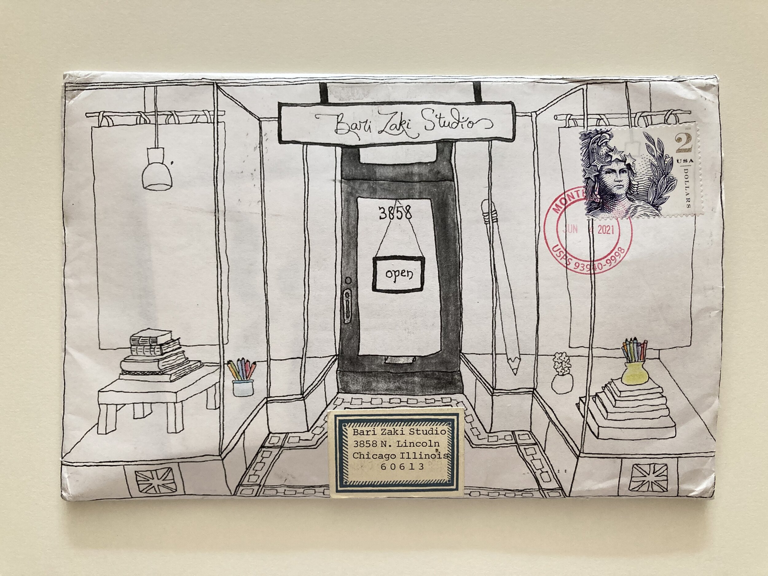
Meanwhile, Alyson Kuhn fairly leapt at the prospect of writing descriptini for the backs of the cards. Janet’s illustration of my shop front makes my heart sing. Several weeks ago, Alyson enlarged that illustration and made it into...an envelope, which she mailed to me! (This “backless” envelope style is one that Alyson & I showcase in our More Art of the Hand-folded Envelope kit.)

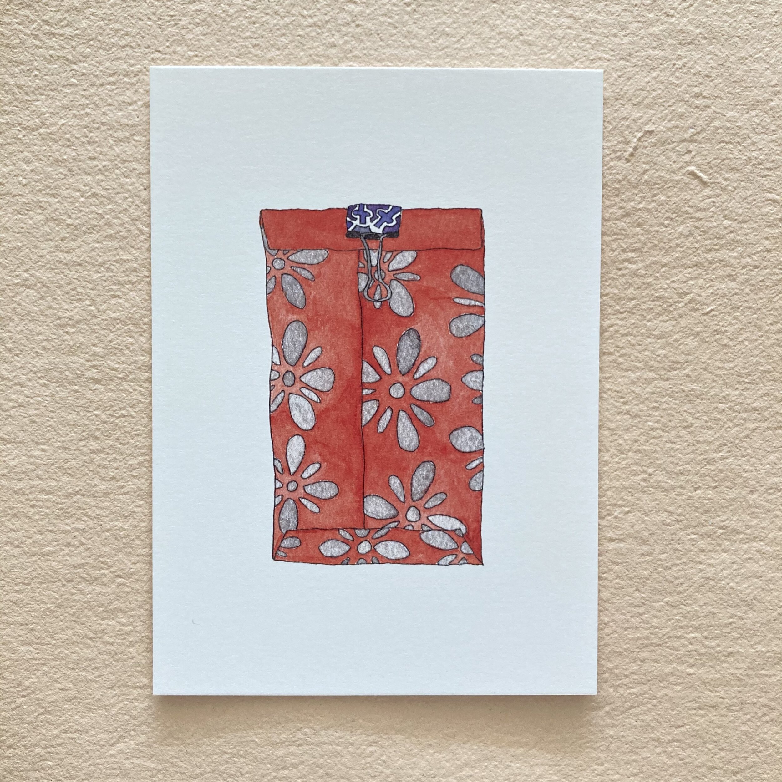
Alyson is a wordsmithing marvel, and we have collaborated for many, many years. As Janet was busy illustrating with pen & ink and prior to watercolouring, Alyson suggested keeping a couple of the drawings uncoloured, reserving that pleasure for you or your recipient.
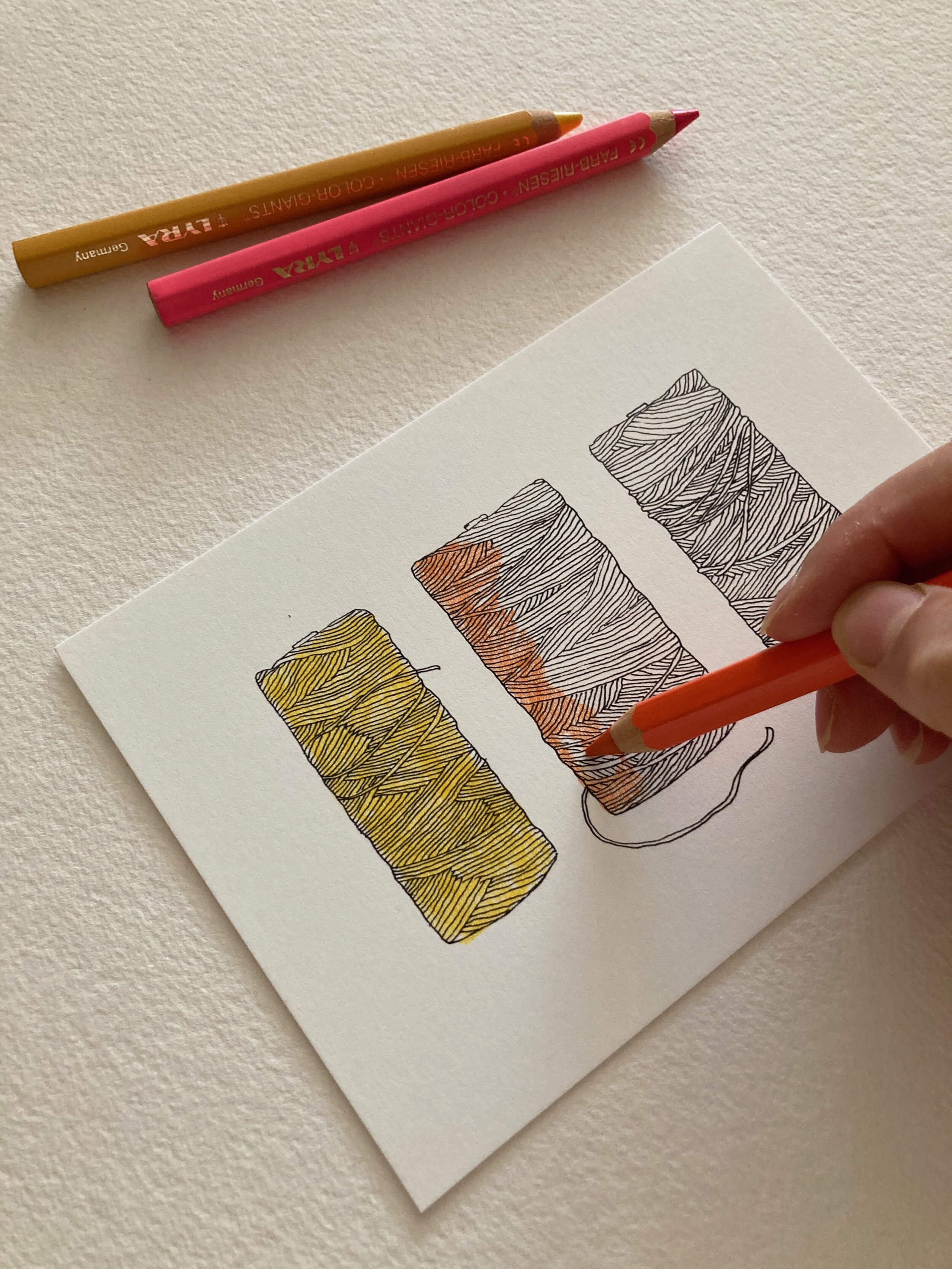
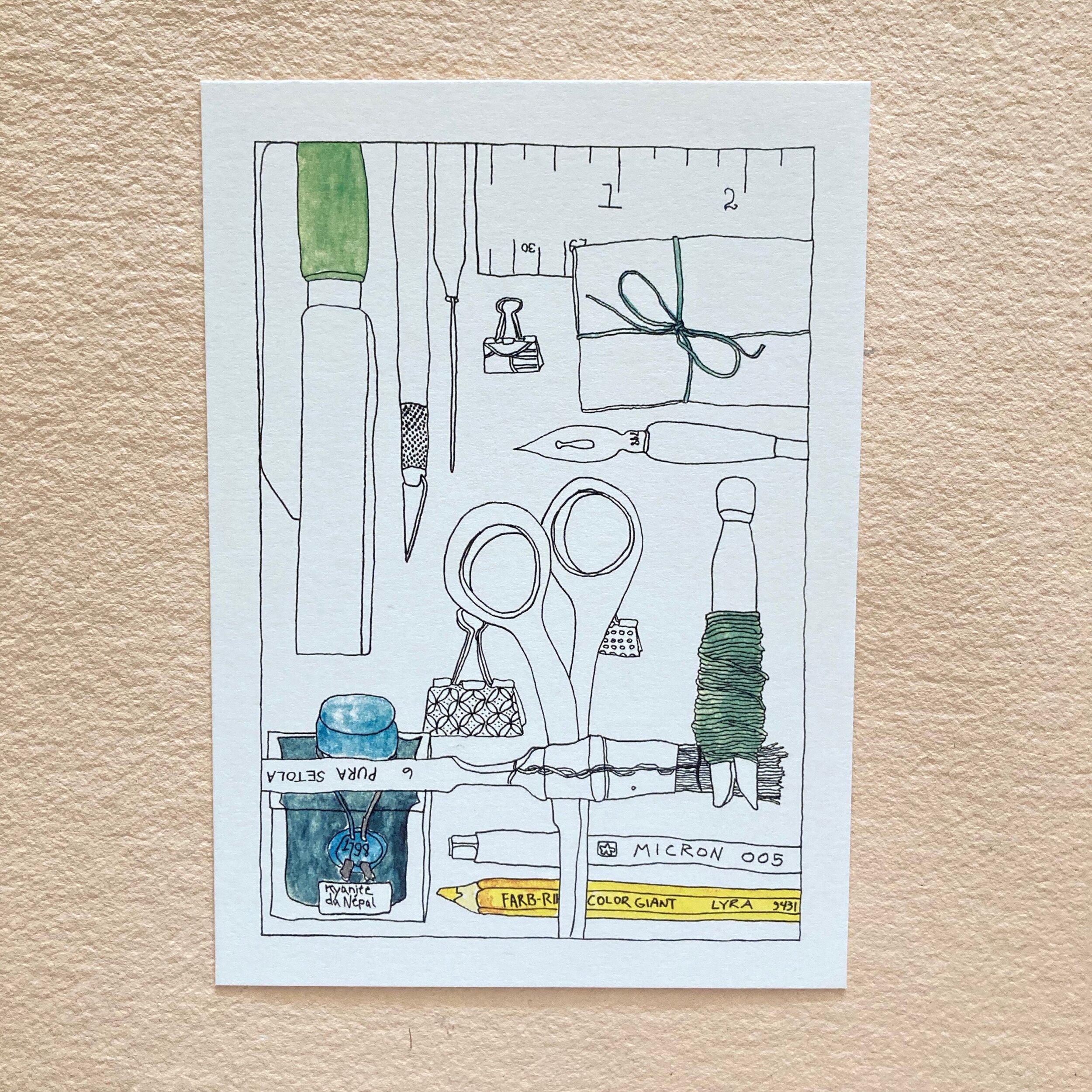
Scene here: I am colouring the You are the hue postcard with the Lyra Colour Giants. I spent many a moment hemming & hawing & even humming over which three colours to use. The palettes are numerous and possibly endless. I eventually settled on Bright Autumn Yellow, Orange Crush, and Light Rose. These are the lyrical names of the Irish waxed-linen threads, not the Lyra’s names, so as not to confound you!

The descriptini on the backs of the cards are more than mere icing on the postcard cake. They are more like postcard poetry. They are almost, as one dear customer quipped years ago, haikuhn!
You are the hue.
Delight to dye for. You can colour these
spools whilst chatting or zooming.
Each set of cards is wrapped with a paper band (of handsome Hahnemühle Bugra) featuring an original unique illustration by Janet. “Original” means a charmola tiny treat watercoloured by Janet directly on the wrapper, a glimpse of Janet in action! Might you do anything with the band? You might, because it is simply washi’d at the back, so you can liberate it intact, to do with as you will, or whim!


The postcards measure 5 x 7 inches, fitting perfectly in an A7 envelope, should you wish to add a layer to your mailing or presenting. The postcards are printed on super-heavy Mohawk Superfine (130 Cover). The envelopes are toothy Hahnemühle Bugra, with a crisp square flap. Sets are available with or without envelopes.

Glimpses & Whimsies of Bari Zaki Studio
Happy collaboratee, Bari