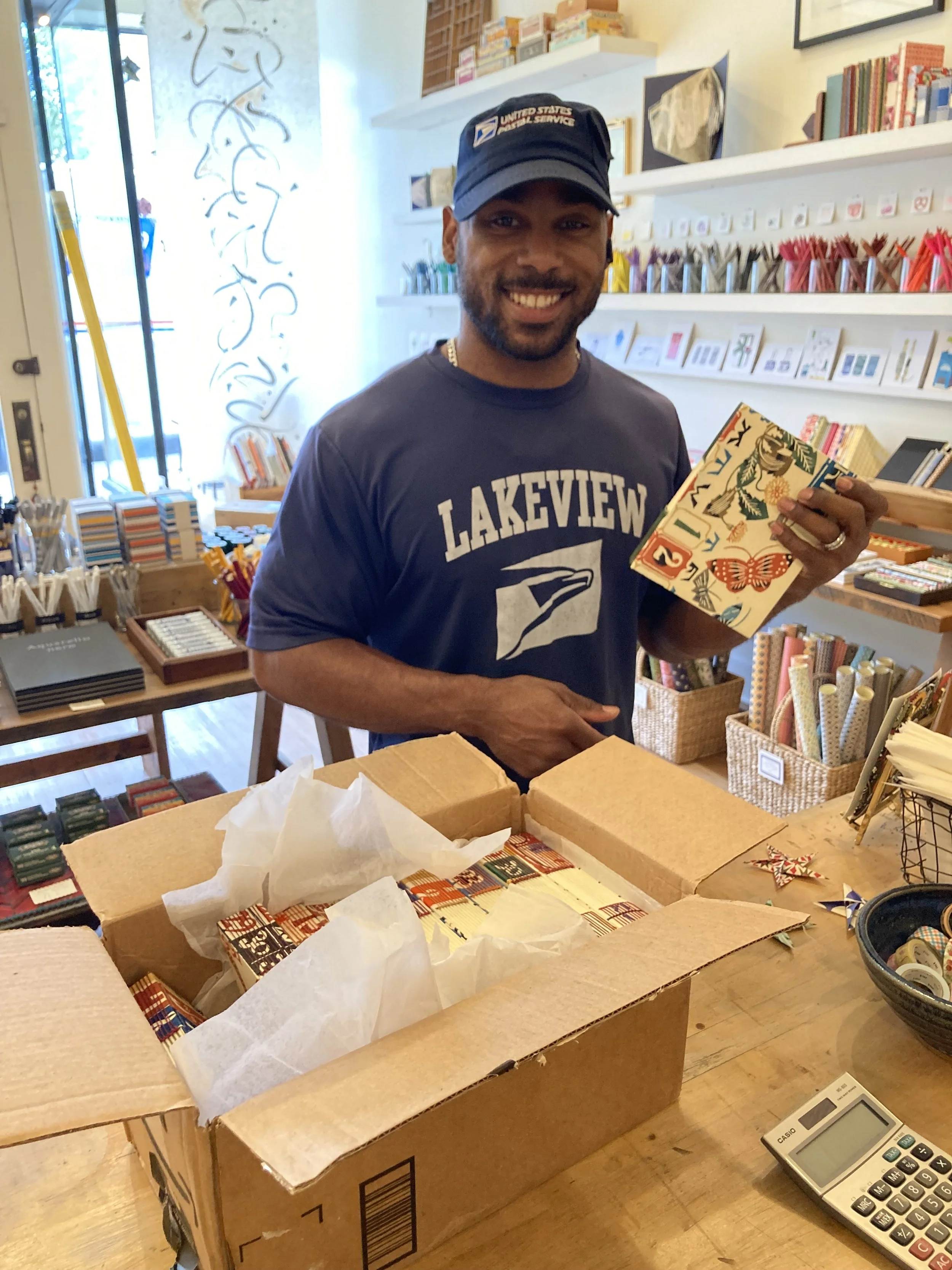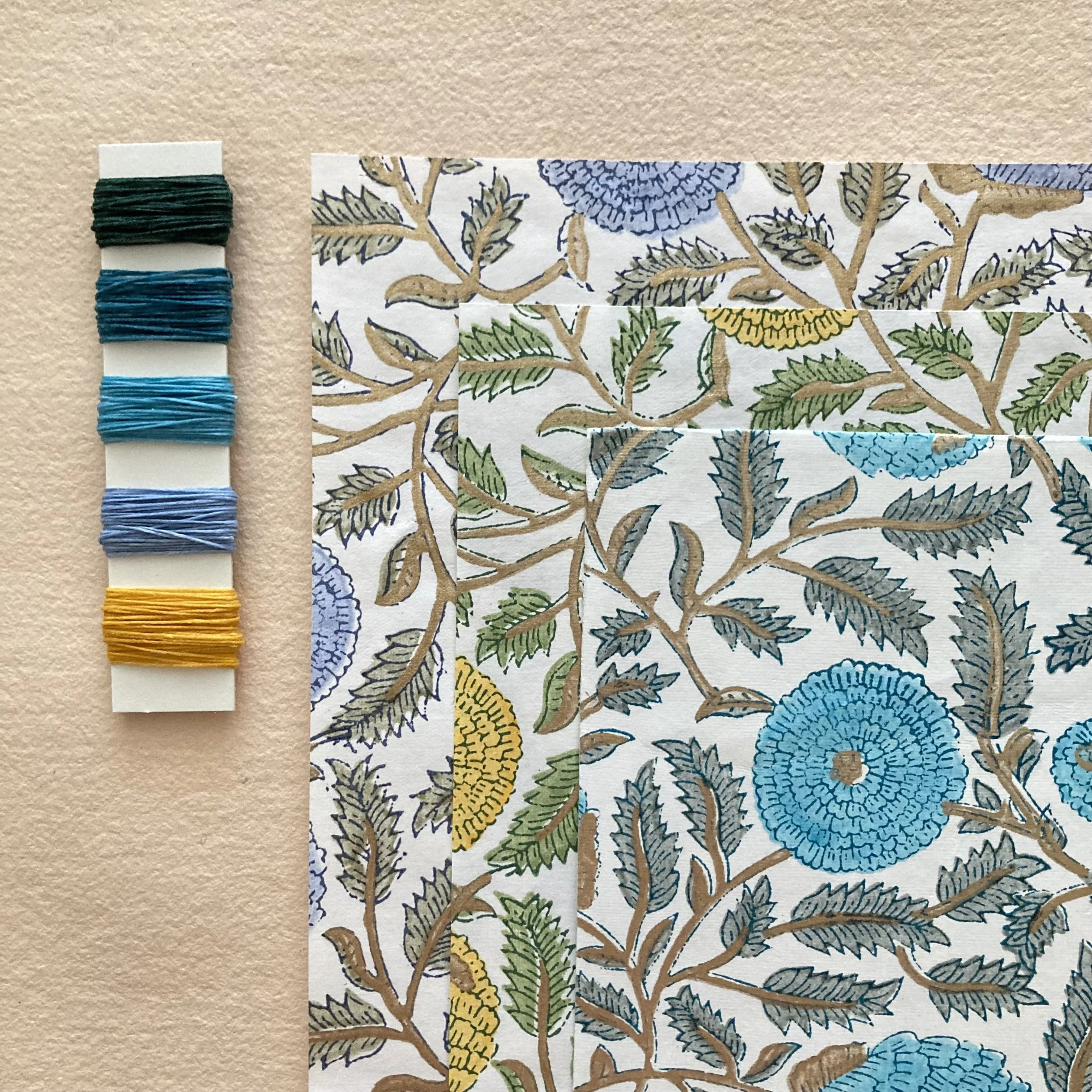
Dear Everyone ~
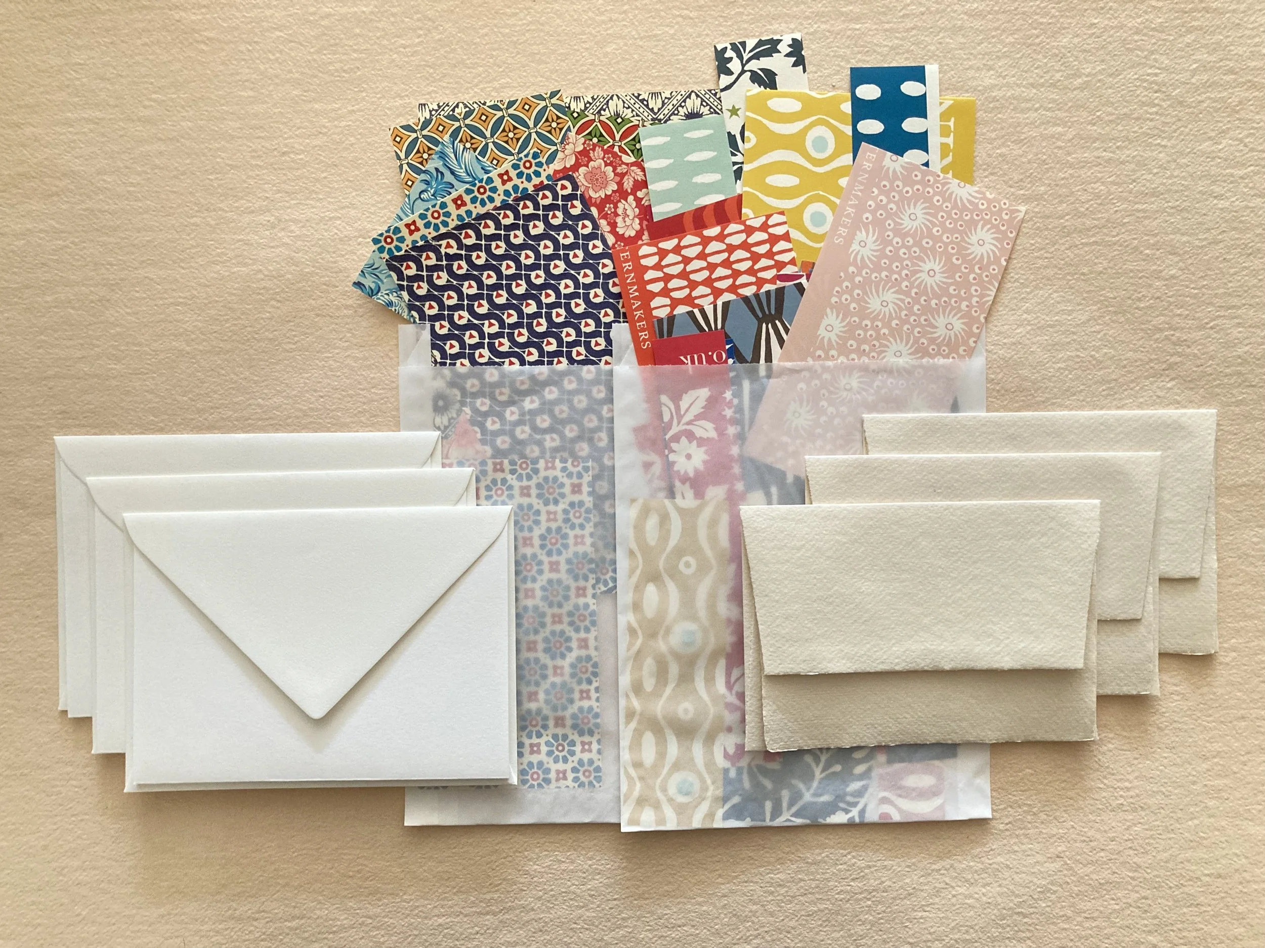
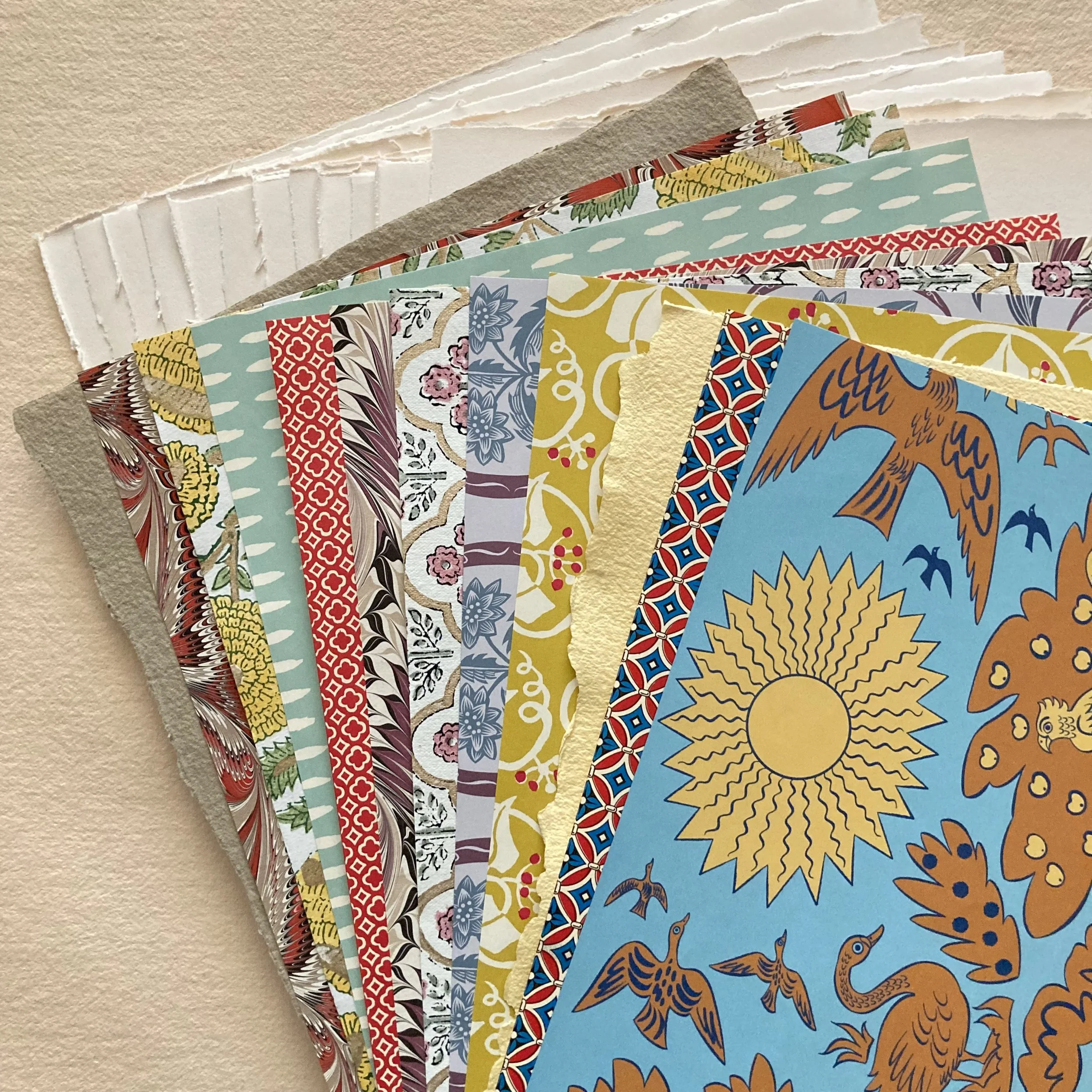
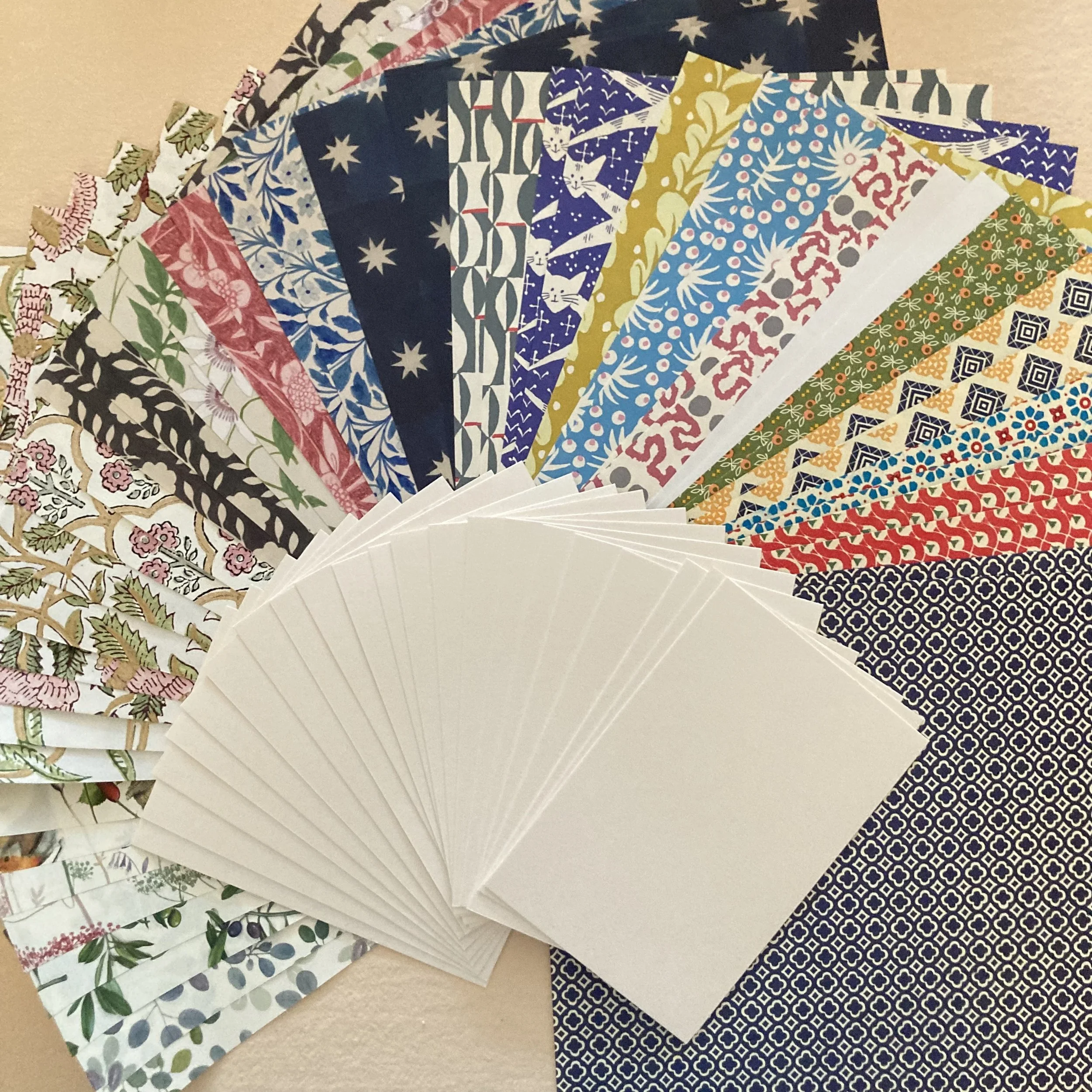
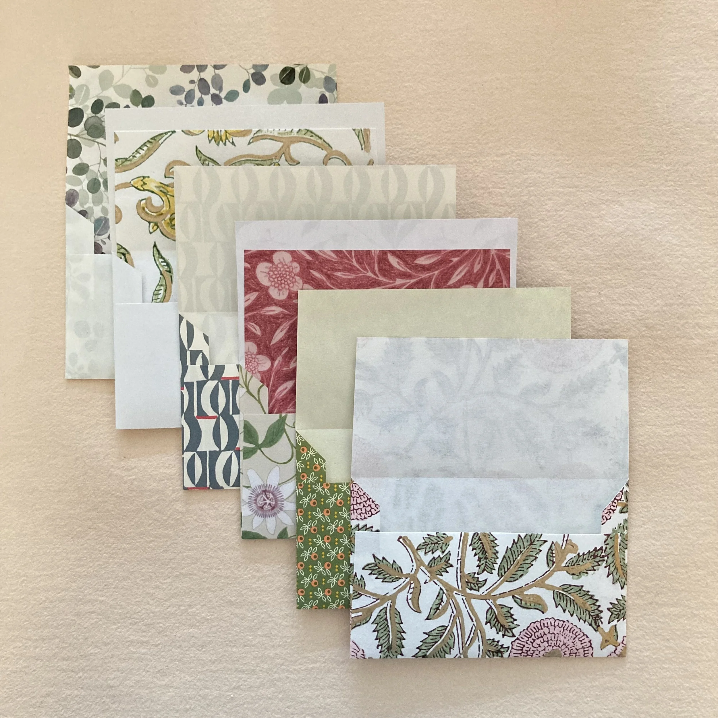
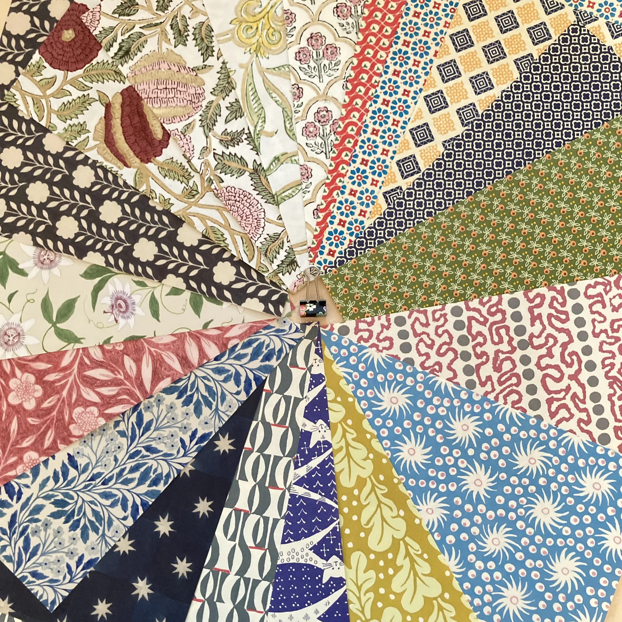
We are delighted to announce the autumnal arrival of new papers & stickers (P&S!). First up is a beguiling selection of double-sided decorative papers by Art Angels in the UK. I’ve ooh’d and aah’d over these renowned artists’ work —Angie Lewin, Emily Sutton, Mark Herald, and Polly Fern—for many moons and am thrilled to add them to our BZS repertoire. Oh, did I mention that there are nine patterns? Yes, we love that it rhymes with fine. Very fine indeed!
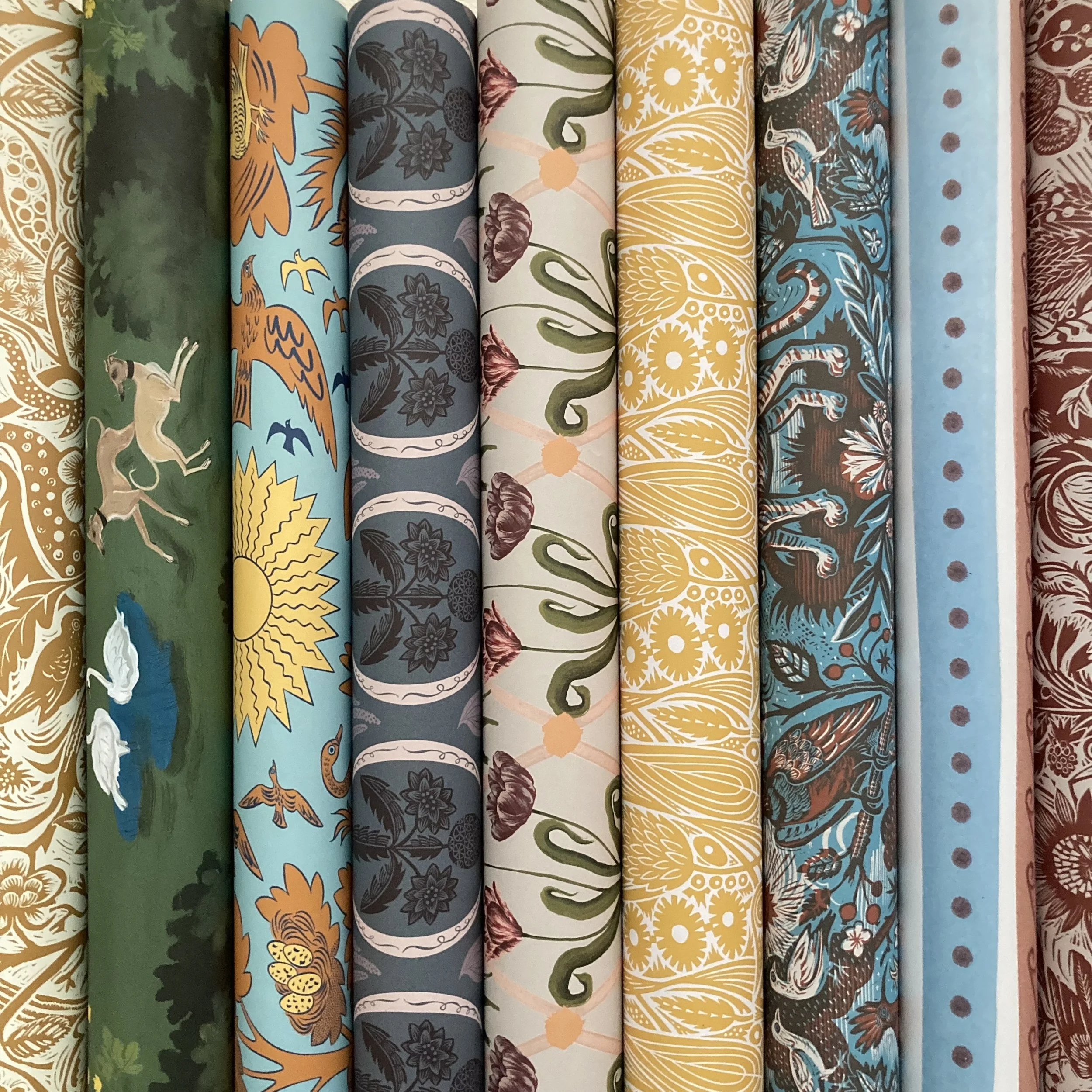
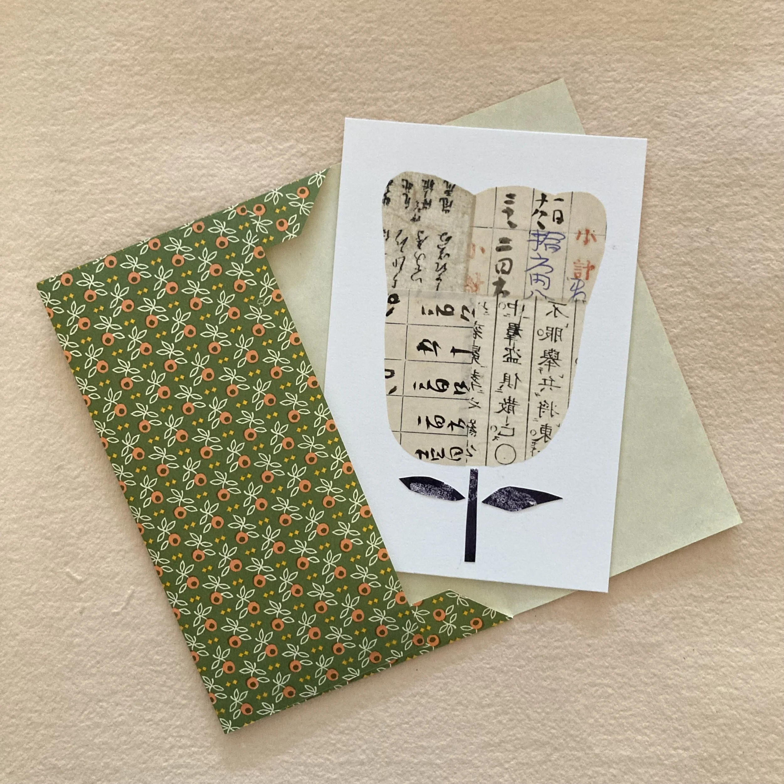
No. 1 ~ Art Angels papers from the U.K.
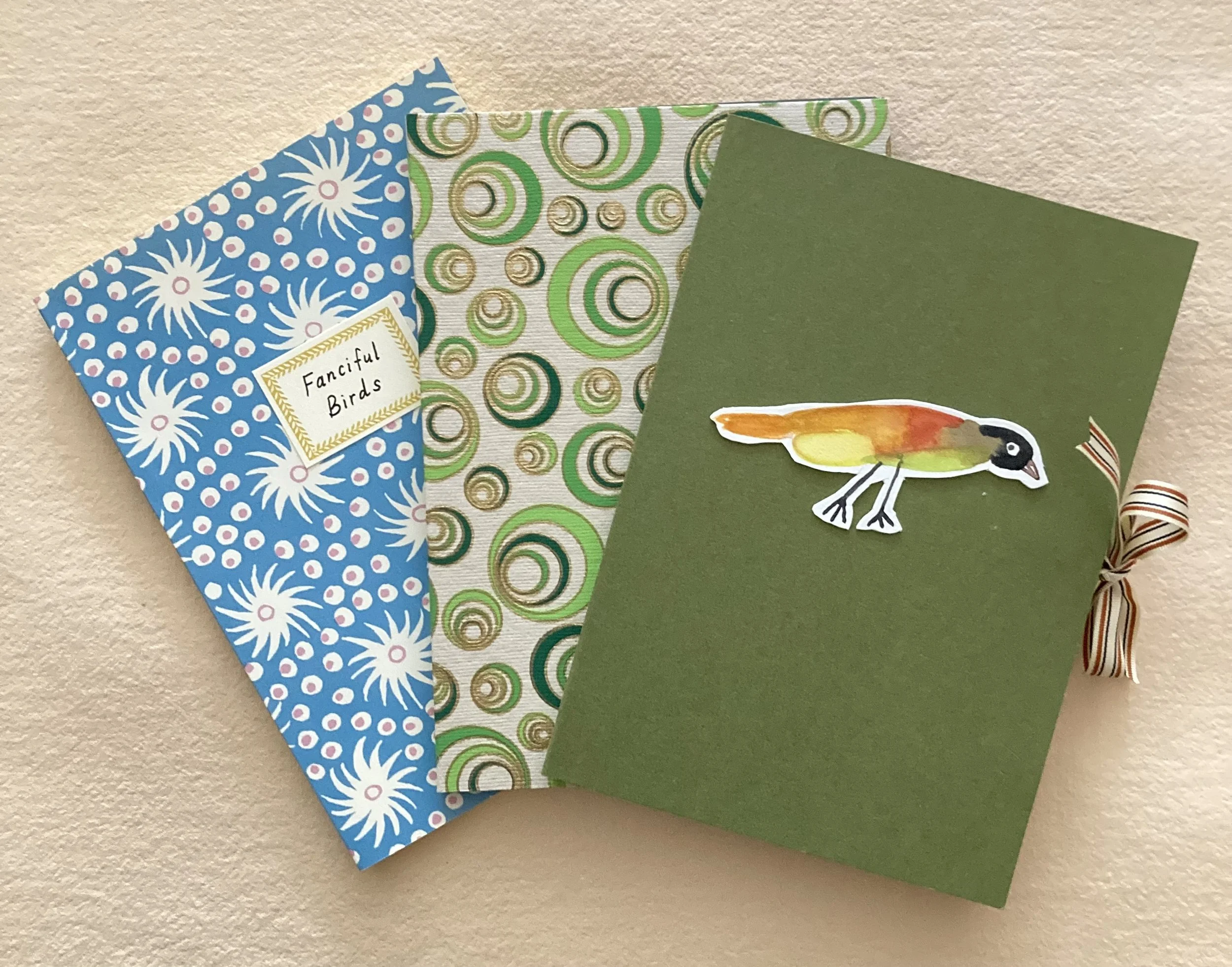
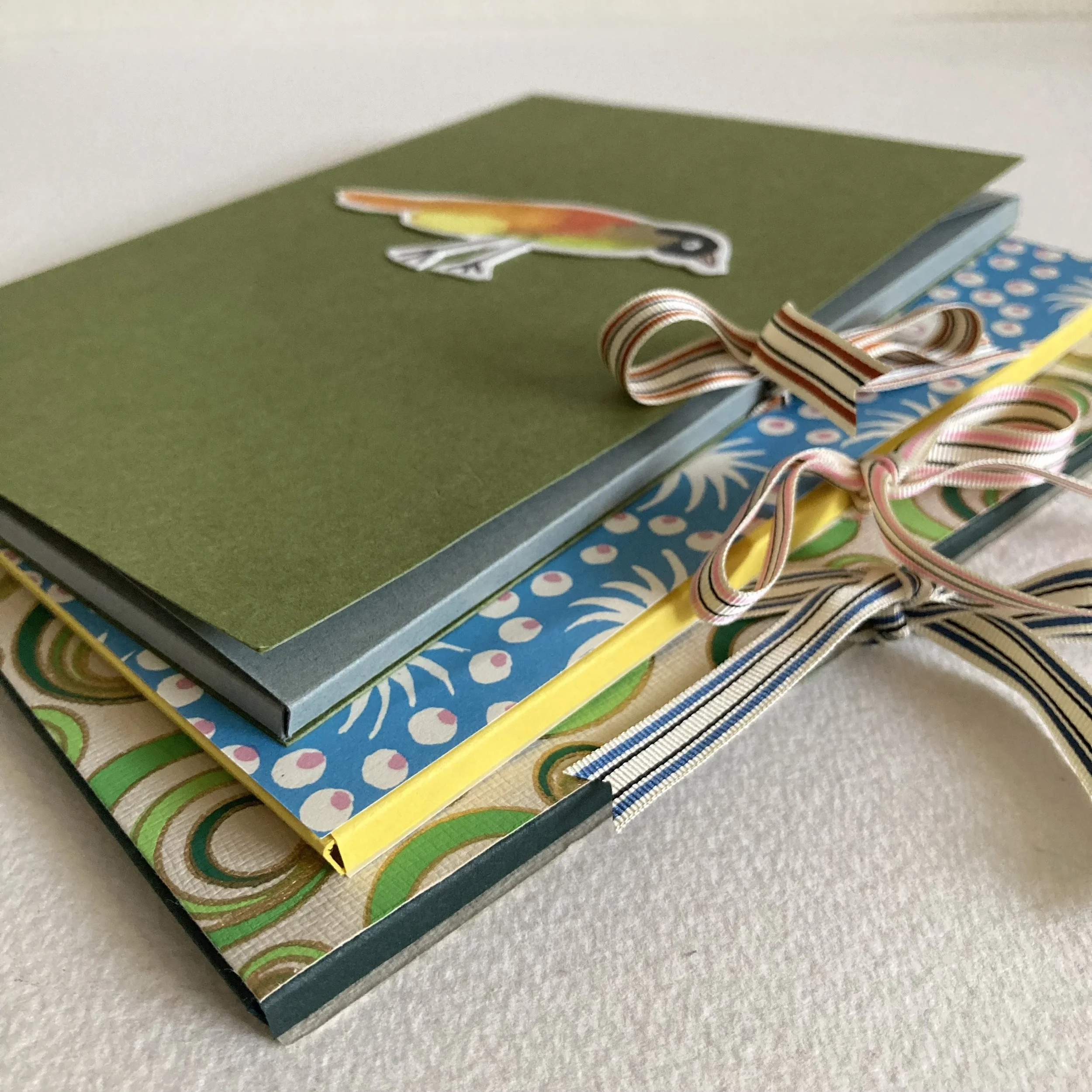
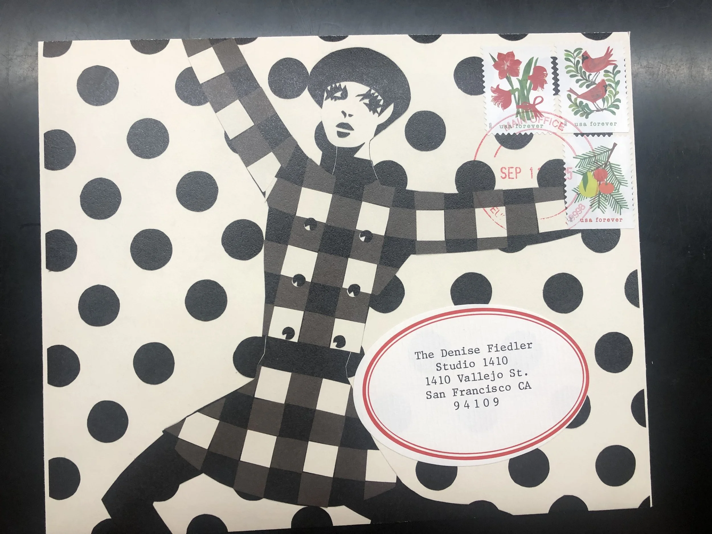
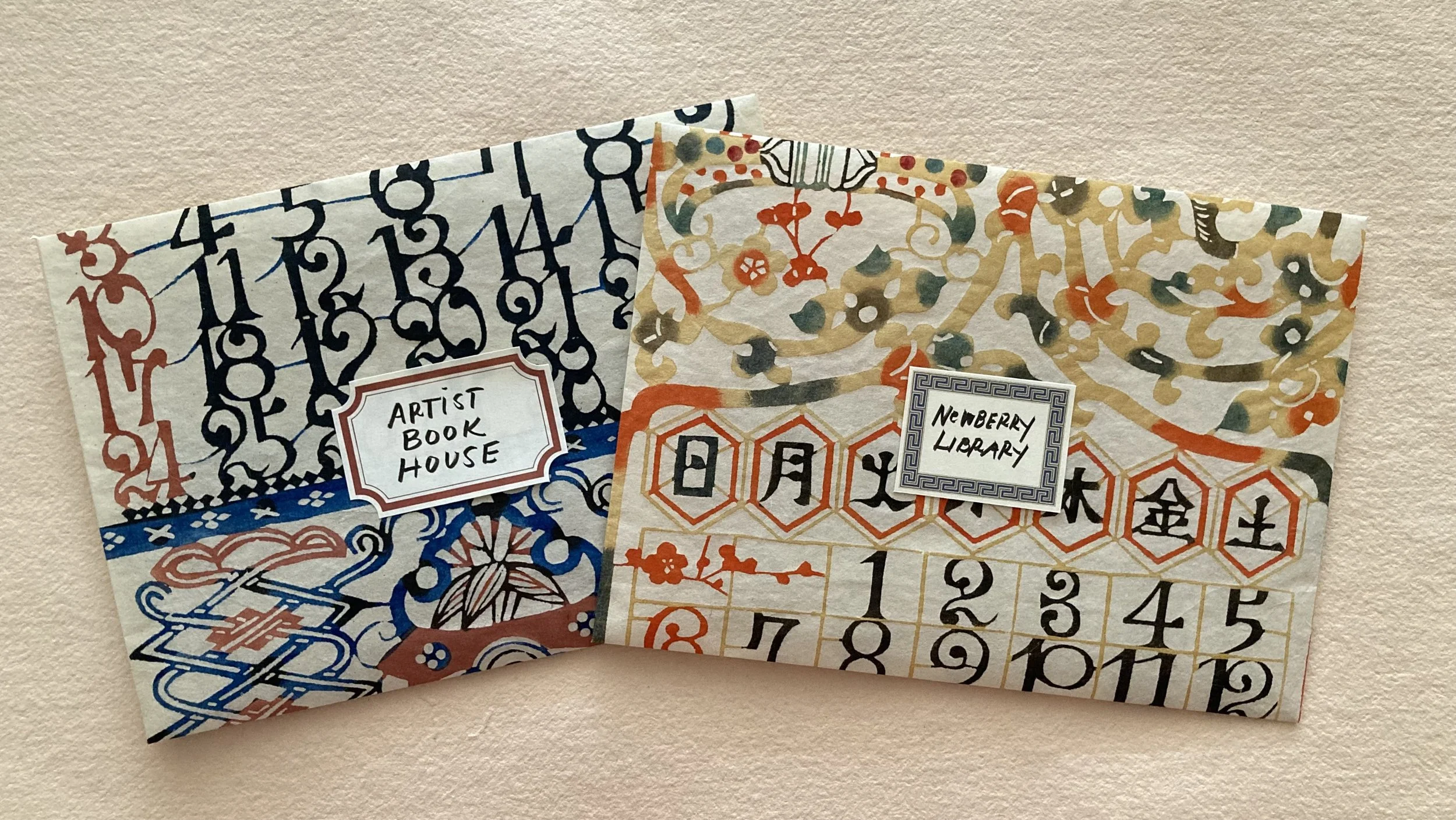
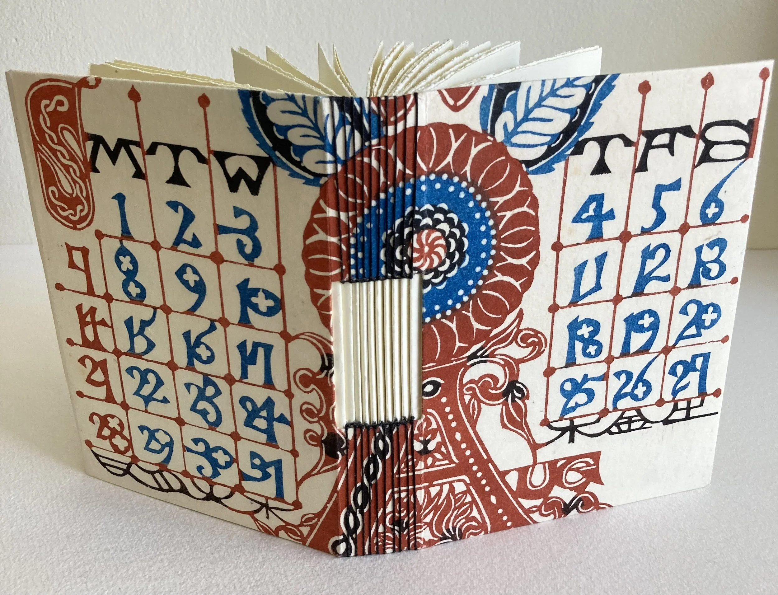
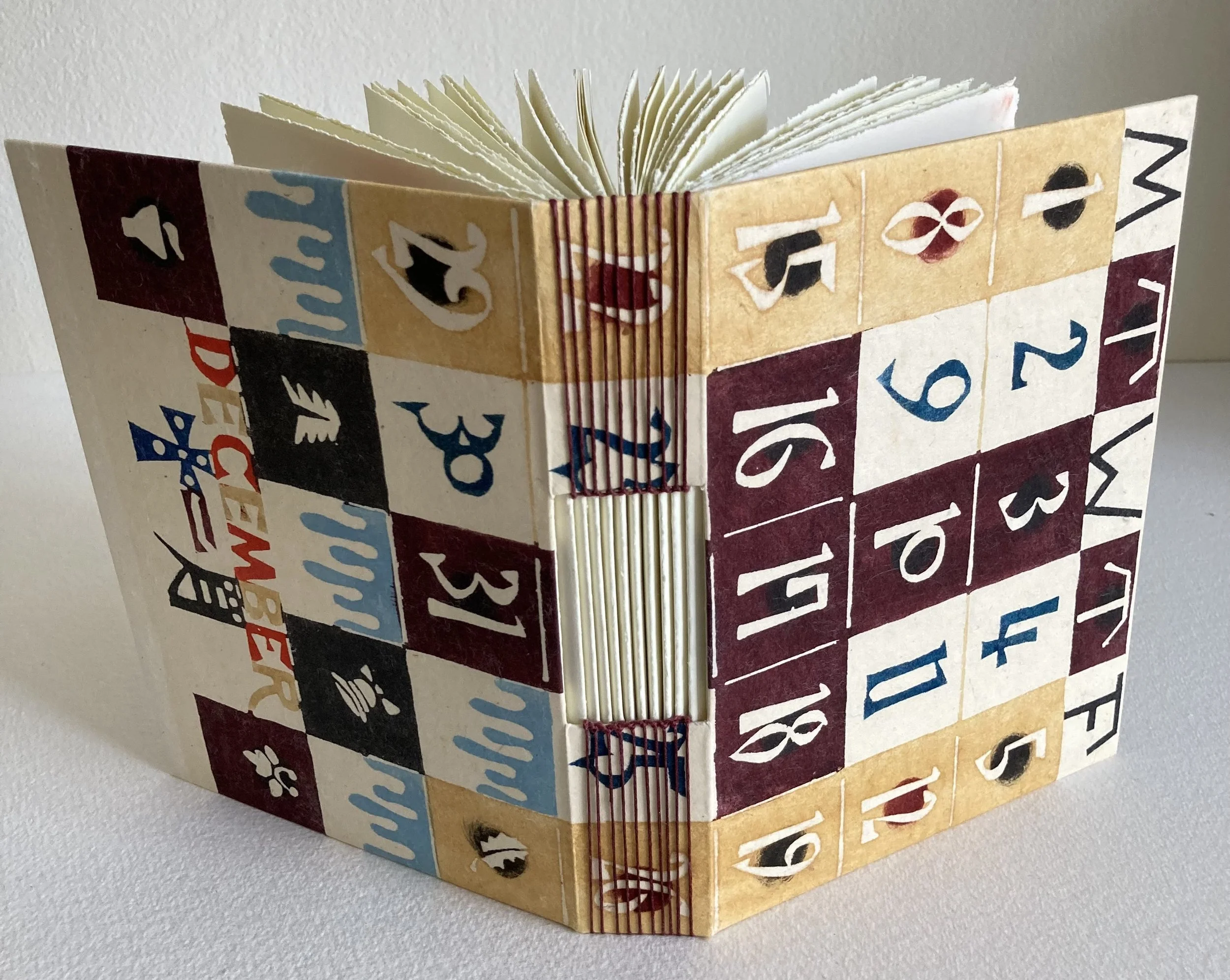
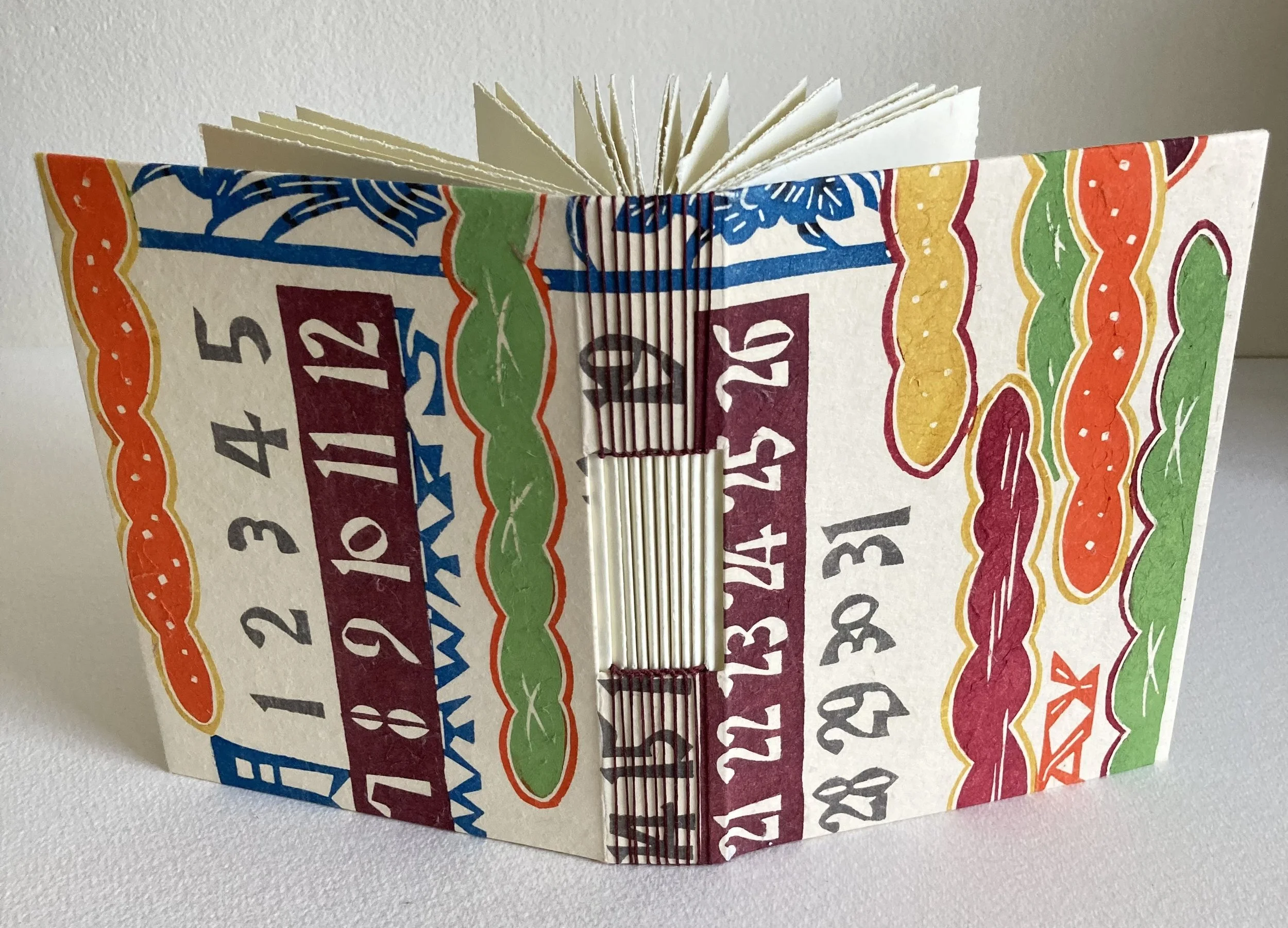
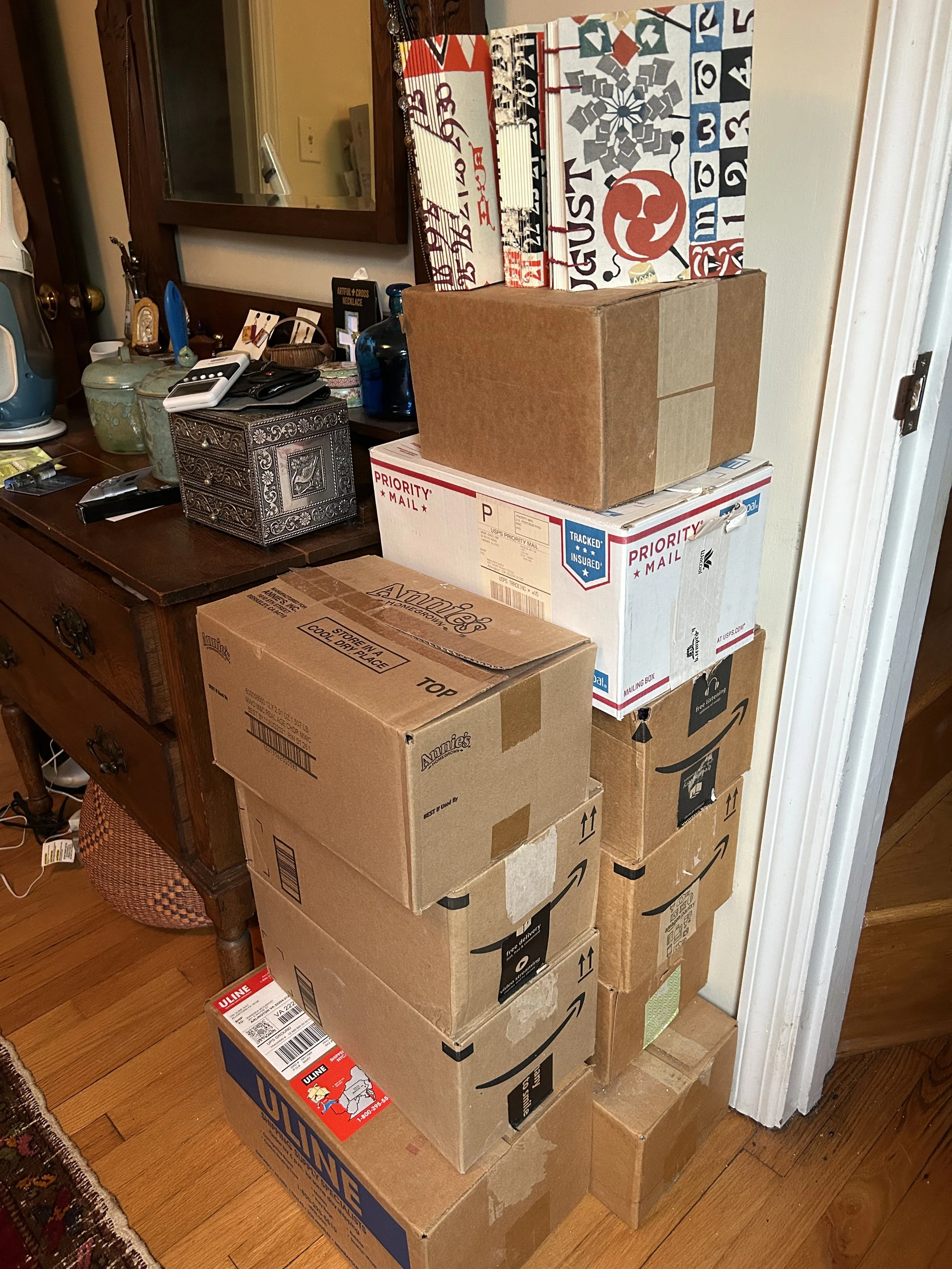
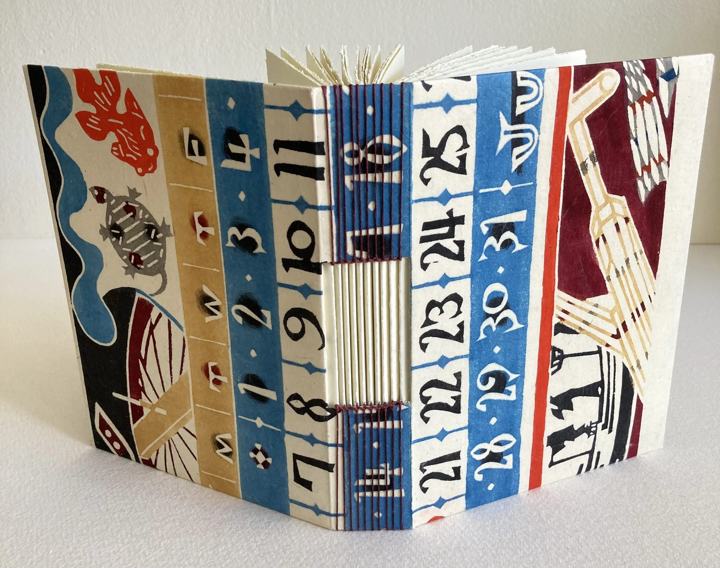
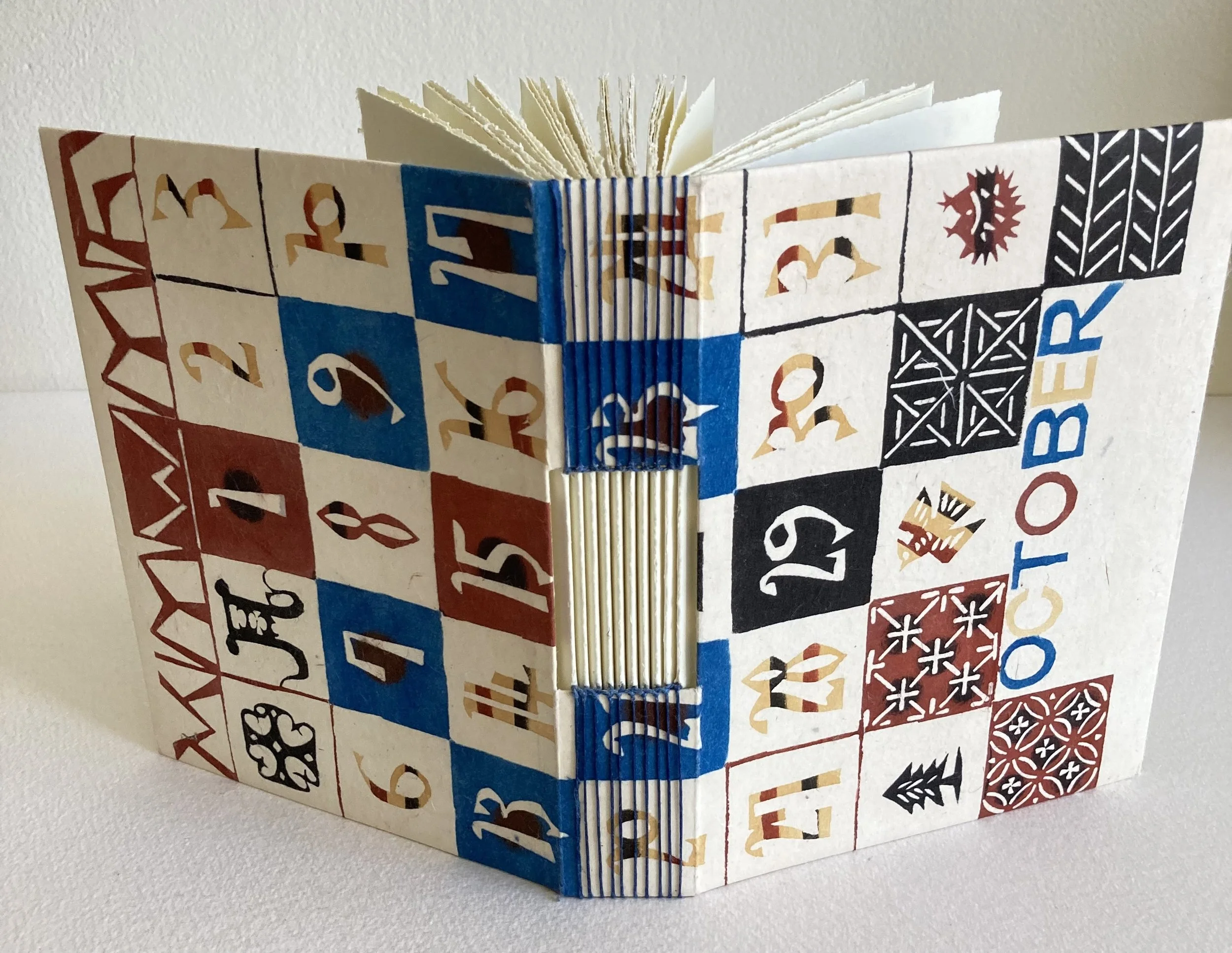
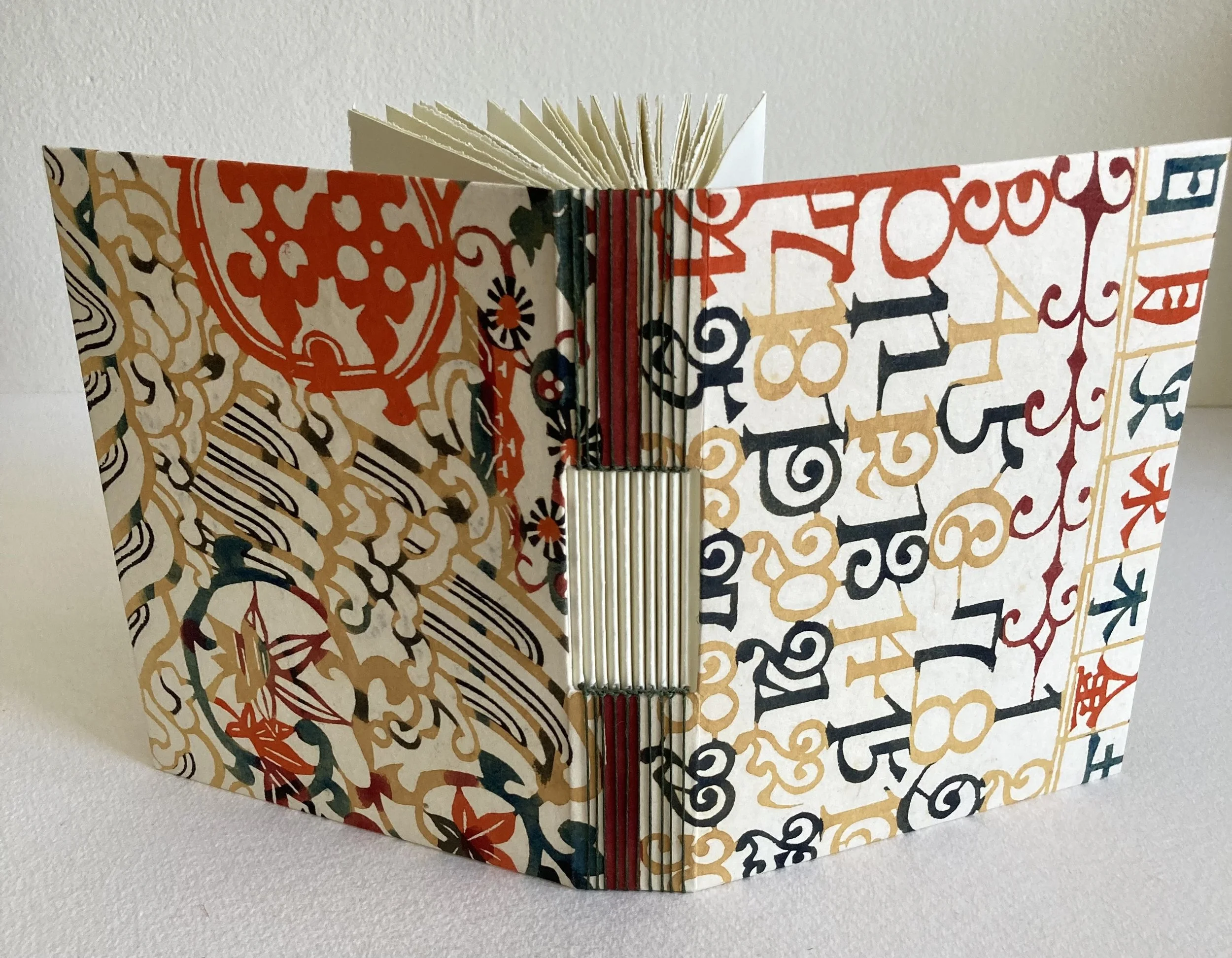
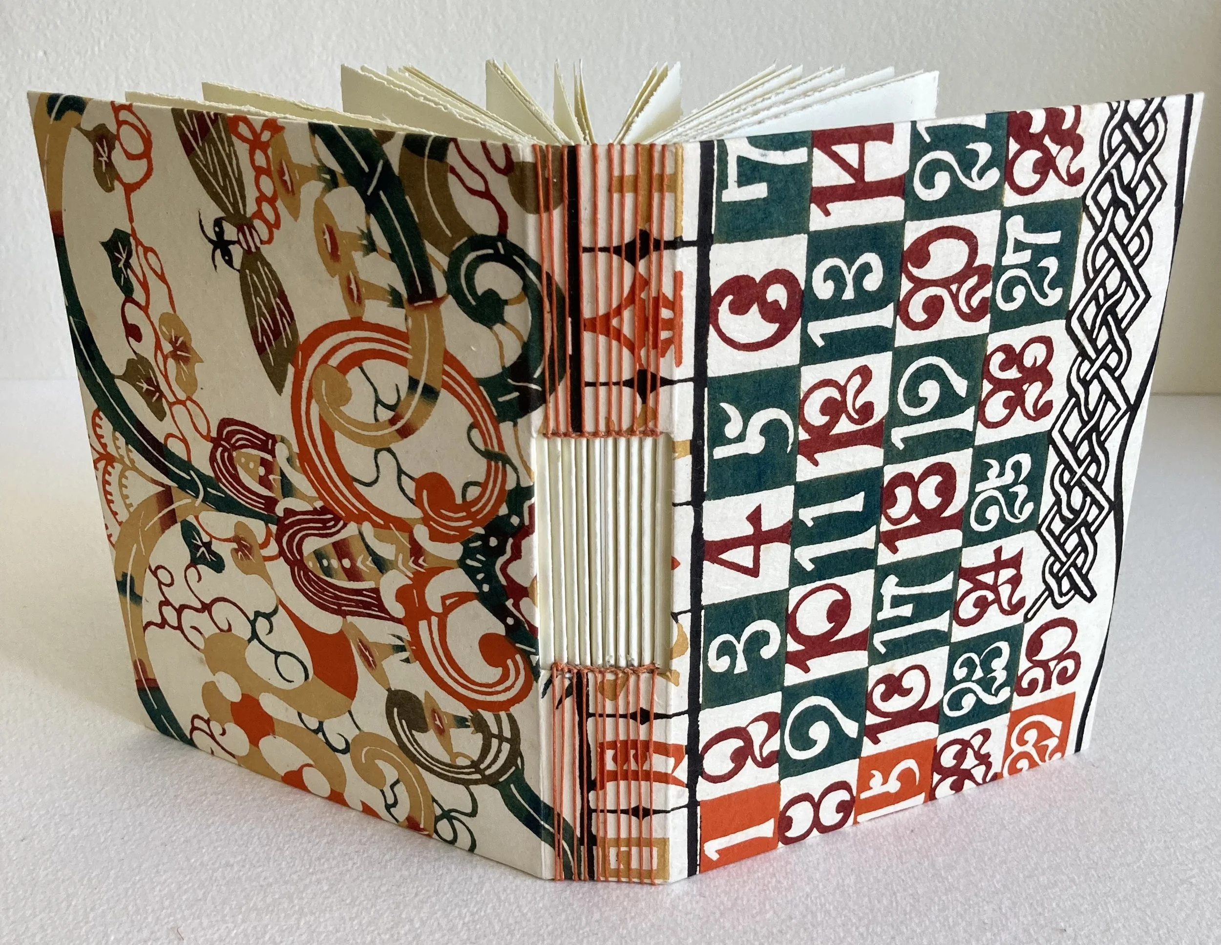
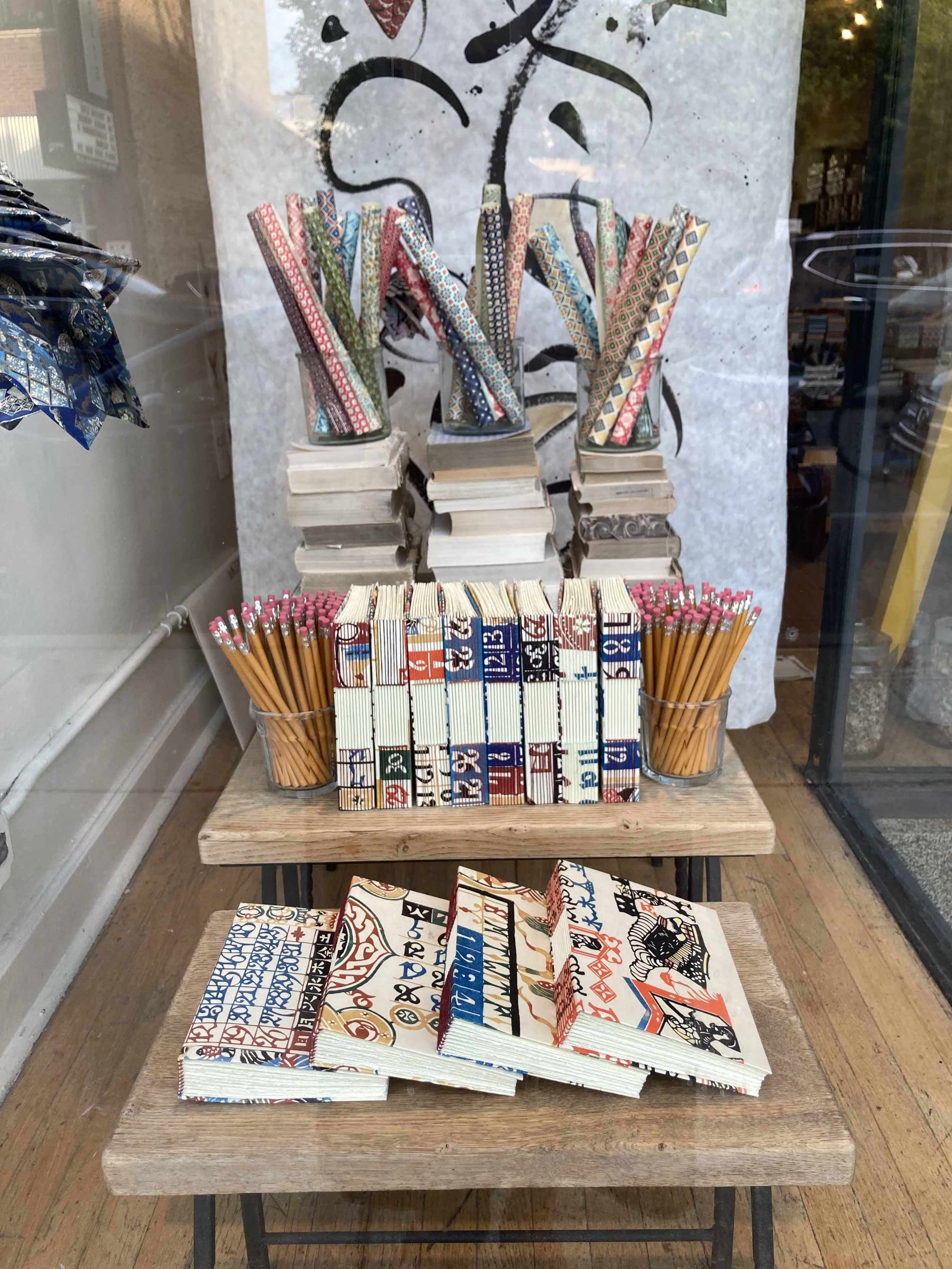
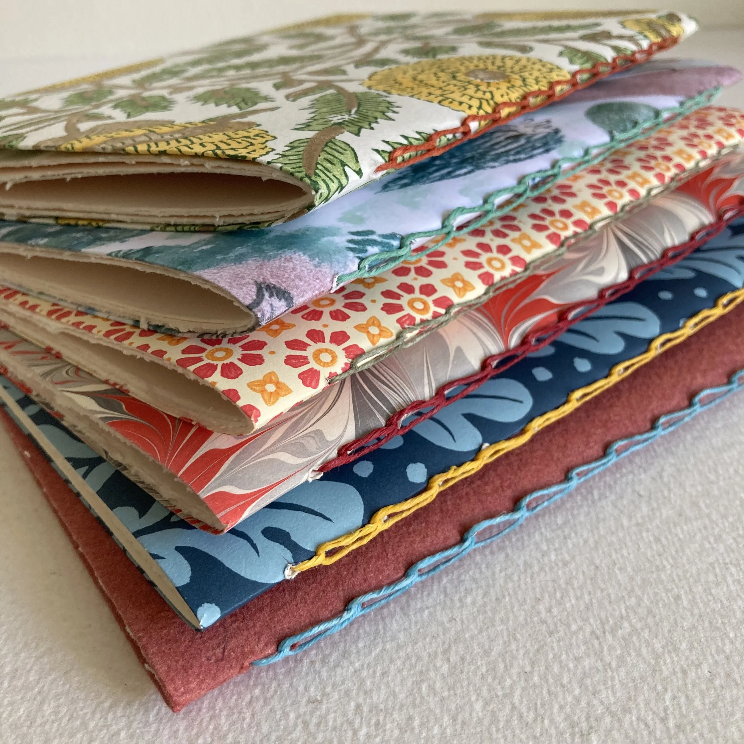
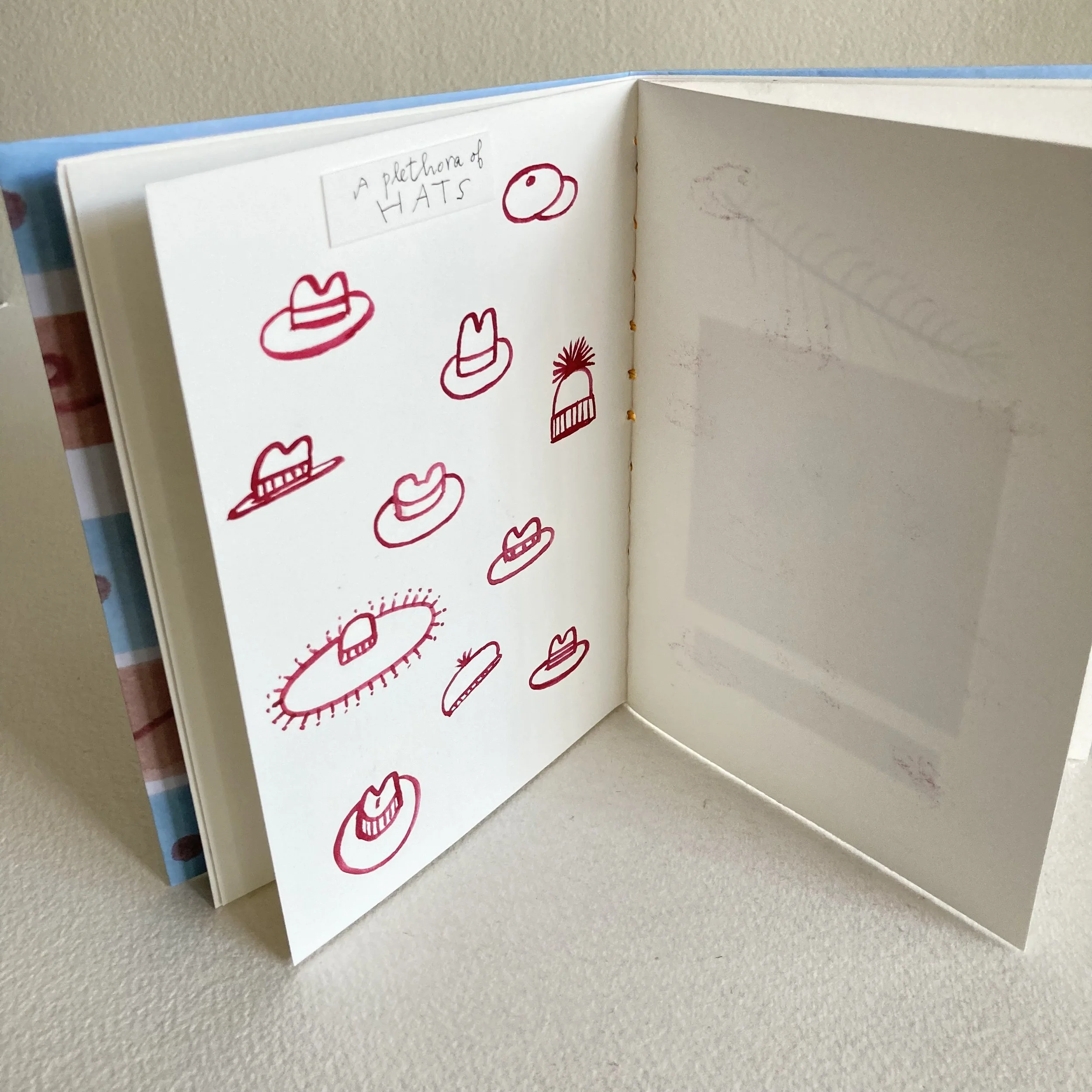
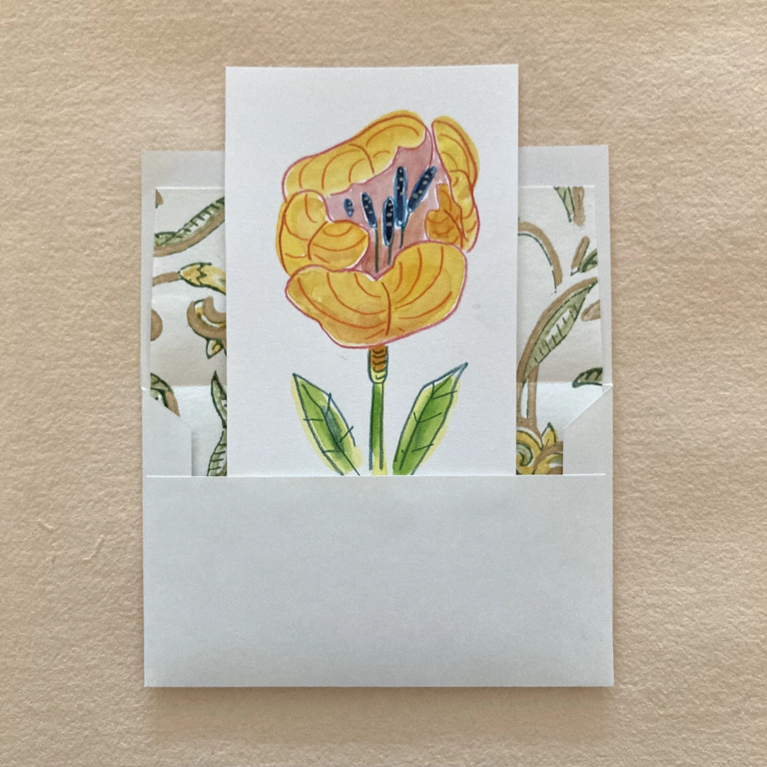
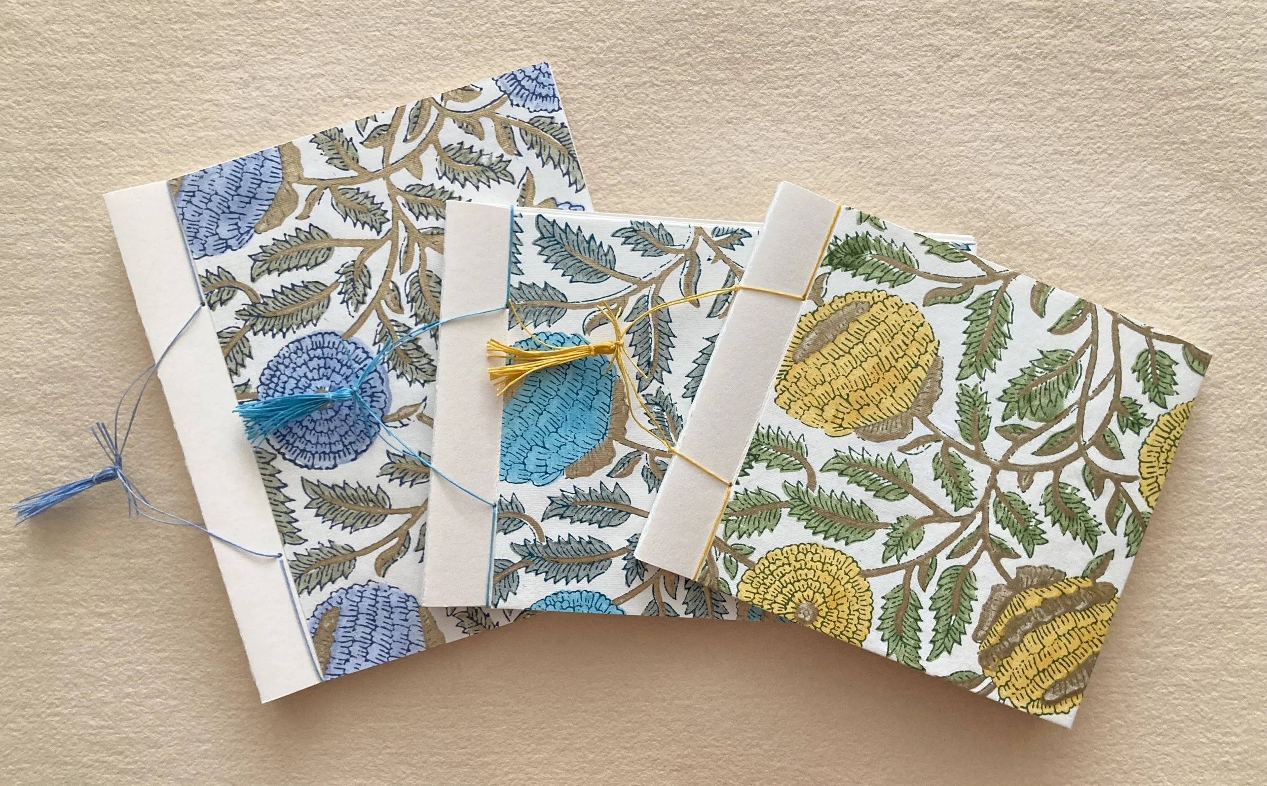
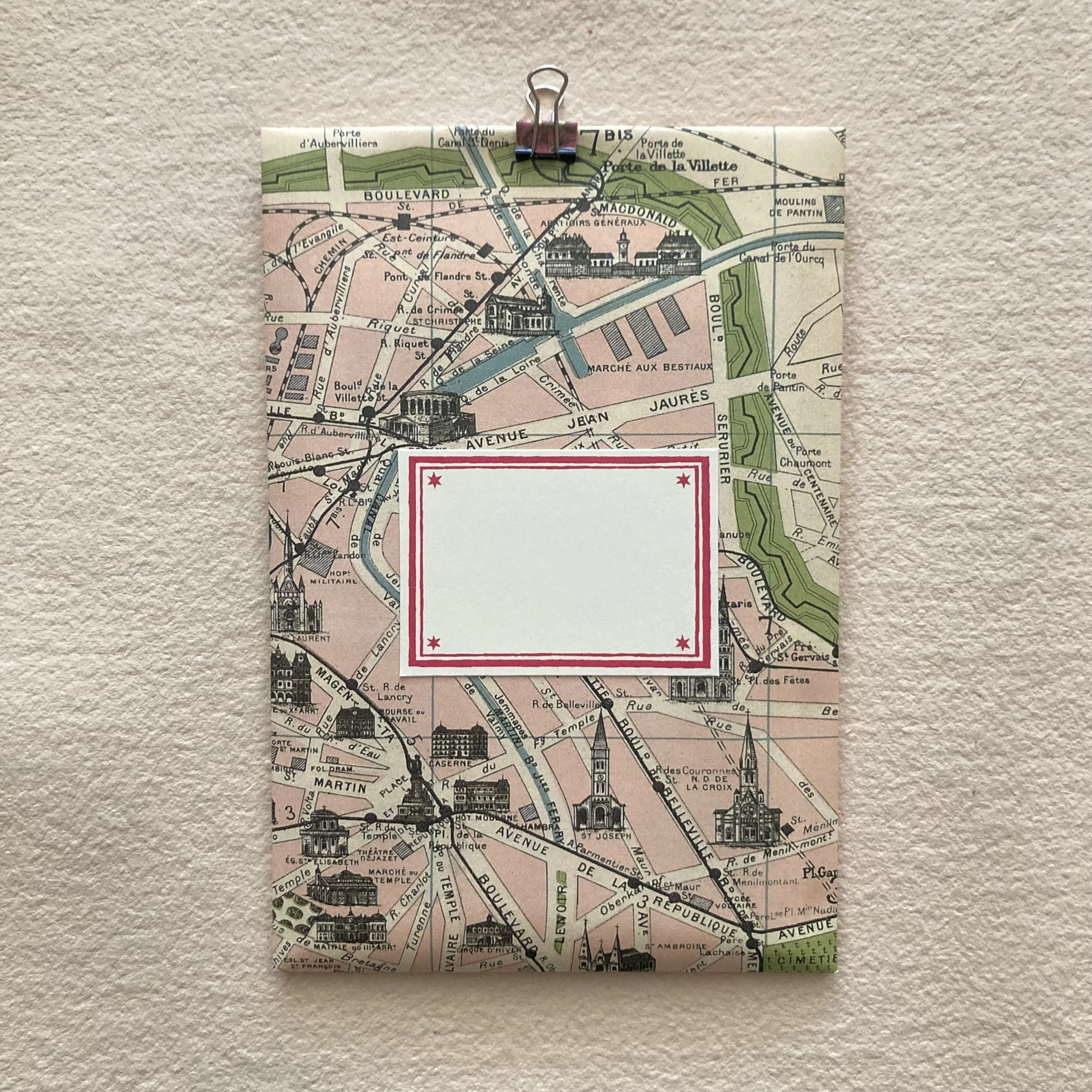
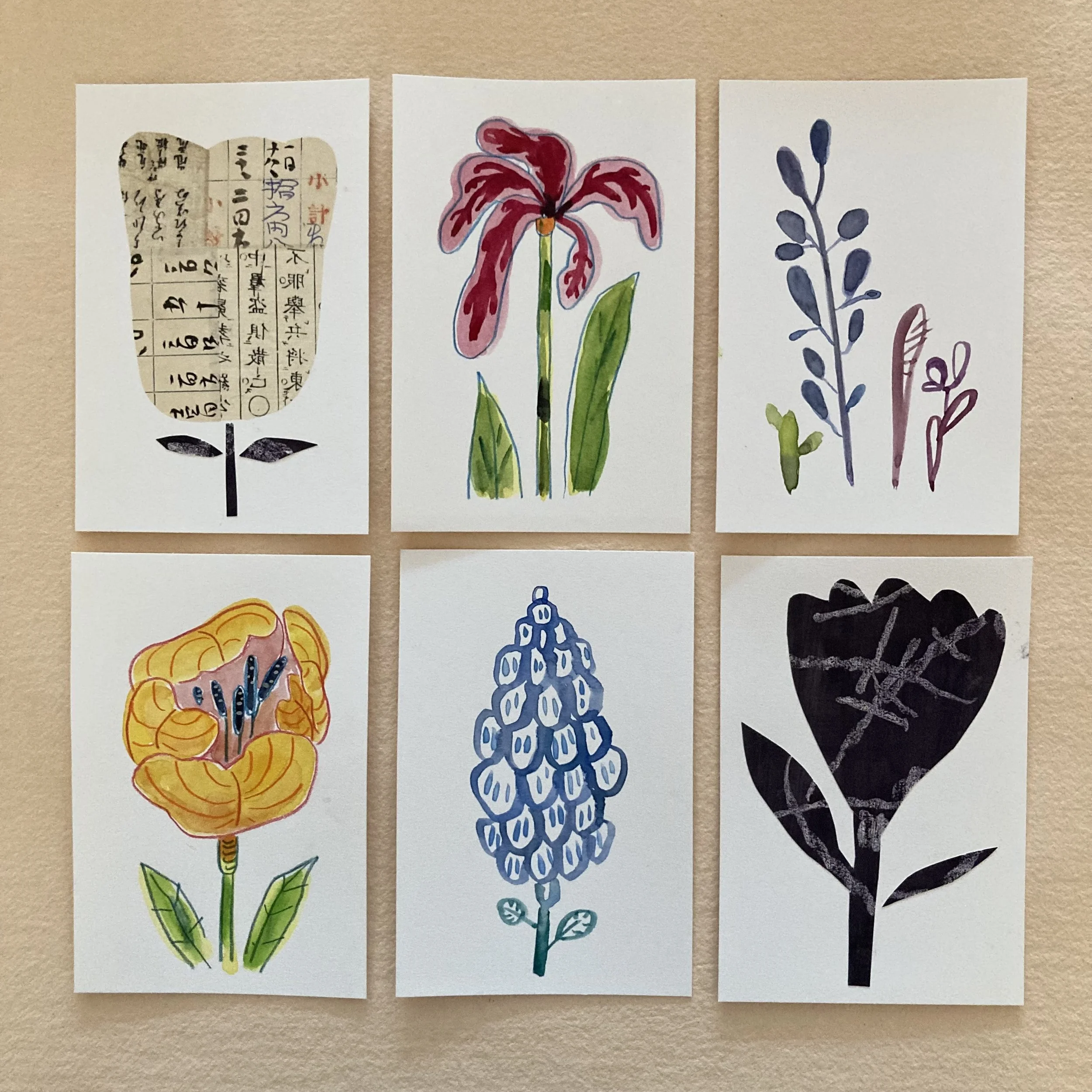
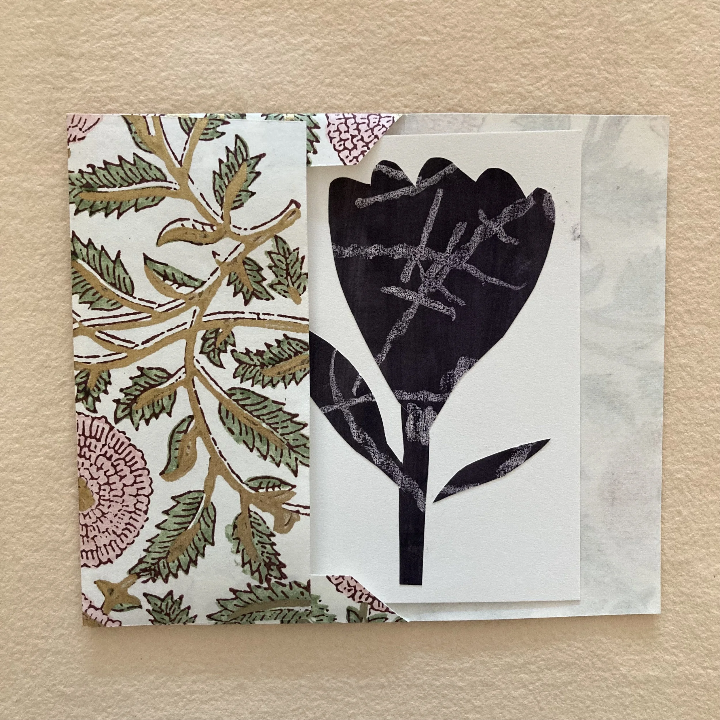
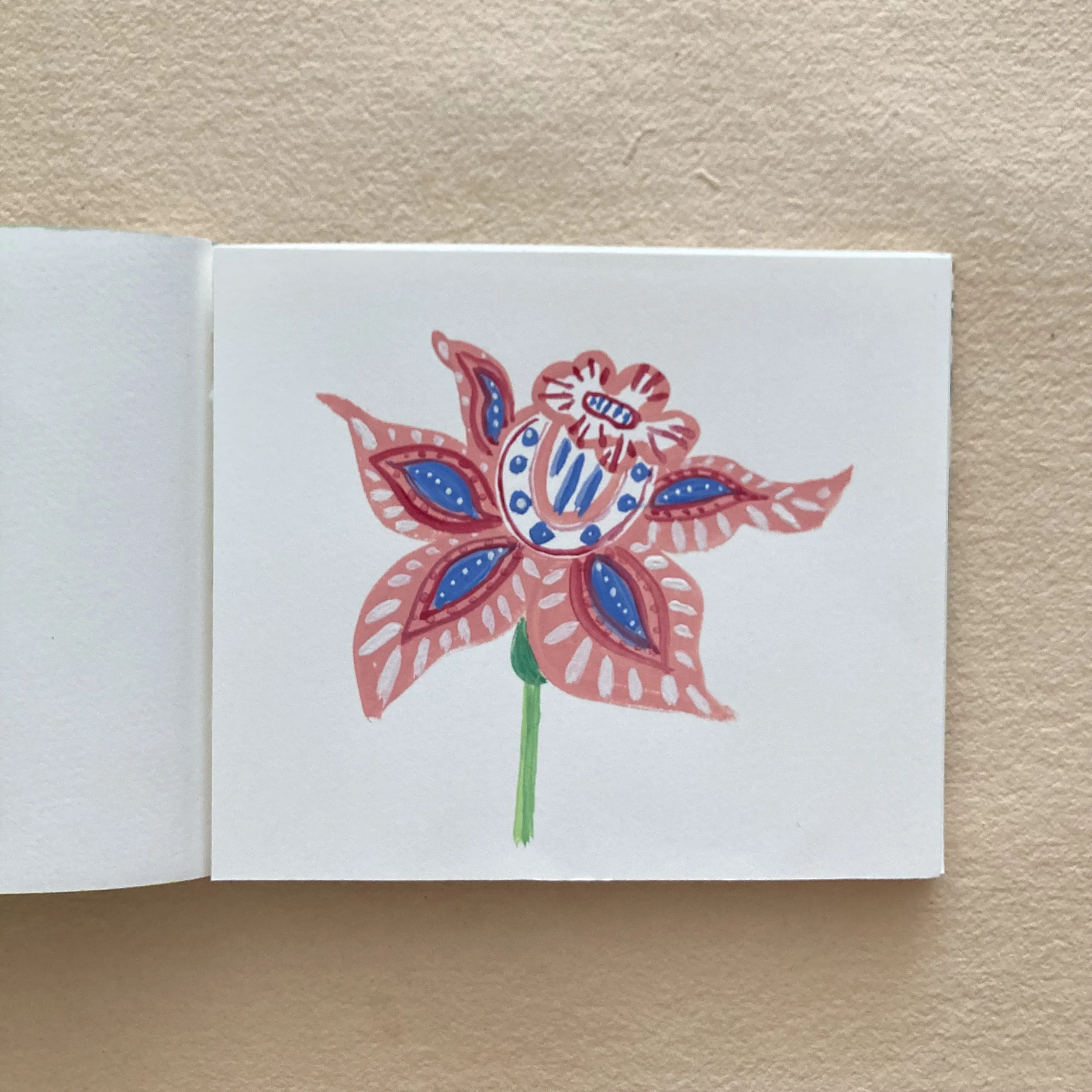
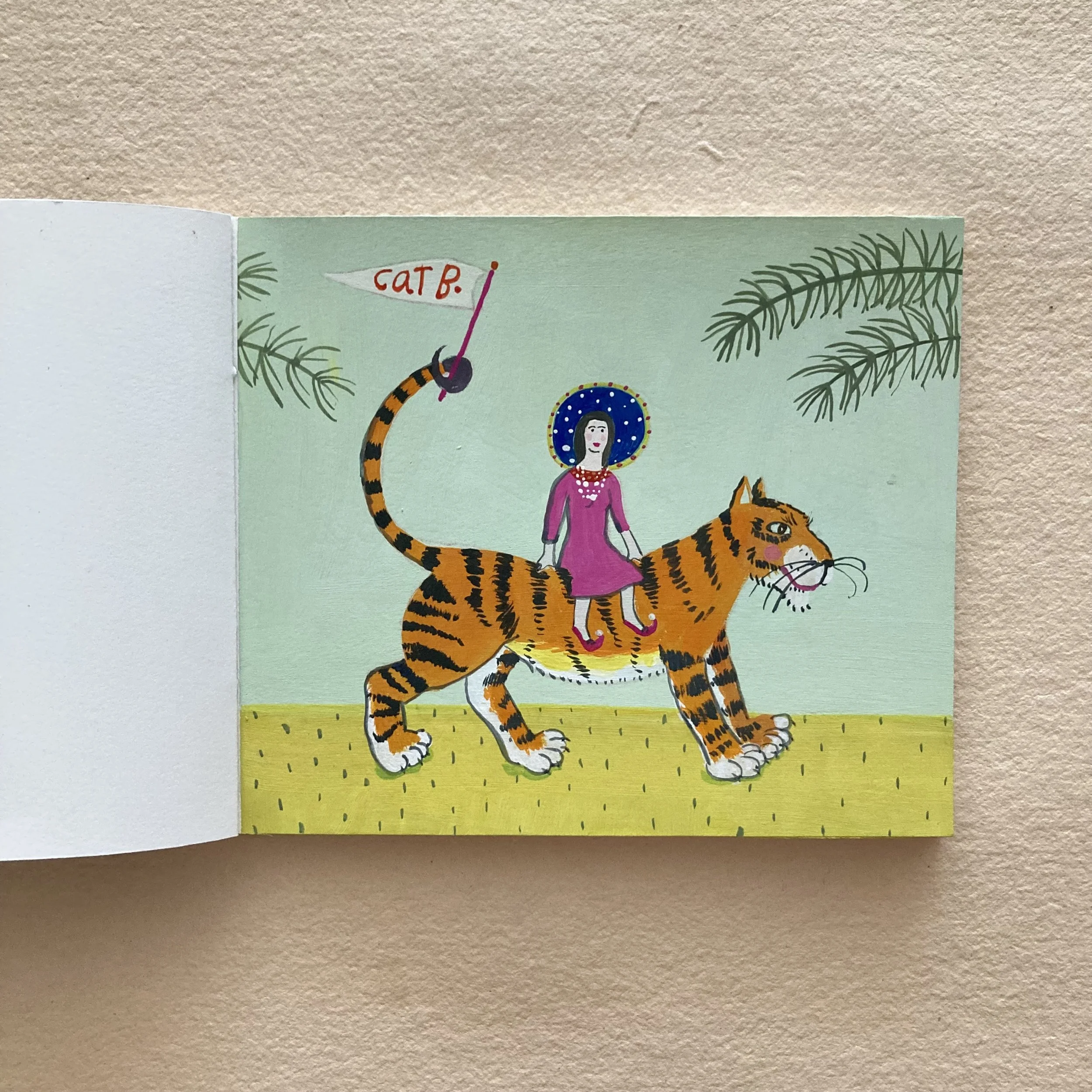
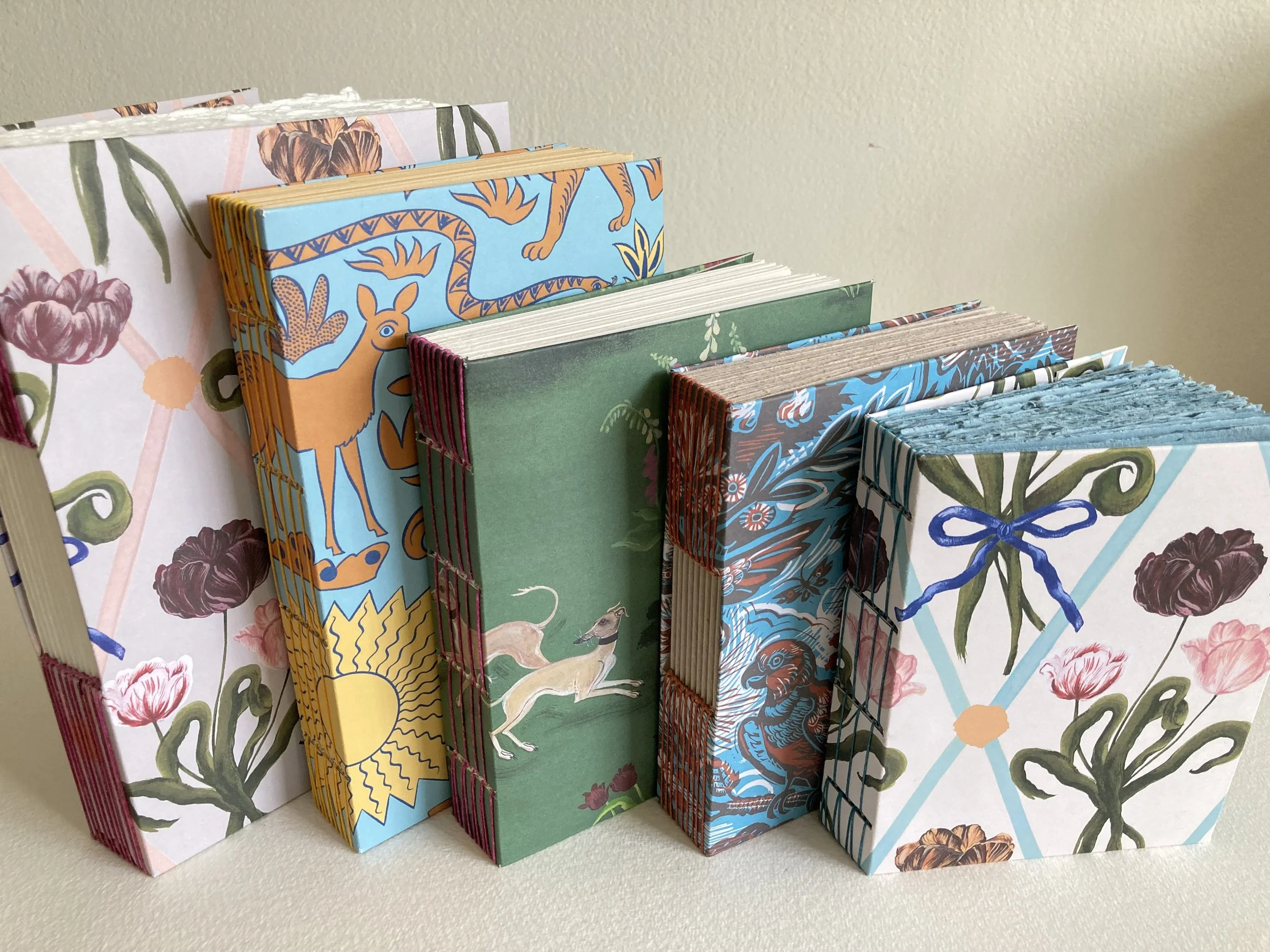
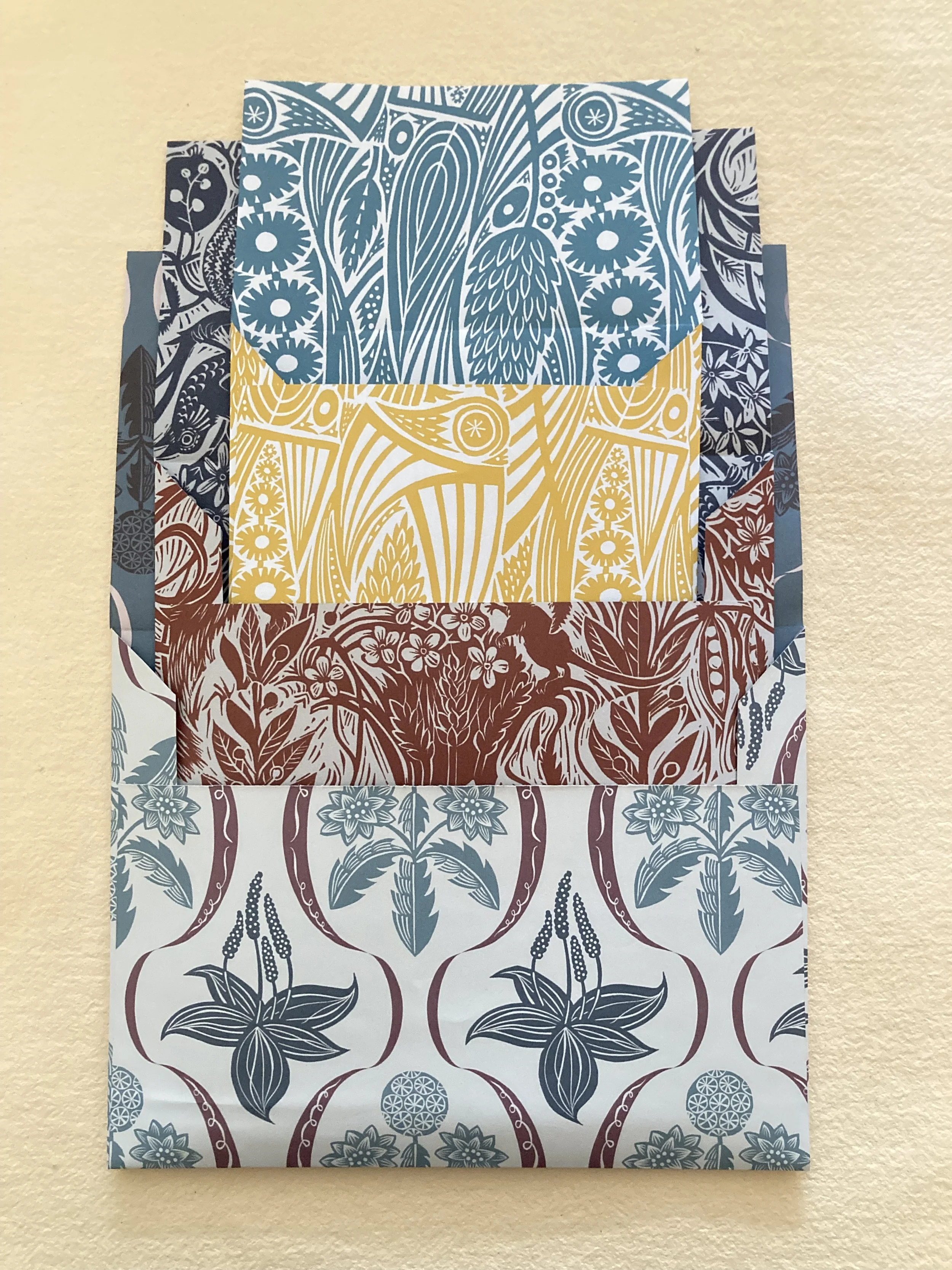
These papers have inspired, or maybe provoked, a bit of a bookbinding binge. I made nine books, four buttonhole-stitch & five long-stitch books to see how the papers behave, as well as how they look on a cover. Seen at very top from left to right: Diamond Tulip, Night and Day, Bucolic, Tyger Tyger, and Diamond Tulip (backside). Soon thereafter I couldn't resist hand-folding a few envelopes, seen below.
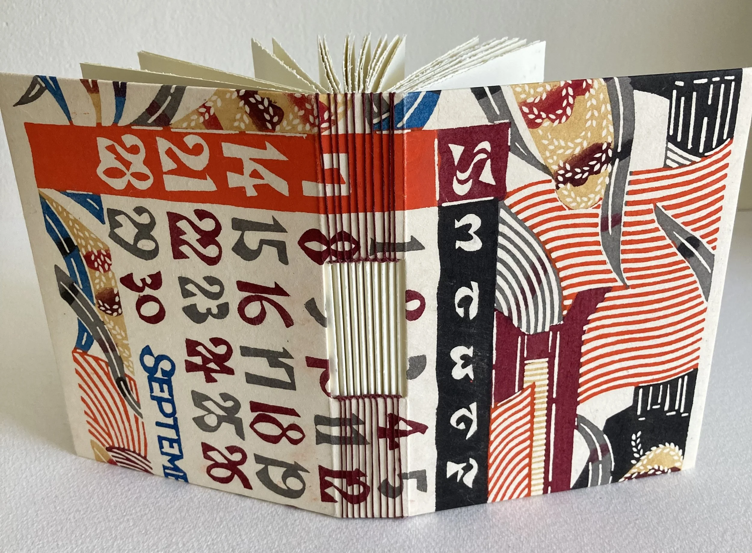
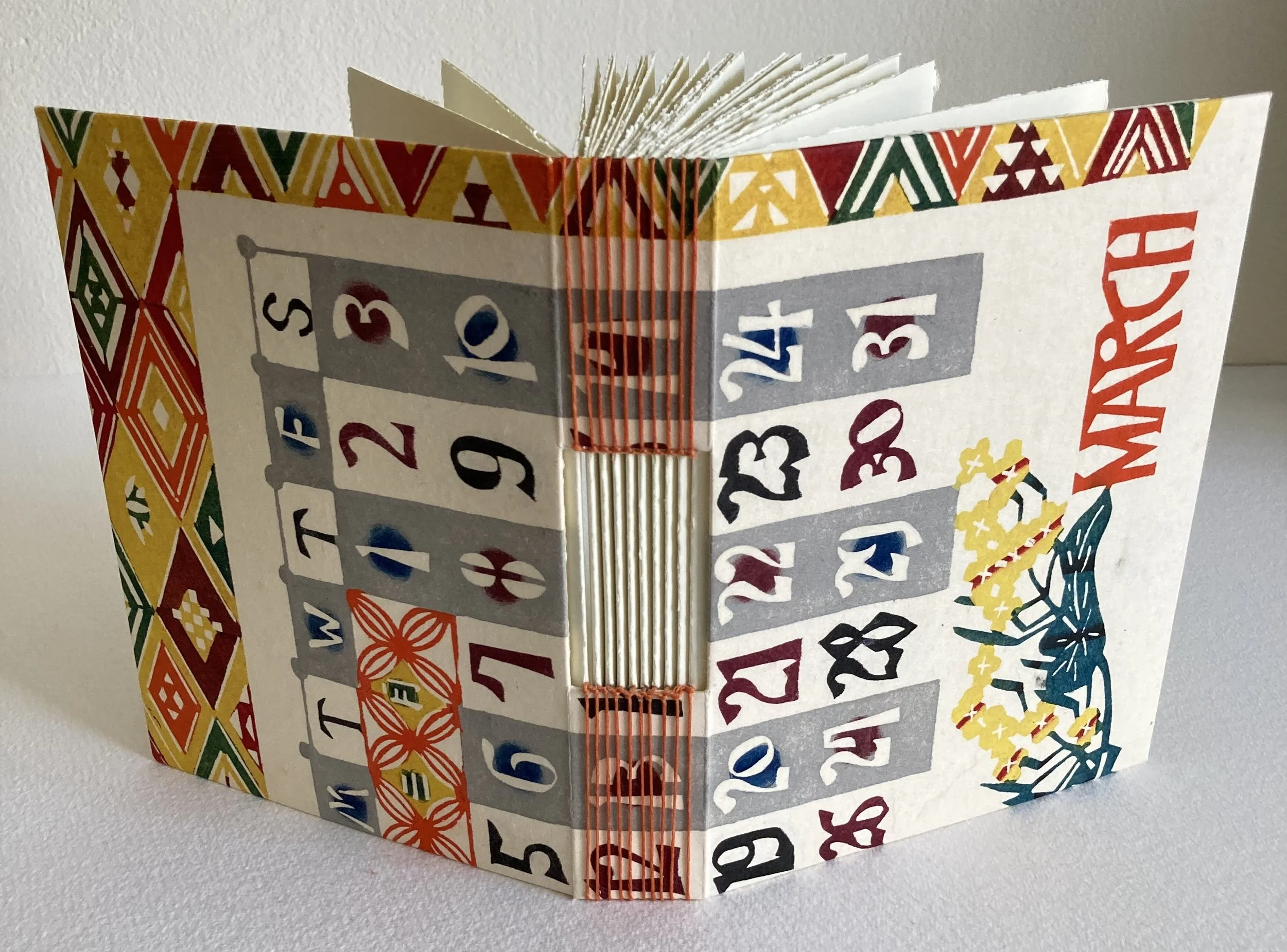
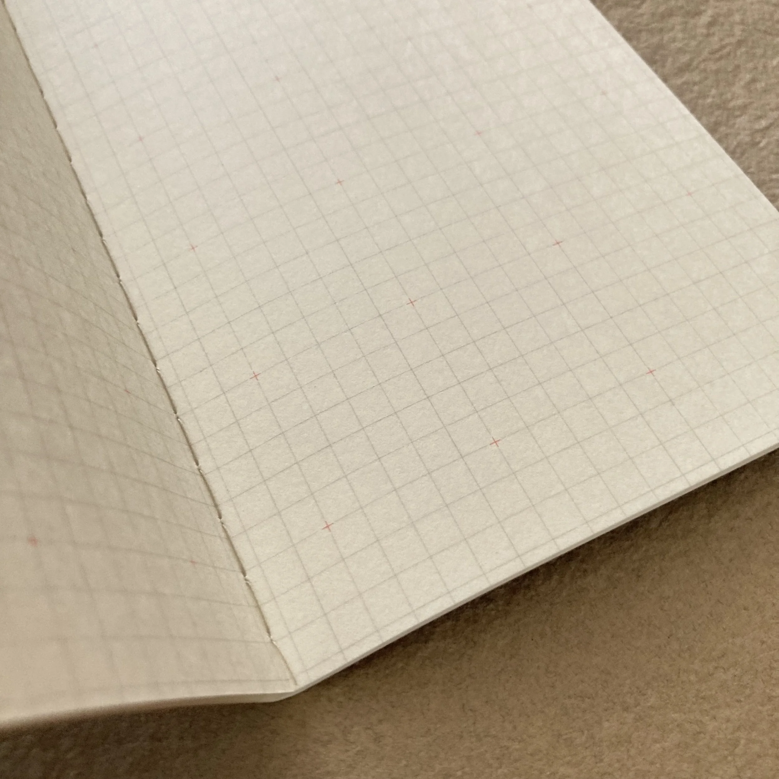
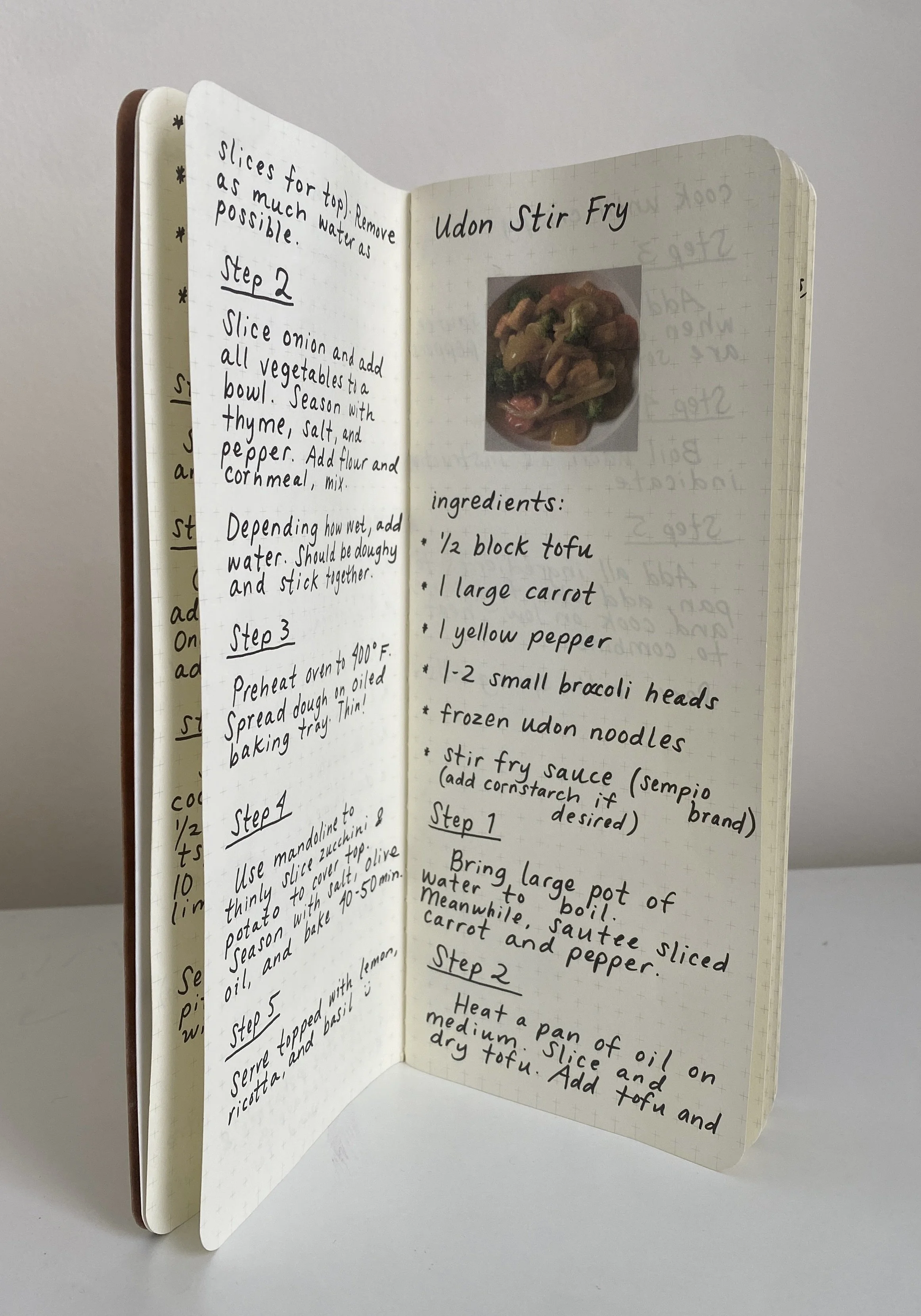
No. 2 ~ Ro-biki notebooks from Japan
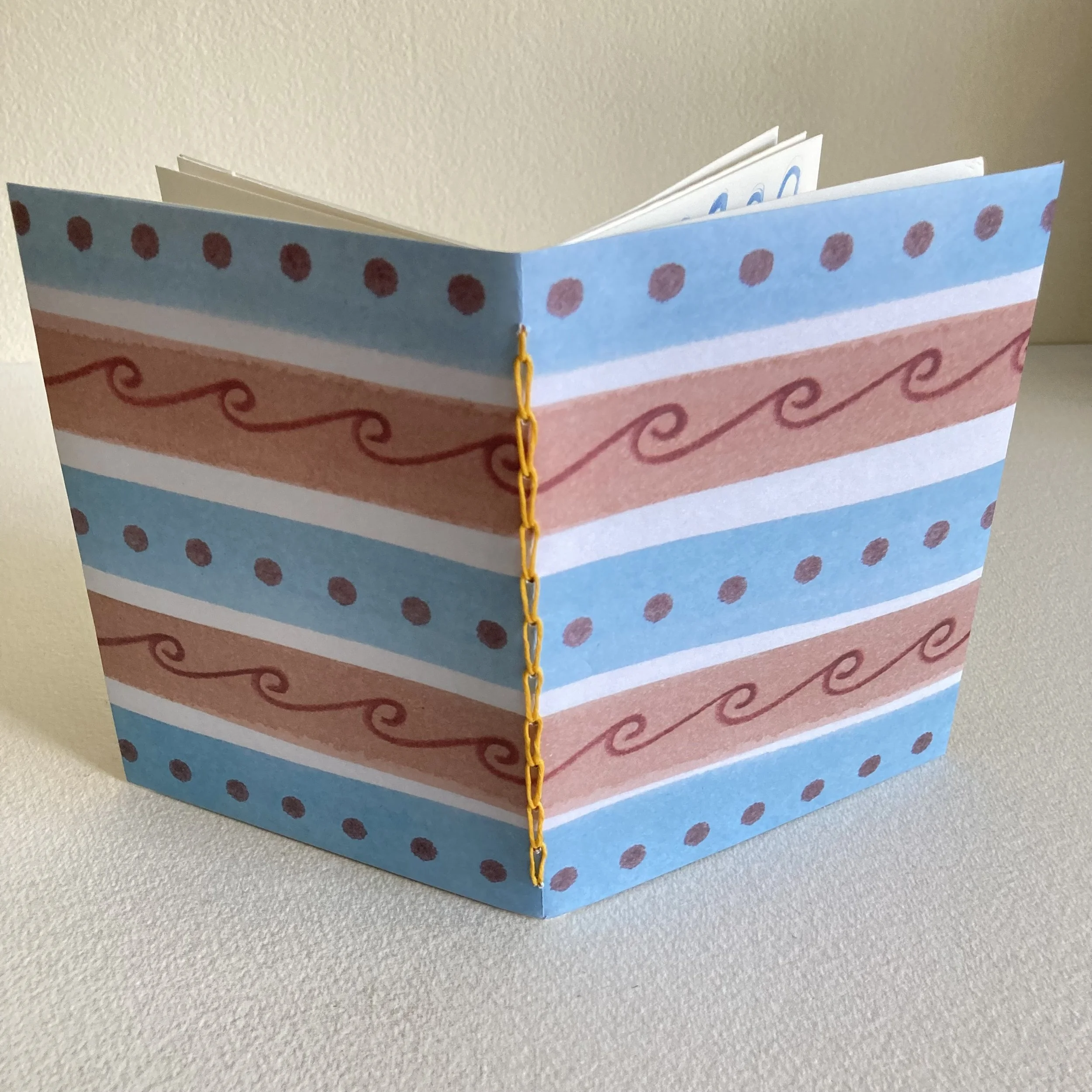
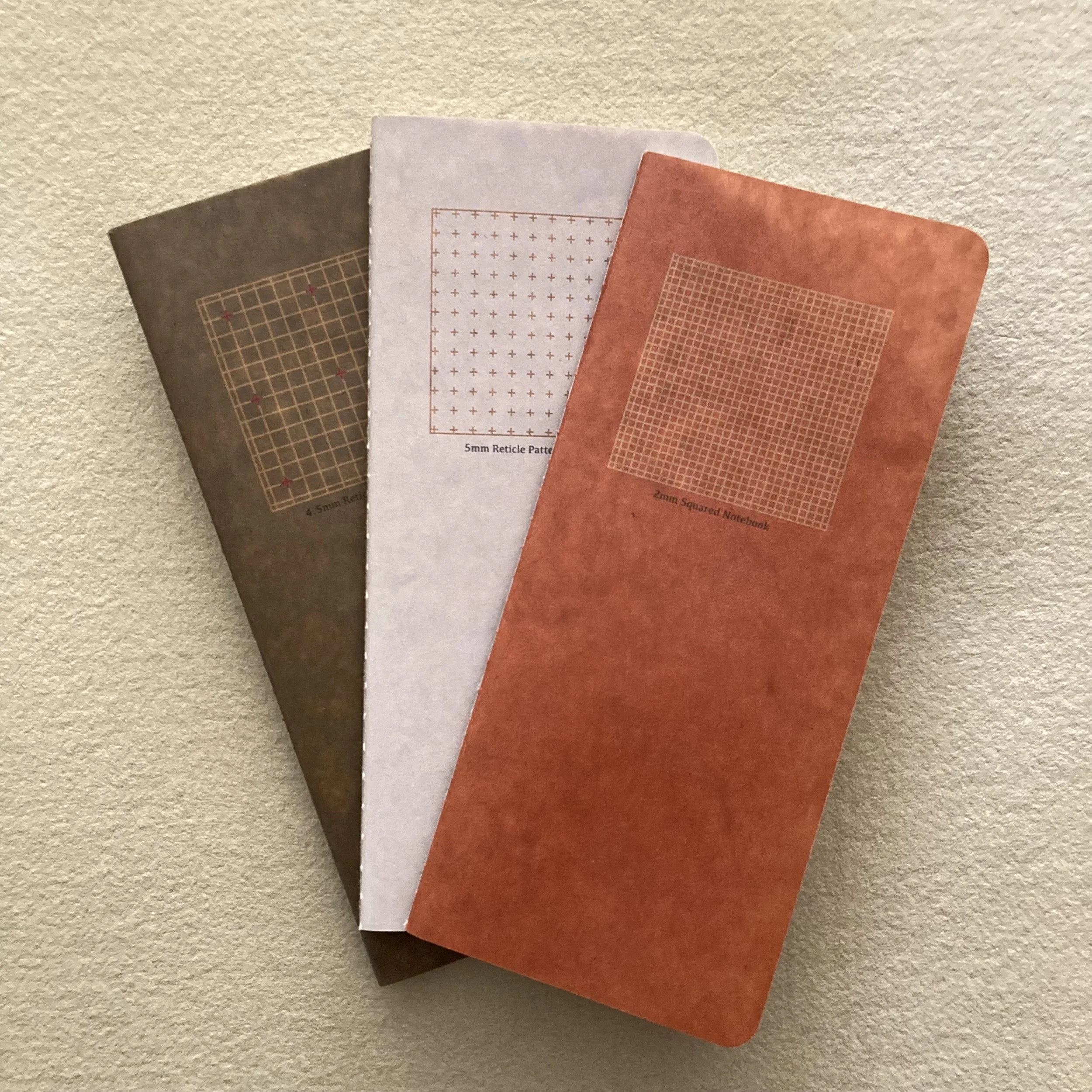
A threesome of handsome booklets stitched with linen thread. My postal muse (a.k.a. AK) notes that the reason the proportions of these notebooks are so pleasing is that 3⅝ x 8¼ is almost two squares put together. Speaking of squares, each notebook features a different grid, subtly printed in gray on soft white, silky smooth pages.
Seen below is a Ro-biki notebook that Ruby covered with Cambridge Imprint paper & embellished with a Wanderlust Paper heart. She’s filled it with sentimental recipes that she’s prepared with her partner Jaik.

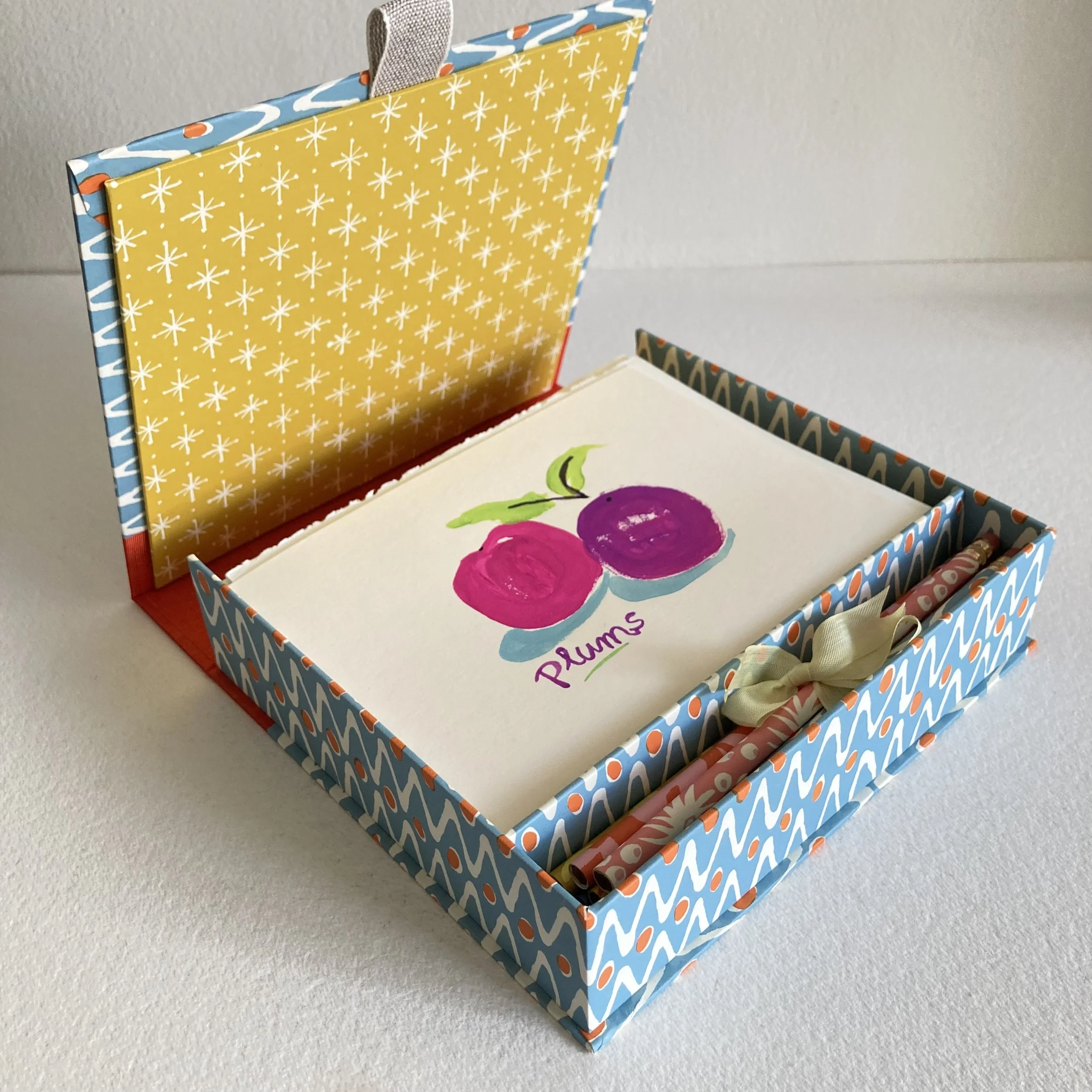
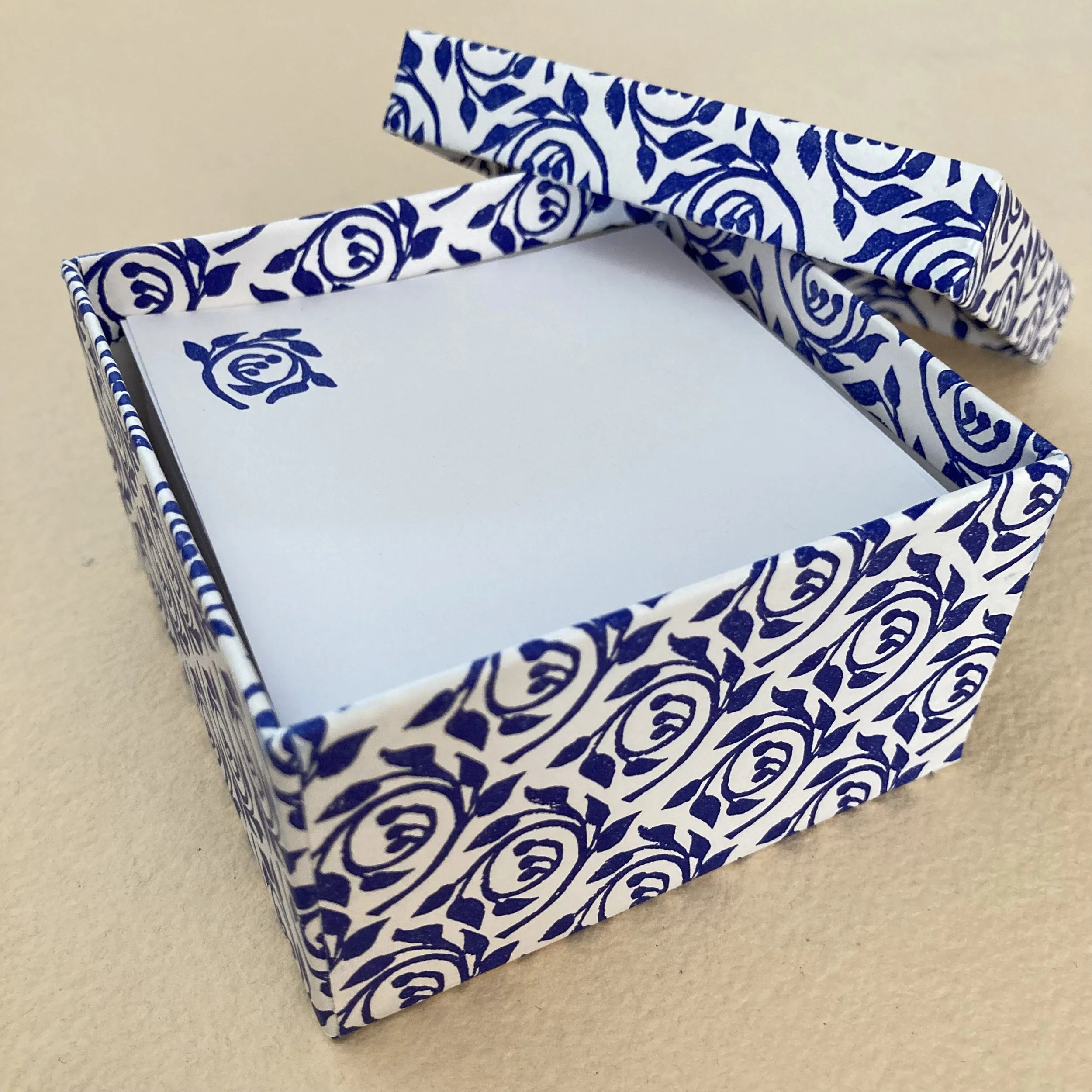
No. 3 ~ New England Paper & Stationery Co.
These patterned paper lidded boxes are as charming as the notepaper inside is useful. Inside are 150 little square notesheets with a matching motif printed on lovely vellum bristol (coverweight) which welcomes all manner of writing tools. And may we mention that you can easily and stylishly overlay the label on the lid with one of your own.

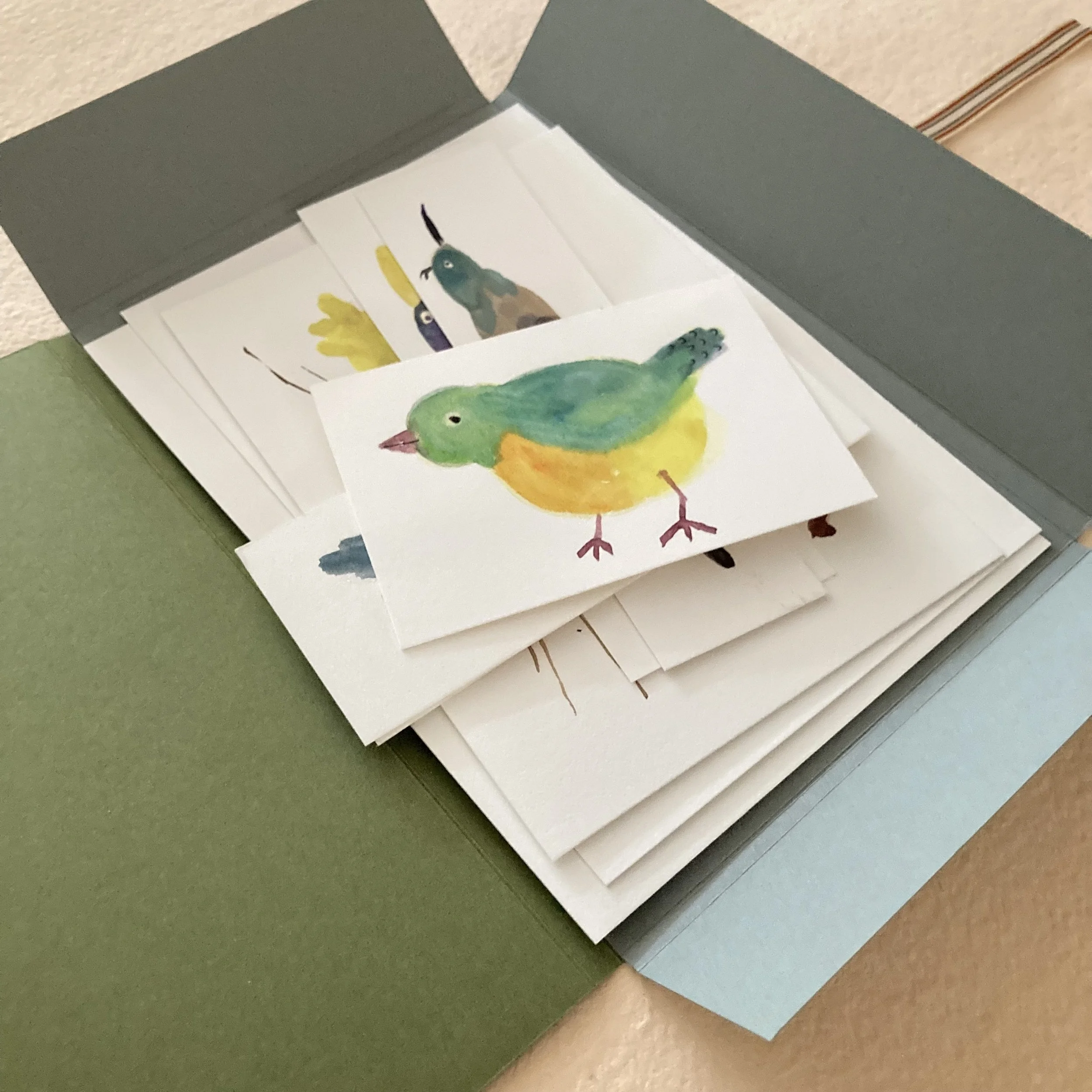
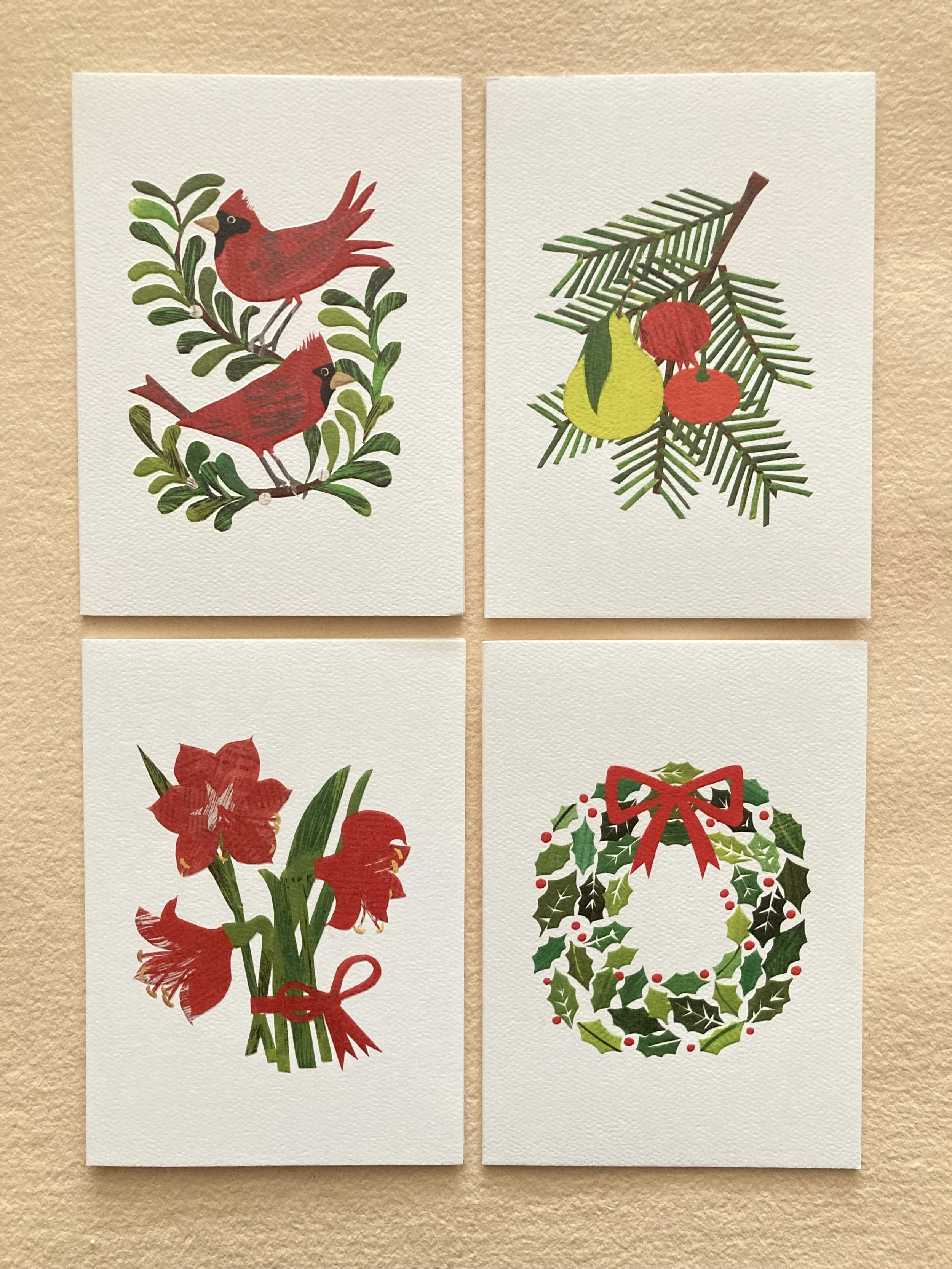
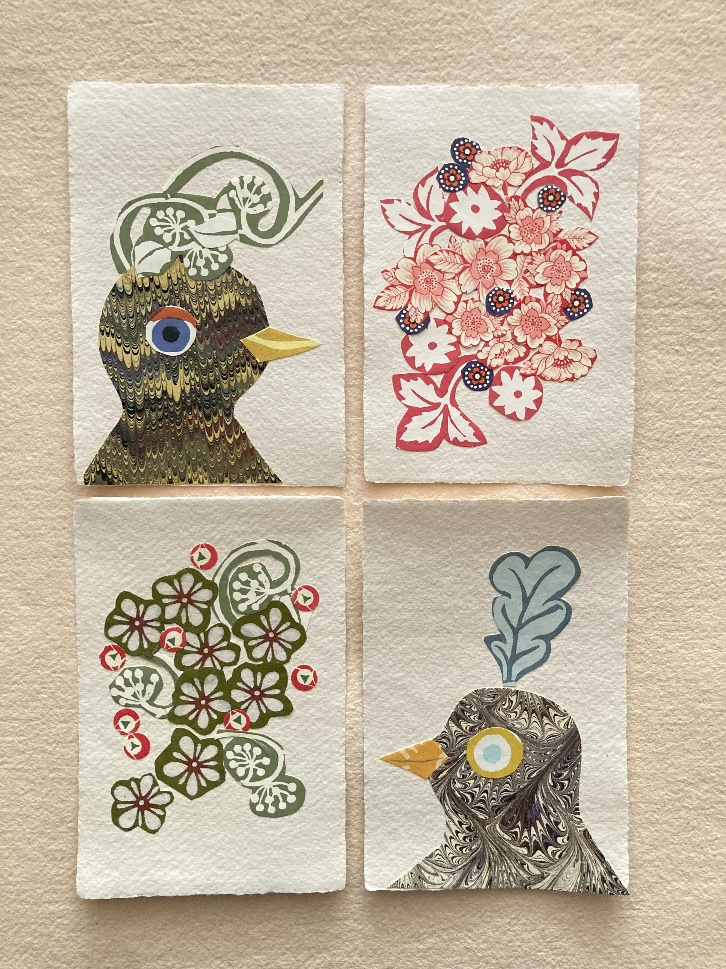
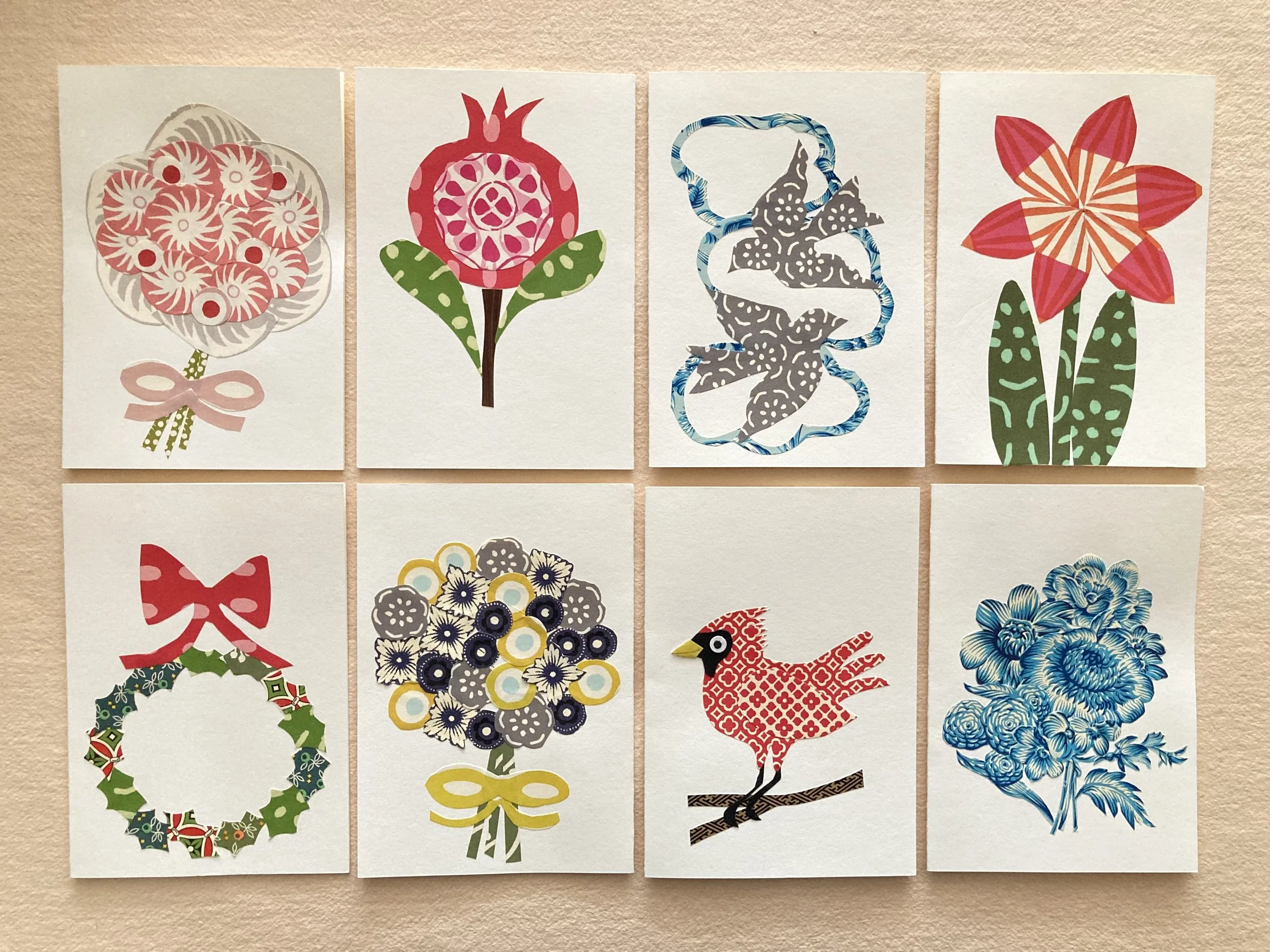
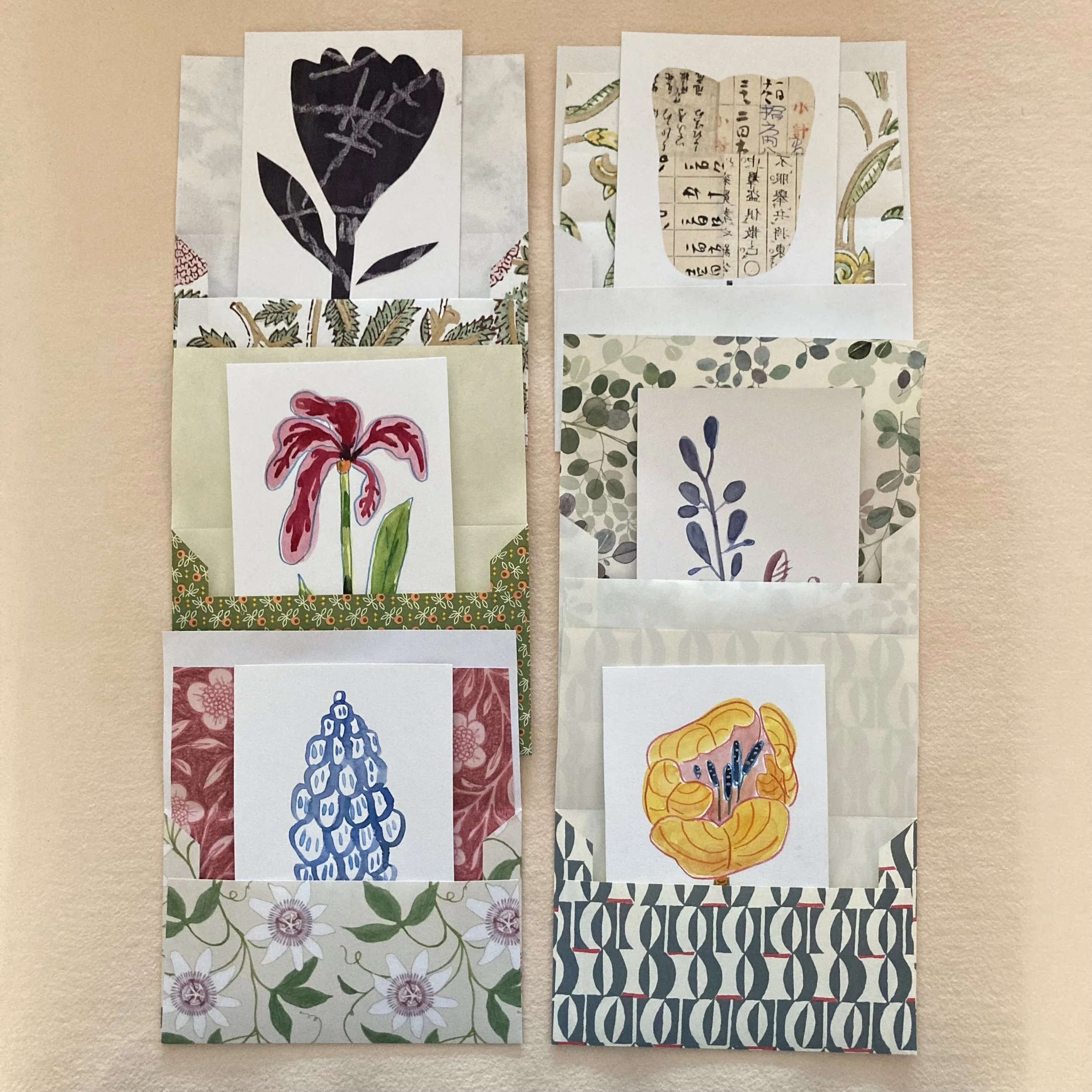
No 4 ~ BZS Stickers
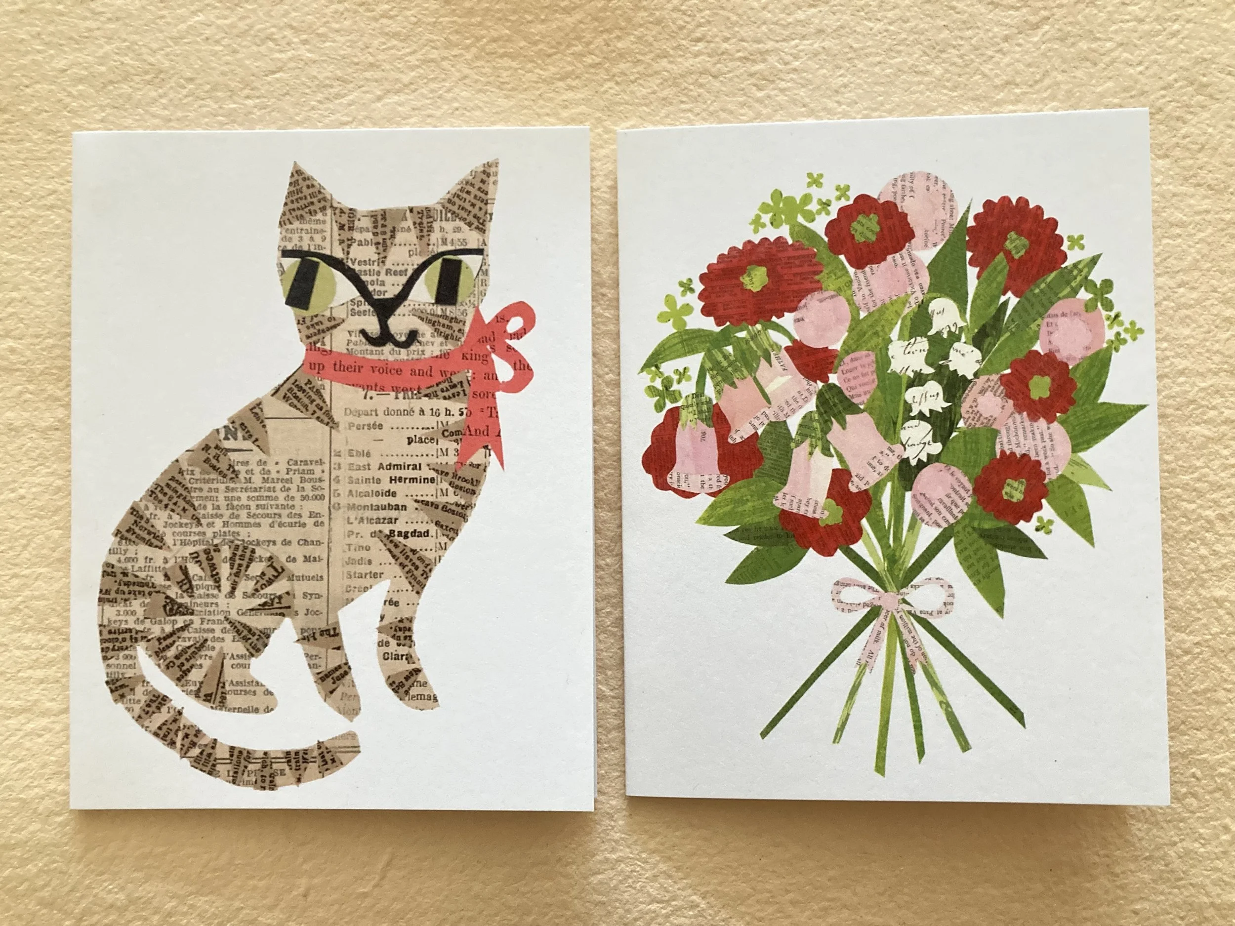
We are delighted to join the sticker parade! Thanks to Ruby’s technological prowess and her general being in-the-now-ness, we have four BZS stickers—for our first foray into stickerdom. All designs by our in-house illustrator, Janet Bouldin. Two are from our Glimpses & Whimsies set of postcards: Welcome to my world and Bouquets of scraps from past pursuits. And two recent additions: Wishing for washi and Waxed-linen spools. Which we will print up as postcards soonish!

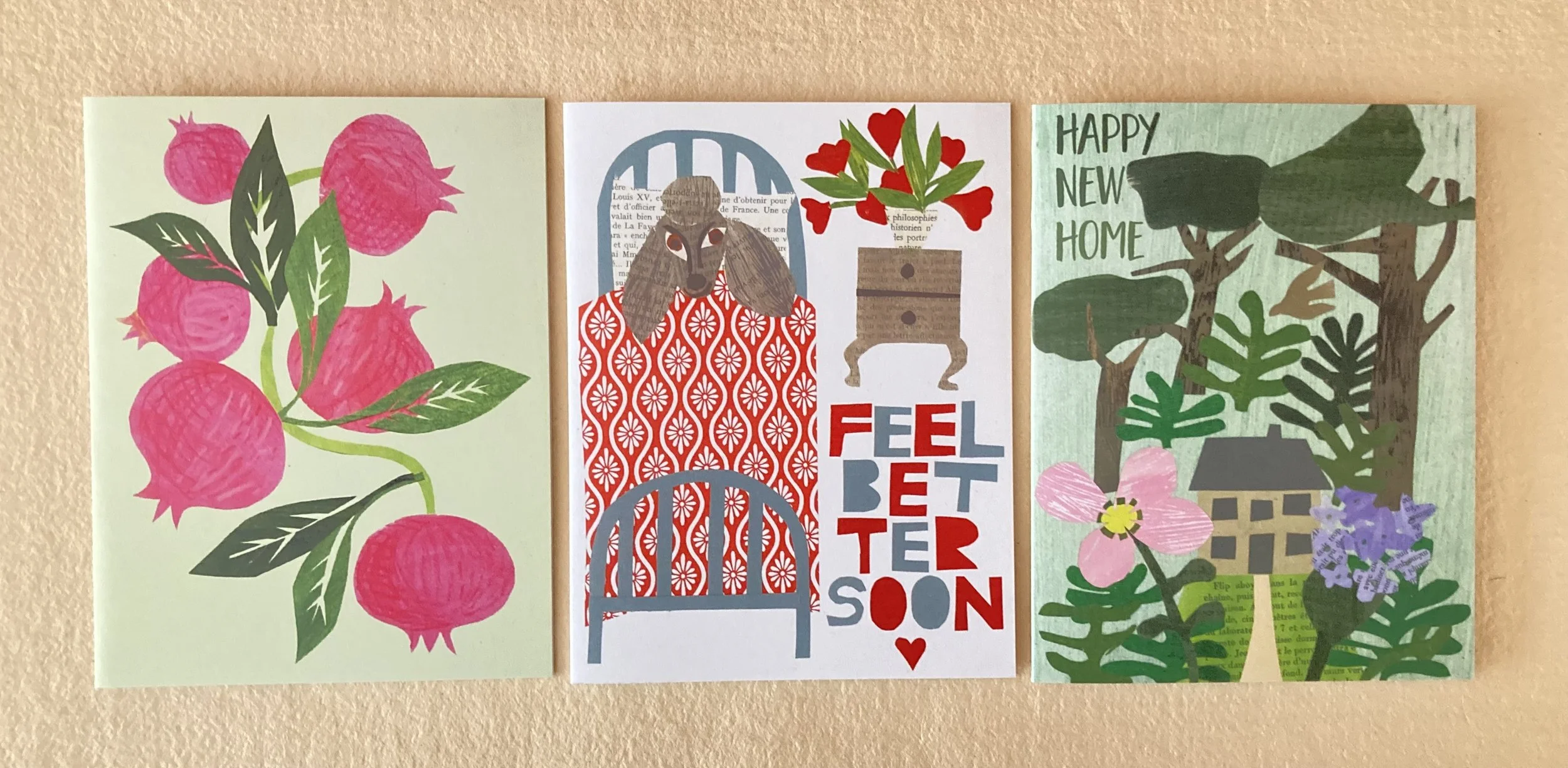
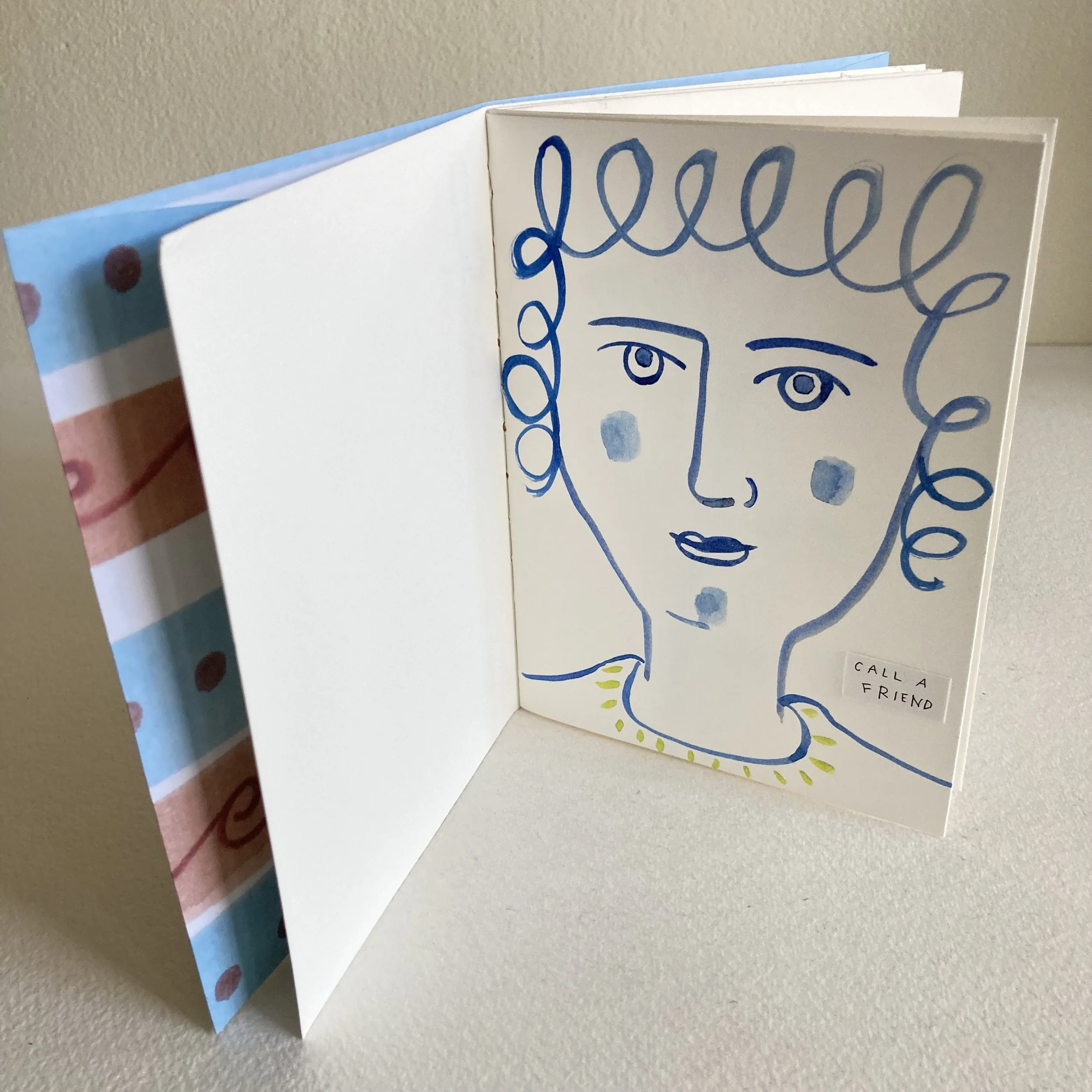
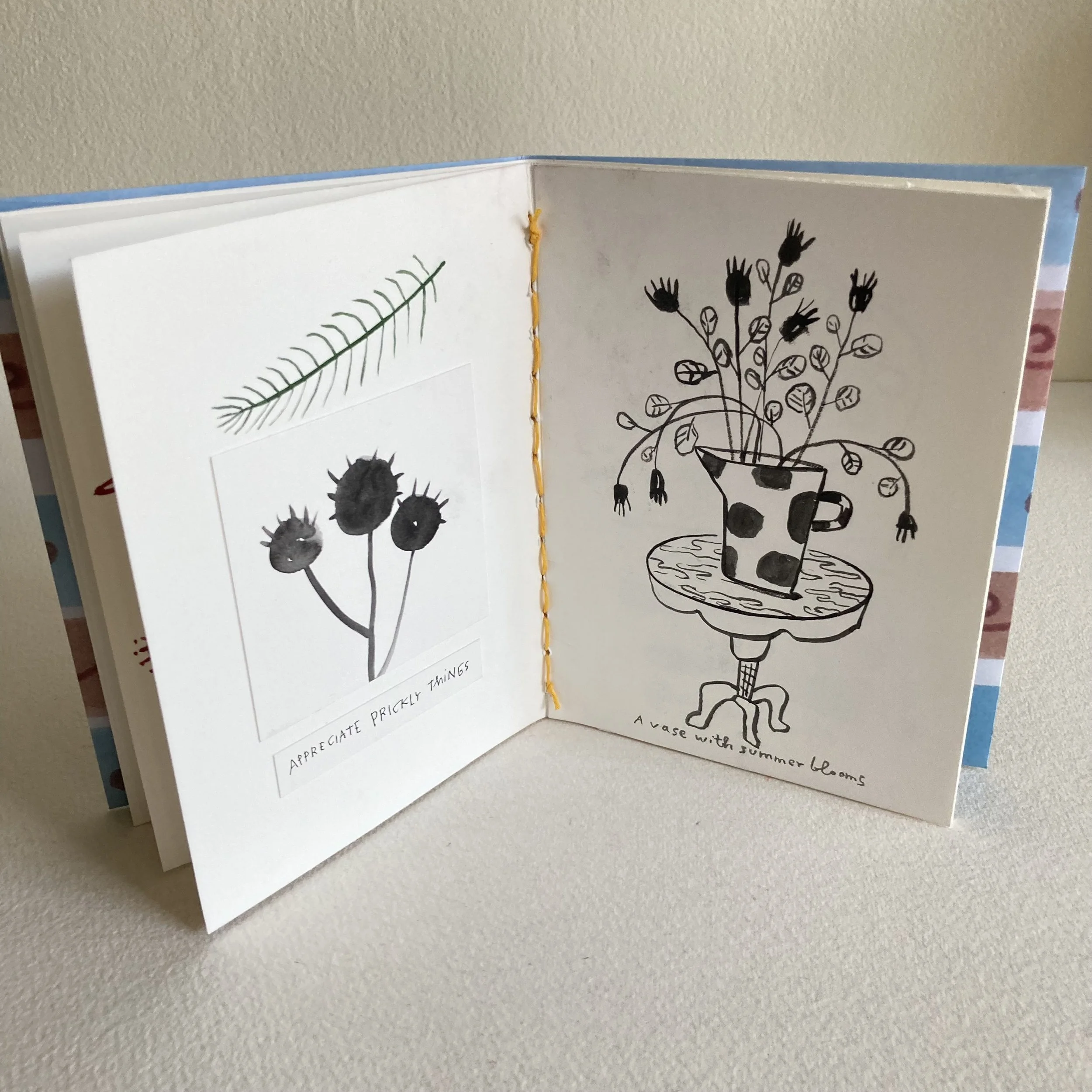
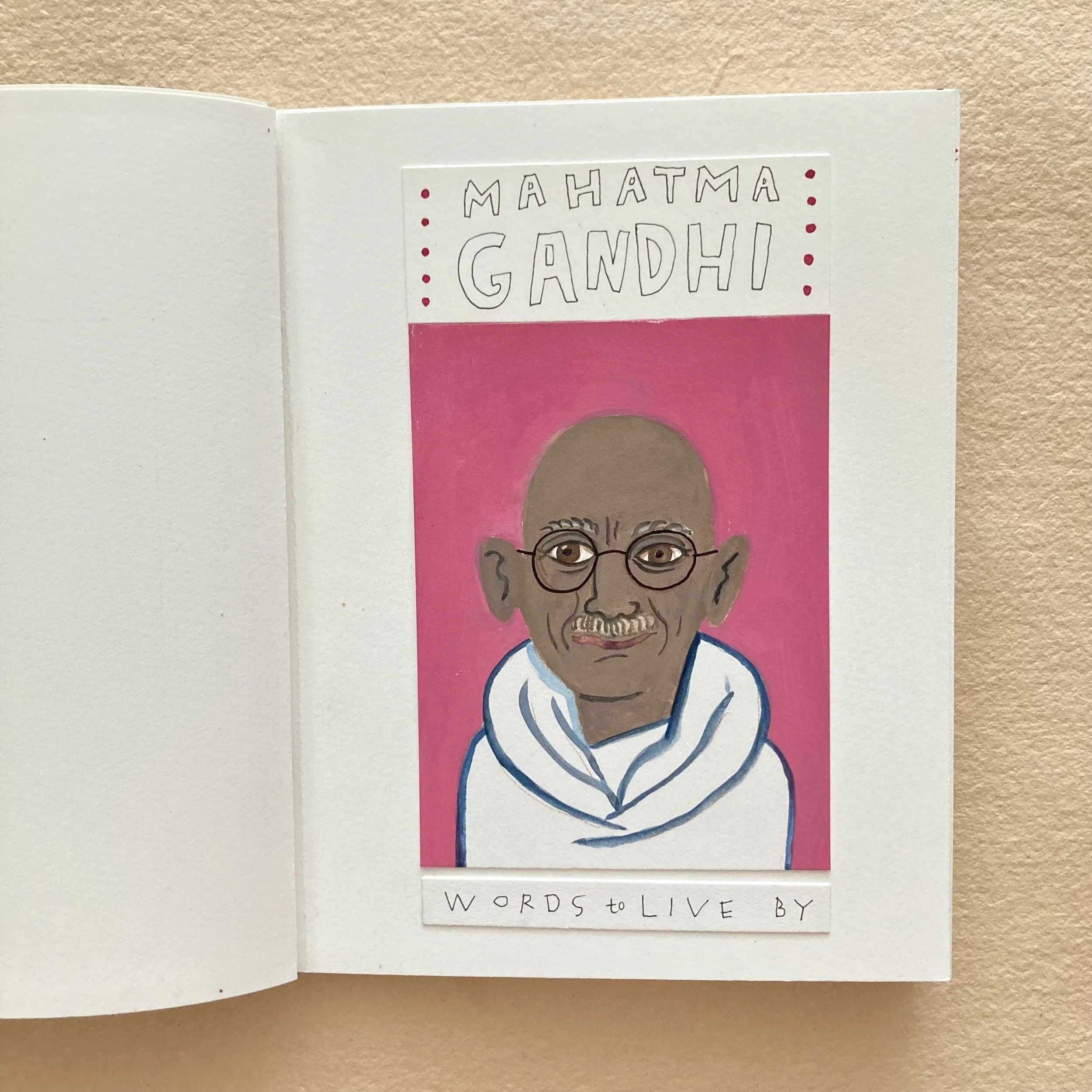
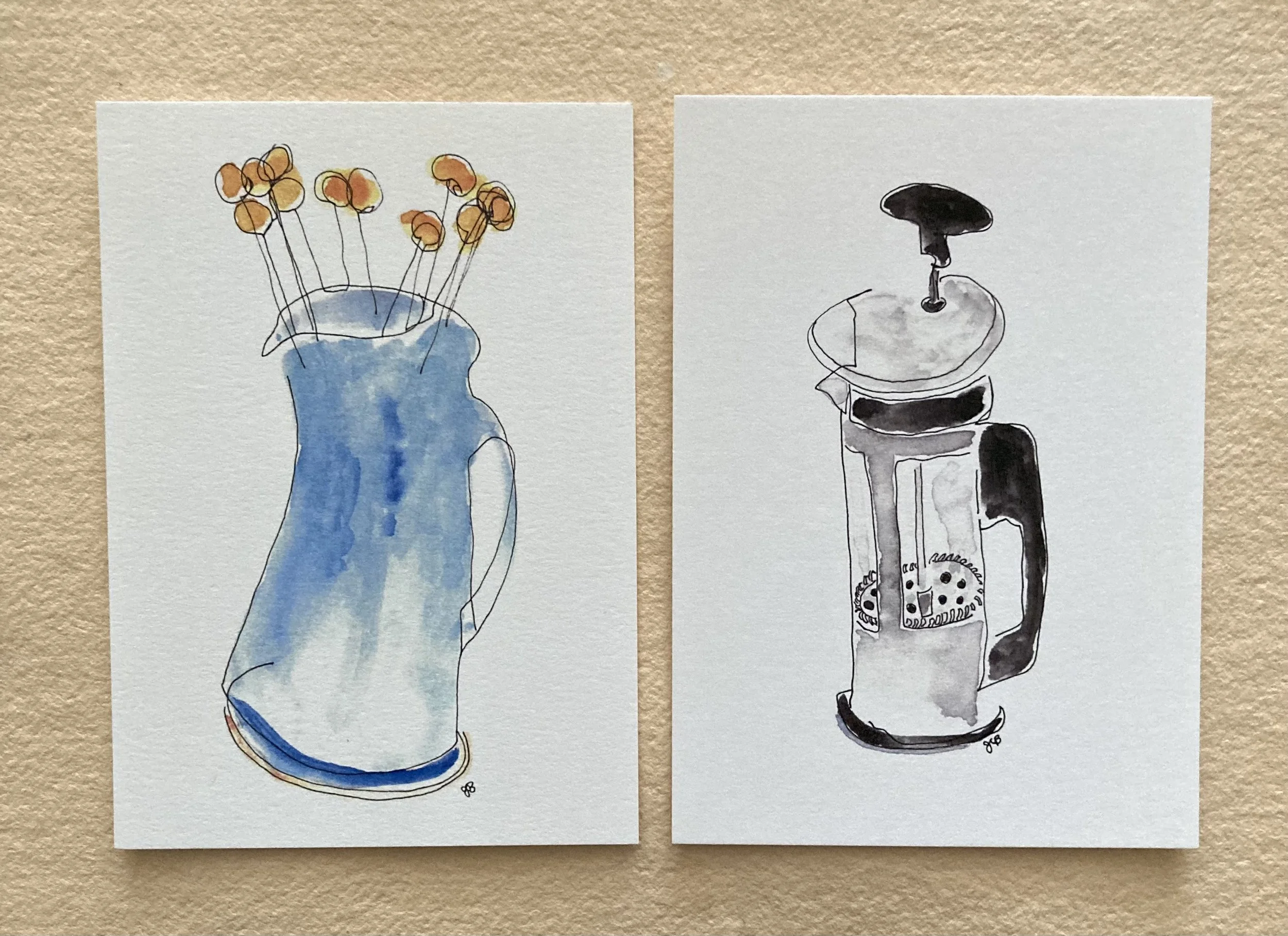
No. 5 ~ Janet Bouldin’s whimsical postcards
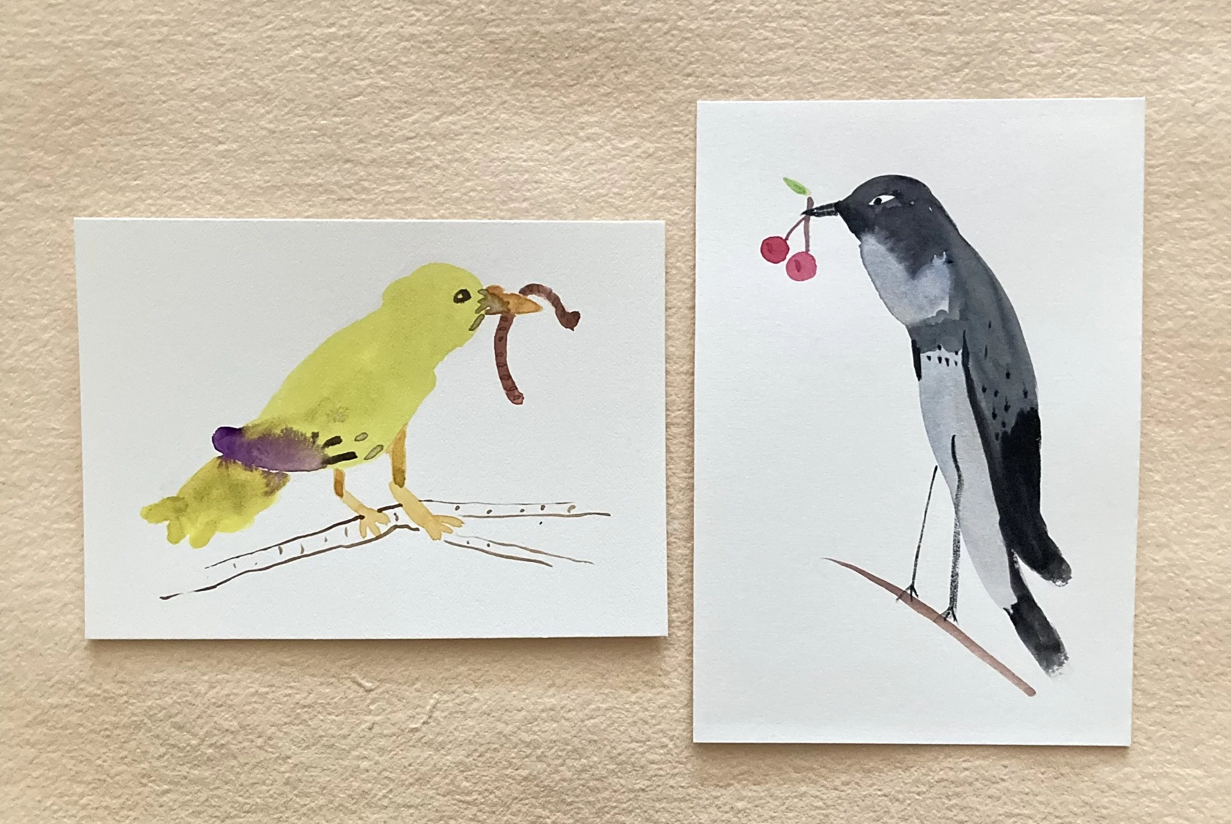
Speaking of Janet’s charming illustrations, last week she delivered two new postcards, both blind contour drawings. On the right is one of her favourite French-press coffee pot, and the left is a ceramic vase that resides on my center table in the studio, always filled with Crespedia.
Very autumnally, Bari