
Dear Everyone ~

In June, we celebrated Bari Zaki Studio’s tenth anniversary on Lincoln Avenue. Now, we are celebrating the United States Postal Services’ two hundred and fiftieth anniversary of delivering mail here, there & everywhere! Alyson Kuhn, my postal muse, bought many panes of the new commemorative stamps the first day they were available (July 23)... and her next order of postal business, so to speak, was sending a parcel to her correspondent Antonio Alcalá… using all 20 of the new stamps. Antonio was the USPS art director for the stamps, which he collaborated on with artist Chris Ware. Once Antonio had received his parcel, he and Alyson had a chat about the project in general and some of the design details in particular.

A bit of background about Antonio: He’s been an art director for the USPS since 2011. Here is a big envelope he sent Alyson in January 2022, franked exclusively with stamps from issuances Antonio has art directed. He is the designer of several as well, including the “love” stamp. Antonio’s hand lettering also appears on the Woodstock stamp and on the empanada, whose Delicioso art is by John Parra. For Monster Messages, Elise Gravel created the creatures and their accessories; Antonio drew their speech balloons and the lettering at the top of the sheet. Other stamp artists on the envelope include Charles Chaisson, who did Yoga Berra’s portrait; Rico Worl, who did the dramatic Raven; and Luis Fitch, who did the Day of the Dead stamps. The Star Trek artwork is by Heads of State.

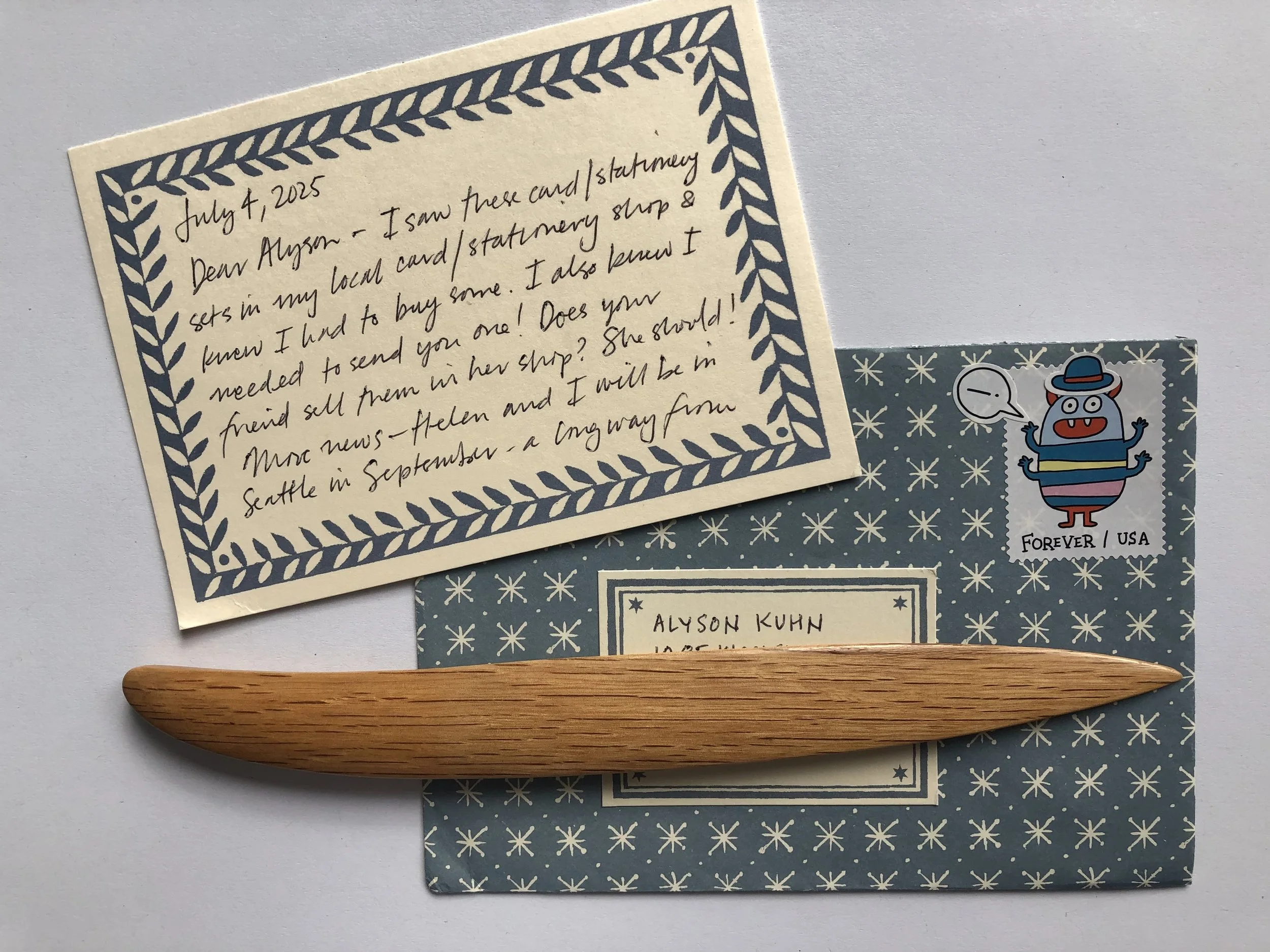
Here is Antonio’s July 4 communique to Alyson, with a message monster sporting a custom derby that accommodates its horns. Antonio begins his note by enthusing about his recent discovery of Cambridge Imprint stationery goods… and goes on to mention the new pane of stamps illustrated by Chris Ware. He concludes, “I hope your local postal carrier likes them!”
We are delighted to be able to share with Everyone selected snippets of Antonio’s conversation with Alyson.
AK:
Had you worked with Chris Ware before this project, or had you met him?
AA:
I hadn’t, but I’ve been a big fan of Chris Ware’s for many years. I’m looking at my bookshelf right now, and I have ... 7, 8, 9 volumes of his work. Getting to work with him was a treat. He was a great collaborator, and our email exchanges were always fun and made me laugh. It was the best of the best.
AK:
And was he surprised to hear from you, especially with the opportunity to design not one stamp but 20 stamps? What was his reaction?
AA:
He was very interested, but not bubbly-excited like many other collaborators I’ve worked with on stamps. I had a pretty clear idea of what I was looking for, but Chris took it and gave it a much richer narrative that makes the piece fantastic.
AK:
Agree! This is not just 20 stamps—the whole pane is greater than the sum of its parts. There is so much going on in every stamp. The sheet could be a quilt, or a tapestry, or a mural, something big. Do you know how Chris created the art?
AA:
He draws it by hand at a substantial size—it’s quite large, like a poster. I’m not measuring, but it’s probably 36 high x 24 wide-ish. He first draws in non-reproducible blue pencil, then inks by hand, and then adds the color digitally.
AK:
I have to ask: was any real mail exchanged in the course of the project?
AA:
I did mail Chris printouts of his sketches at actual stamp size so he could get a better idea of the scale we would be working with. And he mailed me the final artwork flat in a specially constructed cardboard and foamcore container of his own devising.
AK:
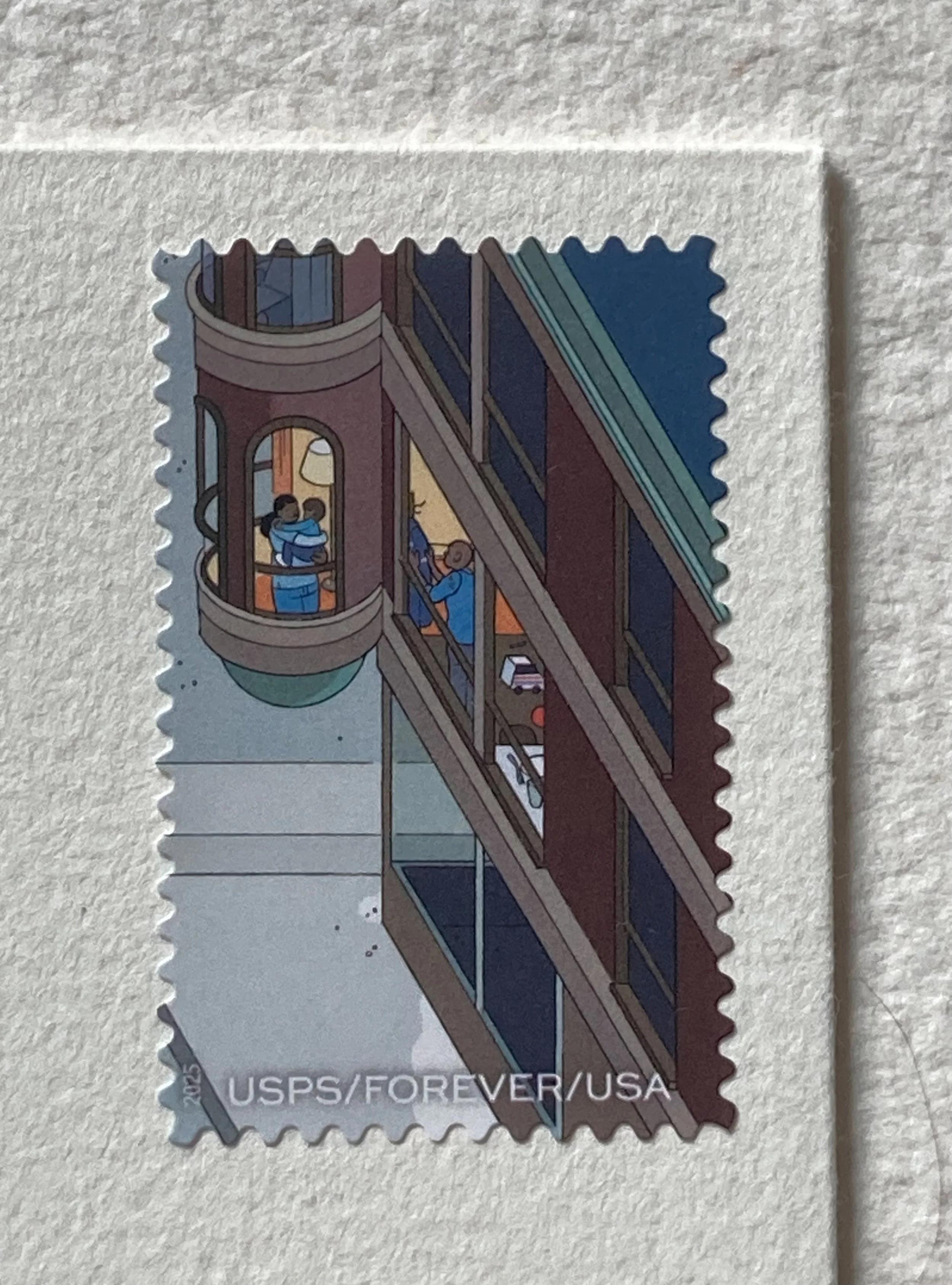
Let’s chat about a couple of the themes, in addition to the double delights of mail delivery and the passing of the seasons. I see the mail carrier delivering mail on every stamp until the last one, at lower right. On that one, I think we see her in the window of her fabulous sunporch, holding her baby.
AA:
Exactly. Let me mention that we didn’t have any discussions about the appearance of the mail carrier. I wasn’t surprised by Chris’s choice, as I’m so familiar with his work. He often has quiet, strong women going about their work—while the men are often caught up in various neuroses. Back to that stamp, her delivery day has ended, and she is at home with her partner and child. You can see her partner through the next window... and have you noticed what is on the table in that room?
AK:
Oh, it’s a toy mail truck! I had totally missed that. I actually have one of those! What else might I have missed? Let me add that I’m using a magnifying glass.
AA:
Well, speaking of magnifying glasses—one of my favorite details is in the bottom row. See the retired stamp collector, looking at one of his stamps through a magnifying glass?

AK:
O, that’s great. I did spot the man popping out of the manhole to hand the mail carrier an envelope. Was that your idea?

AA:
No, that was Chris’s idea. And if you look at the stamp just to the left of that, see if you can spot the theme of that particular stamp. It’s wheels—everyone on that stamp is on wheels.

AK:
O, that’s lovely. And we’re probably looking at three generations on that stamp. And across the street—over to the right— I see some young people at a bookstore or a library.

AA:
In my world, it is a bookstore. But if a viewer wants to read it as a library, that’s fine too.
AK:
I would have loved to see a stationery store! Would it be a stretch to describe the piece as a wonderful slice of Americana? The town seems so friendly, and civilized. And, of course, so postal.
AA:
It’s certainly idealized – it doesn’t feel frenetic. Chris’s stories and his longer forms of graphic novels tend to have a certain melancholy feeling. This pane is surprisingly upbeat in a Chris Ware world. I love that you can follow the mail carrier so easily along her route on each stamp.
AK:
Well, I think this pane of stamps is the perfect philatelic vehicle—oops, an inevitable pun—to celebrate 250 years of mail delivery. And I love that the first stamp, at the upper left, is a hive or a hub of postal activity. I see four USPS workers in addition to the mail carrier setting out for the day, two USPS trucks, and a couple of rolling carts.

AA:
And don’t overlook the statue atop the pedestal. Does it remind you of anyone?

AK:
Well, is it commemorating the wild ride of Paul Revere? I know it’s not the headless horseman from the Legend of Sleepy Hollow—which is a stamp I love.
AA:
No, the statue is a nod to the Pony Express, and the design references an earlier stamp. And above that, a customer is coming up to the Post Office with an armful of Priority Mail boxes. There are so many postal details to discover.
Last words from Alyson:
And to help us discover them, the back of the pane includes some clues in bold type. The text concludes, “...and the joy of reading a greeting never grows old; opening the mailbox to find your note or card can make a friend’s day.” As you might imagine, I am sending Antonio a thank-you note for our chat. Because he is a new Cambridge Imprint enthusiast, I have made him a pair of envelopes using two of my favourite patterns. Selecting the stamp was no challenge: it had to be the Post Office!


Ta-dah!
May we recommend our MORE Art of the Hand-folded Envelope kit almost overflowing with Alyson & Bari’s hand-folding inspirations? Although a beautiful readymade envelope is nothing to scoff at, and you’ll find an international assortment here.
Toastily & postally, Alyson & Bari