Dear Everyone ~
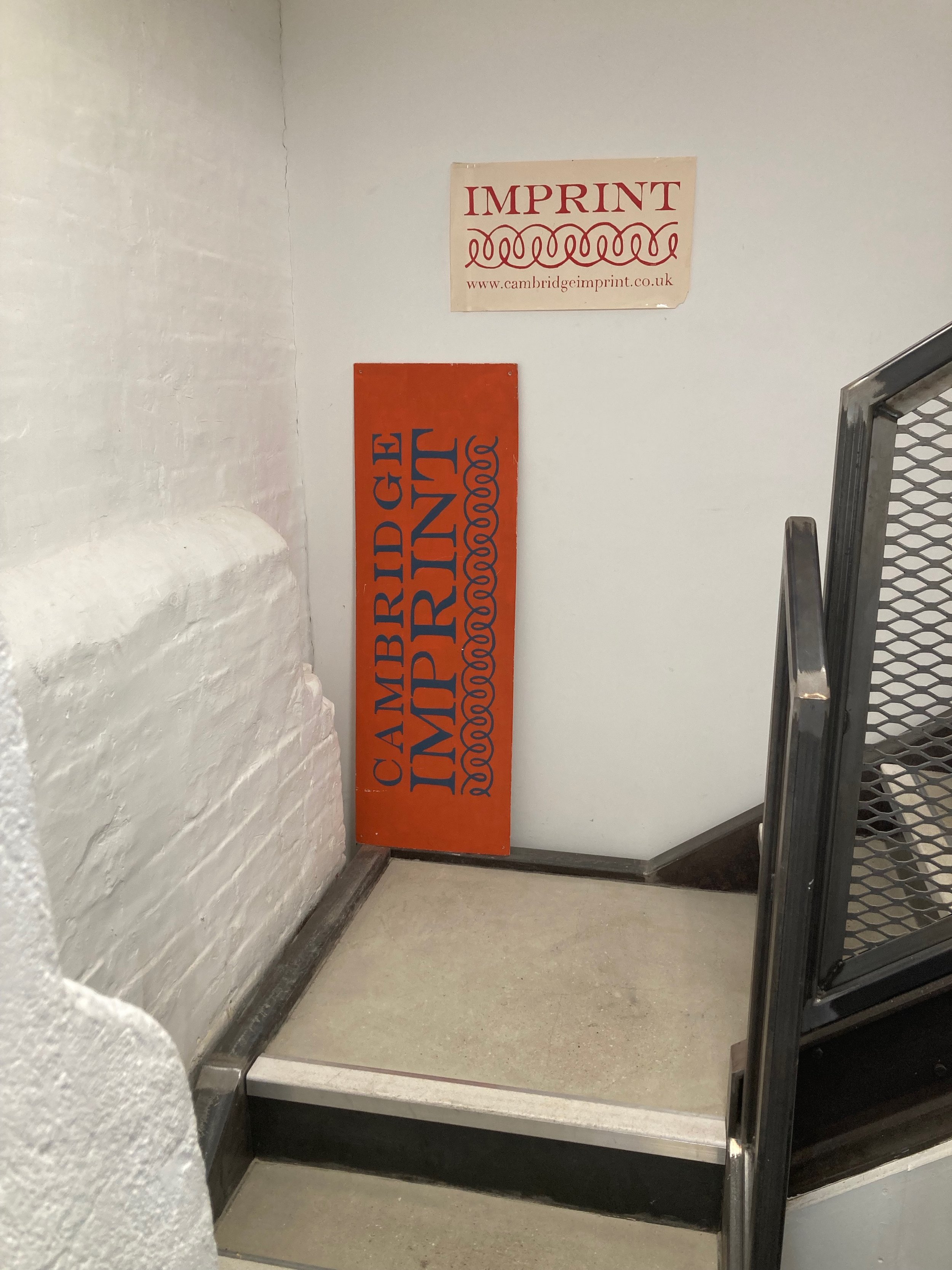
Back in May, Zak & I were visiting family & friends in the U.K. Some of our travels took us to the Suffolk coast, which is close-ish (a verdant, rural two-hour drive, unmarred by billboards) to Cambridge. As soon as our plans were set, I sent word to Susie at Cambridge Imprint—who I’ve been e-communing with for over four years—to arrange a visit to their new studio space at Chesterton Mill, an urban renovation project on the outskirts of Cambridge. They had moved in a couple of months prior, and I was hugely excited to meet them in their new atelier! It just so happened that there was just a single day in all our schedules that meshed perfectly for my visit—a gorgeous & sunny day in so many ways!

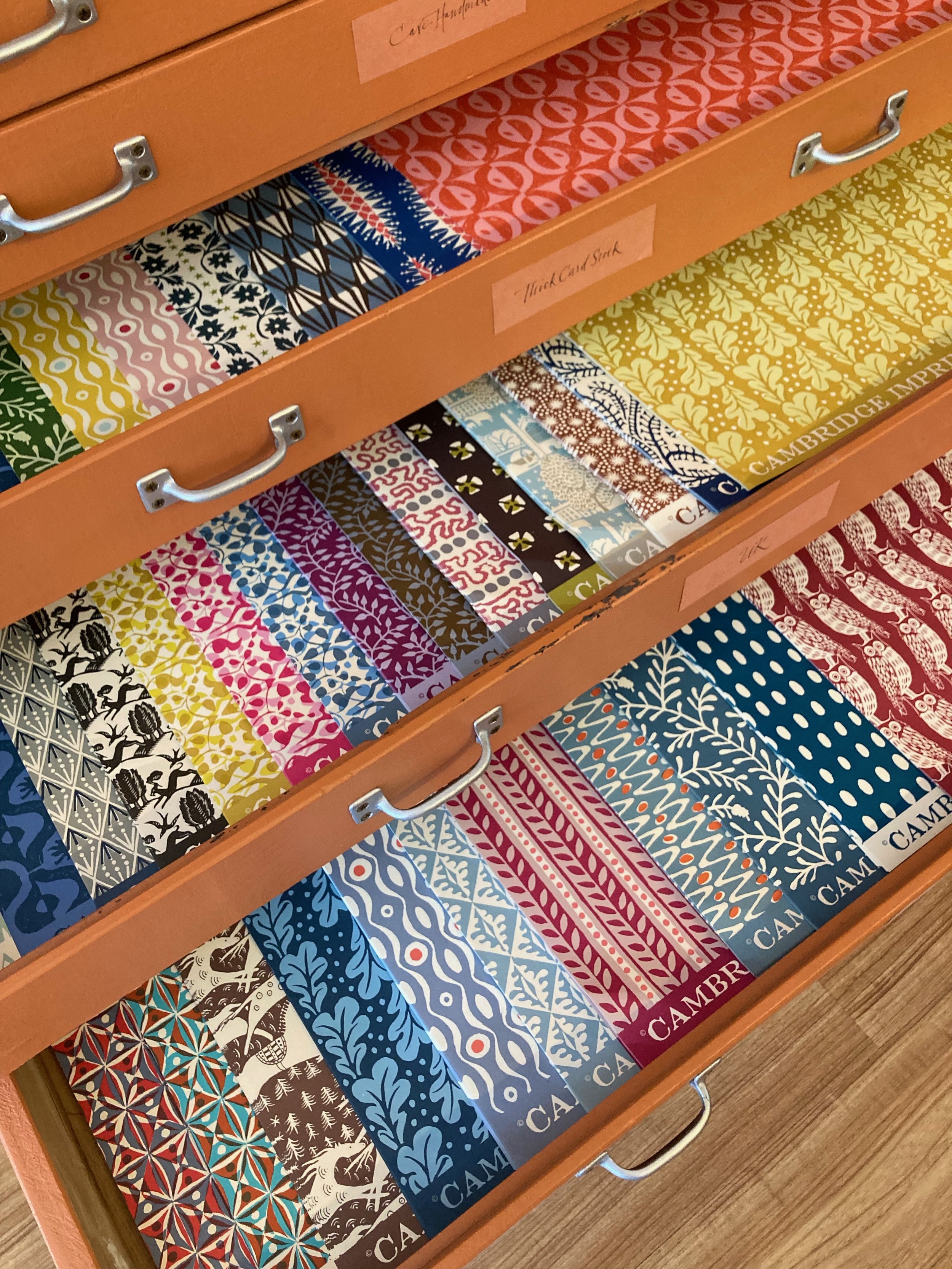
I walked s-l-o-w-l-y up the inside stairs to their space, taking in the moment entirely. Cambridge Imprint occupies two stories, the upper of which is very loftlike. I was mesmerized with just about every corner, table space & shelves in their studio—colour, pattern, p-a-p-e-r! We drank tea from mugs with Cambridge Imprint patterns (not currently available for purchase, alas), and chatted about this & that & these & those.

My favourite scarf (knitted by my merchandising angel, Jamie) is my constant companion when the weather is chilly). It looked right at home at Cambridge Imprint, next to Claerwen, then Susie, then Jane. Perhaps they favour wardrobe solids so as not to compete with their patterns. There is no mistaking that mixing & matching is the name of the Cambridge Imprint game. The more you have, the more you see! I asked the Cambridge crew about their favourite combos:

Claerwen: “My current preferred mix would include the Charleston border, Dancing Hares in violet and Peggy Angus tile prints together. It isn't very summery, but I love the combination of brown shades, for example Animalcules in cocoa and the Dancing Hares in bronze”.

Ali: “Brown horses and Wave indigo and Persephone grey & crimson.
I also love the Smocking and Threadwork patterns we did for the Whitworth—we’re planning some new colourways of Threadwork.”

Jane: “Quercus sap, Wave orange and Charleston ripple”

Inspired by my private tour, I have brought in several new Cambridge Imprint papery provisions. I’ve increased my inventory of parent sheets with 21 new patterns, bringing the total to 40. I’ve created a new assortment of six patterned envelopes, paired with six leafy-bordered postcards. (A few sets of my original envelope assortment remain; ditto the original postcard sets.)

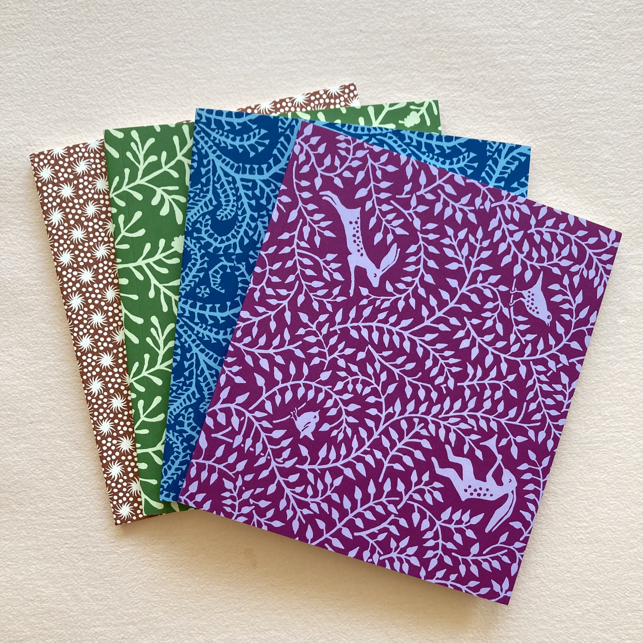
The new Tall Softback Sketchbook is available in four patterns (seen above), and a Trio of Tri-fold Document Portfolios is available in two colourways (seen below).


It has just occurred to me that a parent sheet can make a 9 x 12 or 9½ x 12½ envelope to hold a document portfolio (or two). Like a sweater set! Here is my freshly folded Seaweed Paisley Prussian Blue 9 x 12¼,
lined with Kaleidoscope Red and Blue.

And here is the sweater set, all dressed up and ready to go!
Cambridge Imprint parent sheets
Trio of tri-fold document portfolios
Tall softback sketchbook
Patterned envelopes & postcards
Mixing & matching & delight & delirium, Bari
PS:
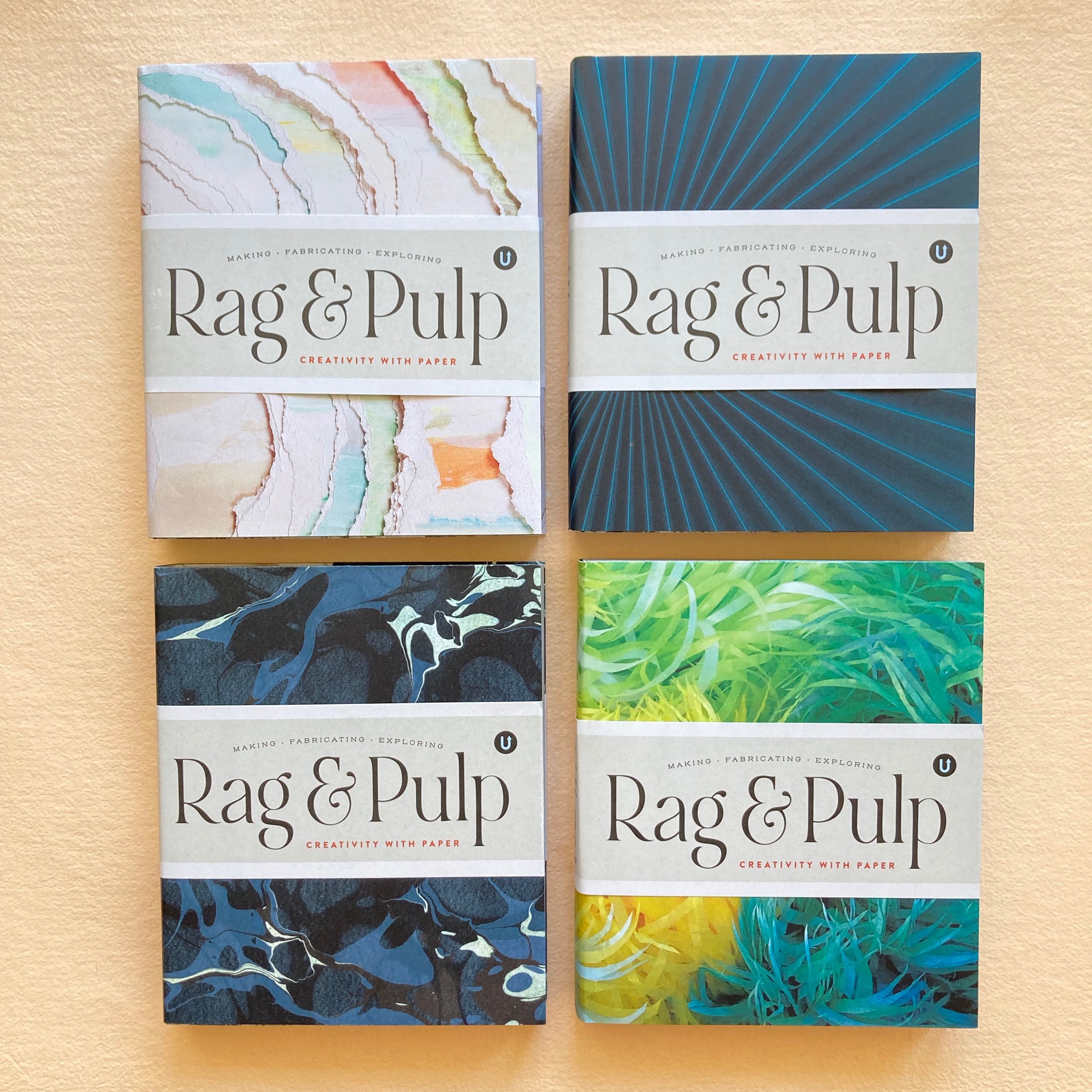
Speaking of delirium, Volume R, for Rag & Pulp, in the Encyclopedia of Inspiration, created & published by Uppercase, is, to quote the promo card, “freshly printed.” Bari Zaki Studio is honoured to be included in this international extravaganza of people who make their living (and their lives!) using paper. I will be selling Volume R online and in the shop. As you might expect, I will be adding custom embellishments. Whether you are acquiring a copy for yourself or for a friend, I will also be happy to personalize. And, inevitably, gift-wrapping will be offered in several papers for a nominal fee. I anticipate receiving my order early in August and will keep Everyone posted.