Dear Everyone ~

I have long been an avid fan of Velké Losiny (VL, the opposite of LV [Louis Vuitton]), the glorious 100% cotton handmade paper from the Czech Republic. Earlier this year, I received word from Pavel, my VL paper purveyor, that he had a handsome stash of VL envelopes & notecards that he thought I might be enthused about. Well, swell-ké! I acquired the complete cache, and want to tell everyone what happened next.
I selected a septet of customers with whom I correspond…and invited each of them to experiment with the grand VL notecards—which measure 8 x 8—and their companion envelopes, which measure 8¼ x 8¼ . But that’s not the half of it! I asked everyone to mail me something and to email me about their experience working with the VL and expediting it via post.
I loved being able to share my love of paper with the septette, seven customers who have become such a part of the BZS ecosystem—only three of whom I have met in person (yet!). Herewith their respective oeuvres…and some of their thoughts about VL. As you’ll read, the medium, the message, and the momentum aligned.
* * * * *
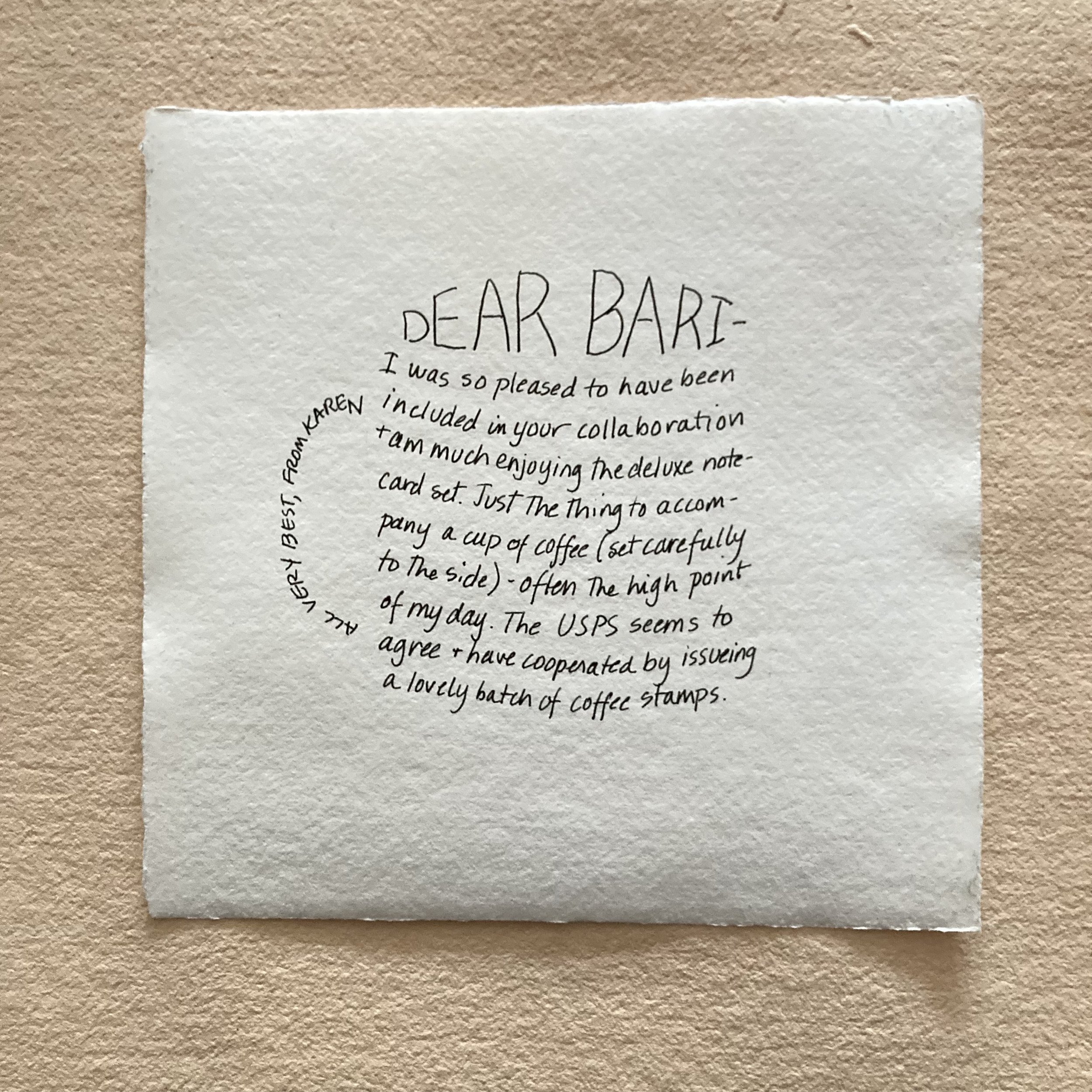
Karen E. is an accomplished watercolour embellisher of envelopes (and postcards). She praised the VL for its luscious thickness, saying “You know I am a fan of painting envelopes and it's hard to find thick enough envelopes—without resorting to making my own from watercolour paper. The VL was a dream.”

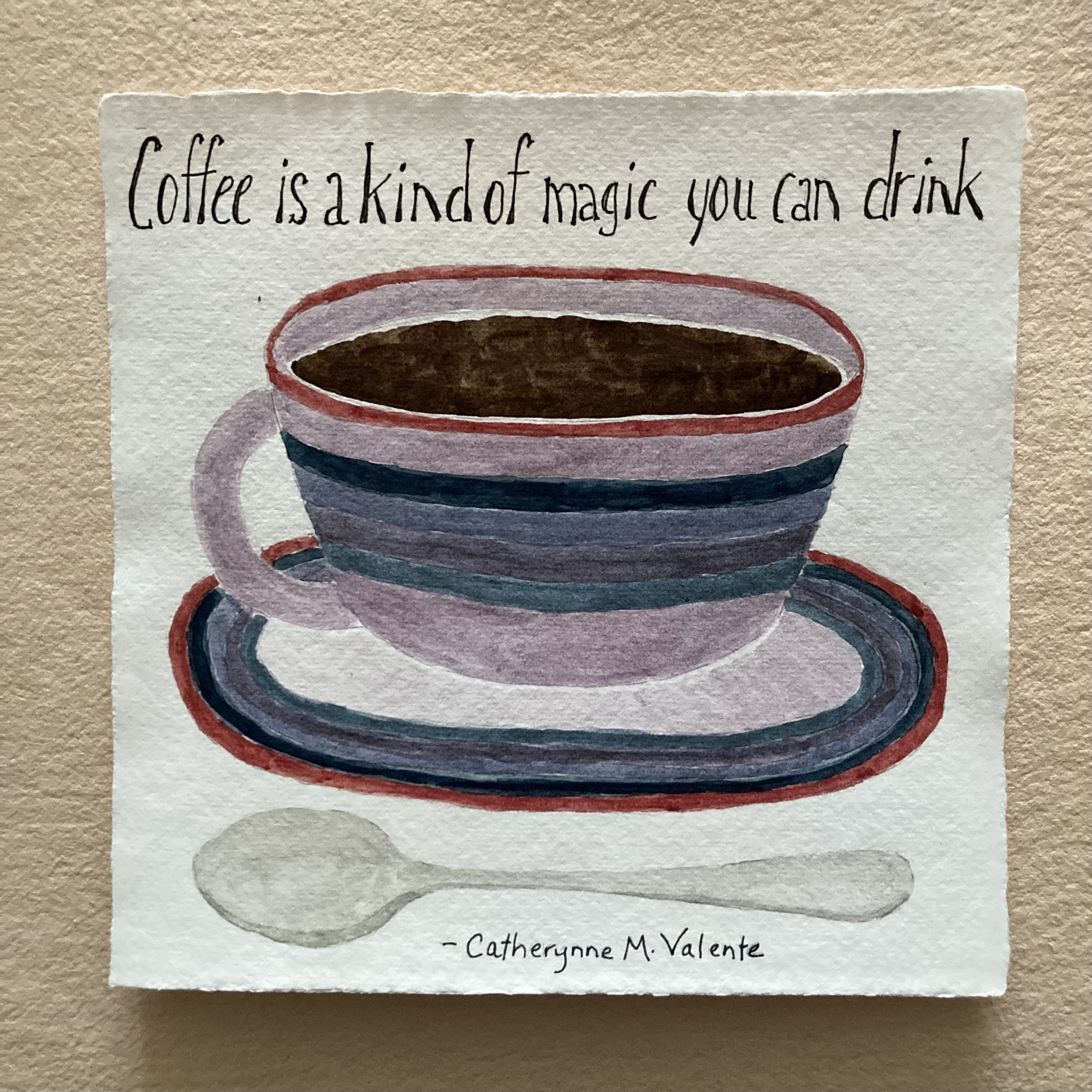
We are honoured to describe Janet B. as our in-house watercolourist. She is also the artist of our BZS postcards. She assesses the VL thusly: “Perfectly lovely for watercolour and gouache. It takes water easily, from dry-ish to a light wash before laying on colour. Overall, it’s beautiful stuff—beyond perfect for creating a special card when you want some space for a larger work.”

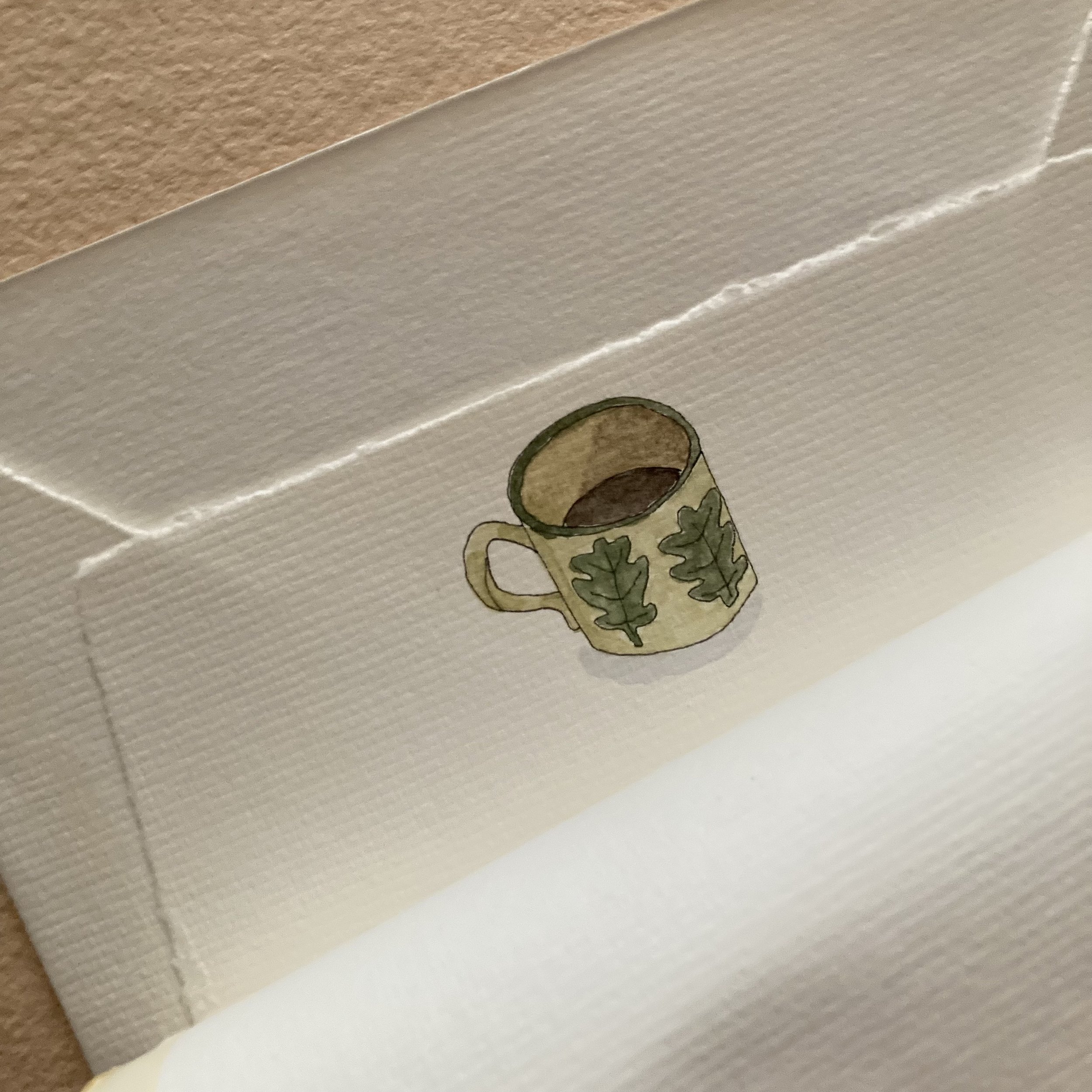
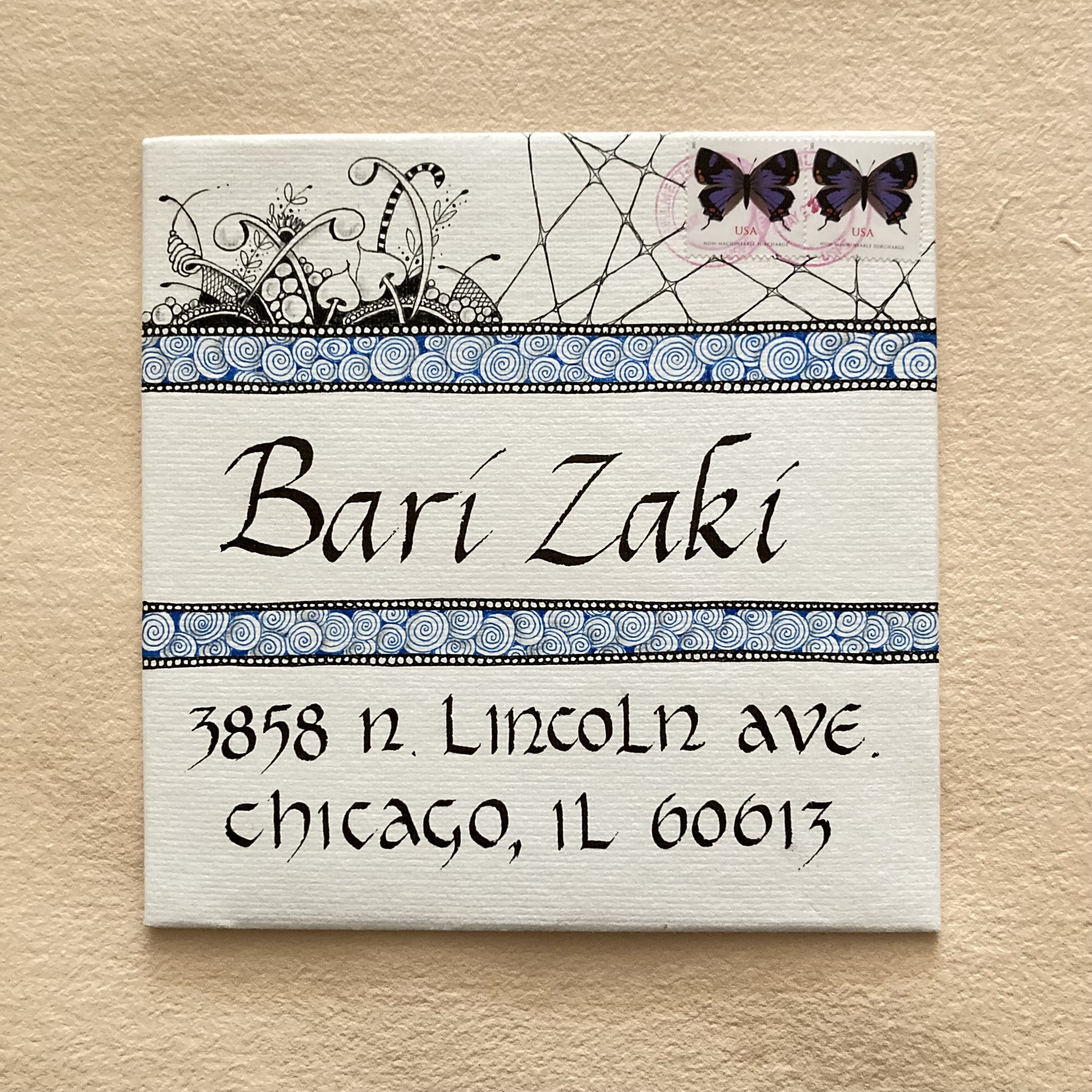
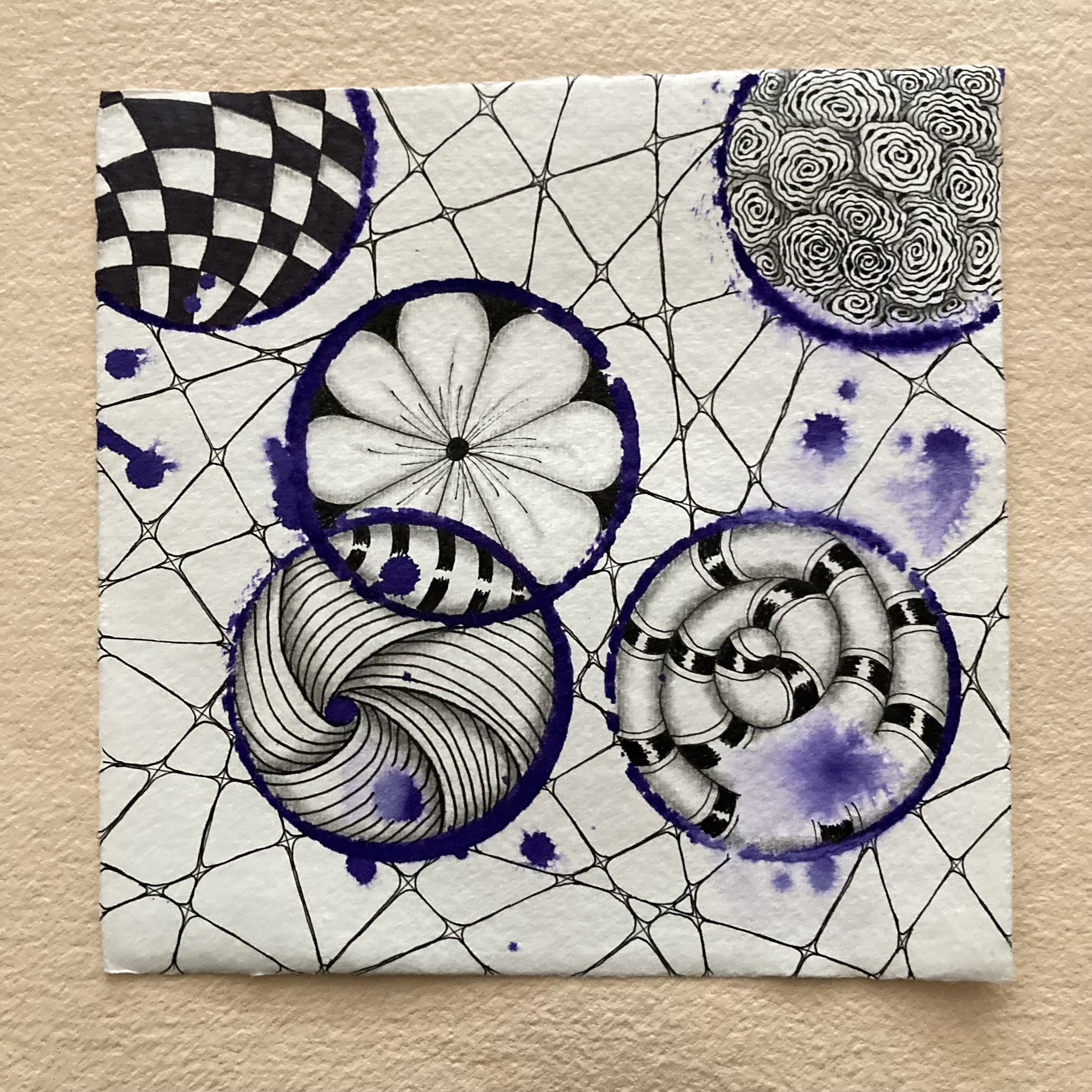
Susan M. is a long-time customer, student, and traveling bookbinding enthusiast. When she is in a multi-media mood, she describes her approach as Zentangle. For her VL piece: “The circles are made with the bottom of a coffee cup dipped in Winsor & Newton ink, the splatters from additional ink and water. Also used were Sakura Pigma Micron pens for the tangles and Pilot Parallel pens for the calligraphy.” She adds, I had absolutely no problems mailing this large envelope, and received only oohs and aahs from the postal staff—and from fellow patrons.”
Jane H. discovered BZS in 2020 in Uppercase magazine, via the “Snippets and slices and shards, oh my!” piece written by my postal muse. So, she is a relatively recent—and ardent— Bookful & BZS student, calligrapher and artist. Jane had this to say, lyrically, about the VL: “I LOVE this paper, Bari, and am so glad to have experienced it and intend to send many more big messages to gladden the hearts of my friends. There is something about writing on this beautiful, majestic paper that speaks for itself—it passes on the message of caring and sincerity from one to another. I felt as though I were sending a gift of myself and a big note of happiness.”

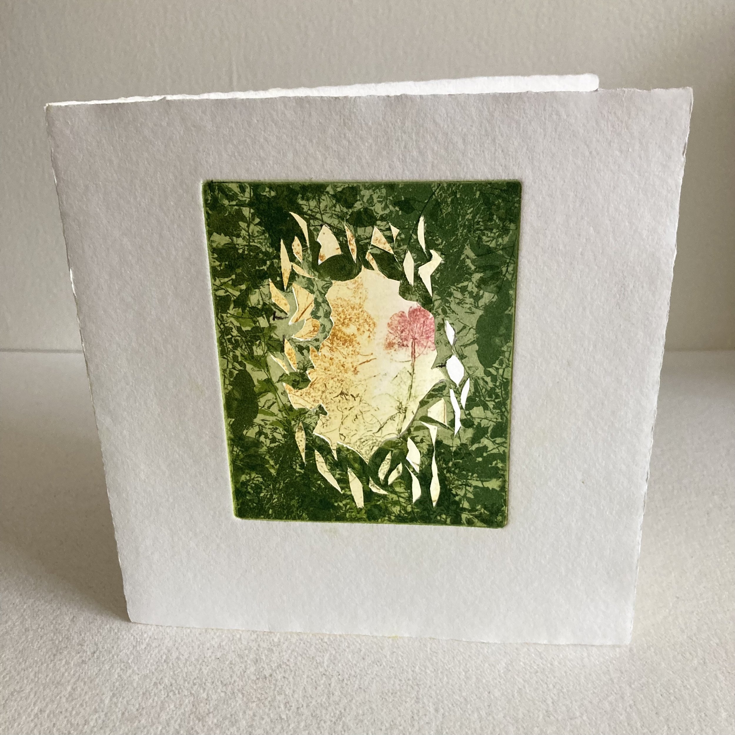
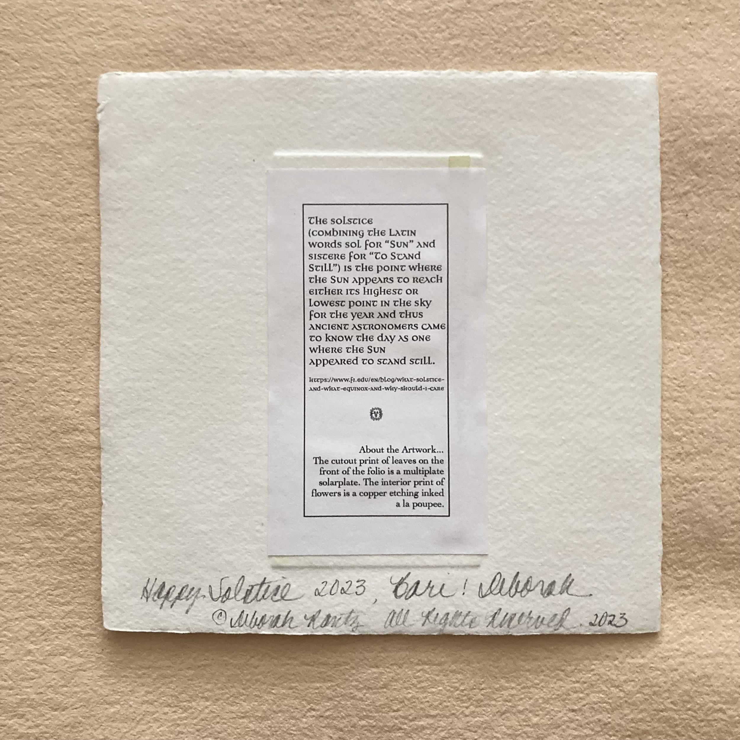
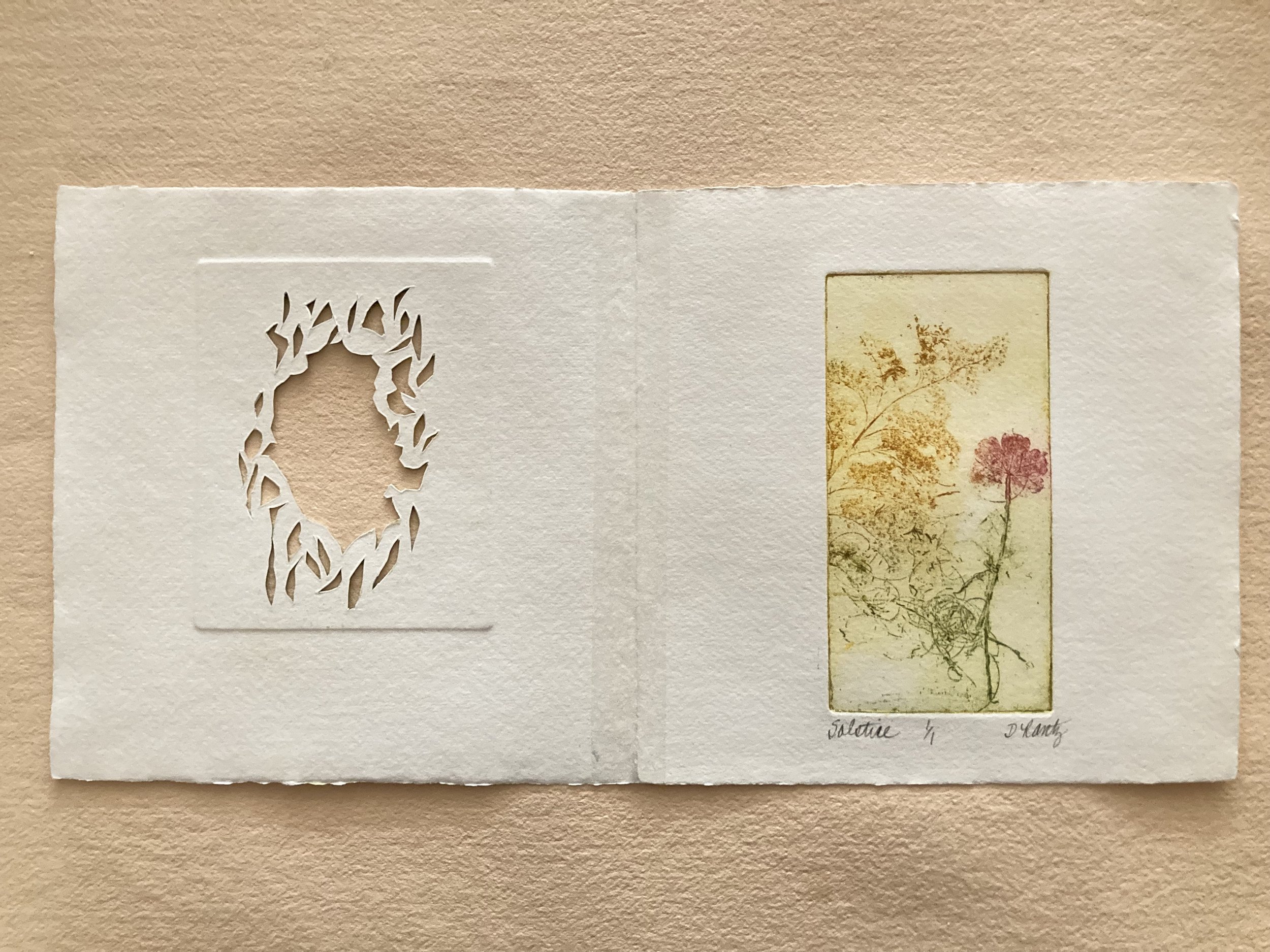
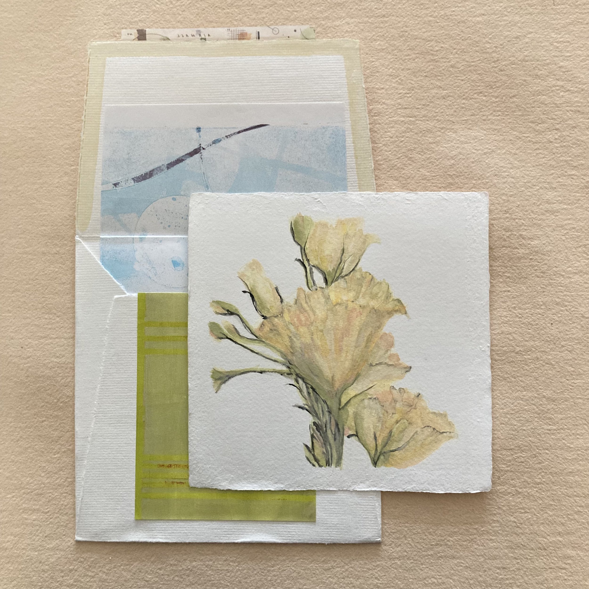
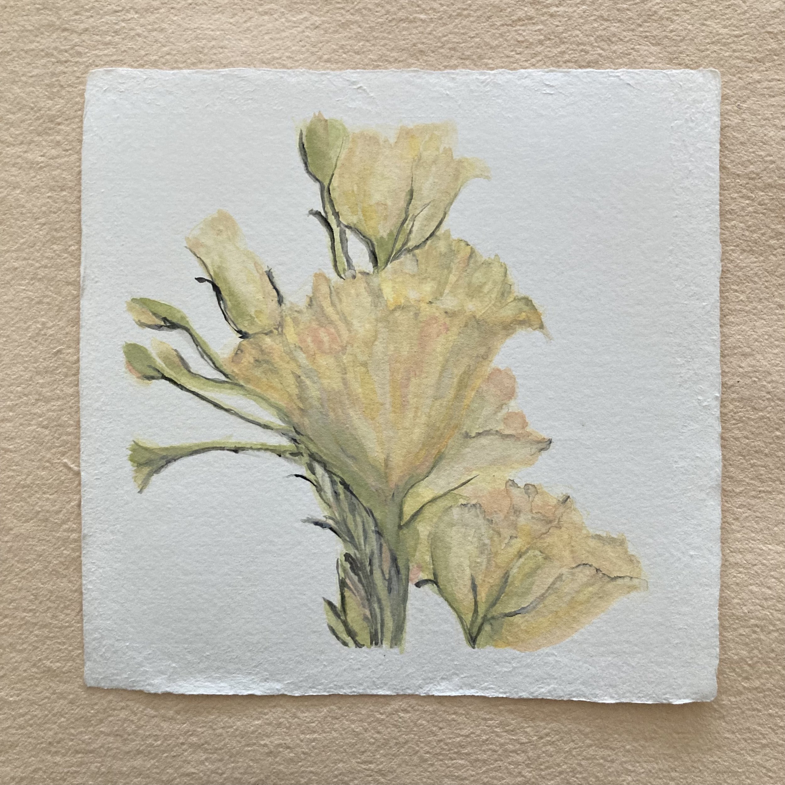
Deborah R. is an artist of many mediums and an avid correspondent. We featured her elaborately embellished BZS shop postcard in a recent blog post, April showers brought a bouquet of marvelous mail. She used two VL notecards to make two different prints. She elaborates, “Both plates required printing on damp paper, and the Velké Losiny stood up perfectly to a 15-minute soak and towel blotting. The paper also cuts like a dream.” And here is her rave about the raw paper: “it is scrumptious like a delicious pastry. I loved the texture, the color, the weight and the oversized square format makes it very special. Just holding this paper in my hands was a delight.”

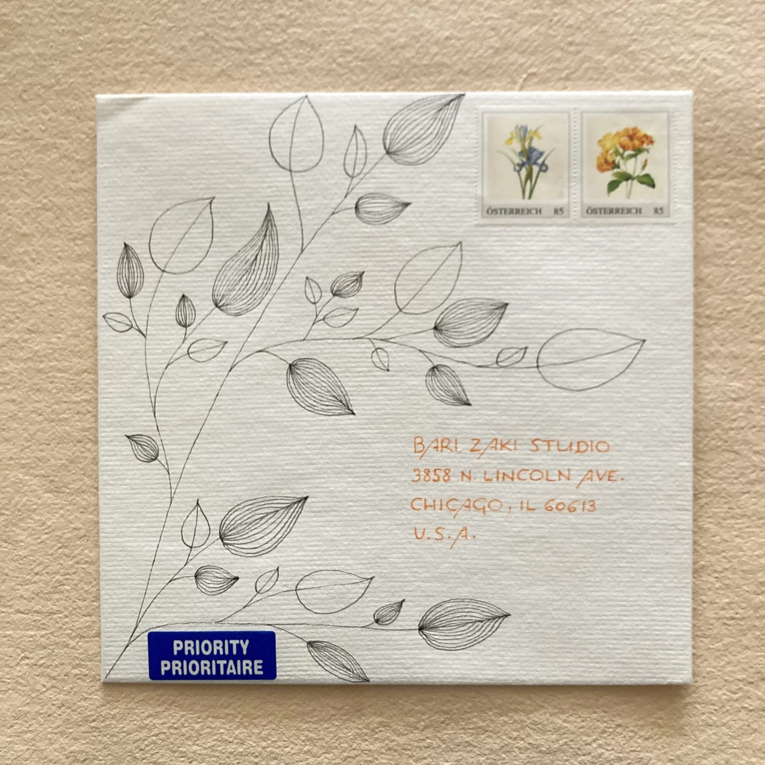
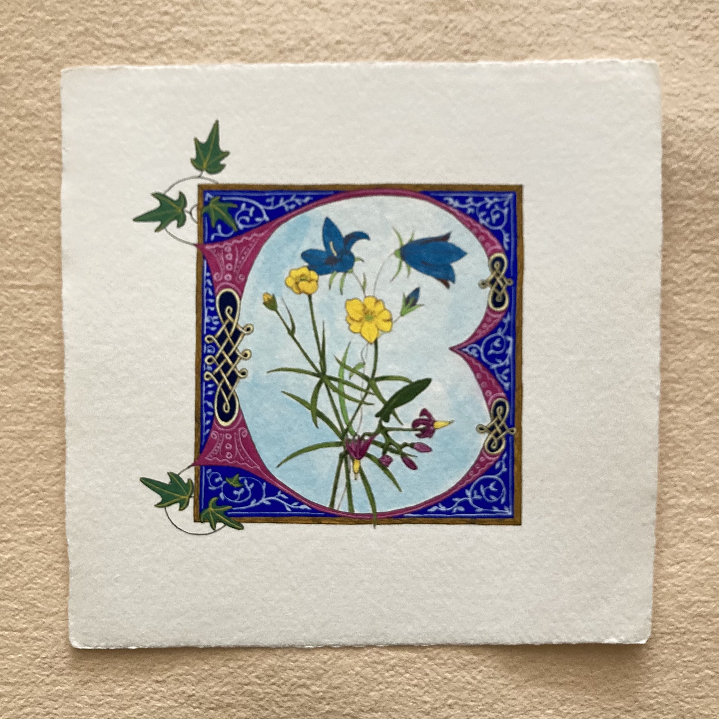
Gabriele is from Austria and a dedicated practitioner of illumination, calligraphy & bookbinding. She has attended many Bookful and BZS workshops, despite the seven-hour time difference. For her VL notecard, Gabriele used several mediums for her ‘B is for Bari’ (and beyond): from a steel-cut italic pen nib to fine gouache, and a stamp made from a hand cut eraser. She shared several technical details, and these are my favourites: “The black outline [of the B] is normally done with a pointed steel nib and waterproof ink, but I decided to take the safer road because ink tends to bleed, and I did not want to risk ruining the beautiful card with the first lines. For the lettering on the back, I decided to use gouache because it does not bleed and produces defined edges even on this slightly rough paper. The cards have a wonderful velvety feel and a bit of tooth but still take even minute details nicely. The paper is wonderful to work with but you have to be a bit careful because it is rather ‘soft’ and creases easily, particularly at the corners.” And here is the exciting tidbit: “The size lends itself to miniature painting and I already have this idea in my head of illuminating the entire alphabet on such cards.”

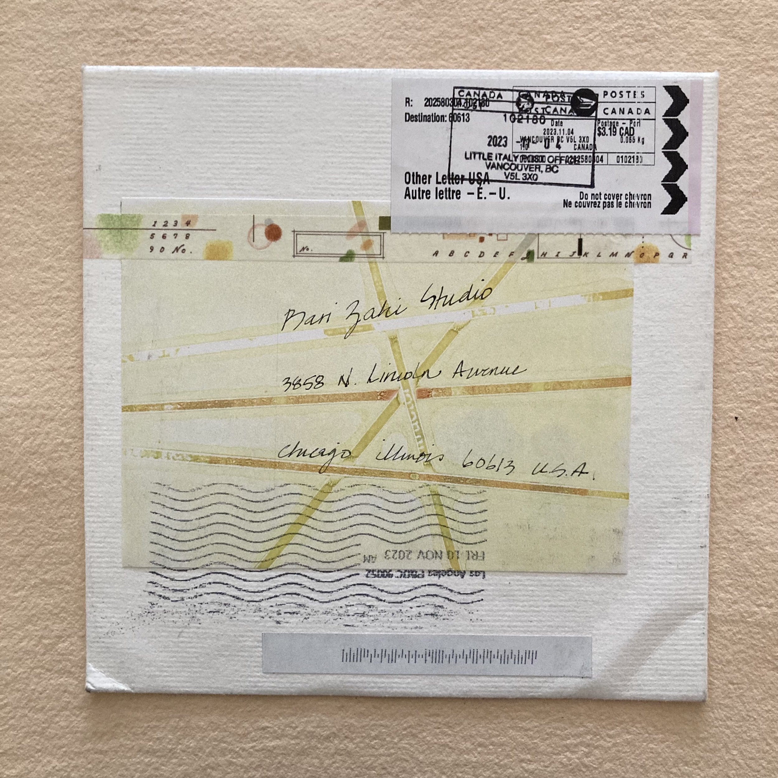
Sue L. lives in Vancouver, British Columbia. I almost know her Canadian postal code by heart, because she has taken every single Bookful and every bookbinding and boxmaking workshop in the BZS repertoire! She loves to draw & paint. The nosegay on her notecard is primarily watercolour, which she noted ‘worked well’. She also acknowledged being pleased with the outcome. She has lined the interior of the envelope with painted paper collage that she’d photocopied. Sue also added an additional layer of collage cascading from the inside flap onto the back of the envelope, then sealed it with a bit of washi-tape, which we love.
Sue’s envelope is a great reminder that the mailstream has a mind and a method of its own. My Mondrianesque address panel is topped with a hand-cancel atop a bilingual meter strip, of which my favourite bit is “Do not cover chevron.” (Why not? Pourquoi pas?) And at the bottom, what seemed at first blush to be a single upside-down gigantic machine cancellation…is in fact two cancellations, one from Vancouver and one, mysteriously, from Los Angeles. Scenic detour!
Voilà-là! I am incredibly grateful for everyone’s continued creativity, enthusiasm, kindred spiritedness, and support for BZS! This past year, I’ve been thrilled to see so many more out-of-town visitors and in-shop shoppers—some of whom I’d only met via Zoom, and some of whom I’d never seen (who follow me on IG and have longed to visit and now finally can and have!)
It is an honour to be the ‘first’ paper purveyor of my longtime favourite papers from VL thanks to Pavel (30 years and counting), and more recently James Winrow and Atelier Écluse. Our relationships to paper and my paper friendships with you bind us together literally & figuratively.
My thanxox to all the VL correspondents who executed their missions with such grace & creativity.
* * * * *
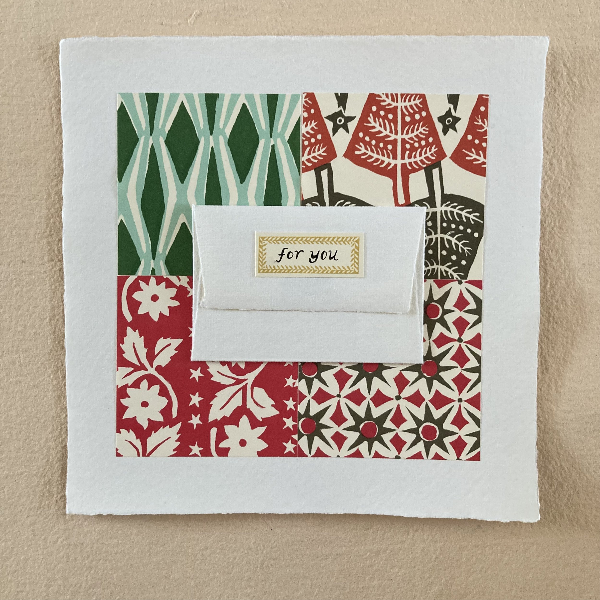
And last but not least, Ruby & I have collaborated on a simple yet charming way to embellish a VL card to frame a minimal message. We’ve trimmed a quartet of Cambridge Imprint origami sheets to 3 x 3 and affixed them to the card in a simple patchwork, then added a VL enclosure envelope, which we filled with vintage postage. Ruby then hand-lettered ‘for you’ on a petite CI label with a Winsor & Newton fineliner and attached it to the top flap. We’ve used a Christmas-y palette, but you could just as joyfully make a Hanukkah palette—or a valentinear colour scheme.


Thank You ... from the bottom of my paper loving heart!
~ Bari ~