La vie en Rivoli Rose

Dear Everyone ~

Christina Bevilacqua is a rhapsodic fan of Rivoli Rose. She had been patiently waiting for her new Rivoli Rose pad, her first assortment of Cambridge Imprint envelopes, and her refills on Cambridge Imprint labels. Here’s what she wrote after decanting:

“ All, needless to say, were thrilling to my eyes, starved, as the late, great André Leon Talley would say, for beauty! I love the shade of pink. It’s my favorite, just pale enough, but just rosy enough. Also, the paper is wonderful to write on. I always use a fountain pen, with pale grey ink, and pale pink and grey is probably my favorite color combination. I have such a huge collection of postcards that there is always the perfect image for whomever I'm writing to on whatever occasion. But I almost always enclose the postcard in an envelope, in part because the pleasure of receiving and opening an envelope is more engaging and literally enveloping (!) than just reading a postcard through all the postmarks, etc., and in part because that way I can write on the whole postcard, including the space allocated for the address and stamp. But often that is still not enough space, and that's where the beautiful petite Rivoli Rose sheets come in so handily! And, life has not been the same since my last bit of rosy Rivoli was torn from its tablet some weeks ago. ”

Christina & I first met in the record-breaking sweltering summer of 1995, the same summer that I met Alyson, my postal muse, and learned how to hand-fold envelopes. I couldn’t have known then just how momentous these two friendships would become, personally, creatively, epistolarily! Christina moved back to the East Coast in the late ’90s, and we have continued our friendship via real mail ever since. Though I have yet to visit her desk and divinely reclaimed dental cabinet in person, a photo is worth a thousand cards.

One of my most prized pieces of mail is Christina’s three-dimensional plastic fish, inside which she sang the praises of Cod. In the pre-pandemic days, whenever I taught The Art of the Handfolded Envelope workshop in studio, I always had Christina’s fish on display to inspire students.

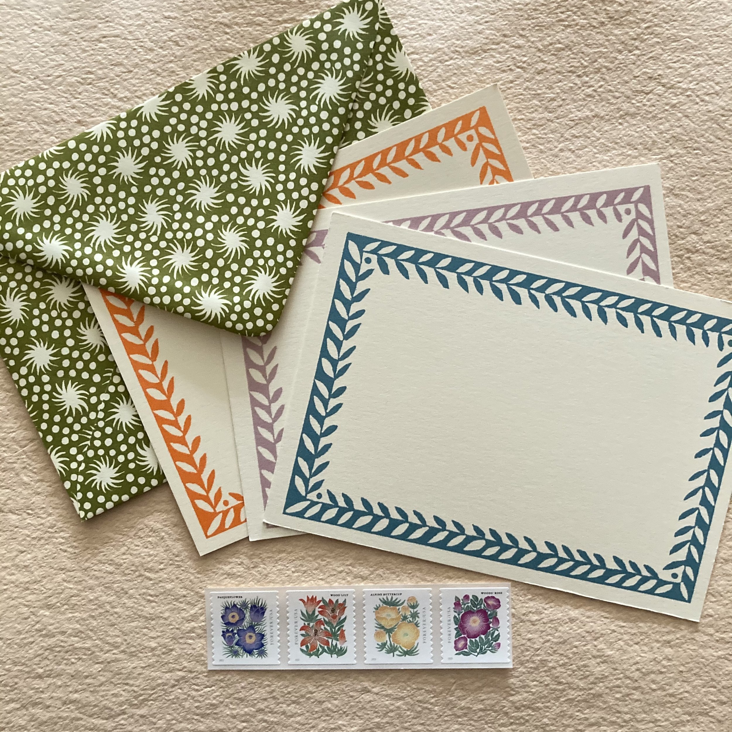
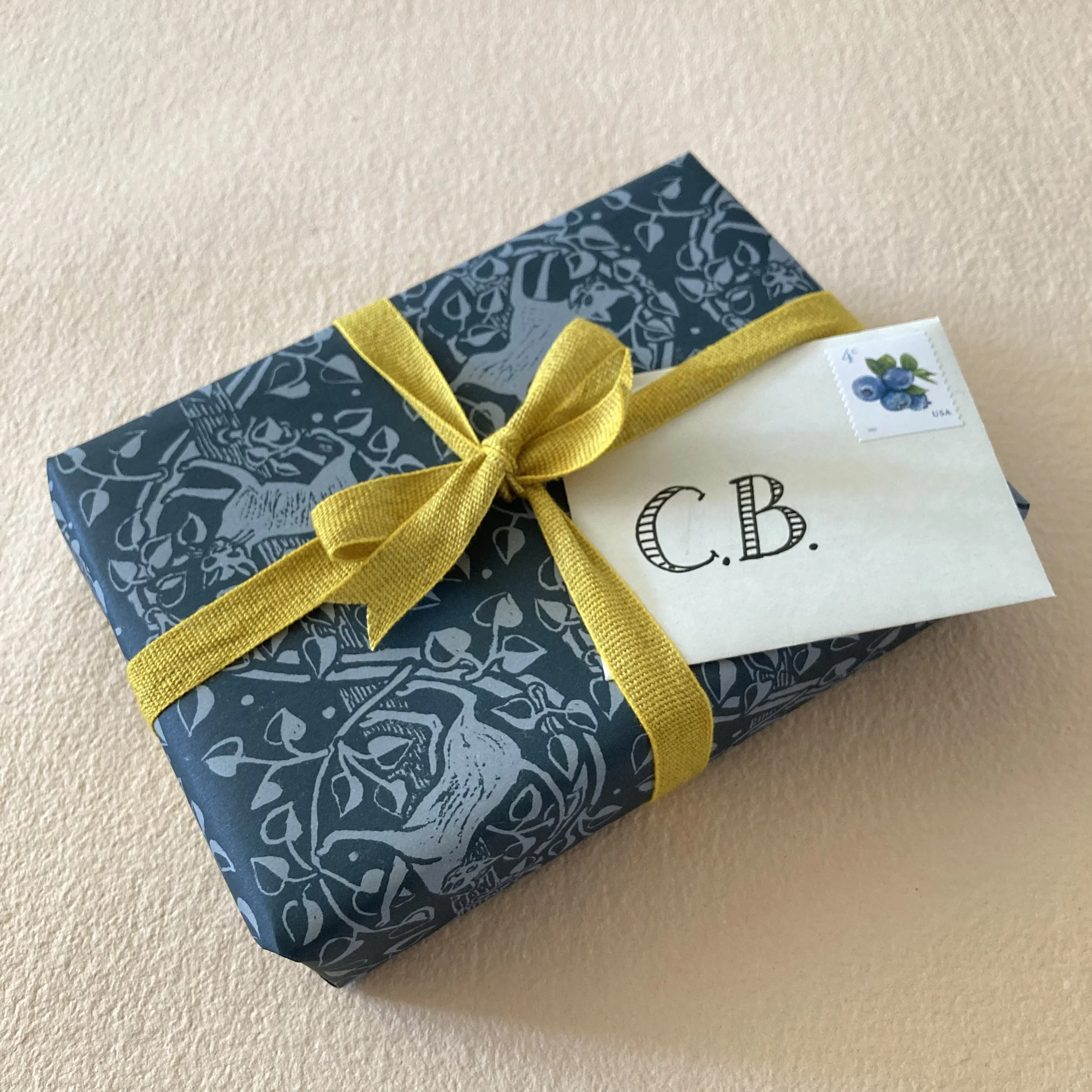
And here is my freshest catch from Christina, a Rivoli Rose envelope addressed in pale grey fountain pen. She has sealed the flap with a slightly vintage French love stamp perforated in the shape of a heart. This one was designed by Yves Saint Laurent.

Christina started 2022 with what she has named her evangelically philatelic aPOSTALic resolution, her correspondential vow to send one piece of mail a day, for the first 100 days of the year. As of last week, she wrote:

“ I am keeping track! I just have a little section on each page of my daily journal where I write down the names of those I've sent to. So I just tallied things up, and we are now on Day 85 of the year, and I have written and sent 79 cards/letters to date—not bad! Having made this tally, I am now determined to catch up to the date this weekend! ”

I asked Christina what had sparked her epistolary resolve, and she replied:

“ It occurred to me that if I made a vow to just write and send one card a day for a hundred days, and some of them could be extra-effortful, with handmade envelopes, etc., but mostly I needed to just commit to communicating again, giving myself the pleasure of beautiful paper and cards and stamps, etc etc etc again, and I also knew that writing cards would increase my chances of getting cards, and the prospect of snail mail was also a big motivator. ”

As to whether she was finding this epistolary exercise therapeutic, she enthused:

“ I have been cultivating the habit of looking forward to my note-writing as a break at the end of my workday, a way to transition from my desk feeling like a frantic, anxious workspace (I'm still mostly working from home) to my desk feeling like a place of creativity and communication and conviviality. The process slows down my racing brain, and brings me back to tactility and anticipation and also happy memories of whomever I'm writing to. ”

Meanwhile, back at the Rivoli Ranch: Rivoli Rose pads are robustly replenished. Ditto the Carta Pura pads the Schreibblock pads, and both sizes of the Coccoina glue sticks. And that’s not all! The medium awls from Carta Pura, with superb replaceable point, are also back in stock.

Verily epistolarily, Bari

P.S.
The binder’s dozen Spring Bundles of Stationery Joy sold out in a Cambridge minute. But I have assembled a handful of additional bundles for early birdies.

Spring into Stationery Joy

Dear Everyone ~

Bundles of Stationery Joy have been a perennial & seasonal favourite since the spring of 2020. In March that year, when the pandemic became official, I announced “Stationery for the Socially Stationary” and talked about corresponding as a way to connect and stay connected. I received so many heartwarming emails (and orders!) from customers that I posted an assortment of their comments, and proceeded to create Deluxe Bundles of Stationery Joy, wrapped in vintage Japanese tie-dyed papers from my reserves. By that summer, they became Booster Bundles—boostering my donation to the MoveOn #savethepostoffice campaign. I remain enveloped in deep gratitude for the incredible and positive responses I received, bringing my final donation to $700. Three beauteous bundles ensued: the Autumnal Bundle, the Scenic Wrap, and, this past holiday season heralded our Dressiest Bundle, cosseted in a Japanese semi-vintage Kikkō sheet beribboned in gold organza.

To celebrate the two-year anniversary of bundling, Cambridge Imprint Special Papers are this spring's choice (and choicest!). I’ve assembled a binder’s dozen bundles (a baby bounty), each one presented in a different blue or red wrapper, beribboned in whipped creamy organza.

Each bundle offers 30-some assorted pieces, including letterpress-printed notecards, hand-bordered sheets with matching envelopes, and at least three enclosure cards, including one handmade from Italy and one from Smythson’s in the U.K. The freshest additions are: a trio of Cambridge Imprint postcards & a quartet of the brand new Mountain Flora postage stamps, featuring the lovely artwork of Lili Arnold. As it happens, Audrey Kuhn (our guest encloser here, the eldest niece of my postal muse) was already enamored of Lili’s artwork. She has three of the artist’s prints in her office: a pair of black-and-white prints above her desk and a vivid succulent nearby. The postage stamps & Cambridge Imprint postcards are tucked into a Cambridge Imprint envelope perfect for posting a postcard.

* * * * *
Continuing the Cambridgerton Caper, we’ve also restocked the red and blue boxed assortments of Special Small Papers: two dozen 12 x 16 sheets, two each of twelve different patterns, for your papery pursuits.

It’s Daylight Serizawa Time!

Dear Everyone ~

I’ve been making books covered with Serizawa & Nishijimi calendar pages since the winter of 2018. For my first “test book,” I used a vintage Serizawa page from March 1962, that was gifted to me by Alyson, my postal muse. As it happened, 1962 “matched” 2018 in terms of days of the week and dates of the month.

I have now made umpteen books with Serizawa and Nishijimi covers, having acquired a veritable trove of 1962 Serizawa calendars and a couple of years of Nishijimis from another dear friend. You can read about my delirium over my Season of Serizawas here. I have since made books using the Buttonhole-stitch, Long-stitch, Soft-cover Coptic stitch, and most recently the Butterfly-stitch.

And now, I am delighted to offer my first DIY (design it yourself) collection of Serizawa & Nishijimi books! I am presenting a binder’s dozen (13!) calendar pages from which to choose for your book cover. And thanks to some fresh functionality on my website, you can then choose from two different binding styles: a Buttonhole-stitch or a Long-stitch. As you will see, the double drop-down menu is a new cause for double happiness. And once you’ve placed your order, I will e you promptly with a photo of your thread colour options. There is always more than one colour that suits, and you can consider whether to complement, contrast, or coordinate.

Last year, I received inquiries from several customers about calendar pages for a specific month, or theme, or colour…and their requests are my inspiration for this limited-edition collection.

Some months ago, Michelle in Houston responded enthusiastically to a book I had posted on Instagram. That book was already spoken for, so I offered to email her photos of a few other calendar pages. While we were e-communing, she mentioned that she would like toned paper pages, so I immediately mailed her some paper swatches. She selected three colours, as you view here.

In the process, Michelle sent me a charming email:

“ I remember being in a cathedral and wishing I could get a picture of the ceiling, but it wasn’t working out. I thought that drawing it would have been perfect, even though my drawings likely would not have been as beautiful as photos. Haha! I wanted to have a landscape oriented sketchbook so I could draw panoramas across two adjacent pages. Or, I could just use one page per illustration and have a more standard proportion when I want. When I start traveling again, I will use my sketchbook as a journal, with a written log, and as a scrapbook for small keepsakes, as well as my en plein air drawings & paintings. ”

Meanwhile, back in the Midwest, Pamela in Richmond (Indiana) had her eye on a Nishijimi calendar book online but it was scooped up/out from under her! This passing disappointment prompted her recent commission for two books as birthday gifts-to-self, one Buttonhole-stitch & one Long-stitch, using a March Serizawa & a March Nishijimi. She has chosen soft white Hahnemuhle Bugra paper for her pages in both books.

Ordering her pair of books set Pamela to reminiscing:

“ When my granddaughter was very young, I would walk her around the neighborhood. I took a notepad, and we would draw flowers, squirrels, and birds, writing their names next to the drawings. If only I had had a book created by you to save those drawings.”

“ The first book I purchased from you is covered in ‘Japanese mountains’ Katazome. When I received it—as soon as I had removed the bit of washi, the twine, and the mysteriously crisp white tissue— I immediately looked to see if you had signed the book, and you had. I will continue to fill it with drawings and ideas for other artwork & projects. It is now My Idea Book. ”

For years, I had kept the pages from Serizawa calendar portfolios I’d purchased at Aiko’s, and I used them mostly for wrapping or making envelopes. I even wrapped a handful of my first edition of Bundles of Stationery Joy in Serizawas. However, once I began covering books with them, I couldn’t imagine doing anything else with them! I love making books and I love these calendar pages, so this is truly my double happiness stitch-uation!

Spring Serizawa & Nishijimi collection

Springing forward, Bari

A Cambridge notebook for every need & nicety

Dear Everyone ~

Last week I received a call from Kristen Hermanny, who has the delightful distinction of being BZS’s Most Accomplished Shopper by Colour. Kristen is an avid correspondent, and she has been a customer since I opened the shop in 2015. In the spring of 2020 (at the beginning of shelter season), she had called to ask if I could assemble and ship a parcel to her “in the yellow family.” Well, what a sunny, golden opportunity! I surveyed the shop to see what I might assemble, and when I had gathered a nice assortment, I photographed the ensemble so she could choose what she liked. You can see and read here in more detail.

Kristen visited the shop twice last year by appointment. First, she focused on fuschia and other pinks, and then later in the year she put together an autumnal palette. I love participating in her chromatic delirium!

In January this year, when I was catching up with my correspondence (which you can revisit here), I sent Kristen a piece of mail that included two first-day covers from Switzerland. The stamps are postal related and two of them are in the teal & light blue family. Kristen said that those stamps had inspired her next colour collection! I promptly put together the tableau you see at top and sent a single, sumptuous photo. She selected every single item except the pencils (which she already has in hue-ge abundance). I’ve shipped everything off, except for the Cambridge wrapping paper “backdrop”, which I'll be mailing in its own tube.

Speaking of Cambridge: Our shipment of Cambridge Imprint notebooks had arrived several days before Kristen’s “remote spree,” and I was decanting, I discovered several—in three different styles—that fit Kristen's aqua-teal-leaf palette.

* * * * *

Keep your Cambritches on! We have five new Cambridge Imprint notebook styles in a lovely array of patterns & sizes. The most petite are 3⅝ x 5½, and they come in three different trios. Each trio contains one notebook with graph grid pages, one with ruled, and one plain.

The petite pocket notebook, only slightly larger than the most petite, measures 4¼ x 5⅞ x ¼. It has 64 smooth ivory pages, and the book lays flat.

The hardcover books (4¾ x 7¼ x ⅜) come with a medium Cambridge Imprint label affixed on the front, a beautifully bookish touch. The 80 ivory pages are silky smooth.

The landscape sketchbooks (8¼ x 5⅛ x ¼) also have smooth ivory pages that have been thoughtfully “perfed” at the spine edge for tidy removal.

The scrapbook, the largest in the selection, measures 9½ x 12, with deep charcoal pages, a lovely backdrop for photos, swatches, collages, or white or metallic ink.

You’ll find details and photos of all the notebooks in creative action in their respective shop listings: A Cambridge quilt wilt keep your desk toasty!

NEW Cambridge Imprint notebooks

Writing write along, Bari

Sheet delight: Cambridge Imprint’s homage to Peggy Angus

Dear Everyone ~

The newest (and possibly springiest) addition to the BZS repertoire of Cambridge Imprint papers has arrived! Peggy Angus (1904–1993) was an innovative & influential British industrial designer and art teacher. She didn’t live in Cambridge, but certainly left her imprint, if you catch our designerly drift. Cambridge Imprint has issued a big boxed set of Angus’s patterns, a set of 24 sheets, three each of eight designs. They probably had names in the day, but we will simply say there’s a lovely echo of Marimekko. (Actually, Angus’s mid-century mod mood predated much of Marimekko, but “echo of Marimekko” was too good to pass up.)

It will come as no surprise that one of the first things I wanted to make with these papers was a book! Well, not just one book. I’ve made eight books, one covered in each pattern. Five Buttonhole-stitch and three Long-stitch, ranging in size from 5½ x 8½ x 1⅛ (at far left) to 3¾ x 5½ x 1⅛ (at far right). I find scoring & folding with Cambridge Imprint papers incredibly pleasing. It’s a gratifying combination of the cheerful & colourful patterns, plus the silky smooth feel of the papers in your hand.

The papers make lovely gift wrap and great envelopes. You can fold an envelope pattern-side out, or pattern-side in…and even line your hand-folded envelope with a contrasting pattern. The sheets are large enough (12 x 16 inches) to wrap a smallish gift box and make a matching enclosure-size envelope (2½ x 3¾). My envelope shown here is folded with the pattern facing in, so it’s a self-lined envelope!

Re: Refills for your Cambridge Imprint origami sets! We now have them in stock. Thirty-six assorted 6 x 6 sheets. We emphasize assorted. These are not duplicates of each set’s original patterns & colourways, but rather a mix-and-match of patterns past, some of which we hadn’t seen before. A set of these unboxed sheets will nestle perfectly in your Cloud of Butterflies, Garland of Stars, or Garland of Bobbles/Baubles box. In BZS style, I’ve enveloped the sheets in a glassine sleeve, fastened with a tiny paper-covered butterfly clip.

More about MORE Art of the Hand-folded Envelope

Dear Everyone ~

Upsy-datesy: We’ve just printed up a fresh batch of MORE Art of the Hand-folded Envelope handouts, because a quartet of customers ordered MORE kits earlier this month. We’ve updated the copyright to 2022…and refreshed the Fresh Fruits & Bunnies Stamp Sampler photo (and the actual Sampler) to include the luscious 4¢ blueberries (strip of 7) issued in January. So, we decided to send everyone who ordered a MORE kit last year, a hand-folded envelope containing a little strip of blueberries and a charmola slip encouraging an exchange of correspondence.

The Superfluous Parts Department has insisted on including the tiniest Japanese paperclip we’ve ever seen, so that you can attach your slip to the front page of your 2021 handout.

Of course, if you order MORE going forward, you will indeed receive the charmola slip, pre-clipped to your front page!

As for the hand-folded envelopes for this mailing, they are a delightfully diverse lot, as you can see. Stamps have been selected to complement each envelope, thematically or chromatically. I’ve used a large Cambridge Imprint label for the address and a small one for my return address. Why does a well-dressed envelope make us so happy?

Note to self: The l-o-n-g tale of paper lacings

Dear Everyone ~

Bookful of Illustrated Notes to Self will debut in a little under two weeks, on Saturday, February 26. Kit assembly has been hilarious, because it required two “seatings,” like a fine restaurant. The covers of the book structure that students will make are 12 x 28 inches, and I ran out of acreage on my huge table. For shipping purposes, I am folding the Stonehenge and the Saint-Armand cover sheet in half, then wrapping them in white tissue (tied with French embroidery thread, pourquoi pas?) and sandwiching them between two pieces of cardboard before wrapping them, yet again, in sturdy kraft paper….Even if you are not joining us for my sixth Bookful collaboration with artist, author, and dear friend Cat Bennett, I thought you might enjoy the voluminousness of the spread, so to speak.

Note to self: For each Bookful workshop, fashion a palette guide for keeping track of all the paper colour-thread-ribbon combinations. I do this so I can have a visual archive keepsake of the materials we’ve used in each workshop. For this one, I’ve selected five cover/lacing palettes: Terra cotta with prune, Mineral green with terra cotta, Prune with charcoal, Orange with mineral green & Charcoal with orange.

I’m particularly excited about this four-Saturday workshop via Zoom, partly because of the book structure and partly because I love the notion of “Notes to self.” Cat and I anticipate that everyone’s books will be so personal, as we illustrate our thoughts, musings, and mantras.

Five overseas parcels—one to Austria and four to Canada—are well en route to their destinations, thanks to the USPS. The parcel I sent to Gabriele in Austria (Bookful four-timer and enthusiastic participant in several other private & group zoom workshops, regardless of the time of day!) weighed over five pounds! Piggybacking onto her Notes to Self kit were Gabriele’s kit for a private workshop (Mighty-fine-nine-signtaure-spine) and an additional kit from the Desk Beautification workshop that she attended last October. She has shared with me what she plans to do with the two additional kits, and when she sends photos, I’ll be able to share them with you.

I’m delighted to announce that Rachel—who was one of three youngest students in my Introduction to Bookbinding workshop last March—will be joining us. Her experience inspired her to become one of our youngest Bookful students to date.

As always: Cat & I both look forward to sharing our love of drawing, painting, and bookbinding with Everyone in this four-part (12 hours-ful) workshop!

Bookful of Illustrated Notes to Self

Wrapping & packing, Bari

Czech out these enclosure sets!

Dear Everyone ~

The Velke Losiny paper mill in the Czech Republic has been making handmade paper since the 16th century. I discovered them a little over 30-ish years ago when I first began bookbinding, and I’ve been smitten ever since with every aspect of their quality. When I first opened the shop, I stocked their DL envelopes (the lovely European equivalent of a #10, measuring 4⅜ x 8¾, with a perfectly pleasing proportion of 1:2). The envelope had a deckle edge on all three sides of its flap. Swoonarama. And the accompanying thick flat card had a dreamy deckle on all four sides. But I am not enveloped with bittersweet nostalgia, because…

Velke Losiny’s petite enclosure set—a flat card and elegant envelope—is doubly swoonworthy. The card has a distinctive texture and measures 2 x 3½ with deckle edges on all four sides. The companion envelope is made from a single handmade sheet and thus sports a deckle edge on all four sides, including the throat (which is lovely enough to be a décolletage). It measures 2⅝ x 3⅞ and is also textured. The set is basically beguiling, taking all manner of writing implements smoothly & splendidly.

For this post, we have a guest encloser, photographer and hand-letterer Audrey Kuhn, the eldest niece of my postal muse. Audrey and Alyson not only share a love of paper, but also have the same initials (ARK). They have the same favorite letter (A) and similar sensibilities regarding wordplay. They have taken to texting each other their Wordle results every morning, with asides. Alyson acknowledges that Audrey’s “default striped lettering” (which she developed while working as a sign artist at Trader Joe’s) awes her. Audrey has graciously added assorted awesome annotations & addresses on these Velke Losiny “cuties.”

As you see, these enclosure cards and envelopes are multi-charmed. You can use an individual card for tying on a gift or a bag, or propping on a pillow. The envelopes are like a sweater set with their matching enclosure card, but they are also ideal for presenting one (or two) tiny Cambridge Imprint origami hearts (folded from a 3 x 3 piece, one-quarter of a 6 x 6 sheet).

We have made petite packets, tied with French embroidery thread: a set of five cards & matching envelopes, or a set of five cards, or a set of five envelopes.

Velke Losiny enclosure sets

Ensconced, Bari

PasteSF’s cards put the Ah! in collage

Dear Everyone ~

Denise Fiedler is a collage artist in San Francisco. Alyson Kuhn (a.k.a. My Postal Muse) recently visited Denise at her new studio, and promptly raved to me about her “Fiedler trip.” Denise and I have now bonded over our mutual love of collage and scraps. I am thrilled to debut her whimsical images on notecards.

I’ve selected a dozen delightful designs: a friendly menagerie (including a pooch sporting a French maritime-striped tee) and some luscious fruits & flora. The A2 notecards are available singly, with a true white envelope. In happy fact, you could make one lucky correspondent deliriously scrap-happy by sending a different collage card every month. Alyson has spontaneously named this the Fiedler of the Month Club, and it’s a delicious deal.

Denise’s appreciation of scraps and their creative possibilities inspired me to customize a parcel of Extremely Exquisite Scraps for her, for an upcoming project.

And I’m already hoping to entice her to offer this beribonned box (below) as a card. It’s one of three collages Alyson commissioned for the backs of her business cards, to illustrate Writing, Wrapping & Rhetoric, her professional predilections.

* * * * *
PasteSF Collage Cards

Scrap happy, Bari

Note to self: Bookful Nº 6 begins soon!

Dear Everyone ~

Bookful of Illustrated Notes to Self is my sixth Bookful collaboration
with artist, author & dear friend Cat Bennett. Our four-Saturday workshop via Zoom will debut Saturday, February 26, which is semi-soonish!

The inspiration for this Bookful series came from Cat’s observation that she says (usually silently, but not always) “Note to self”, when she sees something she wants to remember, both for how it looks, and also for how it makes her feel. For example: Look for the good in all things! or Find beauty everywhere! We all have these simple insights that are well worth recording, by illustrating them in a beautiful bound book (rather than snapping a series of phone photos).

Alyson Kuhn, a.k.a. my postal muse, has added her 2¢ worth to this discussion. She says, “An illustrated note to self is imbued with a sensory overlay, because your image is created by hand (yours!), and the touch memory deepens the visual memory of whatever you put on the page.”

The book structure you will make is a triple-signature booklet with woven paper lacings. The landscape format (11½ wide x 8½ tall) provides a luxurious expanse (8½ x 22) for your “notes to self” in the form of paintings, collages, and musings.

Cat will lead us in exercises to create bold images with brief captions, aspirations & inspirations. You’ll use drawing, painting, and painted paper collage to make your images. And, as you’ll see, your images don’t need to be literal or figurative. You’ll want to have colored pencils, crayons, black marker pens, watercolor paint, scissors and a glue stick. And your notes to self! It’s not unlikely that new notes will occur to you as you work.

The palette options are a celebration of my fresh shipment from the masterful papermakers at Saint-Armand Papeterie. I’ve paired colours to create five earthy combinations: Terra cotta with prune lacings, Mineral green with terra cotta lacings, Prune with charcoal lacings, Orange with mineral green lacings & Charcoal with orange lacings. Each kit includes two different colours of waxed-linen thead, so that you can enjoy the humming and hawing of choosing which to use. And if you’d like to order an extra kit or two, please feel free to call or e me.

As always, Cat & I like to emphasize, especially if you are a Bookful newcomer, that absolutely no drawing or bookbinding experience is necessary. The pace and camaraderie are positively soothing yet energizing. Plus you will have the videos to watch and rewatch. We look forward to rezooming our creative pursuits with you soon!

Bookful of Illustrated Notes to Self

Chattily, Bari