The (Summer) Fruits of our Labor (Day)

Dear Everyone ~

 
IMG_7527.jpeg
 

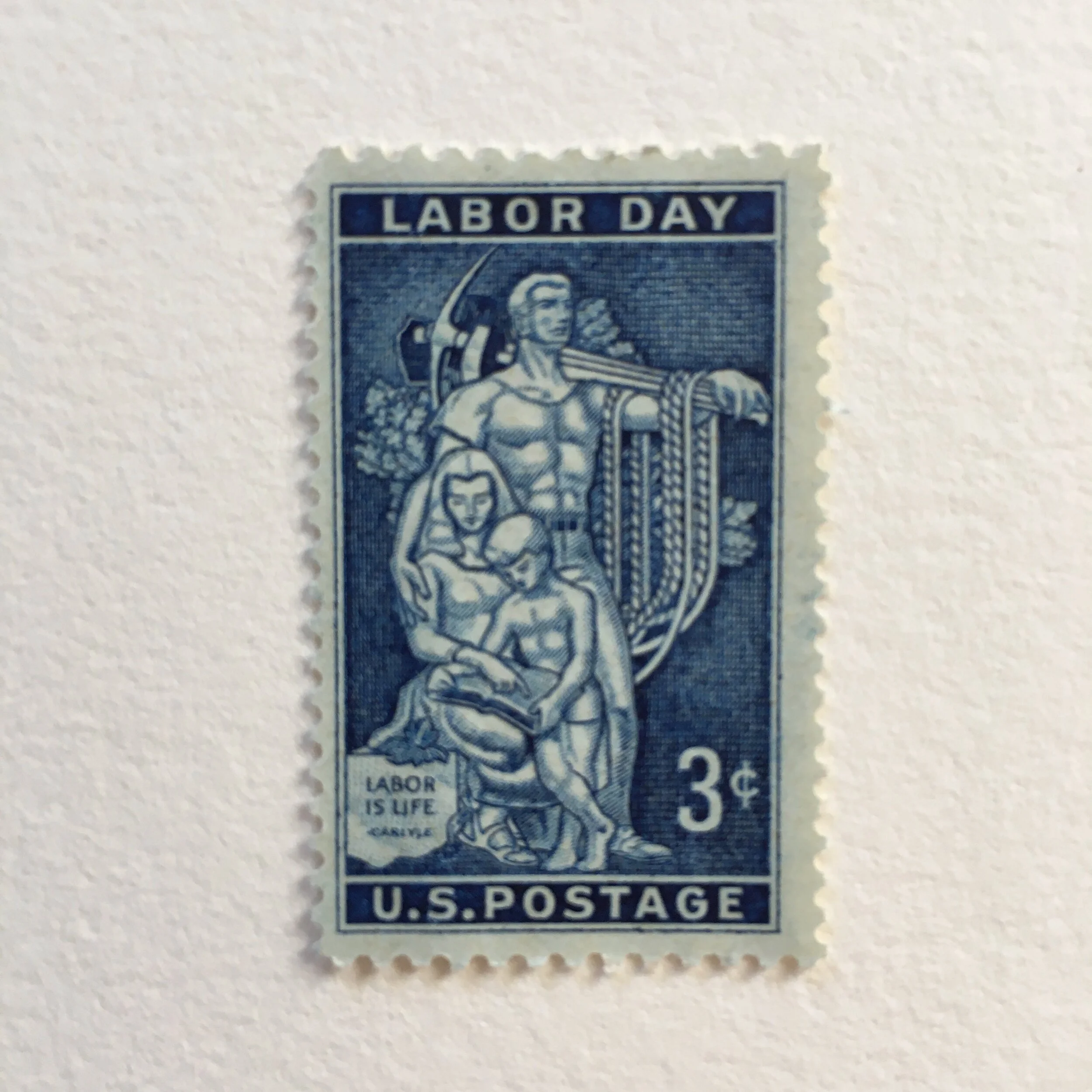
In honor of Labor Day, I thought I’d share with everyone several tidbits of background about the Labor Day postage stamp issued in 1956. I’ve always been fond of this stamp, engraved in extraordinary detail in a deep, rich blue.

The design is taken from the mosaic mural, titled “Labor is Life,” at the AFL-CIO headquarters in Washington, D.C. (In case you are curious, that stands for American Federation of Labor and Congress of Industrial Organizations, and, yes, the organization still exists!)

The mural was designed by artist Lumen Winter, and the stamp was designed by Victor S. McCloskey, Jr. McCloskey had studied at Corcoran Gallery School of Art, just a few blocks north of the Bureau of Engraving and Printing (BEP). After completing an internship at the BEP in 1926, McCloskey joined its staff as an engraver in 1930 and then officially became a designer in 1934. He spent his entire career at the BEP, retiring in 1965.

As it happened, the First Day of Issue ceremony, on September 3, 1956, was, for the first time ever, preceded by a dedication ceremony, both of which took place in the White House Rose Garden. Doesn’t that sound civilized and lovely?

 
IMG_7526.jpeg
 

The horticulture stamp, issued in 1958, has nothing whatsoever to do with the Labor Day stamp, but I have always thought of them as somewhat of a sculpted pair, she being very elegant and he being very muscular. A stampy friend of mine has always referred to her as the Goddess of Gardening. The horticulture stamp was issued to celebrate the centennial of the birth of Liberty Hyde Bailey (1858–1954), the horticulturalist who founded the College of Agriculture at Cornell University and went on to co-found the American Society for Horticultural Science.

The stamp was designed by Denver Laredo Gillen (1914–1975), an American artist and illustrator. (Between Liberty Hyde and Denver Laredo, I can’t decide whose name is a higher tribute to Americana.)

 
IMG_6018.jpeg
 

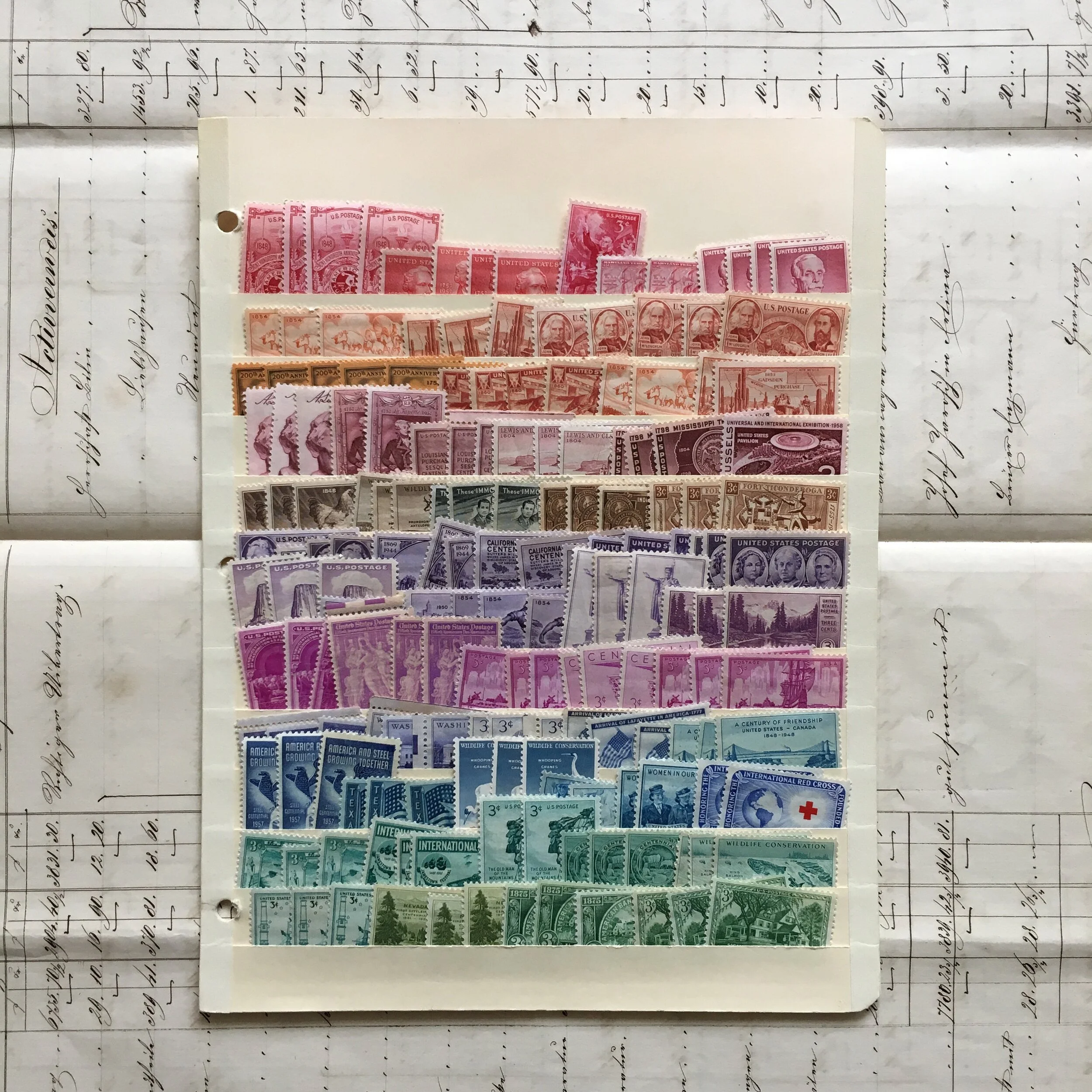
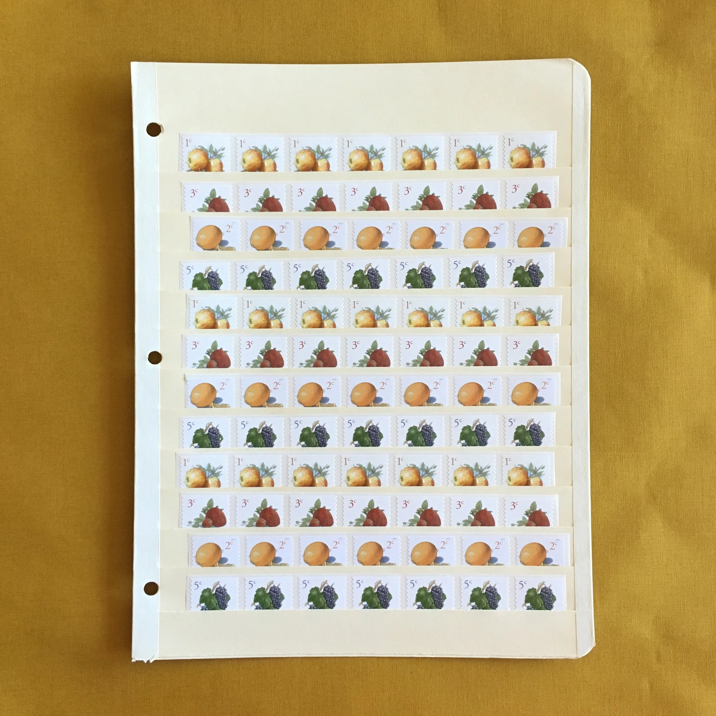
Labor Day stamps and horticulture stamps are always included in the Extravaganza of 3¢ Vintage Postage. And, even though summer is nearly over, Summer Fruit Samplers are still in season. Don’t get in a jam by forgetting to stock up for the winter.

 
IMG_6310.jpeg
 

Summer Fruit Sampler

Extravaganza of 3¢ Vintage Postage

Wishing you a glorious unlaborious day, Bari

The zen of making a hand-bound book

Dear Everyone ~

IMG_7482 2.jpeg

I have talked about my love of bookbinding many times over the years. I’ve also shared with everyone that I am enamored by simple stacks of paper. One of my favourite “bonuses” of teaching bookbinding is how many students spontaneously—and delightedly—discover that they find folding sheets of paper into signatures...to be (a) meditative, (b) calming, (c) soothing, (d) all of the above!

 
IMG_7491.jpeg
 

Taking a workshop requires attention and precision, but unless you’ve experienced it, you wouldn’t necessarily think that part of the process is so repetitive and relaxing. Students actually say, with some surprise, that they could fold signatures all day! I know that I am happy folding signatures until the cows come home. I truly love that so many students experience this same mesmerizing effect.

 
IMG_7461.jpeg
 

The shipping clerk’s knife is by far one of the most popular bookbinding tools in my online shop. My own shipping clerk’s knife has been languishing for lack of exercise almost since the beginning of the Shelter Season. I am thoroughly grateful to have been so busy shipping online orders...but I have so missed making books. When I started teaching workshops via Zoom in July, I was amazed (and relieved) at how much I enjoyed Zooming. I was also SO happy to be making books along with my students.

 
IMG_7458.jpeg
 

Last week, I taught a Coptic-stitch with soft cover workshop. I had sent my student, as part of her materials, a sheet of chiyogami, and I decided to experiment and cover my book with a pair of Serizawa calendar pages from October 1962. To say I was smitten with how it turned out...is a hilarious understatement. Actually, here comes the cosmic Coptic coincidence….

IMG_7451 2.jpeg

When my student first saw the calendar page on my table, she exclaimed that her birthday was in October, and that she had missed out on buying the buttonhole-stitch book covered in October back when I had offered my “Year of Serizawa.” She immediately asked if she could buy my Coptic-stitch homage to October...before I even put it up in my online shop! I realized that she deserved to have it, and so she shall. I’ve put my other recent oeuvres online. The photo at the top of this post shows them all, with the October 1962 (sold out) book at far right. At far left, you can see my inspiration book, covered in a January 1974 page.

 
IMG_7453.jpeg
 

A final aside about signatures: When Sonheim Creative was celebrating their ten-year anniversary this past April, Carla Sonheim asked if I had a favourite short clip from my bookbinding video to use as an enticement for future students. I decided that the sequence of me folding a full-size sheet of Stonehenge into four signatures seemed to be the perfect representation of me and my love of making books—and my love of paper. Folding signatures is my “signature move.”

 
IMG_7492.jpeg
 

Newest Hand-bound Books

Shipping Clerk’s Knife

On a bookbinding BonanZa, BZ

Armfuls of Parcels for Bookful of Art

Dear Everyone ~

IMG_7442.jpeg

Preparations are proceeding apace for the Bookful of Art four-part workshop Cat Bennett & I will be co-teaching next month. In addition to assembling 33 kits of materials to ship, I am marveling—not for the first time—at the creative camaraderie made possible by technology. The idea that Cat & I can teach 28 students simultaneously, and that each student will in essence have a private lesson, truly boggles my bookbinding mind.

 
IMG_0550.jpg
 

And it will be quite a rich experience. Everyone will be able to see our hands close up, as well as to ask questions in real time via the Chat feature on Zoom. Both of us will be “broadcasting live” from our respective studios. (I love this illustration of Cat’s, though she will not be “lolling live” in her living room.) Students will converge from the West Coast and the East Coast, plus several from Chicago, a quartet from Canada and a soloist from Belgium (who will be Zooming the workshops at teatime on the Continent).

 
IMG_0291.jpeg
 

I have never gotten so much enjoyment from preparing parcels of kits, partly because I have never assembled anywhere near this many in one swell swoop—or swoon. The five palettes continue to mildly mesmerize me. If you haven’t signed up yet, and would still like to, this Friday (August 28) is the deadline for shipping workshop materials to you via Priority Mail.

 
IMG_0298.jpeg
 

For Cat & me, the prospect not only of teaching our students remotely, but also of teaching together while we are 986 miles apart, is so extraordinary. Cat has observed, “One of the things that excites me most about the class is that we get to actually see each other on Zoom. Art classes, for me, are just as much about the inspiration that comes from the students as the lessons that come from the teacher—and in this instance, it’s two teachers. I think there's a special synergy in working together.”

Bookful of Art: A four-part workshop via Zoom

In articipation, Bari

Passel perfect: A parcel of postcards

Dear Everyone ~

 
IMG_7399.jpeg
 

Is there a collective noun for postcards? Exaltation has already been taken by larks. Assortment seems too ordinaire. I am proposing passel, and not just because it rhymes with tassel.

 
IMG_7376.jpeg
 

As you may recall, the studio shop recently received a refresh at the hands of My Inspired Merchandise Angel...and I’ve been admiring the supremely organized global array of postcards (from England, The Netherlands, France, and Germany) languishing in their handsome filebox. They are eager to go boldly into the mailstream and brighten the days of their recipients. And so I am inviting you to subscribe to three months of “postcard care packages.” (I am resisting the slight temptation to dub these “Bari & David.”)

 
IMG_7377.jpeg
 

Each installment includes eight different postcards (no duplicates, natch) plus a petite glassine envelope of eight decorative foreign stamps. Your installment will arrive in a luscious Carta Pura envelope (5 x almost 7) on which I will have hand-lettered your name and, inevitably, added an embellishment or few. The installment will be wrapped in the studio’s signature white tissue with twine & a spot of washi, mailed to its destination in a sturdy Priority Mail envelope.

 
IMG_7400.jpeg
 

If the installment is a gift for someone else, you can e me if you’d like me to hand-letter that person’s name on the envelope.

 
IMG_6698.jpeg
 

Speaking of envelopes: If you’d like to mail a postcard (or two) enveloped, I highly recommend the Carta Pura “inner size,” 4½ x 6⅜—which holds a couple of postcards perfectly. These are available in handy sets of eight (with 16 matching notesheets). The “outer” installment size happens to be elegant for enveloping the smaller “inner” size. As noted previously: It’s like a sweater set. The outer envelopes are also available in handy sets of eight.

A triple passel o’ posh postcards
Octet of Carta Pura Envelopes
Rivoli Envelopes with Notesheets


À la card, Bari

P.S.
I’m delighted to announce that sumi-e rolls (nothing to do with sushi) have joined our popular sumi-e pads. The roll is 12 in. wide by 24 yards of the same fabulous paper as the pads. The roll has a simple inner and outer (thin & slightly glazed) wrap, both of which lend themselves to creative re-use. And, if you’d like to have your roll further wrapped in white tissue, I will tie the ends so it looks like an elegant firecracker.

Bookful of Art: a new four-part workshop

Dear Everyone ~

 
IMG_7069.jpeg
 

It’s a joy to be teaching again, albeit via Zoom. I’m grateful for the technology, and I find that the “remoteness” doesn't take away one i-o-ta of the experience. Although I suspect that most people would prefer to be sitting at the big table in my studio, I actually think that students have a better view via Zoom than they would in the studio, thanks to the overhead camera and the ability to zoom in and out. I love that with a few clicks I can alternate between face-to-face & overhead to show my entire work surface. Voilà, students can watch my hands!

bari mini pencils ed.jpeg

For me, it’s very meditative to be working alongside (albeit virtually), my students. When it became certain that the Shelter Season was going to prevent Cat Bennett from coming to Chicago to teach a trio of new workshops at the studio, she and I immediately began to muse on how we could offer Cat’s teachings in combination with a bookbinding workshop. We are beyond pleased to announce that we will co-teach a live 4-week Zoom workshop, Bookful of Art, starting in September.

The first session, you will make an exposed casebound book with me. The following two Saturdays, Cat will guide you through creativity exercises to fill your sketchbook with beauty & positivity. And the fourth session will be a Q&A and show-and-tell with both of us. Cat and I will alternate being your “social-media secretary” so that you can ask questions via Chat in real time during the workshops.

IMG_0296.jpeg
IMG_0319.jpg
IMG_0291.jpeg

The class fee includes the materials (but not the tools) you will use to make your book: 40 sheets of Cat’s favourite drawing paper (9 x 12); 2 pieces of St-Armand for the covers (9 x 14); 1 yard of ribbon; and 1 spool of waxed-linen thread. I also offer a 20% discount on any tools you order for the workshop (via refund after your purchase). In the class listing, you can read about the tools you'll need, and see all five palettes, in delightful detail.

For those of you who haven’t yet experienced a workshop with Cat, allow me to rave about her teaching. I credit her with helping me develop my style of drawing. She encouraged me to experiment and to draw more naturally. Her wisdom continues to give me great joy. Cat has also written three books: The Confident Creative, Making Art a Practice, and The Drawing Club of Improbable Dreams (lovingly signed copies available in our shop & online). Earlier in her career, Cat was an illustrator for 25 years, for clients including The Montreal Star, The Boston Globe, The New York Times, The Baltimore Sun, and The Atlantic. She now makes art, teaches drawing in Watertown, Mass. and also exhibits in group shows.

 
IMG_3965.jpeg
 

Cat and I will also host a private Facebook group to post your work, share your ideas, and ask any questions. We will both monitor it daily. This is something that students have found very enjoyable on my two online bookbinding videos produced by Sonheim Creative. I was pleasantly surprised by the volume of engagement this forum inspired.

Bookful of Art: A new four-part workshop

Zooming right along, Bari

R & R: Refreshing & Replenishing

Dear Everyone ~

 
IMG_7222.jpeg
 

Organizing truly is one of my favourite pastimes. I find it quite calming to arrange, to sort, and even to file. Somehow, these activities help me focus on what I need to focus on. For me, having someone who has an exceptional eye and gifted hands to refresh the shop is an almost indescribable pleasure.

 
IMG_7163.jpeg
 

This past Saturday, My Inspired Merchandise Angel swooped in for a thorough “shop refreshing”, after five months of rigorous sheltering. She arrived well before I did, working her magic with exquisite intention. It was lovely to visit with her, although too briefly. Somehow, her fondness for each & every item imbues everything she touches with positive energy. It’s almost as if she juxtaposes things so they can converse, or at least commune, with each other. The gluesticks from Japan are new neighbors with the sumi-e ink. The Leoni paperclips from Italy are now next to the Serizawa buttonhole-stitch sketchbooks. And in the Petites department, the mini-pencils with rosy erasers are now cozy with the Bundlini and the Bundlissimi. And thanks to My Inspired Merchandise Angel, I can gaze out from the studio upon fresh displays that fill my paper-loving heart with pure joy.

 
IMG_7172.jpeg
 
 
IMG_7177.jpeg
 

In the spirit of refreshing, I’m going to share with everyone a photo I’ve just taken of my desk at home. I do quite a lot of mail assemblage and cut-paper collage and drawing at home, and I love having so many artifacts and supplies and pieces of correspondence close at hand. Several years ago, I wrote about how my desk is the first place I settle when I get up in the morning. (Funnily, as I was typing this, Spell Cheek improved “place” to “palace.” Yes, thank you, my desk is my palace!)

IMG_7200.jpeg

The assemblage of materials on my desk takes shape totally organically ...and if I need more space for something I’m working on, I rearrange. My sketchbooks & postcards propped up aren’t crowding me—they are keeping me company. I don’t think creativity happens “in tidy.” So, I’d like to encourage you to keep the epistolary & arty supplies and tools that bring you joy close at hand. Sometimes, just seeing them together, and being able to reach them, can summon inspiration.

If you’d like to dress up your desk or an adjacent wall with a mini-refresh … I’ve just replenished the shop’s seriously depleted supply of washi tapes: bookish, botanicals, and “attachments” including envelope/eyelets (string-and-button) and dress pins. All the better to adhere almost anything. For a light embellishment, I’ve added super-narrow washi with a little floral pattern. On the wide side, here is a truly beachy washi!

 
IMG_7238.jpeg
 

NEW Summery Washi Tapes

Resuming, Bari

Judge these notebooks by their covers

Dear Everyone ~

IMG_7114.jpeg

I’m delighted to announce the arrival of notebooks made in far-away places: Japan, Korea, and Germany. The pages for writing or drawing or colouring or doodling are all vellumy & versatile & wunderbar. It is their covers I’d like to cover in this post!

IMG_7117.jpeg
IMG_7127.jpeg

These petite red-margin notebooks (3½ x 4¾) from Japan have covers that actually stopped me in my tracks. MARGIN and its lozenge border are actually stamped in matte pigment foil: deep royal blue, front-door red, and golden-yellow. Their spine-tapes match, natch. The tiny text is truly noteworthy: “This memorandum is made of L writing paper white. It is easy to write smoothly.” We assume L stands for Life. We also note that the L!FE logo features a well-fed exclamation point for the uppercase I.

IMG_7119.jpeg

In contrast, three new colours of Hanaduri notebooks from Korea have no text at all on their beauteous covers. They do sport a blind embossed Hanaduri on the back cover. The new covers look lovely with the original three (as shown at top).

IMG_7142.jpeg
IMG_7145.jpeg

A new size (A4: 8¼ x 11¾) of kraft notebook from Germany is now in stock; its popular half-brother (A5: 5¾ x 8¼) is still available. The cover on the A4 is the same über-thick deliciously rich caramel kraft as on the A5. (We note that since our original post, The Art of Kraft Notebooks, at the end of February, we have re-ordered the A5’s five times. Furthermore, we don’t usually mention price in our blog posts, but these notebooks are a Eurodiculous bargain!)

IMG_7129.jpeg

And after many, many moons, the Japanese watercolour postcard books are back in stock. The cover proclaims: “Pad of 24 Japanese cold-press postcards (90 lb) with classic red postal rectangles on the message side. Lovely for a little watercolor.” Lovely indeed!

IMG_6952.jpeg

We’re not brushing you off: The Aquash brush pens we raved about last week … are already A-for-all-gone. We aspire to get a fresh supply.

Hanji Notebooks

Eurokraft Booklets

Marvelous Margin Notebooks

Japanese Watercolour Postcard Pad

With a penchant for notebooks, Bari

Brush up your much ado about scraps

Dear Everyone ~

I love to draw with a brush pen on bits of scrap paper. The shop's new brush pens from Japan (which took almost six months to arrive) have drawn my immediate infatuation. I like to take little bits of scraps and go out into the garden or wander in nature, simply drawing little sprigs or leaves or stems or buds. I’ve been doing this for some time. The uninhibited nature of drawing in this way so appeals to me: just a few lively lines and voilà, you have a charming little something to frame or share, or attach to a sketchbook page.

The brush pen’s name is Aquash (which Spell Cheek likes to tweak to Squash). So, it’s a clever combination of aqua and brush, or perhaps it’s aqua and wash. Either way, the Aquash is a joy to draw with. One of its particular charms is that it provides a variation in the line from a washy black to a rich black. The brush itself is lush, in that you can make a very thick line and a very thin line within a single stroke, by varying your pressure. So, you can evoke the effect of sumi-e ink + water, all in a transportable brush pen.

 
IMG_6986.jpeg
 

The ink is permanent as well as fade-proof. It glides over all sorts of textures. Speaking of textures, let’s talk about scraps. I’ve assembled additional scrap bundles and renamed them: bundlini and bundlissimi. These scraps are all from bookbinding projects past, so they are imbued with creative karma. Each stack is at least an inch tall, garnished with a vintage postage tag.

 
IMG_6969.jpeg
 

Recently I have taken to cutting out shapes that look like vases and glue-sticking them to a scrap I’ve drawn on. I’ve also done this on a few notecards to send to friends. Happiness abounds all around.

Bookbinding Supplies Beaucoup!

Dear Everyone ~

 
IMG_6879.jpeg
 

I always feel refreshed when I add new bookbinding supplies to my repertoire, whether for myself or for the shop. Now that I am zooming slowly toward offering workshops online, I want to make sure students (and everyone else) are able to purchase an extensive & exciting array of supplies online.

* * * * *

Ready, thready? A few moons ago, I had added three new shades of waxed-linen thread to my original offering of 32 colours: Lemon Yellow, Victorian Rose, and Olive Drab. I listed them as NEW in the drop-down menu. Many of you spotted them, and they have been quite popular, both in 4-ply & in 7-ply. More recently, I’ve added two very basic colours: Black & White. I’ve just re-photographed my thread wheel and updated the online drop-down to include three New-ish colours and two New colours.

 
IMG_6900.jpeg
 

On the colour wheel, you can see Black & White at 11:45, Lemon Yellow at 8:00, and Olive Drab and Victorian Rose at 5:00. New thread charts are also available, showing all 35 colours for the 4-ply and 29 colours for the 7-ply. These cards are extremely labour-intensive to make but a joy to have (and to hold).

IMG_6876 2.jpeg

Limited-edition addition: I have a 36th colour, called Williamsburg Blue (in 7-ply) but only a small quantity. It is a lovely shade, subtly between Denim and Royal Blue (shown here: Denim, Williamsburg Blue, Royal Blue). I’ve added it to the drop-down menu, but I’ve not included it on the new colour chart. If you fancy it, don’t dally, or you’ll be blue.

 
IMG_6911.jpeg
 

Pretty Vellumy Announcement (PVA): I am now selling P.V.A. glue in my online shop, in two sizes. Glue Beaucoup is 12 oz; Glue Junior is 6 oz. I’ve been using this glue for as long as I’ve been making books (31 years!), and it is my true go-to glue. I’ve also added their brush brethren to the online shop. They are available individually in three sizes (referencing the diameter of the “bristle block”): small (⅜ in), medium (¾ in), and large (1¼ in). If you treat these brushes nicely, they will serve you well for years.

IMG_6904.jpeg
IMG_6909.jpeg

Enveloped in Gratitude—Literally

Dear Everyone ~

 
IMG_6861 2.jpeg
 

In deep bow is often how I end my correspondences, but I am beginning this email with a deep bow. And a photo of my thank-you envelopes to everyone who contributed to my Booster campaign for MoveOn's #ToSaveThePostOffice initiative. The envelopes will find their way to their respective “honorees” over time.

 
IMG_6870.jpeg
 

The grand total of Boosters of Stationery Joy sold handily surpasses my initial goal. My final tally is 43 Boosters purchased & shipped through my online shop, plus 11 Boosters picked up curbside. Plus four customers made straight-out cash donations to the cause.

 
IMG_6842.jpeg
 
IMG_6847.jpeg

So, Bari Zaki Studio's donation to MoveOn is $799, well over my original seemingly optimistic goal of $500.

Assembling the Boosters has given me particular joy, both stationery and stationary! I loved laying out the expanse of stacks of envelopes, notecards, postcards, and little glassine-encased “party favours” of Letters Mingle Souls stamps. As the towers of tissue-wrapped Boosters grew, my spirits soared with them.

Boosterfully, Bari