Judge these notebooks by their covers

Dear Everyone ~

IMG_7114.jpeg

I’m delighted to announce the arrival of notebooks made in far-away places: Japan, Korea, and Germany. The pages for writing or drawing or colouring or doodling are all vellumy & versatile & wunderbar. It is their covers I’d like to cover in this post!

IMG_7117.jpeg
IMG_7127.jpeg

These petite red-margin notebooks (3½ x 4¾) from Japan have covers that actually stopped me in my tracks. MARGIN and its lozenge border are actually stamped in matte pigment foil: deep royal blue, front-door red, and golden-yellow. Their spine-tapes match, natch. The tiny text is truly noteworthy: “This memorandum is made of L writing paper white. It is easy to write smoothly.” We assume L stands for Life. We also note that the L!FE logo features a well-fed exclamation point for the uppercase I.

IMG_7119.jpeg

In contrast, three new colours of Hanaduri notebooks from Korea have no text at all on their beauteous covers. They do sport a blind embossed Hanaduri on the back cover. The new covers look lovely with the original three (as shown at top).

IMG_7142.jpeg
IMG_7145.jpeg

A new size (A4: 8¼ x 11¾) of kraft notebook from Germany is now in stock; its popular half-brother (A5: 5¾ x 8¼) is still available. The cover on the A4 is the same über-thick deliciously rich caramel kraft as on the A5. (We note that since our original post, The Art of Kraft Notebooks, at the end of February, we have re-ordered the A5’s five times. Furthermore, we don’t usually mention price in our blog posts, but these notebooks are a Eurodiculous bargain!)

IMG_7129.jpeg

And after many, many moons, the Japanese watercolour postcard books are back in stock. The cover proclaims: “Pad of 24 Japanese cold-press postcards (90 lb) with classic red postal rectangles on the message side. Lovely for a little watercolor.” Lovely indeed!

IMG_6952.jpeg

We’re not brushing you off: The Aquash brush pens we raved about last week … are already A-for-all-gone. We aspire to get a fresh supply.

Hanji Notebooks

Eurokraft Booklets

Marvelous Margin Notebooks

Japanese Watercolour Postcard Pad

With a penchant for notebooks, Bari
Brush up your much ado about scraps

Dear Everyone ~

I love to draw with a brush pen on bits of scrap paper. The shop's new brush pens from Japan (which took almost six months to arrive) have drawn my immediate infatuation. I like to take little bits of scraps and go out into the garden or wander in nature, simply drawing little sprigs or leaves or stems or buds. I’ve been doing this for some time. The uninhibited nature of drawing in this way so appeals to me: just a few lively lines and voilà, you have a charming little something to frame or share, or attach to a sketchbook page.

The brush pen’s name is Aquash (which Spell Cheek likes to tweak to Squash). So, it’s a clever combination of aqua and brush, or perhaps it’s aqua and wash. Either way, the Aquash is a joy to draw with. One of its particular charms is that it provides a variation in the line from a washy black to a rich black. The brush itself is lush, in that you can make a very thick line and a very thin line within a single stroke, by varying your pressure. So, you can evoke the effect of sumi-e ink + water, all in a transportable brush pen.

 
IMG_6986.jpeg
 

The ink is permanent as well as fade-proof. It glides over all sorts of textures. Speaking of textures, let’s talk about scraps. I’ve assembled additional scrap bundles and renamed them: bundlini and bundlissimi. These scraps are all from bookbinding projects past, so they are imbued with creative karma. Each stack is at least an inch tall, garnished with a vintage postage tag.

 
IMG_6969.jpeg
 

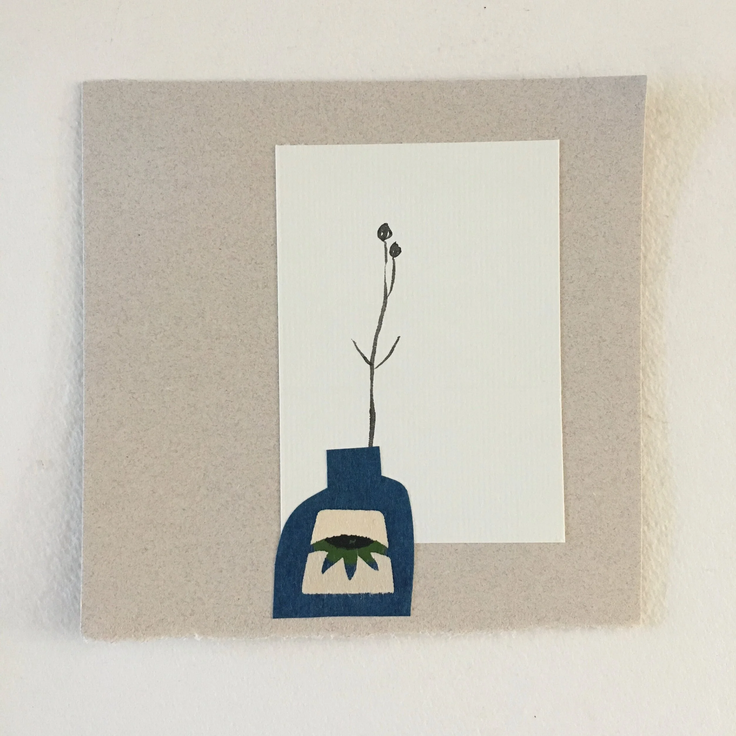
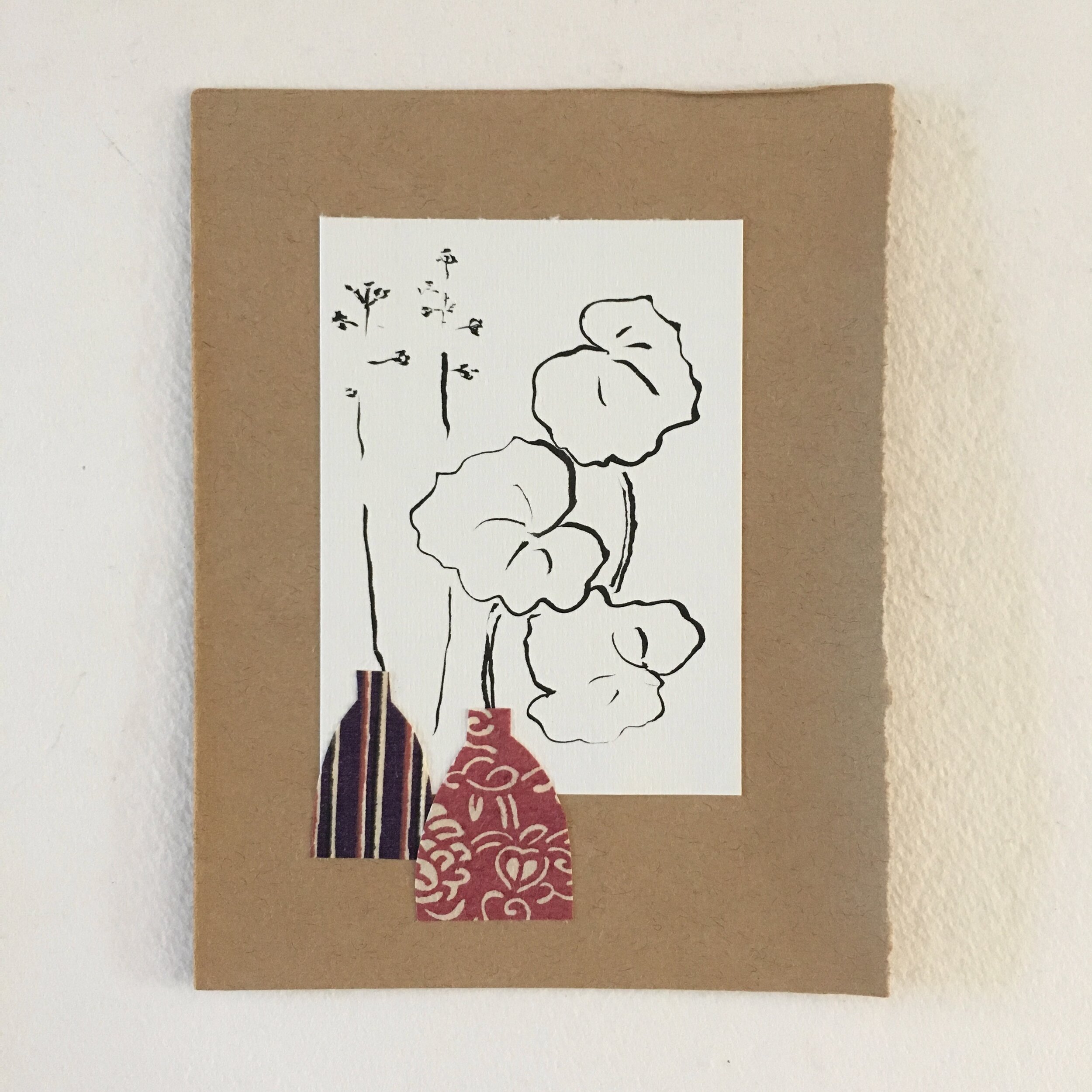
Recently I have taken to cutting out shapes that look like vases and glue-sticking them to a scrap I’ve drawn on. I’ve also done this on a few notecards to send to friends. Happiness abounds all around.

Bookbinding Supplies Beaucoup!

Dear Everyone ~

 
IMG_6879.jpeg
 

I always feel refreshed when I add new bookbinding supplies to my repertoire, whether for myself or for the shop. Now that I am zooming slowly toward offering workshops online, I want to make sure students (and everyone else) are able to purchase an extensive & exciting array of supplies online.

* * * * *

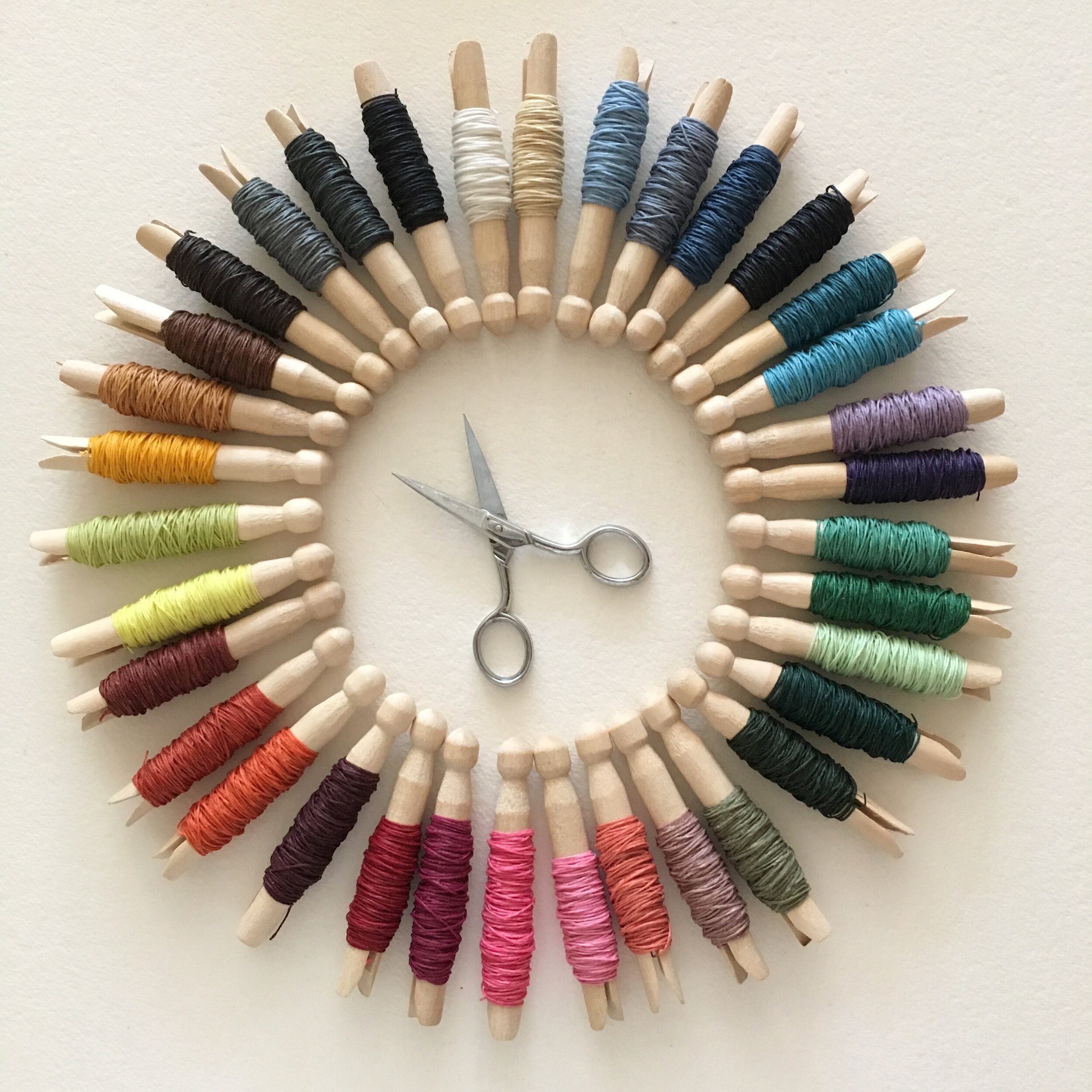
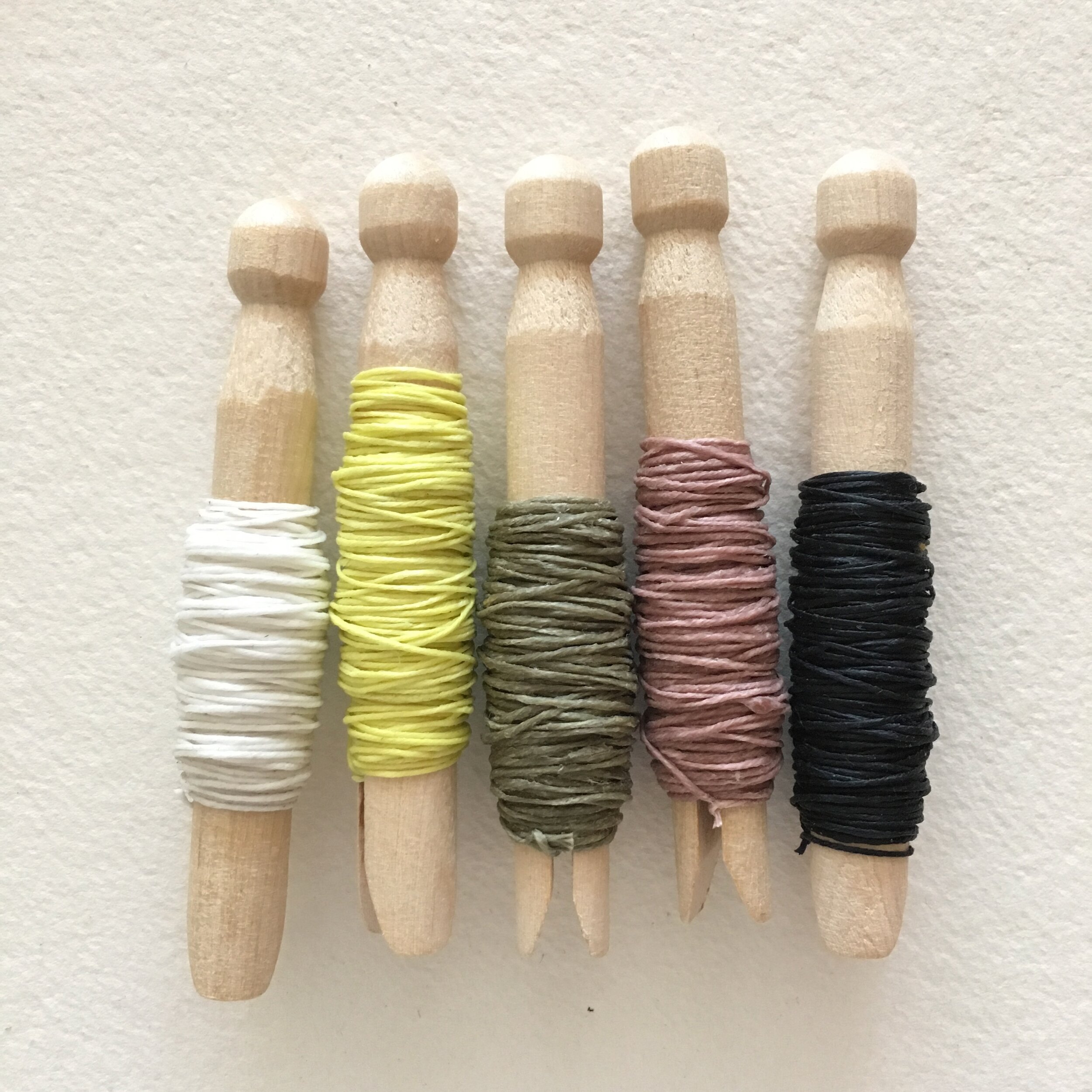
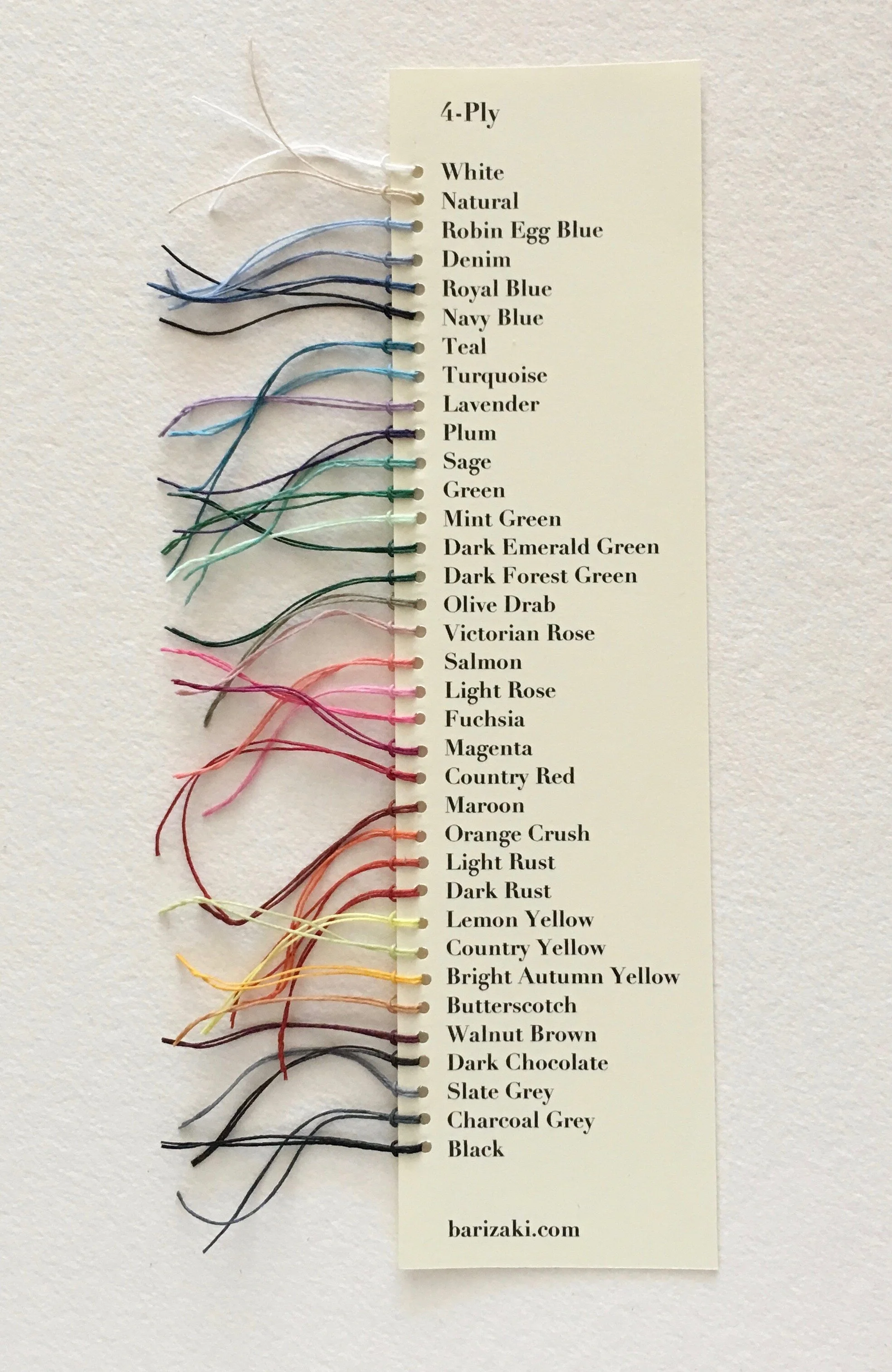
Ready, thready? A few moons ago, I had added three new shades of waxed-linen thread to my original offering of 32 colours: Lemon Yellow, Victorian Rose, and Olive Drab. I listed them as NEW in the drop-down menu. Many of you spotted them, and they have been quite popular, both in 4-ply & in 7-ply. More recently, I’ve added two very basic colours: Black & White. I’ve just re-photographed my thread wheel and updated the online drop-down to include three New-ish colours and two New colours.

 
IMG_6900.jpeg
 

On the colour wheel, you can see Black & White at 11:45, Lemon Yellow at 8:00, and Olive Drab and Victorian Rose at 5:00. New thread charts are also available, showing all 35 colours for the 4-ply and 29 colours for the 7-ply. These cards are extremely labour-intensive to make but a joy to have (and to hold).

IMG_6876 2.jpeg

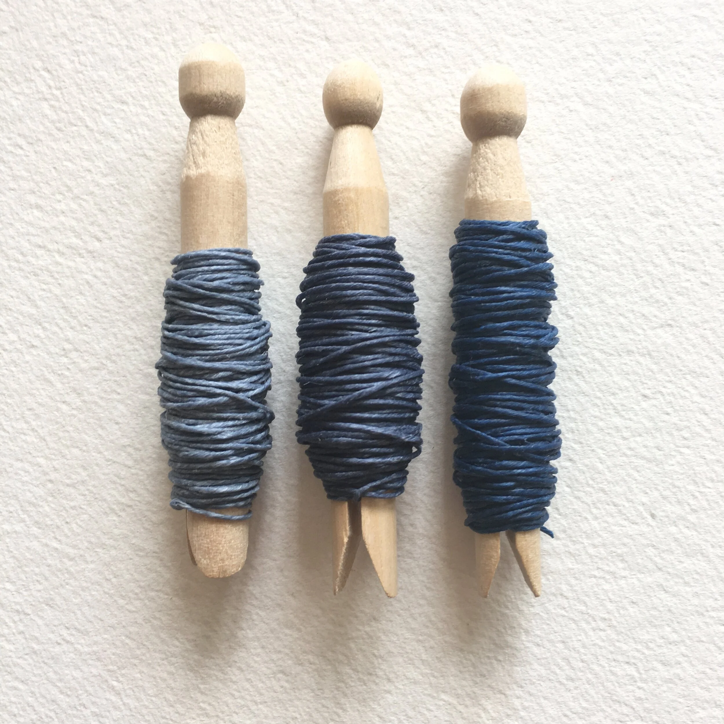
Limited-edition addition: I have a 36th colour, called Williamsburg Blue (in 7-ply) but only a small quantity. It is a lovely shade, subtly between Denim and Royal Blue (shown here: Denim, Williamsburg Blue, Royal Blue). I’ve added it to the drop-down menu, but I’ve not included it on the new colour chart. If you fancy it, don’t dally, or you’ll be blue.

 
IMG_6911.jpeg
 

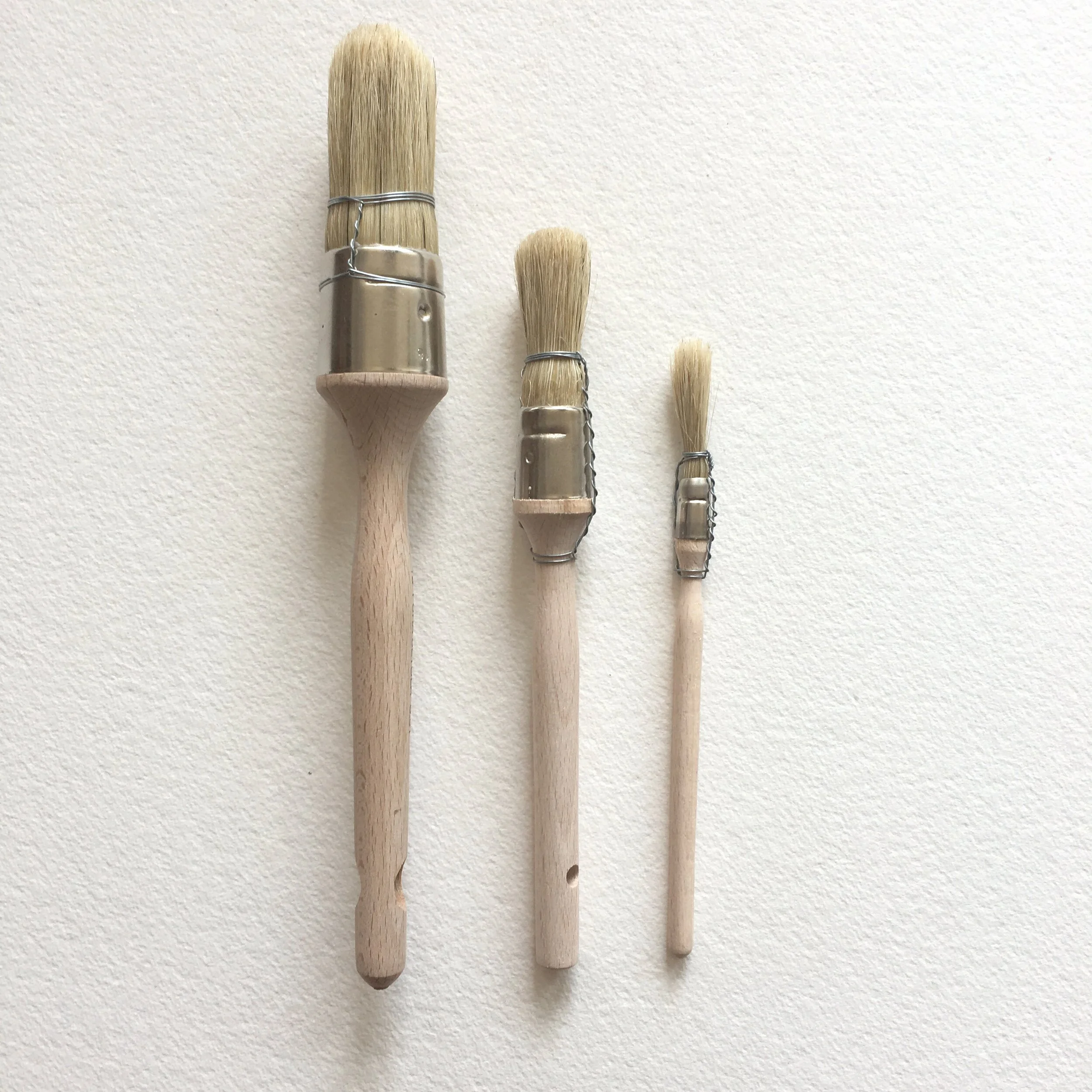
Pretty Vellumy Announcement (PVA): I am now selling P.V.A. glue in my online shop, in two sizes. Glue Beaucoup is 12 oz; Glue Junior is 6 oz. I’ve been using this glue for as long as I’ve been making books (31 years!), and it is my true go-to glue. I’ve also added their brush brethren to the online shop. They are available individually in three sizes (referencing the diameter of the “bristle block”): small (⅜ in), medium (¾ in), and large (1¼ in). If you treat these brushes nicely, they will serve you well for years.

IMG_6904.jpeg
IMG_6909.jpeg

Enveloped in Gratitude—Literally

Dear Everyone ~

 
IMG_6861 2.jpeg
 

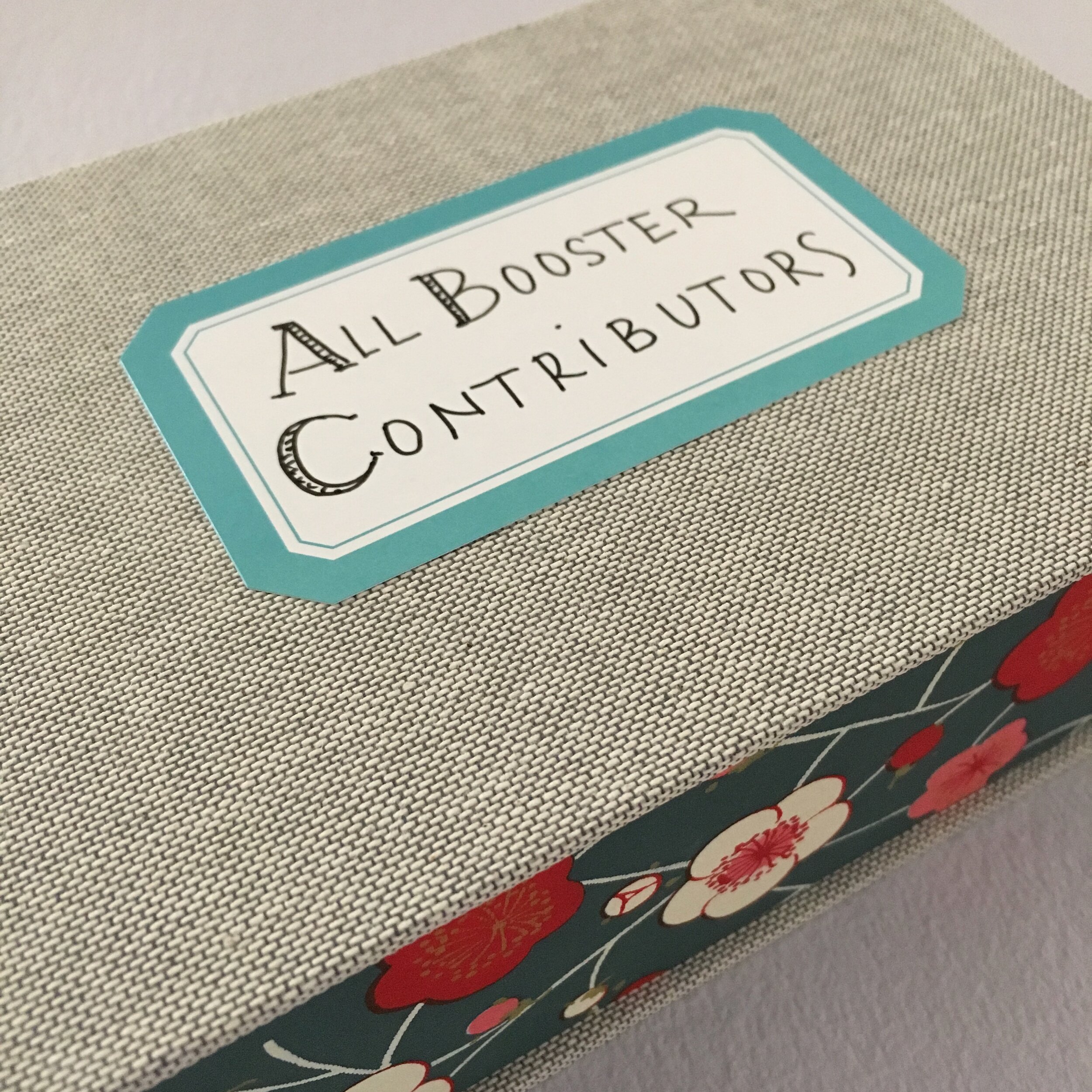
In deep bow is often how I end my correspondences, but I am beginning this email with a deep bow. And a photo of my thank-you envelopes to everyone who contributed to my Booster campaign for MoveOn's #ToSaveThePostOffice initiative. The envelopes will find their way to their respective “honorees” over time.

 
IMG_6870.jpeg
 

The grand total of Boosters of Stationery Joy sold handily surpasses my initial goal. My final tally is 43 Boosters purchased & shipped through my online shop, plus 11 Boosters picked up curbside. Plus four customers made straight-out cash donations to the cause.

 
IMG_6842.jpeg
 
IMG_6847.jpeg

So, Bari Zaki Studio's donation to MoveOn is $799, well over my original seemingly optimistic goal of $500.
Assembling the Boosters has given me particular joy, both stationery and stationary! I loved laying out the expanse of stacks of envelopes, notecards, postcards, and little glassine-encased “party favours” of Letters Mingle Souls stamps. As the towers of tissue-wrapped Boosters grew, my spirits soared with them.

Boosterfully, Bari

Extremely Exquisite Scraps

Dear Everyone ~

 
IMG_6727.jpeg
 

I’m reviving my Studio Sale tradition of packaging amazing assortments of scraps & snippets from around the globe. Each piece is a remnant — and a reminder — of bookbinding projects past.

 
IMG_6734.jpeg
 

Most of the papers are Japanese, vintage treasures as well as newer patterns. Each bag, of course, is uniquely unique, and they all include a smattering of hand-marbled papers from the U.K. and The Continent.

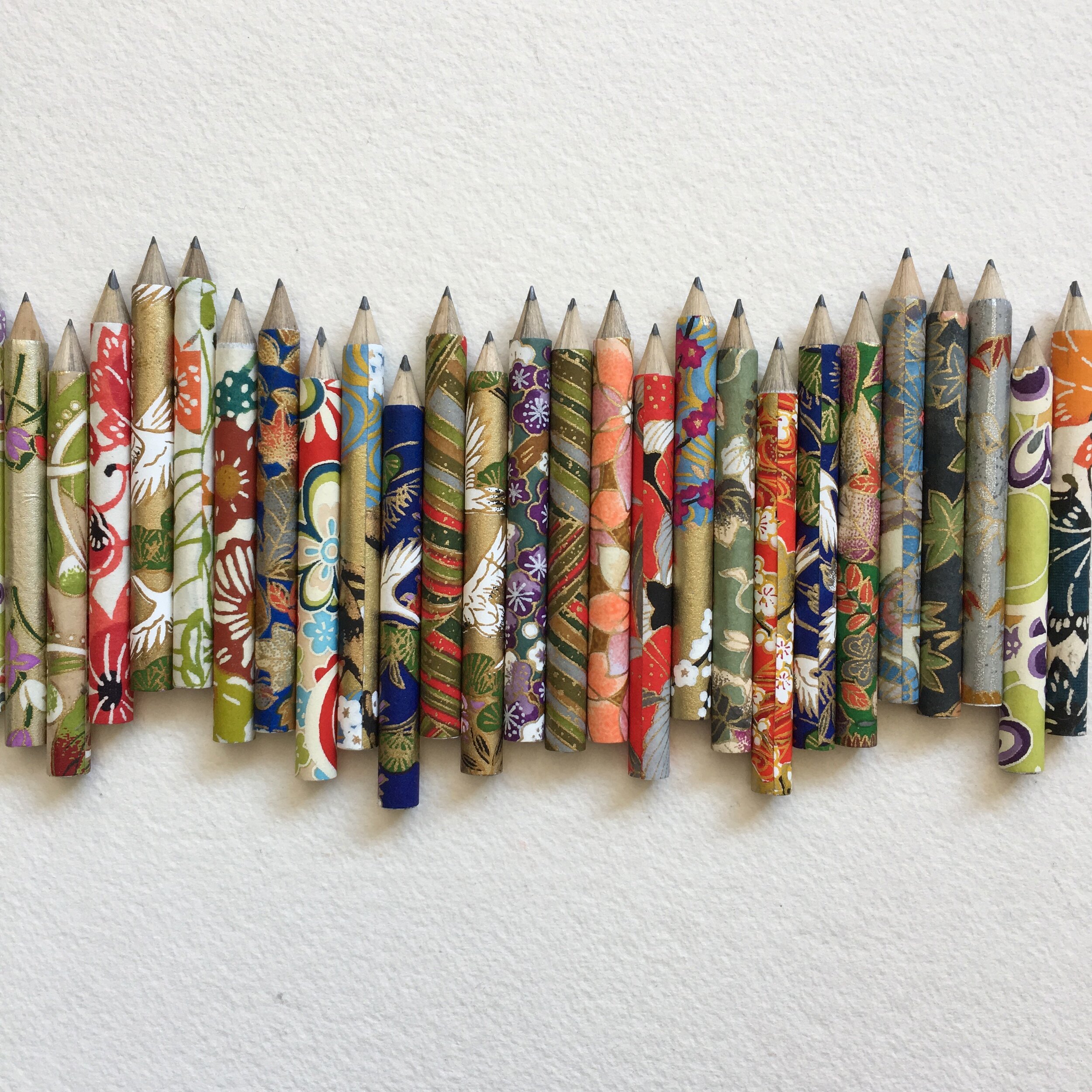
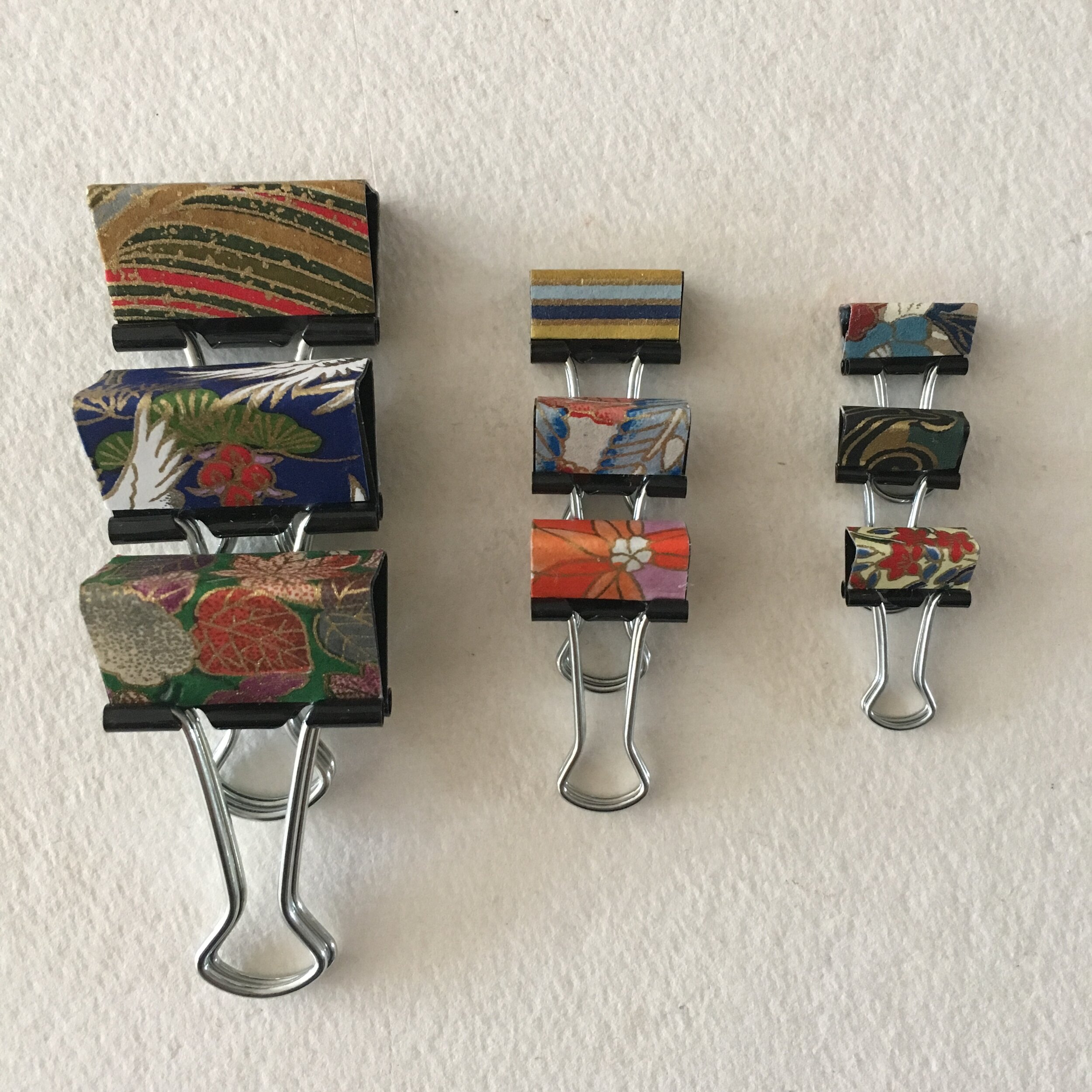
I use scraps like these to cover mini-pencils & butterfly clips. Most recently, I’ve taken to glueing a snippet or shard on an envelope back (or front) just for the fun of it. It looks swatchy or patchworky, a touch of colour & pattern. And delights me to no end.

 
IMG_6737.jpeg
 

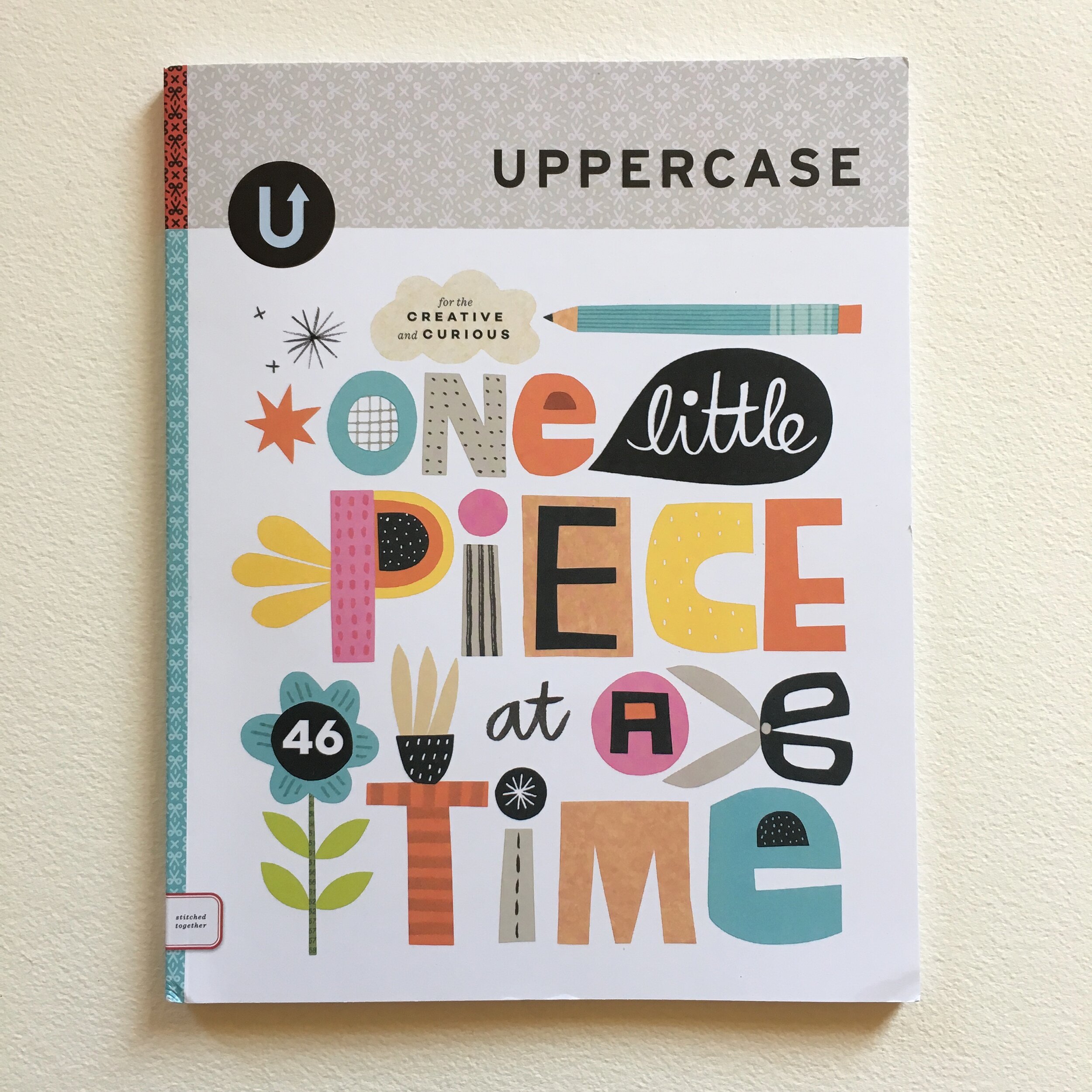
Scrap-happiness is in the air … and on the page! My many uses of scraps are showcased in the new issue of Uppercase magazine, in an article by my friend and postal muse Alyson Kuhn. Bari Zaki Studio has an entire spread in the article, titled Snippets and Slices and Shards, oh my! The subtitle, Little bits of paper and the ways we love them, makes my heart smile from ear to ear. If you don’t subscribe to Uppercase, you can buy the current issue on the magazine’s lovely site.

 
IMG_6735.jpeg
 

Extremely Exquisite Scraps

Extremely happy, Bari

Delicious envelopes: vanilla, whipped crème & rosé!

Dear Everyone ~

 
IMG_6683.jpeg
 

I have always had a soft spot for deluxe envelopes. Some cotton is good, an elegant colour is good, and a nice flap makes me happy. Here are three sets of envelopes that fill the bill. Actually, I’ve filled them with papery companions.

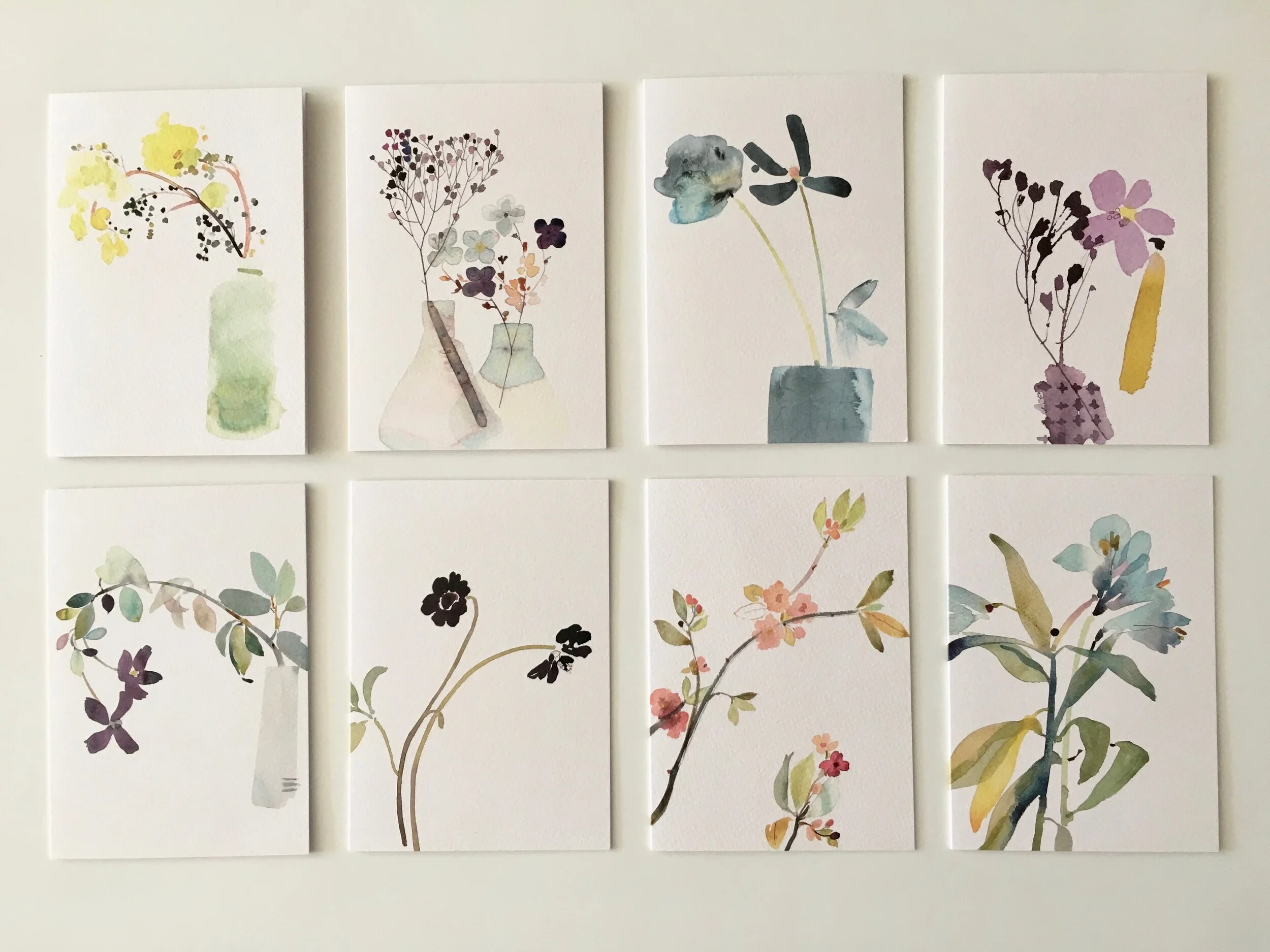
First, Rivoli 25% cotton envelopes, which I’ve paired with a florabundance of Kew postcards, one each of eight different designs. (These are the same designs as on the Kew notecards, but in postcard format.) You could indeed mail the postcards without an envelope, for the postcard rate, but I generally prefer to envelop! The message side is a delight, with a nice setting of tiny type (instead of the brash barcodes and honking attributions that some institutions now favour, intruding on the message space). And we are rather chuffed to be the first, and so far only, shop in the States to carry the Kew cards.

 
IMG_6690.jpeg
 

The Rivoli envelopes are vanilla in hue (which is to say, a bit creamier than the whipped crème shade of the Carta Pura “outer” envelope you see above). That said, the two envelopes look dreamy together. As you see, you can neatly nest the Rivoli Vanilla and its Kew card inside the Carta Pura Whipped Crème. Suite! (The Carta Pura envelopes are also available à la carte.)

I’ve also paired the Rivoli envelopes with their matching notesheets, folded neatly in half (two notesheets in each envelope).

 
IMG_6700.jpeg
 

For the summer season only, I’ve decided to refer to the Rivoli Rose envelopes & notesheets as rosé. They are actually a perfect pale pink. (You might be able to duplicate this shade by gently macerating one raspberry into a cup of sour cream, if you dairy.) Multiple notesheets fit gracefully inside the envelope without folding.

As always, you might consider some fresh postage to complement your correspondence. Frankly, our Summer Fruit Sampler is a delish option.

Kew Postcards with 25% Cotton Envelopes

Rivoli Vanilla Notesets

Octet of Carta Pura Envelopes

Rivoli Rose Letter-writing Pad & Envelopes

Go Fourth & Mail, Bari

Wonderful, Colourful, Summery & Sunny...

Dear Everyone ~

 
IMG_6608.jpeg
 

I’ve recently received, re-stocked, and rejoiced over new arrivals in the shop: notecards, postcards, notebooks, and mini-noteblocs whose side view absolutely reminds me of striped beach chairs.

IMG_6610.jpeg

For many moons I have been in high swoon over translucent, beguiling watercolours from fir+wren in the U.K. When Zak and I traveled to England last autumn, I had been following artist Sue Kane on Instagram for ages. I knew we’d be relatively close to Manchester, where Sue has her studio. I was able to invite myself for a visit!  It took hours to travel there, waking up at the crack of dawn to get a taxi to the train station, and then the train to Manchester, and then a taxi to her studio. The very heavy rainfall the entire day made the journey to and fro very soggy. But nonetheless, a happy day indeed.

A couple of months ago, Sue let me know that some of her images were being published as notecards, and she put me in touch with her agent. The cards have arrived pronto-ly, and they are dreamy in person. They are lovely to look at, delightful to write on, and even to frame! I'm charmed that Bari Zaki Studio is the first retailer to import them.

*  *  *  *  *

 
IMG_6616.jpeg
 

Also noteworthy are notebooks from Korea, with summerweight pages of hanji, which is made from the inner layer of mulberry bark. The paper is almost mysteriously robust, and receptive to all manner of writing & drawing implements. The graphic elements on the covers (here a dash, there a dot) are classic yet refreshing, and perfectly ripe for personalizing by hand.

*  *  *  *  *

 
IMG_6504.jpeg
 

To start the summer season, I’ve replenished my stock of notebooks from Season Paper in France, including four new cover designs and one new Jaunty Journal. There’s also a charmola new postcard set, called À La Mer, with two each of five peachy, beachy designs. I’ve also re-stocked the Les Fleurs postcard set.

*  *  *  *  *
For a bit more beachiness, consider a mini-mish-mash notebloc. These petite pads of lightweight cover stock are neat, but decidedly not discreet: they are vibrantly striped. Each bloc presents its own assortment of colours. Perfect for a very little list or an eye-catchy enclosure.

 
IMG_6515.jpeg
 

Boosted beyond belief

Dear Everyone ~

 
IMG_6544.jpeg
 

What a boosterful start to my summer! I am thrilled to announce that I am officially “overgoal” on my campaign to donate $500 to MoveOn’s advocacy campaign to #SaveThePostOffice. I will continue to donate $12 per Booster sold through July Fourth, in honor of Will (my marvelous mail carrier) and the United States Postal Service. Here is my official accounting of my immediate donation.

 
IMG_6545.jpeg
 

I’ve always enjoyed assembling my Bundles of Stationery Joy, and now they have been given new meaning… and a boost! I’m in awe, and deeply grateful, for everyone’s enthusiasm and contributions to help me not simply reach my donation goal, but to surpass it so swiftly.

bari mini pencils 1 ed.jpeg

Daily mail delivery has long been very near & dear to my heart. Most days hold the possibility, the anticipation, of receiving one or more bits of tangible connection from someone somewhere. And, especially during the shelter season, the idea that I can send a postcard or an envelope to deliver delight, and perhaps surprise, and even a moment of uplift …  makes mail even more meaningful to me.

IMG_6532.jpeg

Before leaving the studio on Friday, I prepared the Bountiful Booster Buffet, so that I can start assembling outgoing Boosters tomorrow morning.

Immeasurably boosted, Bari

The Story of “The Story of This Guy”

Dear Everyone ~

 
IMG_6360.jpeg
 

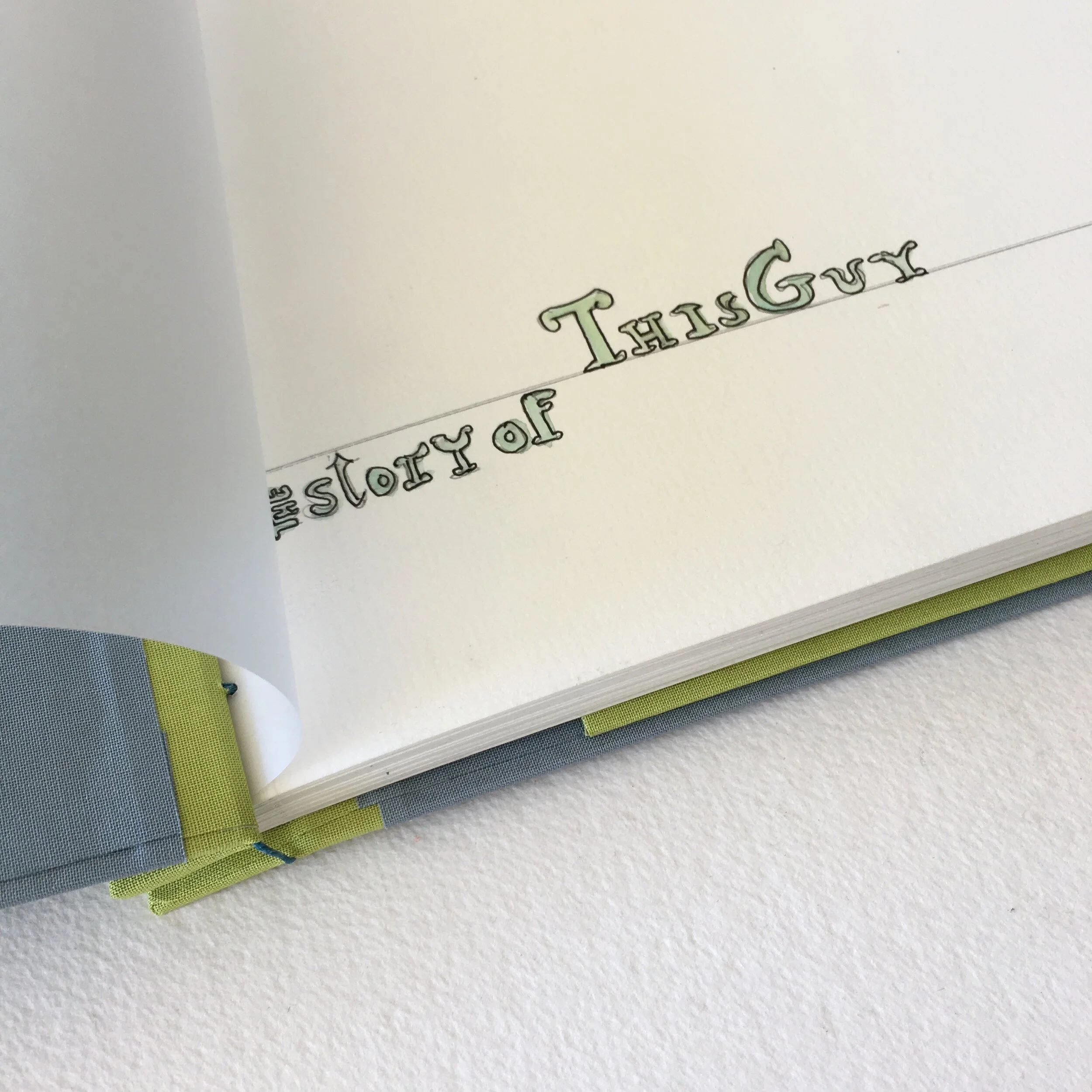
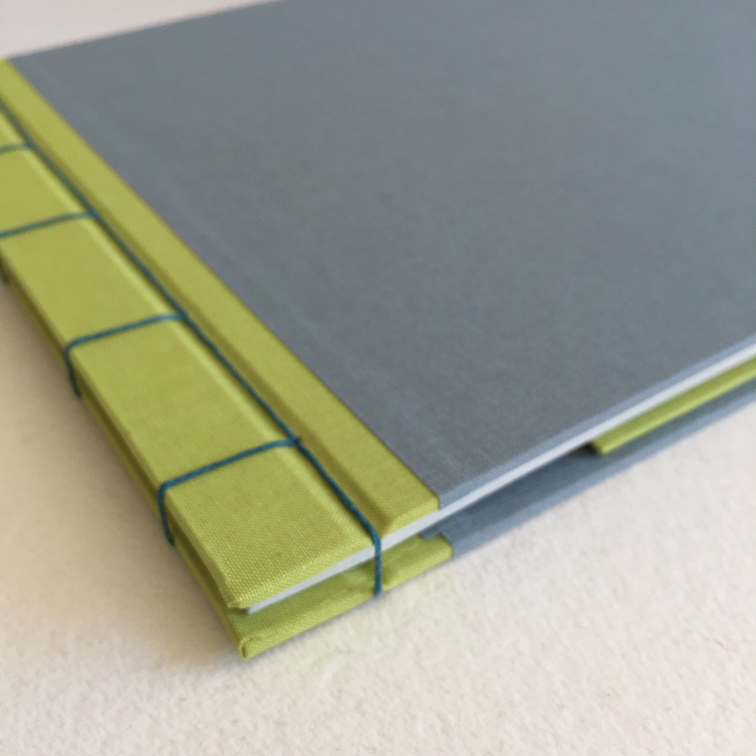
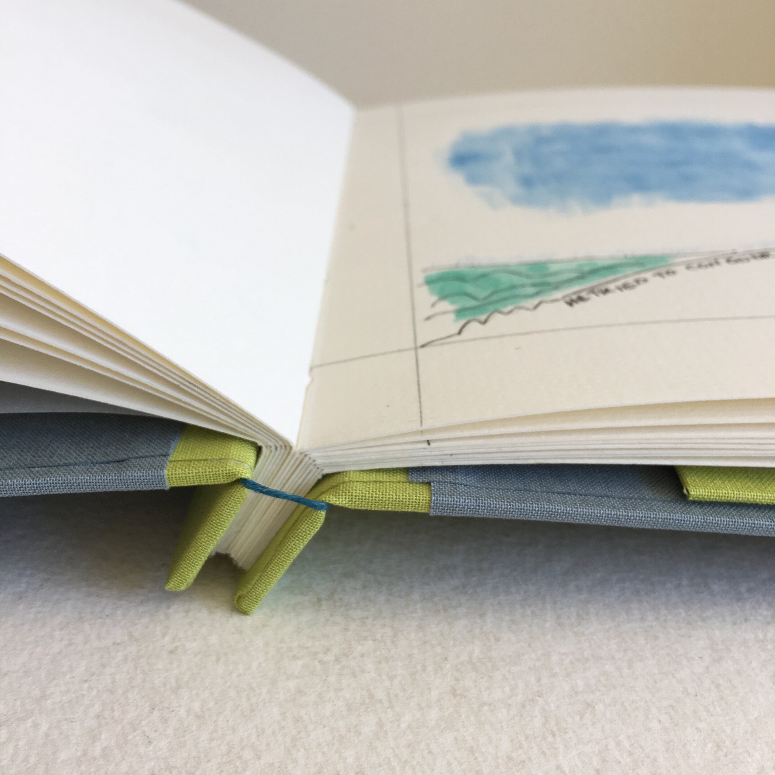
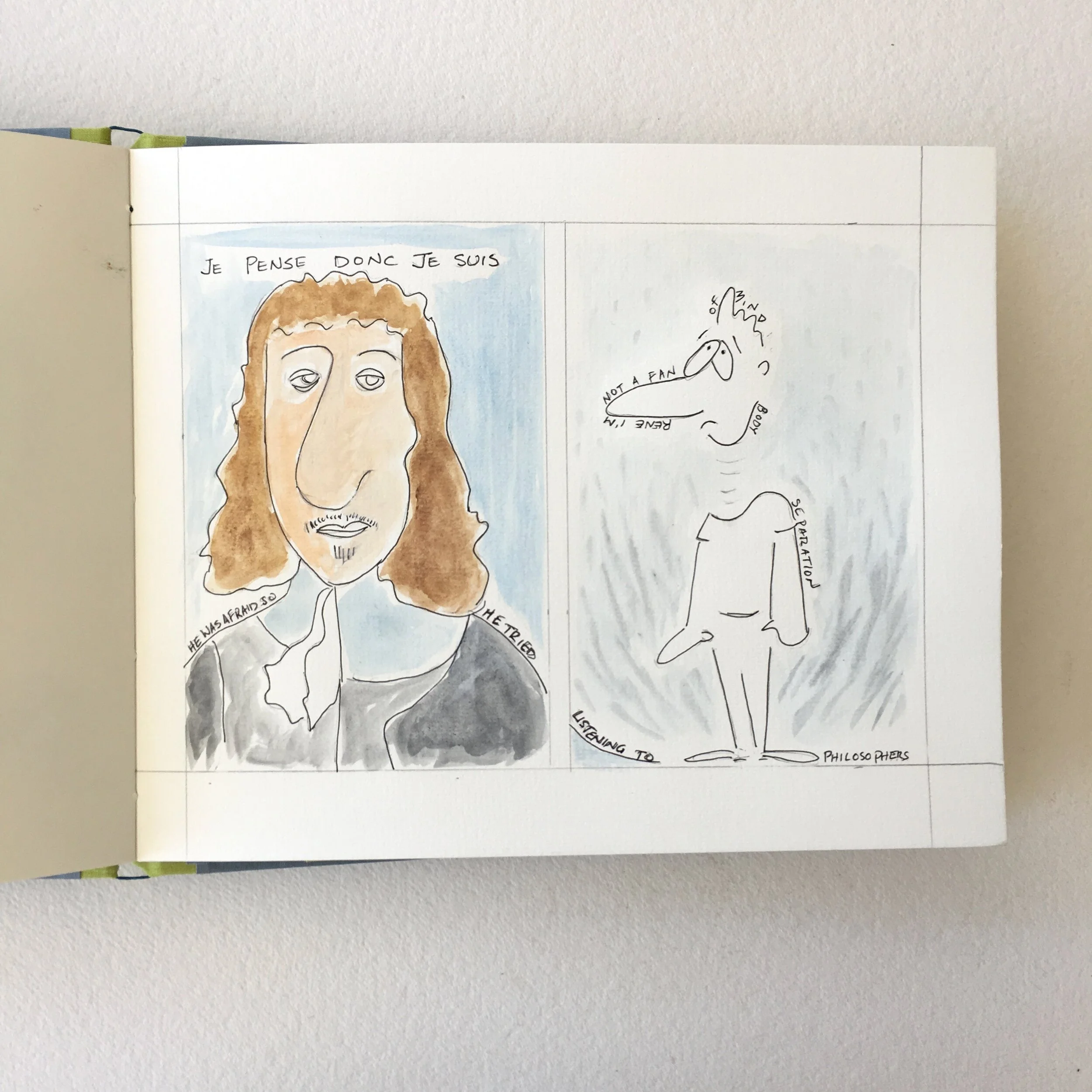
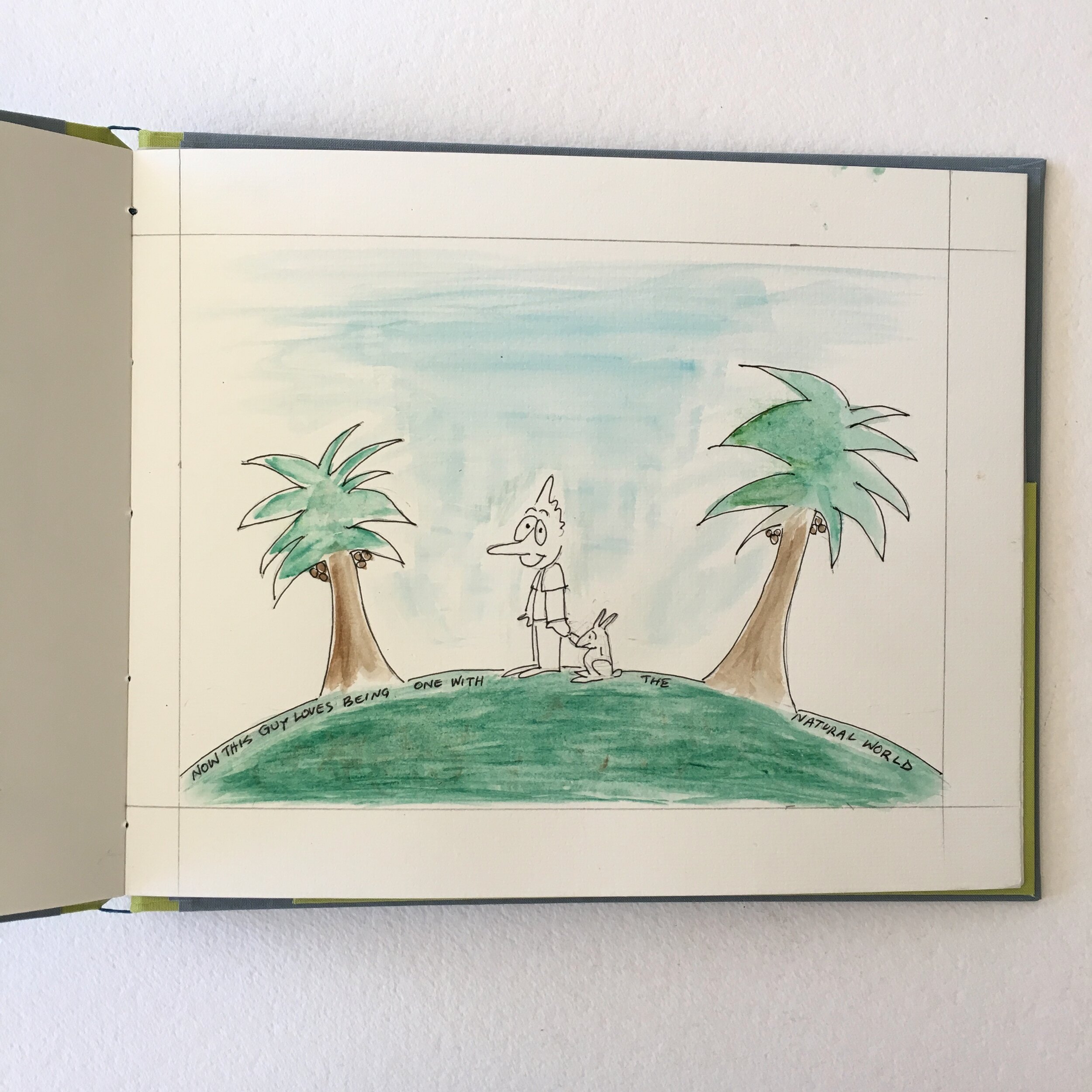
I’ve recently delivered (a delightful garden-drop visit) Bradford Matson’s second storybook for his grandson Charlie, who will turn two in July. Bradford’s first book for Charlie, It’s Cold, was a Christmas gift last December. You may have read my blog post about it at the time. You can see and read about Bradford’s and my collaboration at the top of the Project Gallery in Storybook: by Bradford for grandson Charlie.

In March, at the beginning of the shelter season, Bradford called to say he had finished his second storybook for Charlie. He added that it seemed a good time to do what he could to help support the businesses he values. I was so grateful, and also thrilled to have his second book to work on!

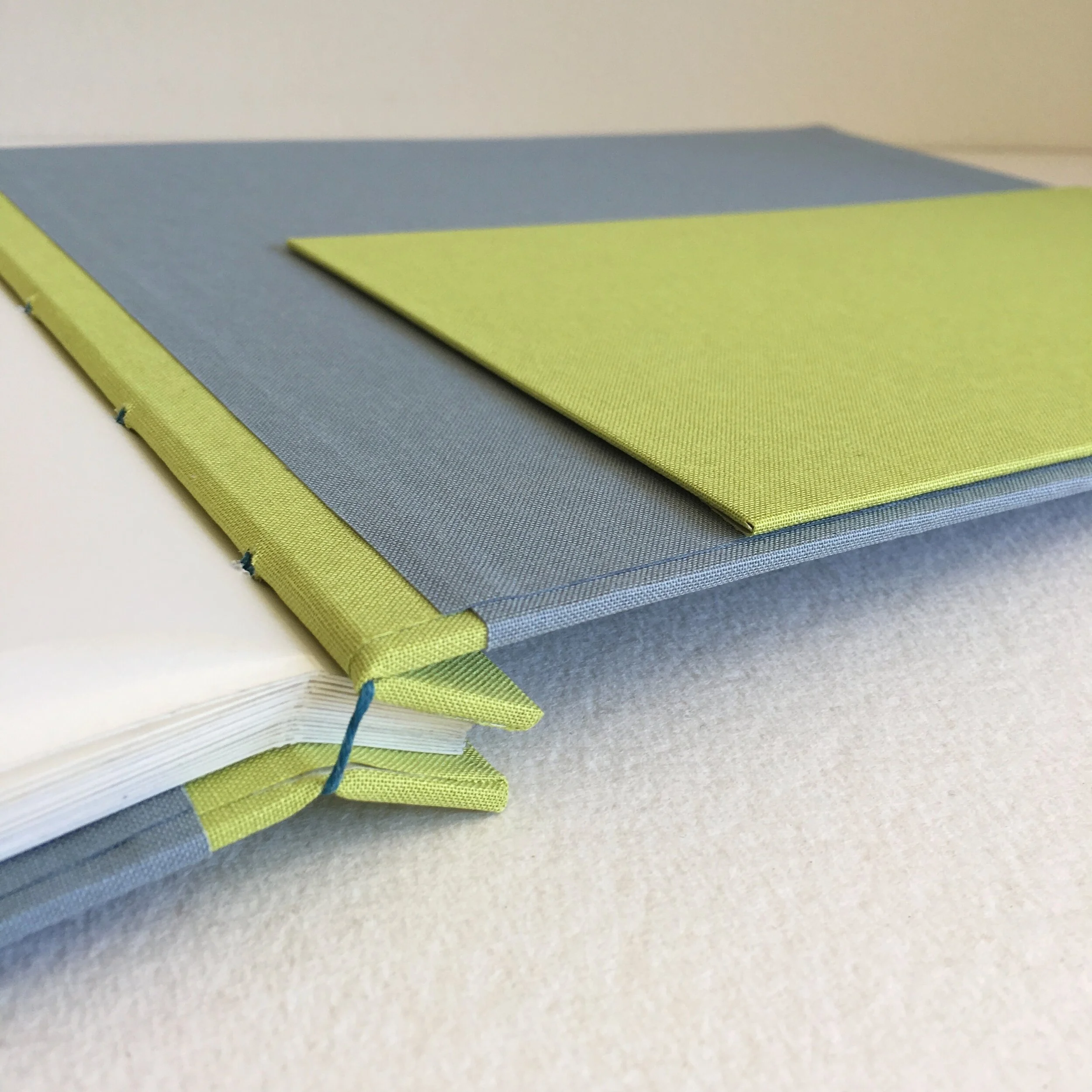
Bradford arranged a contactless drop-off of the pages, I assembled some bookcloth swatches that I thought would complement his wonderful watercolours, and we scheduled a contactless pick-up, including waxed-linen thread options for the stitching. Bradford made his selections, and voilà, I knew everything I needed to know to begin binding The Story of This Guy.

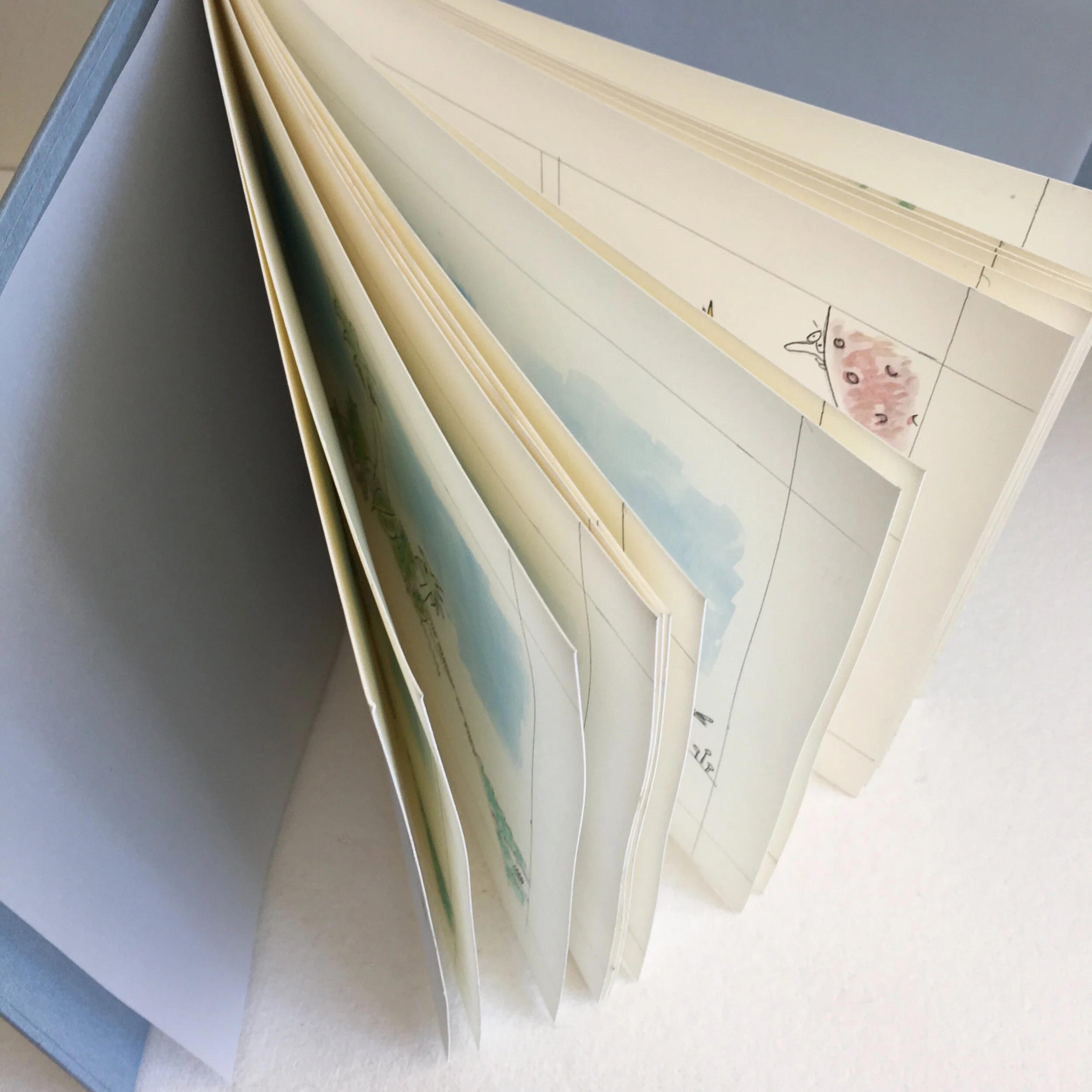
Bradford likes to illustrate on a 9 x 12 watercolour sheet, so I had made the first book that size. The second book is the same size—the beginning of Charlie’s set of books from Bradford. The book structure is also the same: Japanese style binding and a pocket in the back for Bradford’s note to Charlie.

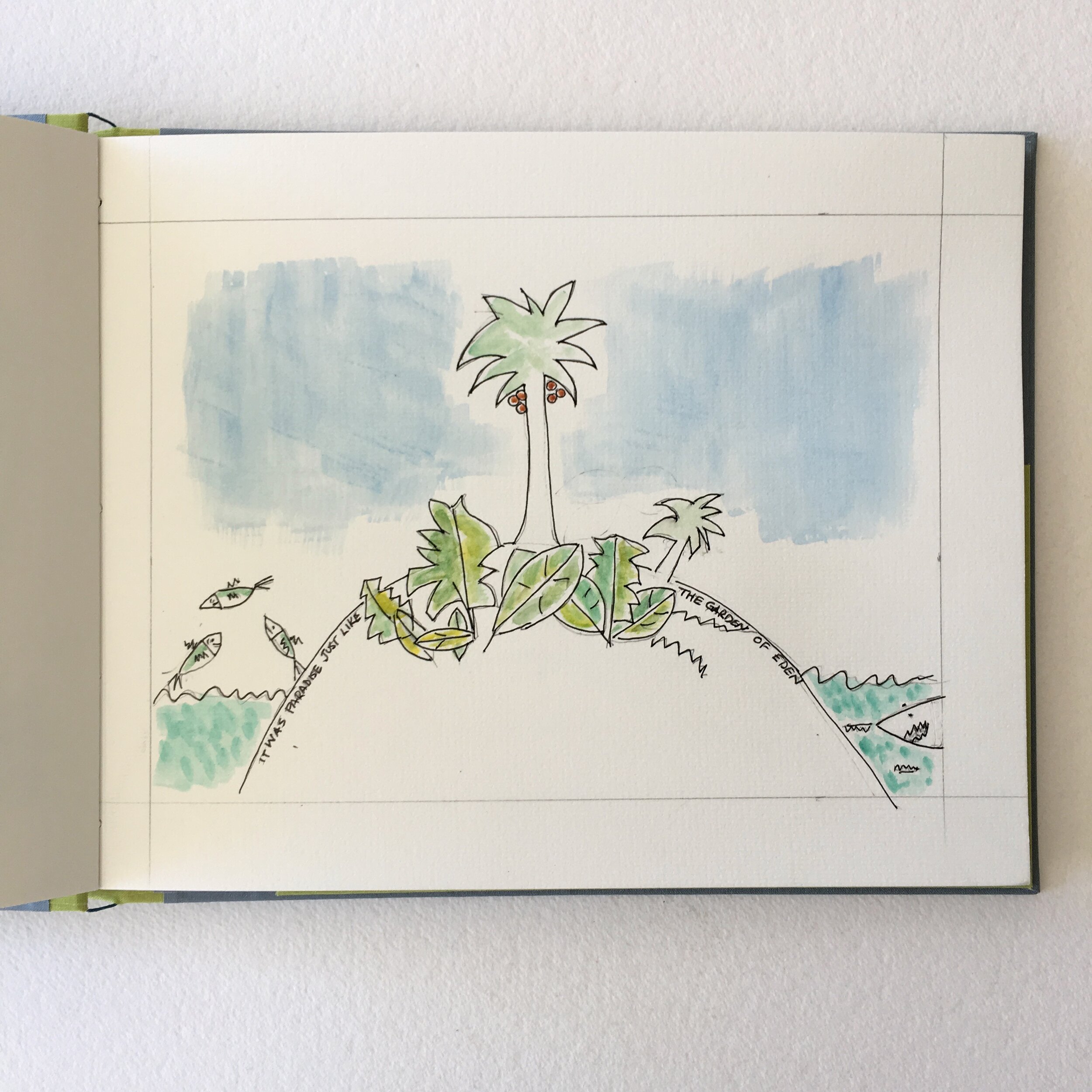
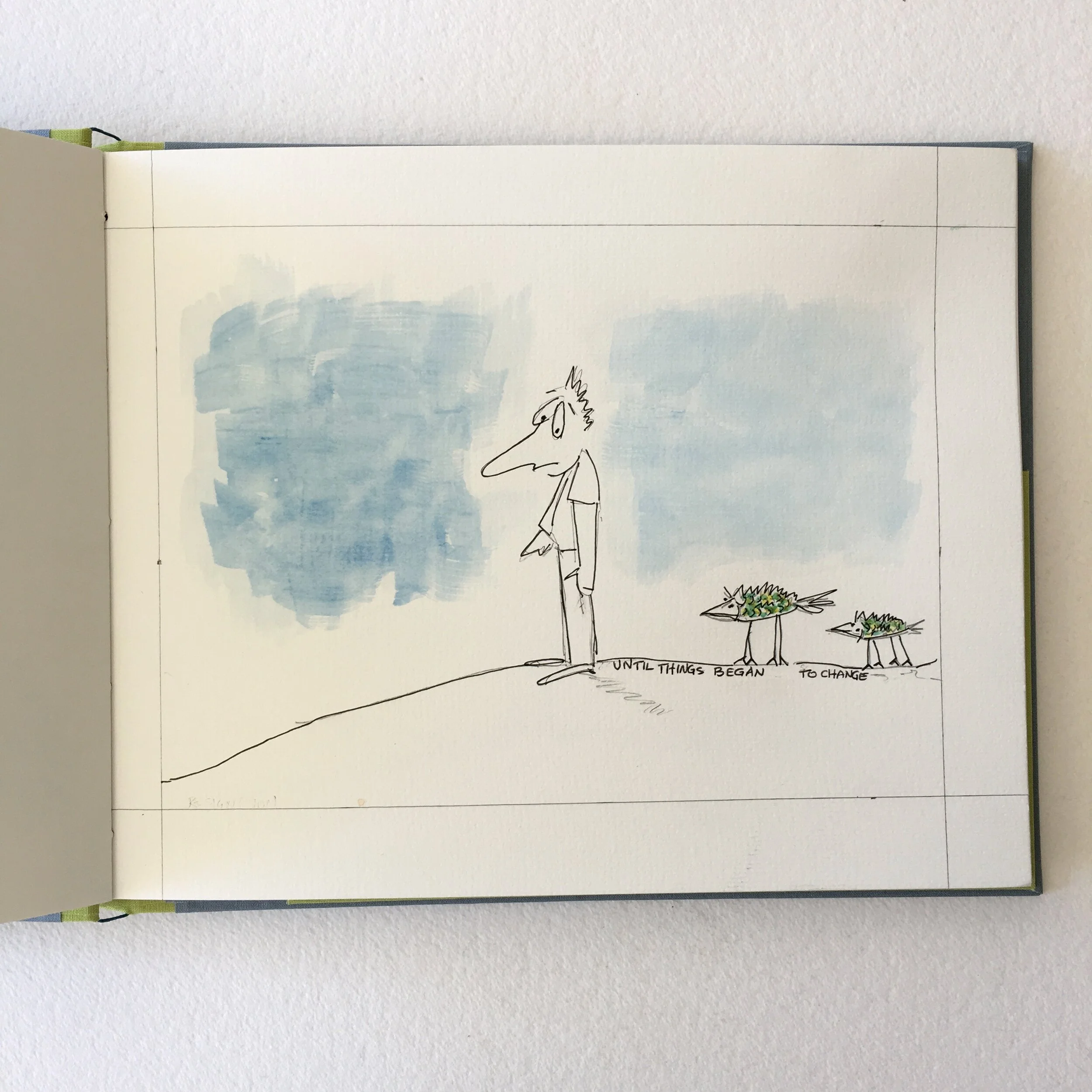
The palette of Bradford’s drawings was a mix of pale greens & blues (how apropos for the beginning of spring). I thoroughly enjoyed selecting some pastel linen bookcloth options to coincide with the season and complement Bradford’s charming illustrations. 

I of course asked Bradford about Charlie’s response to It’s Cold, and Bradford provided such endearing details that I asked his permission to share them.

 
IMG_6376.jpeg
 

“ We were on a video call the other day, and Charlie asked Nora, his mom, to get ‘Da’s book.’ He knows the story and acts out certain parts. For the first title, ‘It’s cold,’ he wraps his arms around himself and says Brrr. When the people say ‘No more,’ he wags his finger and says No more, and mimics the faces in the crowd. When he sees the captain with the spyglass, he points to his own eye, remembering that I have a spyglass that he played with while he was here. On our call, he instructed me to Get it. He was disappointed that I couldn’t pass it through the screen. ” 

“ Needless to say, he’ll get the spyglass for his birthday. You can imagine how much my heart swells watching him enjoy our book. ” 

Bradford’s plan is to give The Story of This Guy as a birthday gift for Charlie. He plans to do a new book for Christmas. I asked him about his inspirations for this book.

“ The genesis for This Guy is pretty simple. I got tired of all the anti-intellectual, anti-science thinking that somehow gets a voice in today’s discourse, and want Charlie to read about evolution early on. Like most of my stuff, the illustrations started with a random doodle I did when I was still working. It’s the image at the beginning of the book, with our hero looking back over his shoulder at fish walking. ”

 
IMG_4583.jpg
 

Bradford shared one more Charlie story that is irresistible.

“ Charlie has been looking through a photo album and  asking his mom who works. When he asked if Da works, his mother, Nora, said Not any more. Charlie asked, What does he do? Her answer was Paint, cook, and garden. I am sitting in the back garden on this beautiful afternoon feeling a deep sense of well being. I am a lucky man. ”

And I am a lucky bookbinder, to have gotten to work on Bradford’s new book for Charlie!

In anticipation, Bari

B is for Being a Booster

Dear Everyone ~

 
IMG_6423.jpeg
 

B is also for bumper sticker! When I received my envelope from MoveOn, I was so excited that I held it up to the light, to see exactly where inside my thank-you-for-donating bumper sticker sat, and then I tore the envelope right open. The backside of the bumper sticker carries a serious encouragement: Display your sticker proudly on your mailbox or somewhere where your mail carrier will see it to let postal workers know that you support them & the essential work they do during this pandemic.

 
IMG_6398.jpeg
 

Well, I’ve never put a sticker on my bumper before … and this one is an almost magical match to my car. But then I had my “papered over windows moment,” and realized that my sticker belongs right in my front window.

 
IMG_6385.jpeg
 

Three months ago (on March 17, to be exact), I closed the shop and cancelled workshops because of the pandemic. But, to me, Bari Zaki Studio still felt like an oasis of calm and beauty. And then the virus crisis was overshadowed by civic unrest in response to the killing of George Floyd. I joined my shopkeeper neighbors in papering over my windows (and dismantling my displays). Bari Zaki Studio doesn’t exist in a vacuum.

 
IMG_4939.jpeg
 

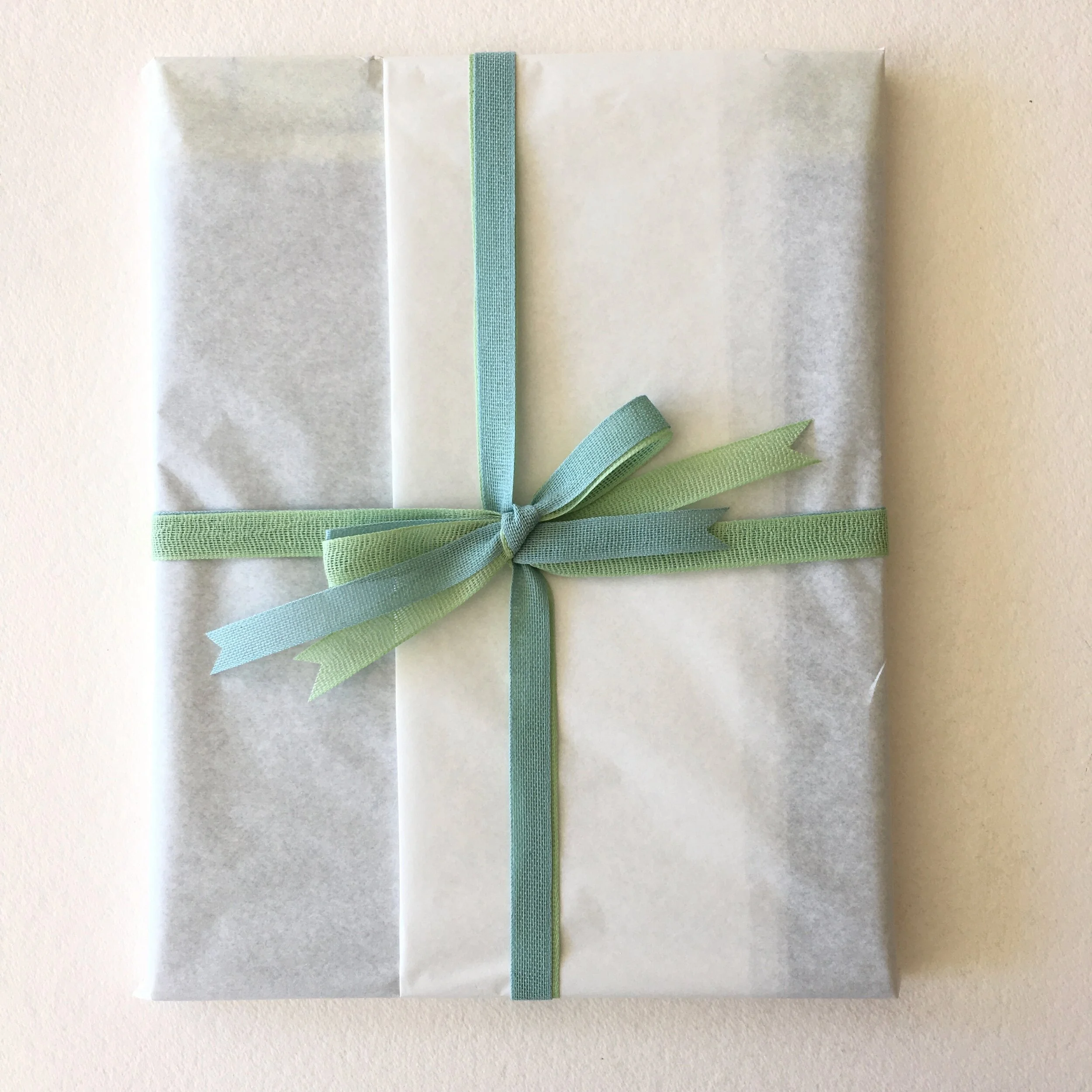
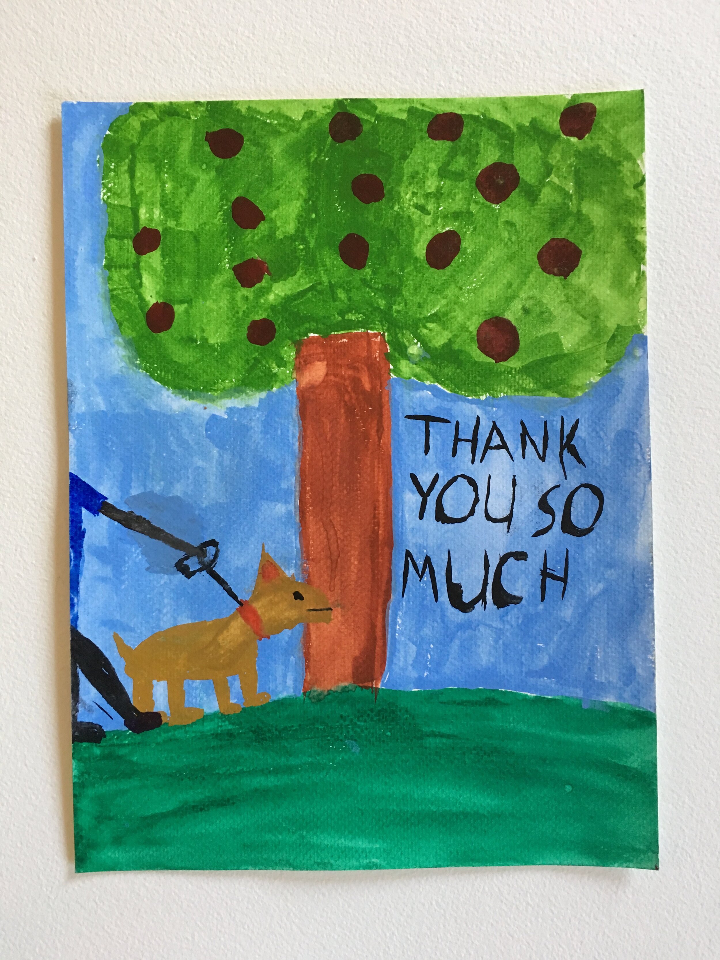
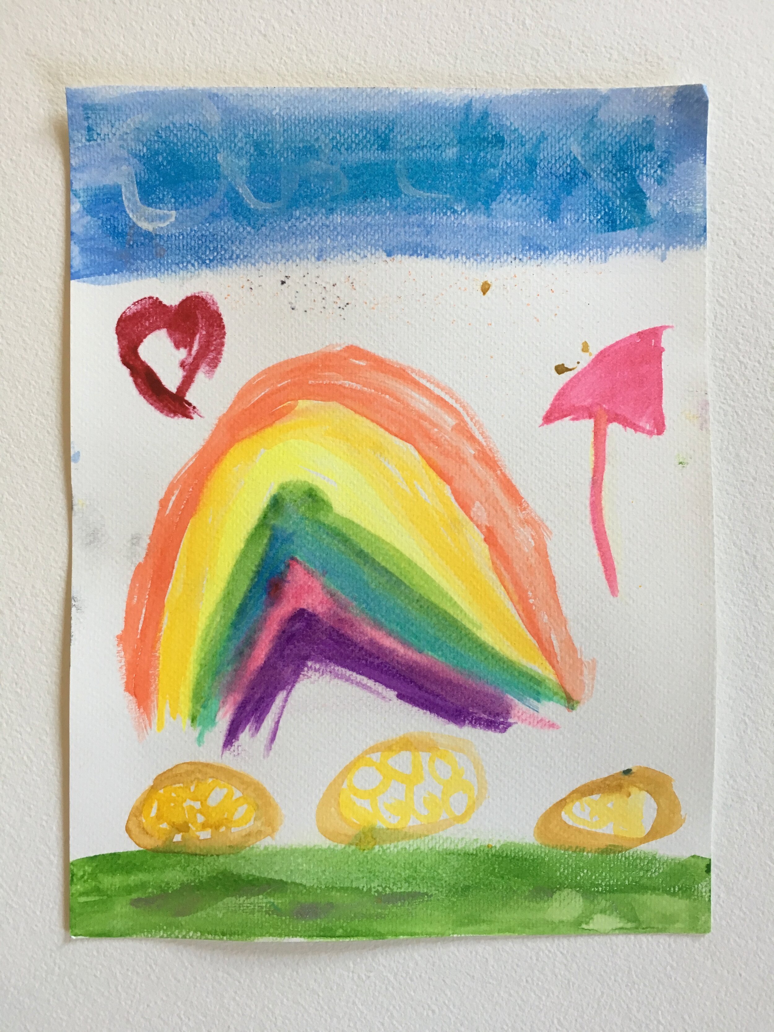
Through it all, Will, my mail carrier, has continued to be a bright spot in my days. He’s now working most Sundays, as well as during the week, so that parcels get delivered even sooner. Last week Will had a very special delivery for me: beautiful thank-you drawings from his daughters, for whom I’d prepared a care package of art supplies. I was surprised and touched … and resolved to do a bit more to support the USPS. 

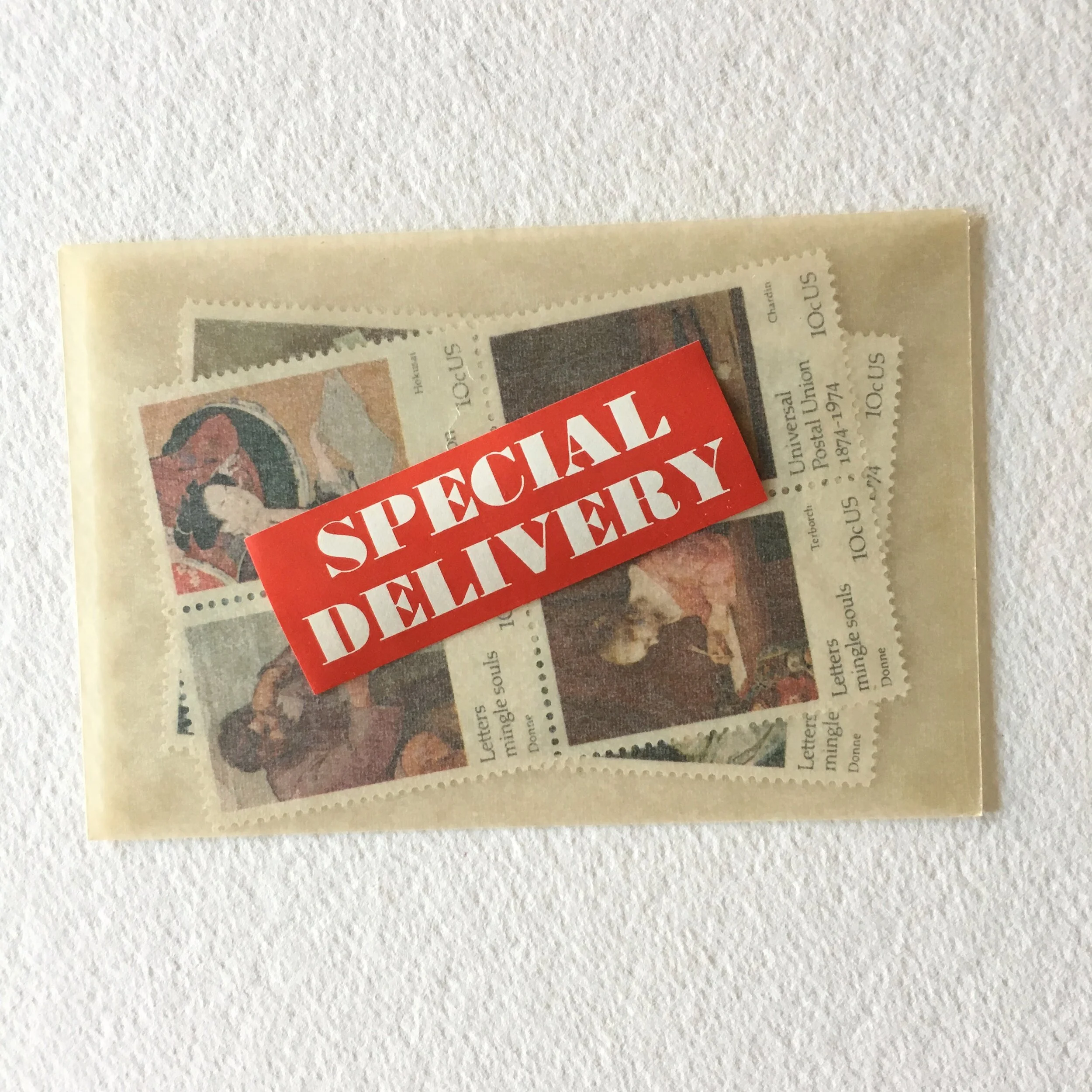
In honor of Will in particular and the USPS in general … I’m announcing my goal of raising at least $500 for MoveOn’s advocacy campaign. To do this, I will donate $12 from every sale of my new Booster of Stationery Joy. The Booster will sell for $36 (the same as a Deluxe Bundle), so $12 is 33%. I hope to sell 41 (a prime number!) Boosters to reach my goal. The Booster includes a set of Letters Mingle Souls stamps from 1974. They are among my all-time favourites.

IMG_1530.jpg

The Letters Mingle Souls stamps were issued in honor of the centennial of the Universal Postal Union, the international body that collaborates and cooperates in getting mail from one country to the next. Each of the eight stamps features a correspondent (or indication of correspondence!) by an artist from a different country. By the way, Letters mingle souls is a quote from poet John Donne.

 
IMG_6441.jpeg
 

These stamps lend themselves to all manner of creative communiques. I’m also tucking in a vintage Special Delivery sticker to grace an envelope or parcel.

 
IMG_6431.jpeg
 

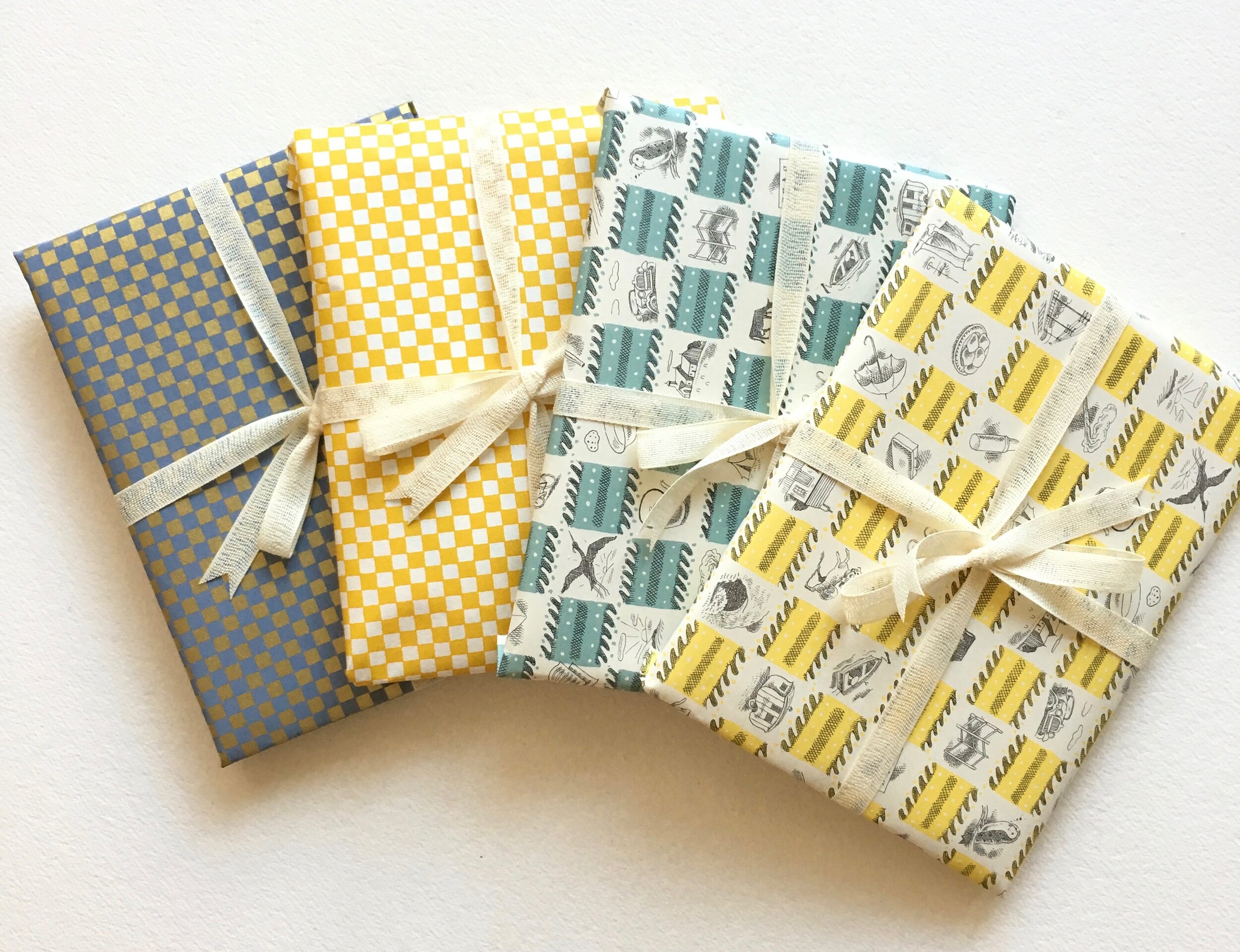
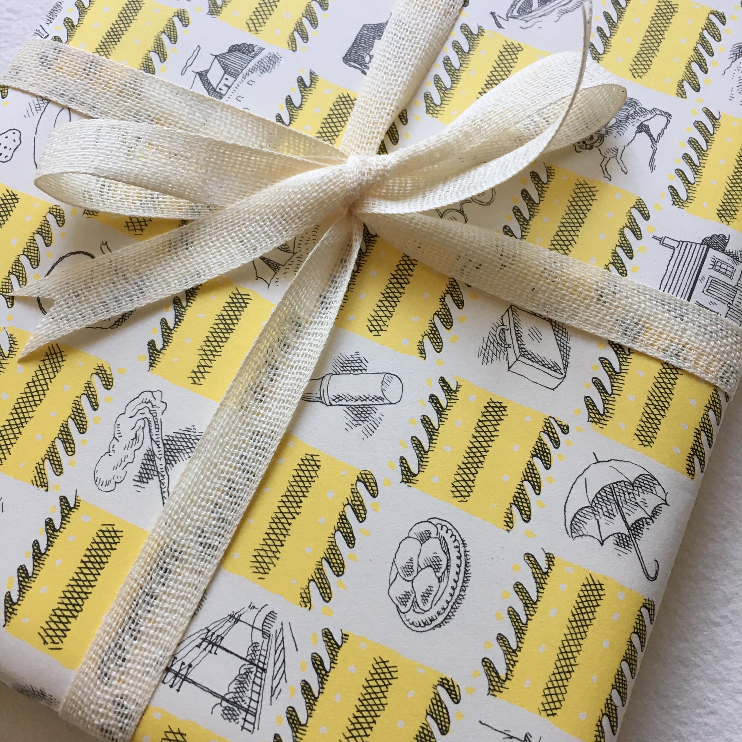
The Booster comes in four different wraps. Choose from two British sheets of incredibly delightful illustrations by Harold Jones, who drew them for a set of endpapers in 1937, or two Japanese sheets of rich tiny checks, one in watered blue and gold, and the other in sunshine yellow and white.

Give your spirits, and your correspondents, a boost with a Booster. I hope you will share my feelings of gratitude to the USPS for the ease & speed (& economy!) with which we are all able to stay connected via post.


Boosters of Stationery Joy

Heartfelt, Bari